Portuguese Modern: An Architectural Tour
by Rebecca Firestone with Mark English AIA | Editorials
“The Paula Rego House is all about form. The mechanical systems are so integrated with the building that they’re invisible.”
Image: Mark English Architects
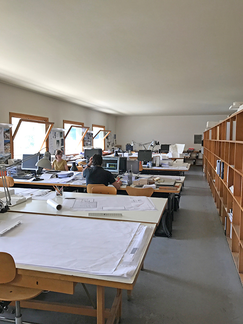
Mark English was telling me about the Portuguese architects Alvaro Siza and Eduardo Soto de Moura, whose works he visited on a recent architectural tour of Portugal. Siza and de Moura both share the same office building, and both have won separate Pritzker Prizes in architecture. This prize is given for distinguished careers rather than design competitions based on a single building.
“I was particularly struck with their attention to detailing,” noted Mark English, who traveled to Portugal with a number of other architects. “Detailing is an area often neglected by other architects, and which we could all learn from.”
Cities Visited
During their Portugal travels, Mark and his companions visited Lisbon, Cascais, Alcácer do Sal, Porto, Marco de Canavezes, Santo Tirso, and Chavez.

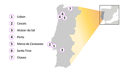
A rough itinerary of the Portuguese Modern architectural tour followed by Mark English and his companions.
Portuguese National Character
“The infrastructure in Portugal is perfect,” said Mark. “They have great bridges, freeways, tunnels, and are obsessed with transportation.” Why? I wondered, thinking of our own national infrastructure challenges.
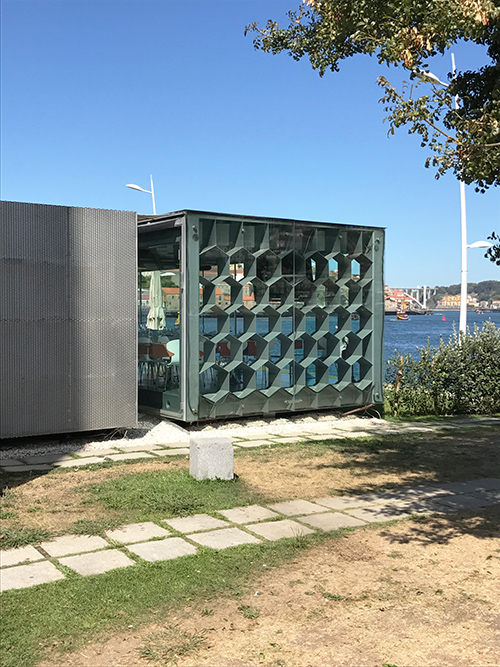
Even ordinary, anonymous kiosks in Portugal show a careful attention to detailing. Note the brisé de soleil or sun blocking hexagons for natural shading.
“The Portuguese people are proud,” Mark replied. “They were a great sea power from very early on. They invented several new kinds of ships and kept it all secret. Originally they were after cod. Later, they were after trade, sailed the globe, and established a presence in Angola, India and Goa, and Brazil.”
“Portuguese people are really into their architecture.” So how would you describe them? I asked. Is there a national character? “They are sober, practical, artistic, historically competent in material arts and sciences. They are open, friendly and want to communicate.”
Draped Concrete
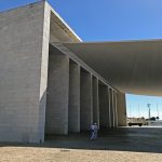
The Portuguese National Pavilion by Alvaro Siza was done for a World’s Fair and now serves as a gateway to the “new section” of Lisbon, Portugal. Its elegance and supreme simplicity rely on a cleverly executed catenary curve, basically the curve assumed by a flexible structure that is supported only on either end.
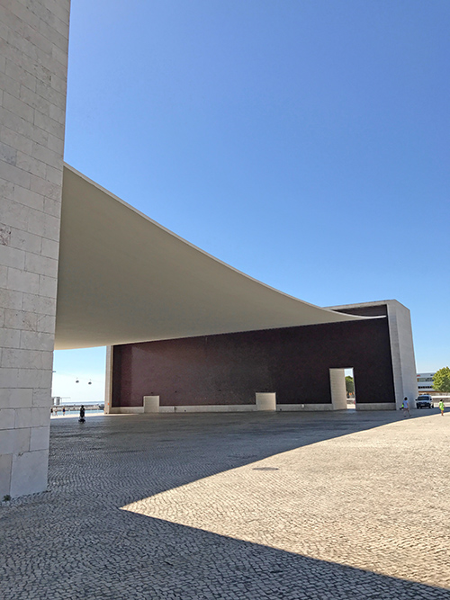
The Portuguese National Pavilion by Alvaro Siza in Lisbon, Portugal. This curved roof consists of steel cables with concrete poured in place around. By design, the weight of the concrete naturally caused the roof to curve. Image: Mark English Architects
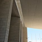
- Detail showing the steel cables supporting this curved concrete roof. Architect: Alvaro Siza. Image: Mark English Architects
- A closer look at the steel cables. Architect: Alvaro Siza. Image: Mark English Architects
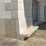
- Architect: Alvaro Siza. Image: Mark English Architects
Red Chimneys
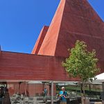
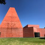
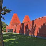
Eduardo Soto de Moura designed this history museum, the Casa das Histórias, Museu Paula Rego, located in Cascais, Portugal. The colored red concrete adds unbelievable drama, recalling a primitive desert rock formation contrasting with a shocking blue sky. The tapering tower mounds echo a common chimney shape found all over Portugal, a shape unique to Portugal – except for the squaring of the more usual rounded form.
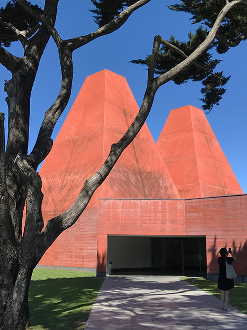
Museu Paula Rego in Cascais, Portugal. Architect: Eduardo Soto de Moura. Image: Mark English Architects
The detailing includes built-in mechanical systems and lighting, which recede into the background rather than calling attention to themselves. “The Paula Rego House is all about form,” says Mark. You have mech, but it’s a system that’s so integrated with the building that it’s invisible.” Not covered up… not hidden… not denied… more like a seamless, subliminal presence, not intruding into consciousness any more than we think about our own heartbeat most of the time.
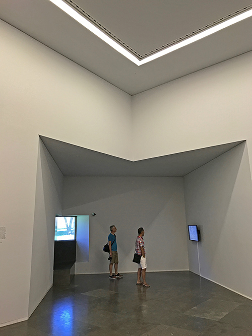
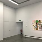
“Note the lack of recessed lighting. The lighting emits from a slot. There are maybe a few surface-mounted lights, not many. The incoming and return air are also simple slots.” In fact, an ordinary visitor probably wouldn’t notice the tiny gap between the ceiling and the walls, but that’s where the air comes in.
This approach contrasts with a contemporary approach that seeks to expose, express, and celebrate the mechanical aspects of a building. “Exposing the guts”, as if that were the main point of a building. One example of this is the Centre Georges Pompidou, also known as the Pompidou Center, opened in 1977.
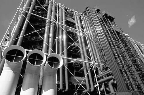
Upon first glance, the Centre Georges Pompidou seems to consist almost entirely of exposed mechanical systems. Design by Renzo Piano, Richard Rogers, Gianfranco Franchini, with engineering by Ove Arup.
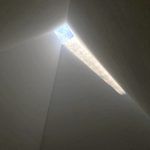
- The “chimneys” are really tall columns with skylights at the top, another dramatic feature, here seen from the interior. Image: Mark English Architects
- A slot near the baseboards is for return air. Image: Mark English Architects
- “Another thing about this building is really nice outdoor spaces. Monumentality is OK, as long as there’s also an understanding of what it means to build at human scale, too.” Image: Mark English Architects
- Bright sunlight makes the abstract forms of the building stand out. Image: Mark English Architects
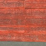
- Close-up of the textured red concrete walls. Image: Mark English Architects
- A shady side lawn provides refreshing coolness as a contrast to the building’s bold, stark abstraction. Image: Mark English Architects
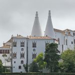
- Compare the twin towers on the Museu Paula Rego with the rounded twin chimneys on this older Portuguese building. Image: Mark English Architects
Senior Home as Abstract Sculpture
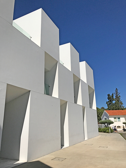
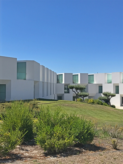
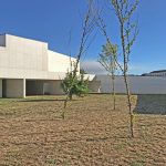
When Mark told me the building with white blocks was a home for seniors, I gaped at him. I’ve never seen a senior home in the U.S. that looked quite so sculptural. This one is a serene and simple in form consisting of offset white blocks. Located in the city of Alcácer do Sal, near Lisbon, it’s sometimes referred to in English as the House for Elderly People.
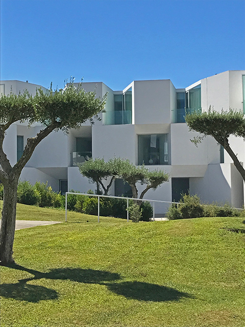
Senior home by Aires Mateus in Alcácer do Sal, Portugal. Architect: Aires Mateus. Image: Mark English Architects
“The people living there liked it. They said so. When they saw that we were interested in the building, they went and found a resident who spoke English. They WANTED us to know!” This pattern was to repeat itself several more times throughout the trip: the locals were eager to share their culture and went out of their way to welcome and inform interested visitors.
The architects, Aires Mateus, have a style that is both monumental and mysterious, imbued with a sense of calm power. Aires Mateus is a team of Portuguese architects: Manuel Aires Mateus and Francisco Aires Mateus. Their web site could win a prize for elegance, minimalism, and perhaps also for utter lack of information – other than a contact page, it has a single self-playing slideshow with images of sculptural models, no photos of actual built projects, and no descriptive text at all. Silence sometimes speaks volumes.
ABAB Building Rhythm
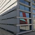
Our next building is a high-rise by Eduardo Soto de Moura, the Burgo office tower in Porto, Portugal. Why did Mark like it? “There’s an alternating proportion shown alternate building faces. On the shadier side, the windows are large and the exposed metallic beams are small. On the east and west faces, which are sunnier, the proportions are reversed. The windows are narrow slots, and the cladding is wider. It’s like an A-B rhythm in poetic verse, where alternating lines rhyme with one another, and then it repeats.”
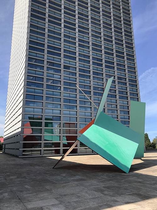
Burgo office tower in Porto, Portugal. On one face, the windows predominate, and on the other, the cladding takes over while the windows, still present, become narrowed. Architect: Eduardo Soto de Moura. Image: Mark English Architects
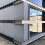
- The shape of the embedded beams is revealed at the corner. Image: Mark English Architects
- Image: Mark English Architects
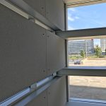
- Interior shot of the same corner, showing the alternating proportions of window and cladding on alternate building faces. Image: Mark English Architects
Concert Hall VIP Room
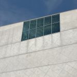
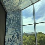
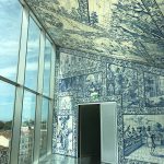
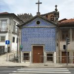
The Casa de Música concert hall by Rem Koolhaas and OMA architects is located in Porto, Portugal. Mark managed to sneak past security and have a look around the inside. Mainly he wanted to talk about the VIP room at the very top, which has some interesting local references to historical Portuguese architecture and materials. “The room is covered in traditional Portuguese blue and white ceramic tile, called azulejo. It’s interesting to see this in a Modern building. The tiles act to tie this building to its surroundings.”
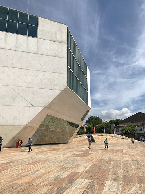
The Casa de Música concert hall by Rem Koolhaas and OMA architects, located in Porto, Portugal. Image: Mark English Architects
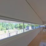
- The top window shows a glimpse of the VIP room within. Image: Mark English Architects
- The VIP room interior is covered in azulejo tile work. Image: Mark English Architects>
- The tile work shows historical scenes, which ties it to the older buildings outside. Image: Mark English Architects
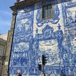
- A Portuguese building with traditional azulejo tile work. Image: Mark English Architects
- Another Portuguese building with traditional azulejo tile work. Image: Mark English Architects
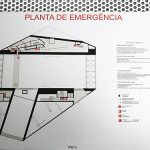
- The building plan for the Casa de Música in Porto Portugal. Image: Mark English Architects
Train Station
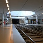
Eduardo Soto de Moura designed several train stations for the city of Porto. Mark was intrigued by the detailing on the pillars, which are actually light wells. “It takes something that looks structural and makes it sculptural instead.”
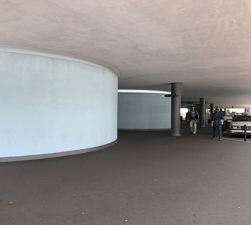
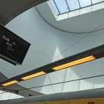
“They look like support pillars, but they’re actually light wells. The small gap at the top where they meet the ceiling is what gives it away.” Image: Mark English Architects
- Same “pillar” from the inside. Note the gap at the top where the walls meet the ceiling. Image: Mark English Architects
- Train station platform, showing the light wells in action. Image: Mark English Architects
Nadir Afonso Foundation by Siza
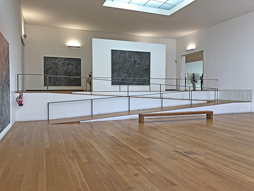
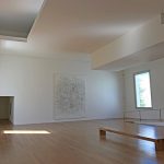
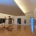
The details inside the Nadir Afonso Foundation museum building by Alvaro Siza typify his approach. This building is located in Chaves, Portugal. Mark’s observations: “Siza’s detailing is consistent. Once he works out a detail, he uses it again and again. No point in re-inventing the wheel for every new building, or for the sake of cleverness.”
“Portuguese Modernism emphasizes how you approach and enter space, how you move from room to room.” More soffits, no recessed lights, reflected light rather than lights shining directly on the paintings. “Lighting designers sometimes over-design things. They need 12 different lighting systems.”
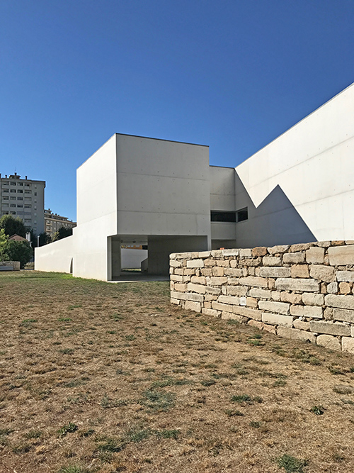
Nadir Afonso Foundation museum building by Alvaro Siza, in Chaves, Portugal. “They found out we were architects and we got taken around.” Image: Mark English Architects
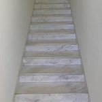
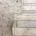
Even things like the application of stone veneer to stairs and walls is consistent. On the stair example, all the stairs except for the bottom one have top piece layered to show the thickness of the veneer looking outwards. The bottom-most stair has it reversed. This is not a detail that any ordinary person would notice, except perhaps to wonder why that one stair was different.
- Mechanical and lighting systems are tucked away behind soffits in the ceiling. Image: Mark English Architects
- All the stairs except for the bottom one have the long piece on the top. The bottom-most stair has it reversed. Image: Mark English Architects
- Close-up of stair detail. Note the difference between the bottom stair and the others going up. Image: Mark English Architects
- “There’s no direct lighting on the paintings, unlike most American museums.” Image: Mark English Architects
- Detail showing a marble baseboard joining to the wall. The baseboard’s thickness was allowed to show, through cutouts in the wall’s veneer. However, the marble wall veneer corner was beveled and plastered right to the edge. Image: Mark English Architects
- Some of the details are where things come together: walls, doorways, corners. “Some architects just leave it to the builder to figure it out.” Image: Mark English Architects
- Image: Mark English Architects
- Image: Mark English Architects
Tea House by Siza
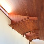
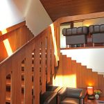
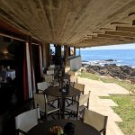
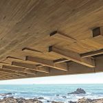
In city of Porto, Portugal, the Boa Nova Tea House was a house that was converted into a chef-sponsored restaurant. Inside, Mark was struck by the detailing on the wood ceiling, as well as by the eaves outside.
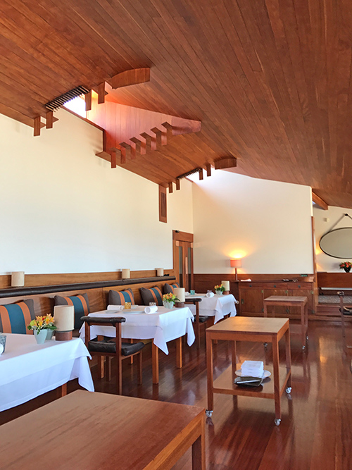
Wood ceiling, with interwoven boards and vent, at the Boa Nova Tea House. Image: Mark English Architects
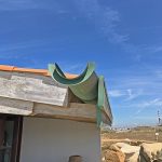
- The exterior has an oversized drain that assumes a sculptural aspect, while still serving its original purpose. Image: Mark English Architects
- Image: Mark English Architects
- Image: Mark English Architects
- The underside of the eaves also have woven wood beams creating a textural effect. Image: Mark English Architects
- Close-up of the eaves. Image: Mark English Architects
Monastery Turned Museum
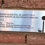
Alvaro Siza and Eduardo Soto de Moura collaborated on the repurposing of this former monastery into the Contemporary Sculpture Museum (MIEC) in Santo Tirso, Portugal. The mechanical systems and marble veneer details re-appear, in a slightly different form. The wood floor areas are slightly raised up, and it’s not apparent to a casual visitor what’s really happening underneath there.
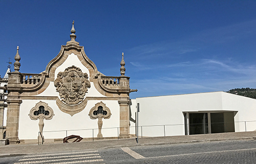
Contemporary Sculpture Museum (MIEC) in Santo Tirso, Portugal, renovated by Alvaro Siza and Eduardo Soto de Moura. The original building on the left also has a new addition, seen on the right. Image: Mark English Architects
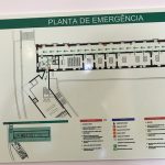
- Floor plan. Image: Mark English Architects
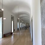
- “Siza couldn’t add soffits and hide the lights behind them, so instead he used a very simple device, hanging bare light bulbs.” Image: Mark English Architects
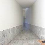
- This corridor connects the old and new sections of the building, with a slight bend to add to a sense of discovery. Image: Mark English Architects
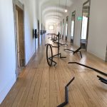
- “Because Siza couldn’t put the mech in the ceiling in a repurposed building, he put it under the floor instead.” Image: Mark English Architects
- Image: Mark English Architects
- Siza used the same detail with the marble veneer as he did on the Nadir Afonso building, making the lowest stair different from the others. Image: Mark English Architects
Fire Station
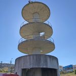
This fire station in Santo Tirso, Portugal, was designed by Alvaro Siza. Even a humble fire station is a source of pride to the crew. Here, as with the senior home, the locals went out of their way to find an English speaking firefighter to expound to the touring architects.
- The main focus was that aviation door: cool, but so heavy that they leave it open most of the time. Image: Mark English Architects
- Fire station training tower. Image: Mark English Architects
- Image: Mark English Architects
Abstract Church
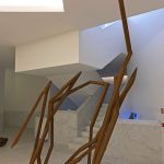
The Church of Santa Maria, by Alvaro Siza, is located in the city of Marco de Canavezes, Portugal. “In detailing, the important thing is how he gets it right, how he turns the corner. Siza traces lines all the way around. Baseboards stairs, guardrails… he thinks about how it will end.”

The Church of Santa Maria, by Alvaro Siza, in the city of Marco de Canavezes, Portugal. Image: Mark English Architects
“Some architects just let the builder figure it out. If you try to make everything expressive, but don’t tell the builder how you want it done, it can lead to ‘builder’s fatigue’ where the builder is forced to look at 500 conditions. They either give up, or they get it wrong. Siza restricts the number of detailed conditions by re-using the same methods. Builders can visit his other built works and get a sense of the essence.”
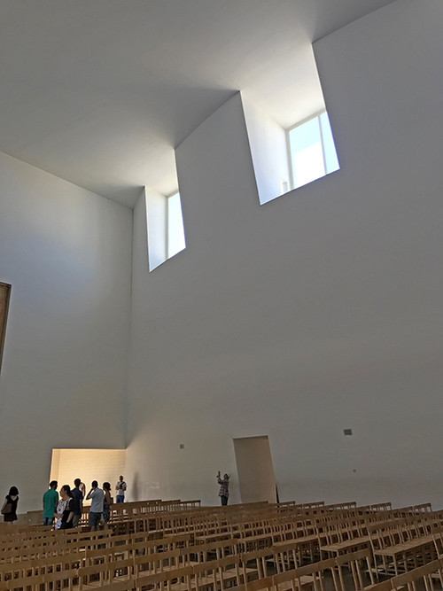
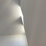
“The light inside fosters reverie, a wandering of the mind, because it’s so abstract.” Image: Mark English Architects
This was the same goal described in an earlier article on 3D hand drawing as both problem-solving, and as a communication tool between architect, client, and builder. “Don’t just focus on cross sections.”
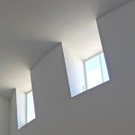
- Windows without jambs wash the ceiling with light. Image: Mark English Architects
- Image: Mark English Architects
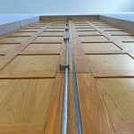
- The door hardware was custom designed by Siza. Image: Mark English Architects
- Another type of attention to detail is that the church doors are easy to operate despite their height. Image: Mark English Architects
- The baptism area uses plain white tile, with a drawing by Siza. Image: Mark English Architects
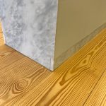
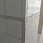
- This corner detail shows Alvaro Siza’s signature detailing, with the marble’s thickness revealed. Image: Mark English Architects
Links
- Alvaro Siza, Wikipedia entry
- Eduardo Soto de Moura, Wikipedia entry
- Interesting biography of de Moura, with some nice insights into his personality, philosophy, and influences. References the train station.
- Catenary curve and arch, Wikipedia entry
- Feature article describing the senior home by Aires Mateus
- Aires Mateus web site, mainly their contact page. The home page shows models of some of their projects as interesting sculptural pieces, but doesn’t actually show any built works.
- A more informative image portfolio for Aires Mateus.
- Centre Georges Pompidou Wikipedia entry
- ABAB rhyme scheme in poetry, Wikipedia entry
- OMA architects web site
- Rem Koolhaas Wikipedia entry
- Casa de Música by Rem Koolhaas, Wikipedia entry
- Azulejo Portuguese blue and white tile, Wikipedia entry
- Feature article describing Nadir Afonso Foundation museum building by Alvaro Siza
- Feature article on the Siza and de Mouro collaboration: repurposed monastery to contemporary sculpture museum (MIEC)
- The Architects’ Take article on 3D hand drawing as a tool for collaboration, problem-solving, and detailing
- The Architects’ Take article on hand drawing for problem-solving in the field
- Feature article on the Boa Nova Tea House renovation by Alvaro Siza<https://www.dezeen.com/2014/07/21/boa-nova-tea-house-renovation-porto-alvaro-siza/>
- Photo feature of the Boa Nova Tea house, a nice photo gallery with plans
- Feature article on the Boa Nova Tea House from Archdaily
- Feature article on the Burgo office tower by Eduardo Soto de Moura

