Carlo Scarpa: A Tactile Experience
by Rebecca Firestone with Mark English AIA | Editorials
A visit to a former Olivetti showroom in Venice, now a museum, yields new insights into Scarpa’s unique genius.
Image: Mark English Architects
“Scarpa knows how to focus on detailing… both large and small scale. He thinks of the user’s tactile experience.” Mark English had visited one of Scarpa’s buildings, the former Olivetti showroom, returning with another pile of photos and observations.
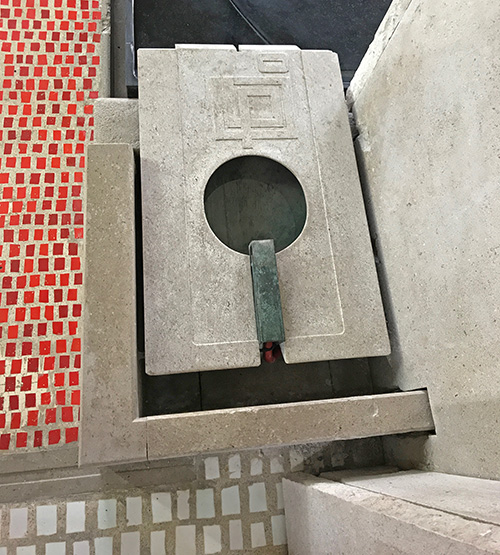
Architect Carlo Scarpa designed the Olivetti showroom in Venice, Italy in the late 1950s. A juxtaposition of carefully selected materials and textures, thoughtfully composed, creates an overall experience. Image: Mark English Architects
Founded in 1908, Olivetti manufactured both typewriters and calculators, and was renowned as a world leader in industrial design. Olivetti even made one of the first programmable desktop computers back in 1964. Remarkably enough, the company’s still around – now making smart phones, tablets, and modern-day business products.
Showroom Relics

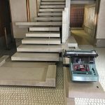
Even though these mechanical calculators (Olivetti Summa Prima 20) are obviously antiques now, Olivetti still makes leading-edge business machines today. Image: Mark English Architects
This building was commissioned by Olivetti in the 1950s as a showroom and used for many years. Later, it changed hands and then was refurbished and restored. In a way, Carlo Scarpa’s attention to design and detailing dovetailed with a similar appreciation expressed by Olivetti. There’s a sense of permanence to the materials and the execution that is often sadly missing from contemporary corporate structures.
Scarpa’s attention to tactile details may also be an important commonality with Olivetti’s ergonomic approach to machine design – something that has come full circle with modern mobile devices and their emphasis on intuitive user experience, and personalized touches.
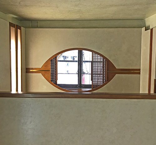
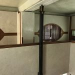
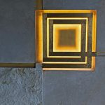
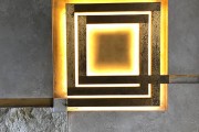
One of many sculptural elements in Scarpa’s Olivetti showroom is this lozenge-shaped opening with handmade wooden screens. Image: Mark English Architects
Did Scarpa have any influence on your work? I asked Mark English. “Yes, definitely. Los Gatos and also Green Street, (aka Cow Hollow), both of which involved working with buildings of a different era. Working with history, rather than obliterating it.” Marks’ Los Gatos project was a restoration and addition to a Mid-Century Modern, and Cow Hollow residence was originally from 1917.
Sculptural and Compositional Qualities
“Scarpa’s other works often involved repurposing ancient or medieval structures that are almost primal… primitive. This is a quality often shared by Modern designs as well. Scarpa would take a 15th century stone castle and put light metal bands across it, and suddenly it’s a sculpture.”
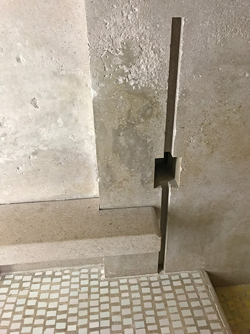
The cast concrete wall includes elements like this slit that serve both a functional and a sculptural need. Also note the joinery and the textures: 2 colors of floor tile with grout, limestone, concrete. Image: Mark English Architects
Sculptural qualities and composition abound. The place feels shaped rather than manufactured. It did not come off of a computer. Not randomness exactly, but not thoughtlessly or mindlessly regular. There are subtle and intentional irregularities: openings round and square, pieces joined together with a zigzag, straight lines that pause and then continue.
Syncopation seems to be a feature of the composition. Openings are offset, rhythmic; they don’t line up all the time. But it’s not careless, or chaotic. It’s not “clever”. Various openings between floors and spaces allow more materials to juxtapose within viewer’s gaze.
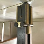
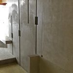
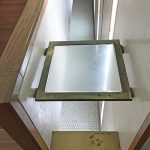
- This steel post on the second floor is actually a cable suspension system. Image: Mark English Architects
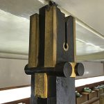
- Vaguely anthropomorphic, this cable suspension element resembles a guardian spirit. Image: Mark English Architects
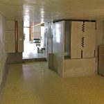
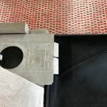
- On the ground floor towards the rear of the building, yellow floor tile makes an appearance, along with a staggered or zipper-like sculptural element in the cast concrete wall. Image: Mark English Architects
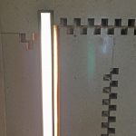
- Close-up of a different portion of the “wall zipper” motif. Image: Mark English Architects
- First floor, rear. A similar wall slit appears on the second floor. Here, that motif is repeated, at irregular intervals, to create visual interest. Image: Mark English Architects
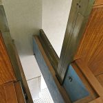
- The top of this wall on the second floor appears carved and shaped. Image: Mark English Architects
Materials and Textures
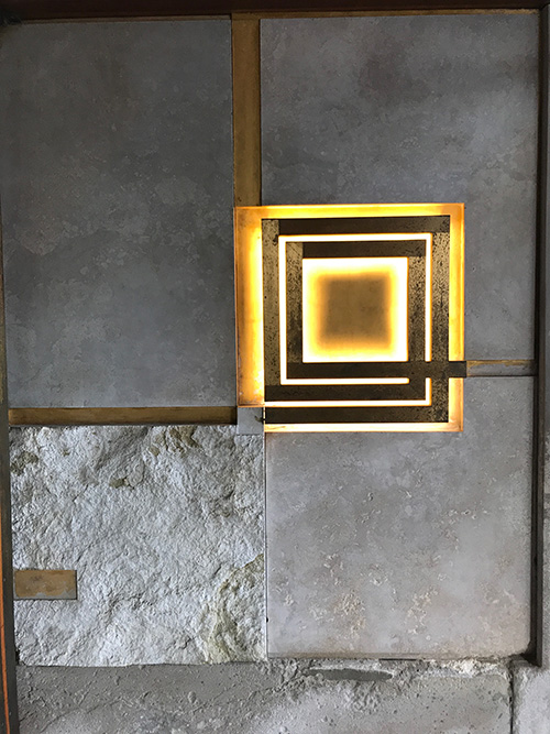
Materials and textures have a hand-finished quality: plaster, wood, tile, stone, concrete. In some cases rough and smooth textures of the same material are carefully juxtaposed. Different types of materials joined together. Also the thickness of the stone veneer is alternated on corners (similar to the Portuguese Modernists we featured a few months back)
Limestone an plaster are more tactile than, say, marble and glass. Plaster sheen subtle, not drywall. Small irregularities.

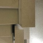
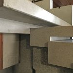
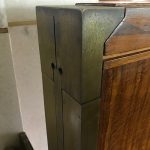
Scarpa juxtaposes rough and smooth textures in the same limestone, and alternates the veneer on a single turned corner. A brass element joins and separates the two. Image: Mark English Architects
- The hand-plastered walls have a texture and sheen that drywall could never begin to duplicate. Image: Mark English Architects
- The floor tile, intentionally showing the grout for texture, juxtaposes with a limestone wall by the stair. Scarpa has carefully rounded the edges of this rail where people are most likely to bump into it, to make it more user-friendly. Image: Mark English Architects
- Beveled translucent glass in brass adds interest to an opening that might otherwise have felt a bit empty. The translucency adds softness. Image: Mark English Architects
- Another opening to the tiled floor below, with accents of soft blue. Image: Mark English Architects
- The exterior door has rough and smooth, and a glass-brass composition. Image: Mark English Architects
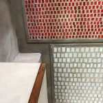
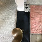
- Red and white floor tile meets a plaster and wood wall. The tiles are set with an intentionally grout-y look that makes it stand out at a distance. Note how Scarpa has raised the beds of tile slightly and given them each an edge. Image: Mark English Architects
The Stair
What’s a work of architecture without a stair? This stair had some sculptural elements in common with our Portuguese Modern walking tour. The careful detailing, attention to treads and landings, and keeping it interesting.
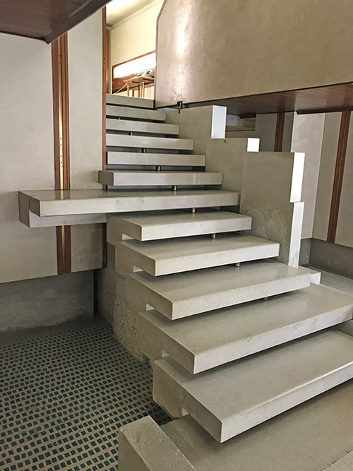
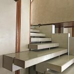
The stair treads are arranged to build up to the narrower channel at the top. One tread is intentionally longer than the rest. Some stairs are un-bounded on one or both sides. Image: Mark English Architects
- Central stair as seen from the front. Image: Mark English Architects
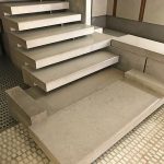
- Central stair from an angle. Note the darker floor tile beneath the stair. Image: Mark English Architects
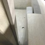
- Central stair seen from above. Image: Mark English Architects
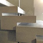
- Stair treads from the side. Note the rounding of the front of each tread, again to soften them and make them more user-friendly. Image: Mark English Architects
- Juxtaposing concrete, limestone, plaster, wood. Note how components are fitted together. Image: Mark English Architects
- Stairs and the stair walls are notched. Brass separators between stair treads echo brass accents used elsewhere. Image: Mark English Architects
Color Palette
Scarpa’s palette is disciplined but not monotonous: mostly natural cream or earth colors, nothing starkly white or black, together with brass, wood, hand-plastered walls, with a few red, yellow, and blue accents scattered throughout the building.
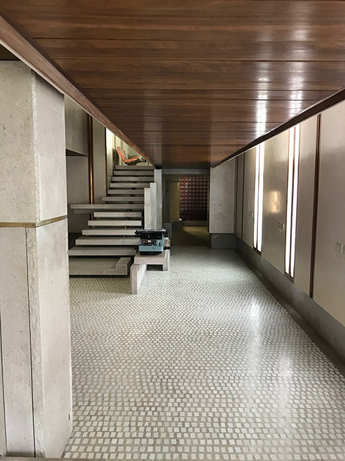
First floor corridor at entry. The floor tiles create visual perspective, with a destination point at the wood screen in the back. Windows are flush with the ceiling to wash the ceiling with light. Image: Mark English Architects
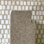
- A concrete water basin at the foot of the stair has a raised pattern. Image: Mark English Architects
- An abstract sculpture faces the water basin. Image: Mark English Architects
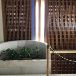
- The textured wood screen frames a small planting alcove. Image: Mark English Architects
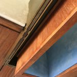
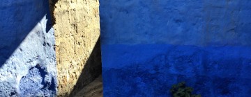
- This opening extends to the second floor. The interior is painted blue, one of the only uses of this color within this building. Image: Mark English Architects
- Brass and wood interwoven on the second floor. The double holes in the bras echo the anthropomorphized “guardian post” cable suspension shown earlier in this article. Image: Mark English Architects
Visual Destinations
Various openings and corridors have visual destinations at the end to entice the visitor forward.
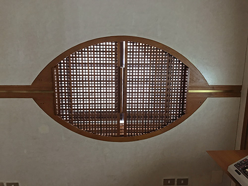
Another textured wooden screen, this one behind an eye-shaped opening. Image: Mark English Architects
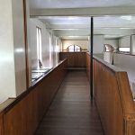
- Upper floor corridor with wood and plaster. Image: Mark English Architects
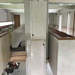
- View into atrium from upper balcony. Polished limestone, plaster, wood, brass, and tile all juxtapose seamlessly. Image: Mark English Architects
Light and Mystery
This museum differed from modern showrooms in one other way. The lighting wasn’t over-designed. Modern tech showrooms are flooded with light from all directions, with pinpoint spotlights on every piece of merchandise. Scarpa’s Olivetti showroom seemed to utilize a lot of natural light, and was not over-lit. This, combined with thoughtful and natural handmade materials, conveyed a sense of quiet drama, mystery, and timelessness.
Links
- Carlo Scarpa, Architect
- Scarpa’s Castelvecchio museum, an example of his restoration approach
- Olivetti, company history
- Olivetti company today
- The Programma personal computer from Olivetti
- The Olivetti Summa Prima 20 adding machine in the photo
- Olivetti Historical Archives, including shop (in Italian)
- Olivetti showroom in Venice
- Mark English, Los Gatos project, a remodel of a Mid-Century Modern house
- Mark English, Green Street project, a remodel of a San Francisco home originally built in 1917
- Portuguese Modern Walking Tour by Mark English


