Casa Gilardi by Luis Barragán
by Rebecca Firestone with Mark English AIA | Editorials
“Color isn’t just a surface decoration for Barragán. It’s not an afterthought. It’s foundational to his architecture. His spaces can’t stand alone without the color.” Image courtesy Mark English Architects
“I never understood how completely dependent his work is on color.” Mark English was talking about architect Luis Barragán, after visiting Casa Gilardi, a private residence in Mexico City designed by Barragán towards the end of his life. This house, with a footprint of 10×36 meters, had two design requirements from the client: to keep the flowering jacaranda tree in the courtyard, and an indoor pool. We’ll see both of these in just a moment.
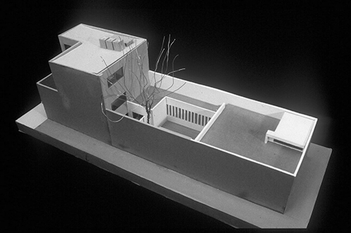
The house is 3 stories tall in the front, with a modest exterior. Front side is on the left in the photo. The rear opens into a courtyard, with dining and pool areas behind. (From https://www.pinterest.com/pin/523402787927649182/)
A Mexican Lifestyle
This house reflects a very different sensibility from that found in American and European contemporary designs. For one thing, the floor plan reflects a more typically Mexican lifestyle that assumes a live-in domestic helper. American homes don’t have maid’s rooms unless they’re over 50 years old.
Second, Casa Gilardi is focused on privacy rather than permeability – far more common in Mexican dwellings, as well as many homes in the Middle East. Modern homes and apartment condominiums in the U.S. celebrate the “glass box” lifestyle, with open floor plans that erase all boundaries, blending cooking and dining areas, and minimizing auditory privacy.
In Casa Gilardi, window openings are modest, and don’t allow passersby to see into the home. The maid’s quarters is kept separate from the rest of the house, and the kitchen is by the maid’s quarters up front instead of back by the dining area.

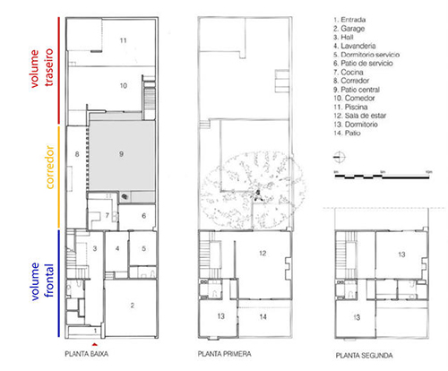
Casa Gilardi floor plan. (from Rafael Kenzo Ishimoto https://www.projecjunior.com.br/single-post/2017/02/01/A-cor-e-a-Casa-Gilardi-de-Luis-Barrag%C3%A1n)
Street Facade
Mark English recalled his first encounter with the building itself. “We arrived at the house, located in a modest, typical Latin American neighborhood characterized by two- and three-story anonymous facades. The only hint that something unusual might be found within this house was its brilliantly colored front. We were greeted at the door by Mrs. Luque, wife of one of the original clients, Martin Luque.”
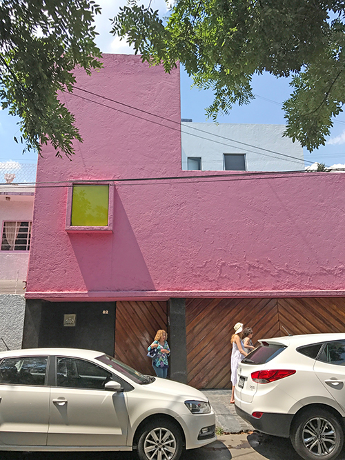
The front facade of Casa Gilardi, designed by architect Luis Barragán is a teaser for the mysteries within. Image: Mark English Architects
“Barragán originally designed the house for a couple of bachelor friends, Martin Luque and Pancho Gilardi, co-owners of an advertising agency. It was a party house! It’s now the Luque family home, and is definitely and obviously lived in to this day. The house is not so intellectual – it’s more about feeling.”
Flow and Privacy
There are several sample floor plans online, although none correspond exactly to how the house appears now. “It’s zoned for different levels of privacy,” explained Mark English. “After the entry and the service areas, one traverses a corridor leading to first-floor areas for dining entertaining.” Ascending the stairs brings us to a deeper level of privacy, to which perhaps not all guests are invited.
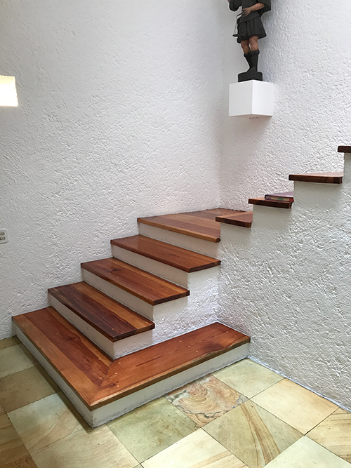
At the front entry, stairs plus a maid’s quarters. “Barragán was clever in this house. The entry is very low-key, white walls with natural materials. It’s not grandiose, instead serving as a transition from the noisy and chaotic street to the sheltered serenity of the home.” Image: Mark English Architects
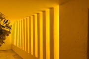
The flow is restricted in several ways – intentionally. There’s no access to the first-floor courtyard from any of the front areas, not even a window. The only access is from the dining area in the rear. This forces people to traverse through a passage, a golden-yellow light-filled corridor, in order to enter the first-floor courtyard area. The maid’s room has a window and access to a separate “patio del servicio”. There appears to be a wall separating it from the main courtyard. So there is visual privacy but not auditory privacy.
The second story extends the courtyards with open, smaller courtyards.

On the second story, a smaller series of courtyards extend the experience of protected outdoor space. Image: Mark English Architects
Color is King
“Color isn’t just a surface decoration for Barragan. It’s not an afterthought. It’s foundational to his architecture. His spaces can’t stand alone without the color – if they were all white, they’d be dead. The color is as important as the volumes.” I never thought I’d hear Mark English say something like this… he’s a passionate Modernist, drawing his “warm and Modern” inspiration from Mid-Century Modernist sensibilities. In his own spaces, he often employs the “whitespace” look, if we can judge from his office and his Napa house.
After I got up off my fainting couch, I recalled colorist Jill Pilaroscia’s parting advice to architects in our interview a few years back, where she said, “Don’t be afraid of color. Give color a chance!”
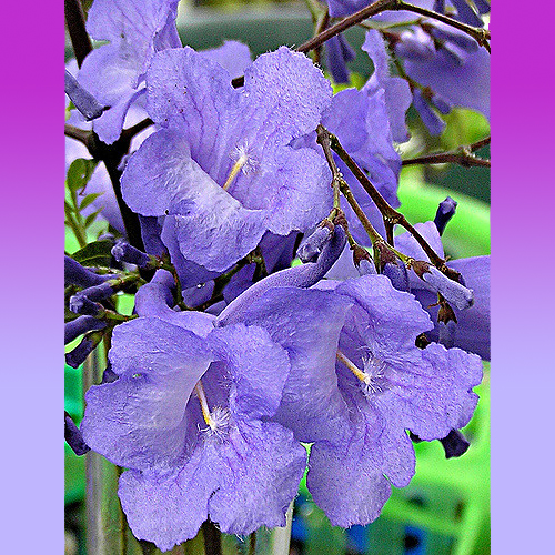
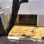
A jacaranda tree, with its lavender-purple flowers, formed the basis for the courtyard at Casa Gilardi in Mexico City.
A Wikipedia article notes Barragán’s early affinity for le Corbusier’s notions that houses are “machines for living”, and his subsequent transition to “emotional architecture”. Colors have a deep impact on emotions and perceptions, and instead of erasing these to focus on pure form, the architect has employed them as primary building blocks to create a sensory experience.
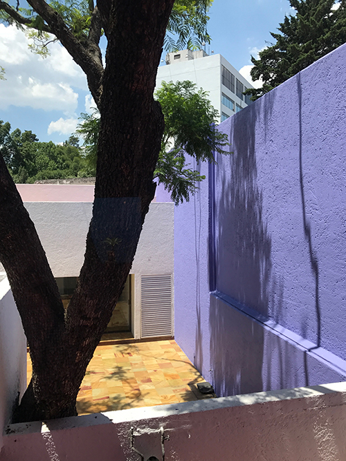
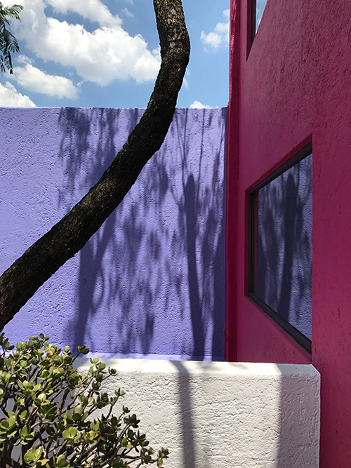
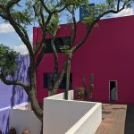
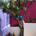
The violet-colored exterior walls in the courtyard at Casa Gilardi by architect Luis Barragán echo and complement the purple jacaranda flowers. Image: Mark English Architects
The Trade-Offs of Relying on Color
I asked Mark if he planned on changing his own design style as a result of experiencing a color-centric environment. “Time will tell,” he replied, somewhat enigmatically. “Part of me worries about what happens to a place that is so color-dependent. What if someone paints it white? It would lose all of its appeal and just be dead space. For example, consider a home featuring a curved wall as its central design element. One could paint that wall any color you wanted without marring the original design concept, because the color is not so married to the form.”
Corridor Transition to Dining and Pool
After entering, a corridor transitions from the front area to the dining and pool areas. It is only from the dining room that one can even access the courtyard directly.
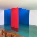
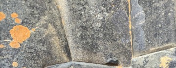
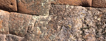
Barragán creates a sense of abstraction through the use of simple colors and shapes. The interior uses primary colors: blue, red, and yellow, while the walls of the courtyards are complex secondary or tertiary colors: vivid lavender, a sky-blue hue, deep rose, golden ochre, and olive green accents. In some places, the openings seem reminiscent of the sculpturally abstract feel of Incan architecture.
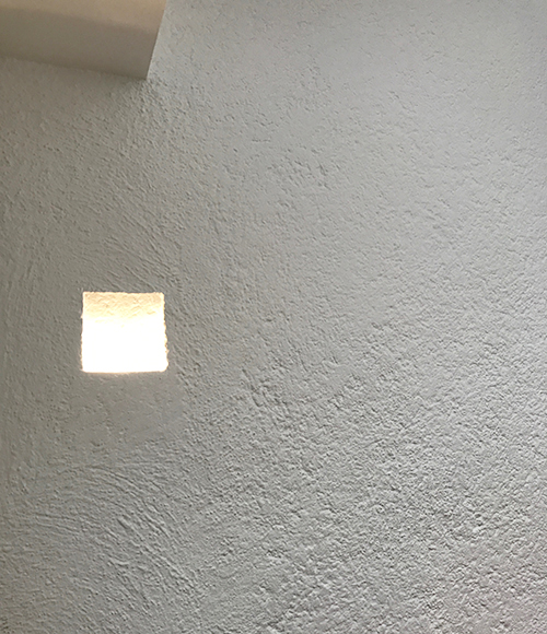
Luis Barragán uses abstract forms in his design to create a sense of otherworldly serenity. This opening is in the front entry area is actually a wall sconce with a concealed light fixture behind. Image: Mark English Architects

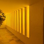
- The corridor is washed in golden yellow light from painted windows. “There’s no header to limit the windows from meeting the ceiling directly. It’s abstract… the light just washes over the ceiling.” Image: Mark English Architects.
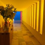
- Barragán painted the windows to create the golden light wash for the corridor. “Why did he do this? To me, it was like a journey through a portal… a sunset.” Image: Mark English Architects.
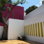
- The yellow corridor viewed from the courtyard outside. Image: Mark English Architects
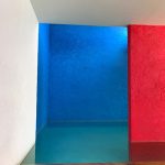
- At the end of the yellow corridor, a blue square beckons. Image: Mark English Architects.
- The blue square opens up to the pool. Image: Mark English Architects.
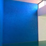
- A gentle light wash from an upper clerestory window directly over the pool. Image: Mark English Architects.
- Dining area. “The acoustics aren’t super live,” said Mark. Image: Mark English Architects.
Second Story
The second-story area includes a living room, bedrooms, and exterior courtyards and walkways.

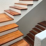
- Ascending stair. Image: Mark English Architects
- So how do you get up here again? Through a small and modest door from the second-story living room. Image: Mark English Architects
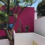
- Courtyard again. Image: Mark English Architects
- Yellow corridor windows seen to the right. Image: Mark English Architects
- View of the first floor courtyard and jacaranda tree, as seen from above. Image: Mark English Architects
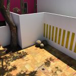
- Courtyard, as viewed from second story, over the maid’s patio in front. In the rear, sliding glass doors open into the dining area and pool behind. The stone paving is known as “piedra hermosa” or beautiful stone. Image: Mark English Architects
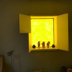
- Front room. The window faces onto the street, also painted yellow like the corridor below. The window has sectioned shutters that open independently. Image: Mark English Architects
- The artwork, much of it by prominent Mexican artists, creates a sense of home. Image: Mark English Architects
- Furniture designed by the architect. Image: Mark English Architects
- Main living room. The art was selected by the original owners. “The actual living spaces are not heroic. They’re comfortable. The house is actually zoned this way, for easy living.” Image: Mark English Architects
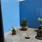
- Sky-blue walls in the front courtyard of the second story reflects the sky above. Image: Mark English Architects
This leaves me to wonder what impact this experience might have on Mark English’s future designs.
Additional Links
Floor plans, a good link on Wikiarquitectura.com
Remarks and tour, critique, on Architizer

