
Jill Pilaroscia: Give Color a Chance
by Rebecca Firestone with Mark English AIA | Interviews
“Color isn’t just about surface decoration. There’s a cellular response to color that we have as human beings, and it’s that response which we are addressing when we work with color. Sometimes colorizing a space costs more to do and to maintain. But our environment shapes behavior. It’s WORTH spending time on.
Few architectural institutions offer a formal program addressing color in the built environment. Any exposure they have to color theory is frequently through studio courses that focus solely on two-dimensional color applications. Architects aren’t taught about bio-responses to color. They’re not taught how they can move volumes around in space through the application of color, or how they can use color to shape experience and behavior. I’d like to tell them not to be afraid of color. Give color a chance!”
– Jill Pilaroscia
Jill Pilaroscia and I met in her airy and light-filled studio in downtown San Francsico to explore the science of color. Some of the questions below are based on previously published interviews and Pilaroscia’s own writings, which you can find on her Colour Studio web site.
Why Color?
On your site, you’ve got a quote from Denis Baylor, Professor of Neurobiology at Stanford University, saying that colors are inventions of the nervous system.
In the experience of vision, there are three components: the visual stimulus itself, the receptors in our eyes, and then the interpretation which occurs in our brains. You see an image. The light from this image enters your eye through the pupil, focused by the lens – not unlike a pinhole camera – and falls on your retina, which acts like a big screen on the back of your eye, carpeted with special receptor cells called rods and cones. The rods and cones transmit information to your brain via the optic nerve. In the brain, this information is processed first through your thalamus gland, which is connected to all of your hormonal systems. First-response reactions like flinching from a perceived flying object, happen here, as do panic reactions for people who’ve been conditioned by experience to react to certain visual triggers. Only then is the information channeled to your visual cortex, the most massive system in the brain, which interprets the image to categorize the visual stimulus.
Color isn’t just about surface decoration. There’s a cellular and biological response to color that we have as human beings, and it’s that response which we are addressing when we work with color.
Background and Biographical
How did your family background help to lead or inspire you towards your current field?
I grew up in Rochester, NY. My mom was an artist. She sketched and always had a portfolio. She was a registered nurse by profession, and always wished that she could have pursued a career as a full-time artist. My dad worked in insurance sales and real estate, but he was also a gardener and a stonemason. We had an acre by the side of hour house which he planted with row upon row of dahlias and gladiolas, for both the neighbors and for us. I remember being small and wandering through the gladiolas that were taller than I was.
On family excursions we went to places like Highland Park in Monroe County, near Rochester, NY during their annual lilac festival. This is the only 10-day free festival of its kind in North America, inspired by a magnificent lilac collection at the Park that plays host to over 500 varieties of lilacs on more than 1,200 bushes. What was first planted in 1892 by horticulturist John Dunbar has now become the world’s largest lilac collection. Other places I remember include stone quarries in Vermont, and historic venues like Williamsburg, Virginia – I will always remember the colors there.
Tell me about your early music and fine-art interests. What happened in that radical shift from music to fine art?
I started singing in the first grade and continued all through high school, training as a coloratura soprano. I was steeped in music! But I was always interested in looking at colors and color combinations.
I want to know more about how color is like music.
Some colors look pleasant together, as if harmonically tuned. Others look harsh and dissonant.
Here is a formal definition of color harmony as per Wilheim Ostwald: “Colors harmonize if they have equal hue content – one does not overtake another.”
Yes, but how far can we take that musical analogy? Are there equivalents in the color world of a major fifth or an octave in music?
Color is a phenomenon of light, which is about vibration (oscillation), and musical sound is also vibratory in nature. We perceive both light and sound based on its frequency, which is a characteristic of wavelength. Maybe the octaves would be different shades or tints of the same color. Sharps and flats, which are subtler variations in pitch, might correspond to different colors that are very close together on the color wheel. One of our clients, IDEO, once asked me for an “atonal cacophonous solution” – what they meant was a color solution that was unusual, edgy.
What about the visual equivalent of tonal quality or timbre? A pure tone actually sounds less interesting than one that’s a mixture of tonics and overtones. (draws simple and complex sine waves)
[RF: If you’ve ever heard someone play a musical saw, it sounds sweet but synthetic because the tone it produces is almost too pure. It doesn’t have the tonal depth that an oboe would have. That’s because oboes have more overtones. I was looking for the equivalent of overtones in light as opposed to sound.]
[RF: The lighting designers talk about continuous spectrums, color temperature, and color rendering, but they’re talking of course about light sources, and it’s always some variant of white light, rarely colored. I wonder if different pigments or materials might yield colors that LOOK approximately the same, they’re both cornflower-blue for example, but one is much richer than the other because the surface itself reflects ordinary white light in a greater spectral diversity.]
Not all light sources render the same color. There are “warm” fluorescents and “cool” fluorescents, halogens – all of these light sources have different color rendering capabilities. Some are brighter and whiter, some render cool colors more clearly, while others enhance warm colors. You need to understand the lighting that will be in each space, but you also need to understand the color relationships among the room elements as well as the light sources in order to get things to work well together.
Smooth surfaces bounce light differently than rough surfaces. The light reflectance of a surface is the amount of light bounced back at the viewer. The light that bounces back is what the viewer sees. Light that is absorbed by the object is not seen by the viewer. So an object that absorbs all light except for visible red wavelengths will appear red to the viewer. The amount of light reflected or absorbed by a surface will influence the viewer’s perception of the color of that surface. A hard, shiny surface reflects more light than a soft, textured surface, which in turn changes its perceived color. Thus, a matte surface creates a softer impression.
Tell me about singing rooms and harmonic edges.
A room that’s good to be in is well-tuned. You can go in and subliminally feel that it’s well put together, that it’s balanced. You go in and you just feel good. Sometimes in order to tune a room I have to consider how it feels to be in there – is it too harsh, too bright, too dark in spots? Color can mitigate a lot of these issues.
Can you cure a “sick” or “poorly tuned” room with color alone, even if the design flaws aren’t color-related?
You can do a lot with color, because you can trick the brain into perceiving a space as less noisy or even less odoriferous, just by changing the colors that are in there. [See under Human Response, below]
Opinions on Use of Color
Who are some of your favorite artists & designers?
Henri Matisse had a masterful sense of tertiary color. He could make the viewer see all of the image at once, or direct the viewer’s eye to just where he wanted it by using color and contrast.
Gerhard Richter, Sol LeWitt, Frank Stella, James Turrell, Steven Holl. And if that’s not enough, try Verner Panton, Sauerbruch Hutton Architects, Billy Baldwin, and David Hicks.
Dorothy Draper and Diana Vreeland. They all had self confidence with color and how it’s applied.
[Editor note: We reference images by other artists in grayscale to distinguish them from the color images of the primary interview subject’s own work. However, much of these artists’ work, having to do with color, can’t be fully communicated in grayscale. We encourage our readers to do a Google Image search on these names, because their color sense is quite dramatic!]
Can you cite examples of color throughout history?
The Pompeiians had an organic yet rich palette of earth tones and mineral-based reds. Medieval churches used blues on vaulted ceilings, because saturated blues tend to move away from the viewer’s focal point, making the ceilings appear higher and grander. Blue is the most atmospheric color. It blurs all edges. It’s one of the nicest colors in architecture for creating a diaphanous sense of space – but terrible for graphics, because our eyes can’t distinguish the edges unless the blue is dark and contrasted against a light background.
Up until a certain point in history, color was used symbolically, as a communication tool. Blue was used to indicate sky, while purple, which was an expensive pigment, was used for rich clothing and vestments to denote status. If you look at Egyptian art, or cave paintings, or Medieval art, color is used to indicate rank, function, or morals. The Madonna always wears a blue outer robe, for example – sometimes with white beneath, sometimes red, or sometimes both. People didn’t think of color as being decorative in an individualistic or fashion sense. Later on, color had to move from being symbolic to being more personal, more ornamental, more subjective.
When exactly did this shift occur? Here’s a quote from Janice Lindsay’s book “All About Colour“: “By 1856, chemists and not nature had become the color makers.” At a certain point, the available range of pigments became much wider and more affordable. Two other interesting books are Rene Huyghe’s “Color Symbolism” and Faber Birren’s “Symbolism of Color.”
I’m always asking people for examples of bad design, because cautionary tales are just as revealing as success stories.
Instead of just declaring that something works or it doesn’t, there can be different levels of “working”. For example the famous Golden Arches [McDonald’s] decor is intentionally chosen so that fast-food customers will want to leave quickly. That’s not pleasing to me personally, but it serves its purpose.
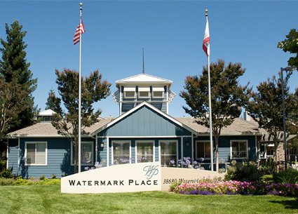
Jill Pilaroscia chose the blue of the front office for this existing rental property to support a water-inspired theme, and also to help create a sense of calm and security.
I don’t like color just for color’s sake. By that I mean color used purely to shock, or to call attention to a thing. It has no integrity. However, there are some Dutch architects and colorists, like Sauerbruch Hutton Architects, who DO use color for color’s sake, but it’s part of their culture. They EXPECT more color.
Europeans are more open, culturally, to color – especially in the more extreme climates where they they really need more color. In Italy, which is much farther south than the Netherlands, they want architecture that is chromatically tuned to the soil and vegetation, rather than seeking color as an attention-grabber.
What are some common mistakes of architects with regard to color?
These are not mistakes so much as a misunderstanding between color and architects, and it’s due to the way architects are educated. They’re not taught about bio-responses to color, they’re not taught how they can move volumes around in space through the application of color, or how they can use color to shape experience and behavior.
Architects value materials and the honest colors found in those materials – for example woods, stones, even concrete has a natural beauty that I do not deny. Architects value light, and the way the light brings materials to life. However, now we have environmental concerns about endangered resources. With more people sourcing materials from locations within a restricted mile radius, and of course budget constraints, color offers a wonderful opportunity to play a role in architectural design.
Architects are not always taught to see color as a tool that has its own integrity. Sometimes architects look at color as a last resort, and may wait until the last moment to throw color at a problem, instead of integrating the color into the design to enhance spatial relationships or the experience of a space.
Le Corbusier was really into color for a period of his career, but then he became anti-color, and that’s what the Modernists picked up. But I don’t fault them for not respecting color, because color has been misrepresented. David Batchelor’s book “Chromophobia” is a cultural history of color that talks about this fear of color. Since Aristotle’s time, color has faced discrimination – some technical, some moral, some social, some sexual, some racial. Immanuel Kant said that color could never participate in the beautiful or the sublime.
I would like to add one thing here, to say that developers are more open to color because they look at architecture as an investment. Anything that can be done to the investment to enhance its appeal, its presence, and its sale potential is viewed as a positive.
Do you have any pet peeves related to color issues within the building, design, or real estate industries?
One of the worst things to do is apply fashion colors to fixed objects. Here in town, I probably shouldn’t dish too much on the projects! But imagine a huge high-rise painted sugar-pink. I can also think of one new condo complex South of Market, which used gold and red, only it came out as mustard and ketchup. Not very sophisticated.
[RF: I think it’s because most of us are more used to choosing colors for smaller items, like clothing or jewelry, rather than entire walls or buildings.]
Large expanses should be classic. Use color to enhance and support the architecture.
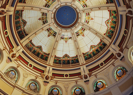
Jill Pilaroscia used twenty colors of graduated intensity to color the historic dome at the San Mateo County Courthouse. Photo: Dennis Anderson
How can you tell when are neutrals a courageous choice rather than the coward’s way out?
Every neutral color has its chief feature. Beige is not just beige. You can have a beige with pink or yellow overtones, or greys with different characteristics. If you don’t know this and start combining neutrals, you can have unintended effects like a couch that suddenly looks purplish when placed in a beige room.
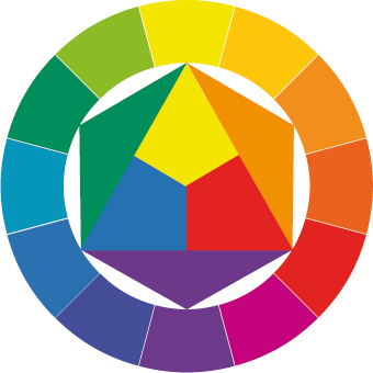
Our eyes produce an afterimage if we stare at something long enough. Simultaneous afterimage was something that Bauhaus artist Johannes Itten discussed at length. What this means is that the underlying color in a neutral tone can be brought to life by adding its complementary or opposite color to the visual field. That is how a beige couch sitting in a beige room can suddenly become a purplish-beige couch against a yellow-beige wall.
White is difficult, too. Every object inside a white space is starkly outlined, giving things a sculptural quality. The bright glaring white creates a tonic edge. You need to be very careful when choosing whites, because if the pigment is at all dull, it can collect shadows in corners and look dirty. Other whites can be so gleaming that they create excessive glare in some spaces.
Human Responses to Color
In terms of human response to color, is color a drug, a spice, a tool, or a nutrient?
It’s a core material. Every signal and every message that we send to one another is communicated somehow through color, or using color contrast. Every color we visually observe about our environment signifies something – time of day, season, the location of objects in space. Objects cast shadows and we need those contrasts of dark and light, also. Monochromatic space is dangerous, and boring. It’s tiring.
Monochromatic, all-white space can look so cool, so glamorous. But is it comfortable? We have a social responsibility when designing public spaces not just to create intellectual spaces that look good in photographs. In one such space, the users were observed implementing creative devices to mitigate the glare on their desks, like moving the tack board to screen the reflectance.
What could be the evolutionary or biological reason behind color and the human response? Why do we even see colors when animals don’t?
Actually many animals do see color, including bees, fish, and birds. They need to be able to find food, mates, and avoid predators. Even plants have been shown to grow differently in colored mulch!

At Red Envelope, Jill Pilaroscia made strategic use of red as both a brand differentiator and to provide visual stimulation. Photo: David Wakely
What happens to people who are deprived of color?
If given a choice, people typically will gravitate toward color. A lack of stimulus is unappealing to a typical individual. Monochromatic environments in nature are typically extreme, as in the Arctic or the Sahara. The monochromatic palettes combined with the climactic conditions and qualities of light are very demanding. If you ask someone to visualize a healing, serene, restorative place in their mind, most people will reference a place in nature such as a forest or a beach, a place that offers a variety of colors and textures.
I had a slide in one of my talks that showed a women’s prison. Identical cells, monochrome: white ceilings, gray floors, stainless steel. Someone gave these women yarn and crochet needles. They created all kinds of items for their cells, toilet cozies, spreads. They transformed their cells with color. People WANT color. It’s instinctive, this drive to bring color into our spaces.
What are the “visual ergonomic factors of color”? What does that phrase mean?
Visual ergonomics has to do with bringing relief to the eye, and stimulus to the eye and brain so that our visual mechanics can stay refreshed. Our eyes need variety in both color value and intensity. Our eye instinctively seeks out places where edges meet in a contrasting way. Staring at a neutral fabric in an office cubicle, with a neutral wall beyond, will cause your eye to grow fatigued. However, looking off into the distance at a carefully selected accent color will allow your pupil to open and close, thus exercising your eye muscles. This in turn allows your entire brain-eye mechanics to be stimulated, and thus to relax.
One project at Hewlett Packard is a good example. They had an all-beige office, with beige furniture systems up to 6 feet. The people working in there were staring at their monitors all day, in an unrelieved beige environment. There was no way for the pupils of their eyes to exercise, to dilate and then contract. All-white museums can be fatiguing in this way, too. The white sets off the artwork but it can be too much intense work for the eye.
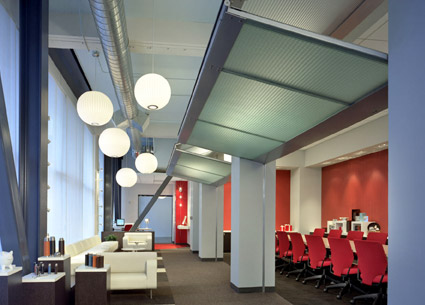
The viewer's gaze can switch between the neutral areas and the red accents to avoid fatigue and eyestrain. Color accents also aid in orientation within the building. Photo: David Wakely
Are color-blind people still affected emotionally by different colors, even though they can’t distinguish them? How did people who were blindfolded still demonstrate their response to color? Would a blind person in a red room experience the same increase of heart rate and blood pressure as someone who could actually see the red color?
There are experiments where subjects could sense the colors with the palms of their hands. Even Helen Keller noted how colors affected her. I’ve done color palettes for color-blind people, mostly red-green color blindness which is the most common. Even color-blind people can sometimes distinguish colors, they just see them differently. They see the world in their own palette.
Have you ever reviewed esoteric spiritual systems such as yoga or the Kabbalah on the uses of color to deliberately and consciously induce certain mental states?
The chakra system goes from red at the bottom to violet at the top. Tony Torrice, an interior designer who worked extensively with children, made a series of color cards for kids that were used in childrens’ hospitals. He’d give them the cards and ask them what color they preferred. Often, children would choose the color that was associated with the same chakra where their medical problem was located. For example, the throat chakra is blue, so a child that chose a blue card might very well have trouble in the throat or tonsil area.
[RF: I didn’t find much on Tony Torrice directly, but there’s a book on Amazon by Ro Ligrippo titled “In My World: Designing Living & Learning Environments for the Young” that was apparently co-authored with Torrice.]

Chakras refer to energy centers associated with colors and locations within the human body. They are referenced within traditional Indian medicine, yoga, and Buddhist systems.
Rudolf Steiner, founder of Waldorf education, says that hyperactive children should actually have a hyper-colored room, to in essence overload them so that their energy would spend itself out, leaving them calmer.
How does color influence our sense of time, temperature, taste, etc? How can color alter time and space?
First we have the effects that color has on things like heart rate. Subjects in a red versus a blue room will respond differently. Red tends to cause elevated heart rate and blood pressure, which in turn affects the person’s internal sense of time, because our internal clock is calibrated to our heart rate. So if you’re in a doctor’s waiting room, which wait is going to seem longer? A blue room is more calming, and thus time appears to pass faster.
In manufacturing situations we use color to alter all the senses. A forklift, for example, might be colored blue because the perceived load will actually seem lighter to the operators. In a carpet factory where the heat might build up in the summer months, walls can be colored blue to make it feel a little cooler inside. In noisy environments, I might use blue-green or blue to make the sound a little less noticeable.
You can even alter the sense of smell. Hewlett-Packard had one factory where they used plastics that had a very sour and pungent smell. Placing a sweet color, like a pale soft apricot, near those stations actually can mitigate the sensory impact of those odors.
For sensory purposes, these primal associations are pretty consistent even cross-culturally. Symbolically they’re different but physiologically they’re not. A red bridal dress, for example, might say “harlot” to us but “fortunate” to a Chinese person. But everyone’s heart rate will speed up the same on seeing the red color, regardless of the meaning they put on it.
How do you discover an individual’s personal color biases? Do you use tools like Rorshcach, fabrics, take them places, structured interviews? What if the person isn’t good at accessing their own feelings?
You have to ask questions in such a way that they can respond to them. It’s a little like being a psychologist and an expert communicator. Someone who couldn’t access their feelings at all probably wouldn’t be hiring a colorist! Usually we start with basic preferences such as “I don’t like earth tones” and I just ask them to tell me more about that.
For public and corporate projects, where there are a lot of people who will be affected by the colors in their environment, I use environmental analysis questionnaires to assess people’s responses to a space. For example, they might be asked to rank the space according to various pairs of attributes that may be important to that project: could be bright/dark, high/low, open/enclosed, friendly/hostile, fragrant/odoriferous, calming/arousing, powerful/weak, etc. The attributes themselves aren’t entirely fixed, and can vary from one project to the next.
Color and Climate
Your other articles talk a lot about using color palettes appropriate to the locale and weather.
Even the building orientation has to be taken into account. For an exterior project that’s mainly getting northern light, you have to pump up the color. If the building has four sides, yes, you pump it up on the north side. The same thing happens indoors. Sometimes you have to nudge the colors.

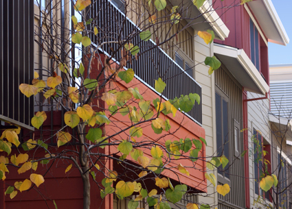
Color can not only strengthen architecture, but also enhance the pedestrian experience. If this facade were all-white, or all one color, it would lose its sense of variety and rhythm. Shown here is the Fillmore Center, color consultation by Jill Pilaroscia. Photo: Greg Lindley
Financial Influence of Color
Let’s talk about color and financial performance. When we talk about a “successful” project or a “successful” color design, what meaningful metrics can we come up with besides occupancy and rent rate increases?
As we said earlier, there are different levels of success. Most of my clients for public projects or housing developments, their #1 driver is financial performance. Other intentions can include creating as sense of place within a community or mixed-use area. It should be attractive, handsome, pleasing, friendly, and it should look like it fits with where it is.
One cautionary tale comes to mind. When people started developing here in the Bay Area, a lot of it was done by a few developers who came north from Southern California and they just re-used the same formulas that had worked down there: Mission-style homes with pale pink, white, and pale peach. It was misplaced. These homes did not sell well, and we were hired on many occasions to correct the palette so the buildings would look more appropriate for our geographic area.
The same thing happened when trying to bring SoCal to the Pacific Northwest. Those homes that had looked so good in SoCal suddenly looked like they were from outer space.
Can color alone suggest “upscale” or “economy”? I can tell you that color is only one of many signifiers that suggest luxury or economy to me personally. To me, fake bars on windows and shallow window indentations spell “cheap construction” and no amount of colorizing can change that, although better color might make the place a little more palatable.
I know exactly what you mean! Those fake bars are terrible. But as a colorist I can’t do anything about the choice of window or the depth of the moulding.

In this multifamily rental project, color was used to make the multiple buildings stand out from one another, and to create visual interest. Photo: Paul Peck
Color can communicate status by making a statement. Black = expensive, and sometimes beige = economy. There’s a reason why so many high-end gadgets are black – it’s so sleek, so shiny, so high-tech. Here’s a crasser example. When a well-known major American retailer first opened, they marketed towards a lower-income clientele. That’s not necessarily true anymore, but it was at first. Their color choices included pale pink and mint green, both colors that were statistically associated with lower socioeconomic groups!
Related Professions
How do you feel about minimalist architecture that treats color as a frivolous distraction from form?
I like Minimalist architecture. Color could be used to orchestrate and illustrate the simplicity of their designs. Color can enhance and accentuate form without being overbearing. You don’t have to paint it red to make it stand out.
[RF: We discussed the all-white apartments that still appear with some regularity as feature articles in places like the NY Times Magazine]
I call the all-white apartment a whitescape. An all-white apartment might be calming initially, but all that white, with its high reflectivity, can become fatiguing to live with over a longer period of time. In Joseph Conrad’s novel “Heart of Darkness” everything is black or white: white teeth, white bones, white fog, white hair. There is a sense of coldness and inertia.
But some people find solace in white. There is nothing wrong with preferring white in one’s personal environment. Every man’s or woman’s home is their castle. If white resonates with them, then that is the appropriate color for them to live with. I am more concerned about public space. Don’t force a single color scheme on every environment because it seems intellectually superior.
For public spaces, I would suggest that a variety of color and color value is important, so that users can find something with which they can visually or emotionally resonate. Add flowers or plantings, art, or furniture to break up the monotony of a single unrelieved color. There’s a great book called “White Walls, Designer Dresses” by Mark Wrigley on the history of white in architecture.
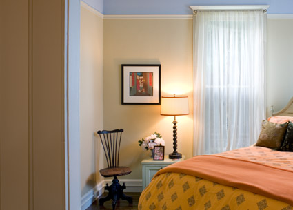
In Jill Pilaroscia's own home, each room is a new world of color. The bedroom has a golden theme, but doesn't rely on super-saturated color. Photo: David Wakely
I did see one white apartment that really worked. It was in a San Francisco high-rise with northeast exposure and a 180 degree view. The owner had a wonderful art collection which displayed well against the white walls. The art itself was powerful enough to counterbalance and complement the spectacular views.
White spaces are also associated with schizophrenia!
Have you ever worked together with a lighting designer on a project?
Yes. I have worked with lighting designers on numerous occasions. Many times, my color is already selected or installed prior to the coordination with the lighting designer. As with other design collaborations, it is always best to coordinate these two disciplines early on, but it’s not a blocking issue, because a color scheme should really work in a variety of lighting conditions, independently of the artificial light sources chosen.
I don’t use special viewing rooms or light-boxes to test my colors. I just use regular daylight. About 70% of the time I can already tell if a scheme is killer or not, and if it’s killer I can take it most anyplace. If the edges and palette are well-balanced, then MOST of the time it will work, even under a variety of light sources.
Lighting designers don’t seem to work much with colored light, other than to sometimes use reflected light from a colored surface.
Philippe Starck comes to mind. He did a “light” hotel.
Have you worked with very fine-art driven architects on a joint project like a building lobby?
I have worked with high-end residential architects, and it’s been a treat. Sometimes the art itself is part of a high-end project – making sure the colors and finishes resonate with the art. I have also worked with art consultants, some of whom I absolutely adore. Tessa Wilcox of Art Source Consulting is amazingly insightful and talented. If your client is a major collector, you have to make the color work with the art so they don’t fight one another.
Let’s talk about Feng Shui. Do you believe in Feng Shui? Can we draw some parallels with your own experience?
Feng Shui has a logic behind it, like not putting 4 doors in a row, or not having the toilet be the first thing you see upon entering the home. I don’t care so much for the Feng Shui approach to color, too formulaic – something like “We need more Metal, so let’s add brown”. A color scheme should NEVER be a formula. It should always be site-specific.
Do you have any advice for architects?
Just this. Consider the role of color in the built environment. In today’s economic climate, there’s less money to go around. You might not be able to achieve the same level of architectural materials and finishes. But applied color (paints and stains) are now more eco-friendly, so entertain the idea of color. “Give color a chance”!

The color palette for this development in Fremont seems to riff off the green mountains and sky in the background. Photo: Patrik Argast
Color and Health
Have you ever worked with color therapists or mental health professionals? Is color scientifically accepted as a method to heal physical or mental illness to the point where insurance companies will reimburse for treatments?
As if! Well, maybe someday. We’re not quite there yet, but some of color’s effects on human health have definitely been demonstrated. There are practical concerns in hospitals, too. Making a huge wall lime-green will reflect light on the patients and make them look green, too. The doctors and nurses of course assess patient condition partly based on complexion, but they can’t do that with too much interference.
Frank Mahnke has stuff in his book about the human color response that speaks to this.

The developers of this condominium wanted it to look rooted in history, so JIll Pilaroscia chose a palette that referenced a more "historical" feel, in this case the earthy palette of Tuscany. Photo: Patrik Argast
Famous Last Words
Do you have any famous last words of advice for architects in particular?
If there is an opportunity to mention the International Association of Color Consultants that would be great. I am a fully accredited member of their North American Chapter and have completed my Thesis on Color In the Manufacturing Environment – A Case Study. The thesis in catalogued in the library of the IACC in Salzburg and San Diego. The program is a multi disciplined course in the art and science of color application for environment.
Few architectural institutions offer a formal program addressing color in the built environment. Any exposure they have to color theory is frequently through studio courses that focus solely on two-dimensional color applications.
Don’t be afraid of color. Some public projects are at the mercy of facilities management, which may be afraid of having to think. They care only about the bottom line: how fast can we touch it up, we can only use 4 hours of your time, and every floor is the same, even in a hospital where one floor may be for children and another for seniors.
It’s hard to understand the value of color through measurements as a bottom-line return on investment, because ROI doesn’t factor everything that’s truly important. The concept of ROI itself has less meaning because we only value the bottom line. We don’t value people, and we don’t value nurturing people. The people don’t matter. It’s all about corporate profits, making it easy, and not working too hard. Sometimes colorizing a space costs more to do and to maintain. But our environment shapes behavior. It’s WORTH spending time on.
10 Responses to “Jill Pilaroscia: Give Color a Chance”
Leave a Reply
You must be logged in to post a comment.




Michelle
31. Jul, 2010
You said “oboes have more overtones” – actually the musical saw is the instrument which has more overtones than any other instrument! Have you ever heard one live? If you happen to be in NYC, look up the ‘Saw Lady’ (http://www.sawlady.com/blog ) – she plays the saw in the subway. The sound of her saw is very similar to that of the human voice – like an opera singer.
Rebecca Firestone
02. Aug, 2010
Actually, I have heard musical saws played live on a few different occasions, and it never sounded rich – not exactly. It didn’t sound like an opera singer, either. It was eerie, fascinating, pure – could also have been the intonation, which can be difficult on any fret-less instrument, but it seemed even harder to play true to pitch on a saw.
The only other instrument with a sound quality that reminded me of this was a traditional Armenian flute called a duduk, which is made from apricot wood.
– Rebecca
Bud Plochere
03. Aug, 2010
Jill,
Magnificent.. Your use of color demonstrates a complete understanding of color theory. And you write to explain color application in various disciplines.
Wow.
Bud
Give my love to Jerry.
Dr. Ray Firestone
16. Aug, 2010
Jill Pilaroscia has lots of excellent ideas. Her concept of color shaping our subconscious feelings and even behavior rings true. I’ve often felt, entering some room or building, or even looking over an urban landscape, that I was pleased, or irritated, or had a rush of feeling (good or bad) just from the overall impression of color and shape. Of course Pilaroscia deals more with color than shape, but I think that’s at least equally important. It’s quite right to speak of color combinations that are harmonic or dissonant, just like chords of music.
The question regarding continuous vs discontinuous spectra is a good one. Many people do not realize that you can visually get a given color in more than one way. For example, you can mix just a few pure wavelengths and get the impression of white even though most of the colors are missing, or you can get it with a continuous spectrum like sunlight. But many things look quite different in lighting via the two whites. In the old days, fluorescent lights looked white but flesh tones were ghastly.
“An object that absorbs all [but] visible red…will appear red.” Yes but usually objects look red, not because they absorb everything except red, but because they merely absorb only some colors opposite to red on the color wheel.
I thought that the various rooms in her own house were especially interesting and nice. I also admired her San Mateo dome, and her various outsides of buildings. There were a couple in which she used different colors on each of a large group of similar attached homes. There is a charming street on the waterfront in Bergen, Norway, where each house is a different color, just like hers.
“…carefully selected accent color will allow your pupil to open and close…” Nonsense. The pupillary reflex responds to the intensity of illumination.
I find it unbelievable that people sense colors with their hands, or that truly blind people sense color. When people whose eyes function normally are blind from some defect in the brain they sometimes experience blindsight, which arises from a normal optical image that cannot reach the conscious center of the brain, but does reach some intermediate place where it registers somehow. Color-blind people like me can indeed distinguish colors, but differently from you.
Hyper-colored rooms for hyperactive children. What an great idea. Also the color of a doctor’s waiting room. If they color it green like money, the wait would become intolerable.
“Feng Shui has logic.” Maybe so, but I’ve been places where rich Chinese buy up houses and tear them all down because their front doors are not pointed in the correct direction.
Rebecca Firestone
16. Aug, 2010
This comment was a private email from my dad, published in edited form by permission.
– RF
gastonolvera (Gaston Olvera)
14. Sep, 2010
Good interview on color and design – Jill Pilaroscia: Give Color a Chance – http://bit.ly/aUcGpk
paintedroom (Jean Molesworth Kee)
10. Apr, 2011
Architects- Give Color a Chance
http://tinyurl.com/2eamswu #color
Parthenon1 (Tara Imani)
10. Apr, 2011
RT @paintedroom: Architects- Give Color a Chance
http://tinyurl.com/2eamswu #color
Meet Jill Pilaroscia, Colour Studio - The Design Narrative | The Design Narrative » Blog Archive
19. Apr, 2011
[…] Read the full article here. […]
Meet Jill Pilaroscia, Colour Studio - The Design Narrative | The Design Narrative » Blog Archive
20. May, 2011
[…] Read the full article here! […]