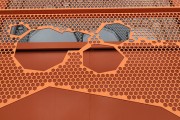
Lyon’s La Confluence District: Walking Tour
by Rebecca Firestone with Mark English AIA | Editorials
The French city of Lyon’s “La Confluence” is a bold island of modernity exists on a sliver of land between two rivers. “Part of the logic of making the architecture more bold is to make it interesting from all angles.” How does this compare with similar redevelopment efforts in San Francisco?
Image: Mark English Architects
When most of us think of European walking tours, we think OLD: picturesque châteaux, ancient tile roofs, Renaissance cathedrals, Roman antiquities, and the like. But there’s plenty of Modern work as well – not only in Paris but in other cities, like Lyon. Mark English takes us on a short one-hour walking tour of Lyon’s bold and successful approach, integrating old and new into a highly satisfying urban experience.
“Lyon is a real working place.” The new nexus of modernity is the district known as the 2nd Arrondissement: an island sliver between the Saône and Rhone rivers. It’s shaped a bit like Manhattan. Transportation hubs include trains, river taxis, and roadways providing efficient tie-ins. “The buildings are clearly visible from the waterfront, from the trains, the sidewalks, and the roads. That’s part of the logic of making the architecture more bold is to make it interesting from all angles.”
We’ll start at the bottom tip of the 2nd Arrondissement, near the Musée des Confluences Lyon. This was the one building we didn’t visit – mainly due to time constraints. We do, however, have a few comments about it as well.
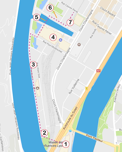
Our Modernist walking tour of Lyon’s 2nd Arrondissement starts at the Musée des Confluences Lyon and ends just north of the water channel.
The sites are as follows:
- Musée des Confluences Lyon (Architect: Coop Himmelb(l)au)
- 59 Quai Rambaud
- Orange Cube (Architect: Jakob + MacFarlane)
- Euro News Building (Architect: Jakob + MacFarlane)
- Shopping Center Pôle de Commerces et de Loisirs de Confluence (multiple architects and urban planning organizations)
- Pont des Arts (bridge)
- Various Riverfront Housing Complexes (architects), with courtyard transition
Musée des Confluences Lyon
Designed by the Vienna-based firm Coop Himmelb(l)au, this museum of science and anthropology is worth a visit for the exhibits and content, even though we didn’t have time to go inside.

We started out from the Musée des Confluences Lyon designed by Coop Himmelb(l)au. It was difficult to find an “iconic” image of this building, perhaps a sign of its fragmented visual identity. (Image from http://www.telegraph.co.uk/)
Mark was frankly not a fan of this building. I found one online critique that agreed with him. Mark’s comments, “A typical blob… formless and faceless.”
Instead, we invite you to join us walking up the Quai Rambaud along the Saône River.
59 Quai Rambaud
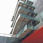
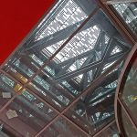
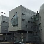
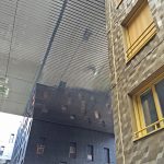
We dubbed this one the “Cantilever Building”, a simple steel-and-glass shell.
- View from below of the glass and steel external stairway. Image: Mark English Architects.
- View from below, looking up. Image: Mark English Architects.
Orange Cube
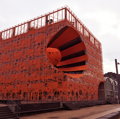
When I first saw Mark’s spectacular photos of this orange cube-like office building by Jakob + Macfarlane, I dubbed it “Orange Hole Building” because of the ethereal-looking opening in the center. It’s referred to elsewhere as the “Orange Cube”, and is a design showroom and office building.
The hole is ingeniously engaging, and opens up a river view to every office up and down the cube. The opening is not straight, either; it’s an organic tunnel-like shape that invites the viewer to float up and through it.

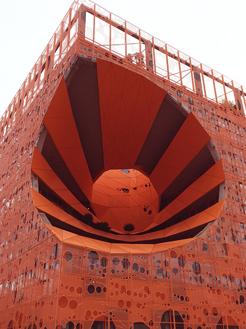
The hole penetrates throughout the building, drawing the viewer inside. “Orange Cube” by Jakob + Macfarlane in Lyon, France. Image: Mark English Architects
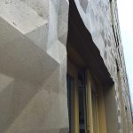
The building further reveals itself upon gradual approach. The skin is carefully worked with designs at various distances, like a cellular organism with a richness of detail at successive levels of magnification. The skin also offers some light screening for the plate-glass curtain wall behind.
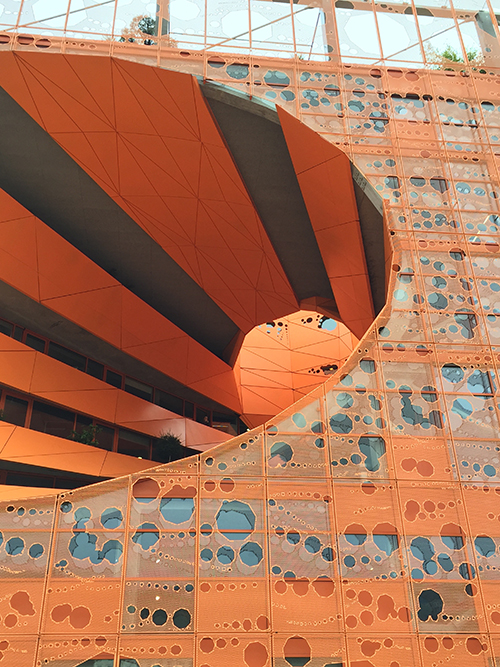
Repeated motifs on the surface reinforce the large opening. “Orange Cube” by Jakob + Macfarlane in Lyon, France. Image: Mark English Architects
Upon closer approach, finer layers of texturing become visible.
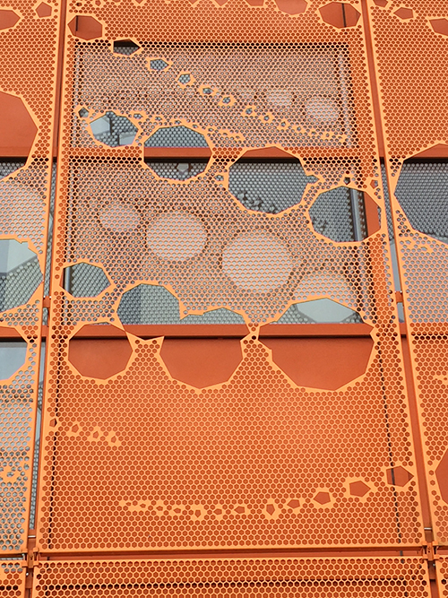
Further textural details reveal themselves upon closer examination. “Orange Cube” by Jakob + Macfarlane in Lyon, France. Image: Mark English Architects
Euro News Building
A companion piece to the Orange Cube also by Jakob + Macfarlane is a few blocks farther up. I dubbed this the “Green Hole Building”. Elsewhere, it’s referred to as the Euro News Building or Euronews Headquarters. It looks equally attractive at night.

A similar design theme informs the Euro News Building by Jakob + Macfarlane in Lyon, France. Image: Mark English Architects
There are actually two openings, which you can see in other similar images of this building online.
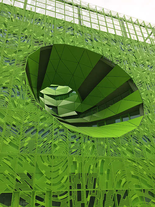
The openings reveal river views to interior offices. Euro News Building by Jakob + Macfarlane in Lyon, France. Image: Mark English Architects
The Pôle de Commerces Shopping Center
The Pôle de Commerces et de Loisirs de Confluence is a major landmark and a pass-through point on our walking tour. Many English-speaking Silicon Valley readers will immediately think of the software package Confluence by Atlassian Software… however, the word “confluence” actually refers to a junction of two rivers. You’ll have to translate the Wiki page, which is in French; this center was an integral part of a larger urban development effort spearheaded by the then-mayor of Lyon and a large developer, SEM Confluence.
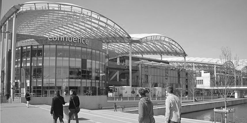
Pôle de Commerces et de Loisirs de Confluence, a major shopping center in Lyon’s 2nd Arrondissement.
Mark English felt that overall, the redevelopment effort was very successful, because the parties weren’t afraid to be bold. They didn’t want to simulate “fake Tuscans” or fit new buildings into an existing mold based on “neighborhood character”.
Various Housing Projects
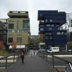
After crossing the Pont des Artes, a bridge over a water channel connecting the two rivers, we reach the Quai Antoine Rambaud. Here we find a collection of apartment buildings that, like the business buildings, are fearless in intention.
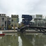
- From across the water channel at the Pont des Artes, we can see a row of housing buildings, each one a design experiment. Image: Mark English Architects.
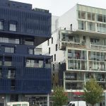
- Crossing over the Pont des Artes, two apartment buildings complement one another with shifted volumes and intentional gaps that create space and an airy feel. Image: Mark English Architects.
- Shifting a bit right, we see an apartment building with stainless steel cladding. Image: Mark English Architects.
- A housing complex with a bold irregular window opening along the street-facing side. Image: Mark English Architects.
- Detail of previous image, showing operable shutters for each apartment unit. Image: Mark English Architects.
Openings and Mews
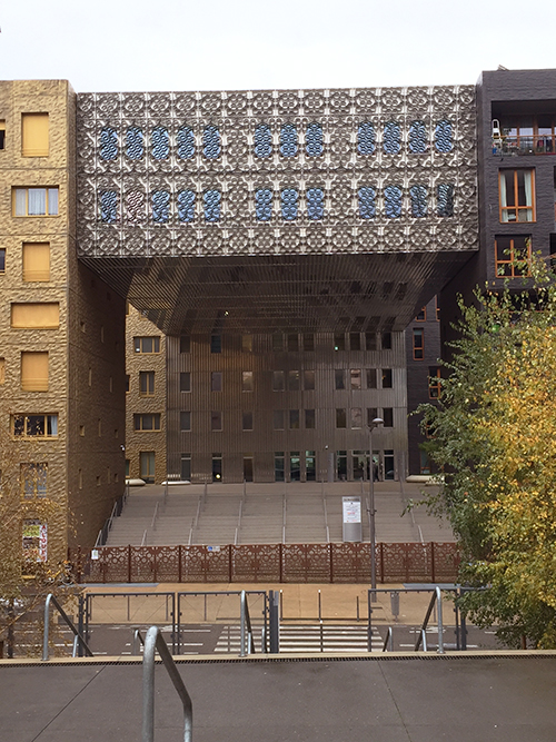
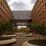
Notice that many of the new Lyon apartment buildings have “mews” or entryways into private courtyards, with overpasses or walkways that allow pedestrian traffic to pass through below. 
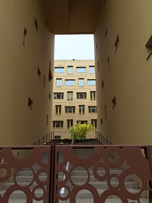
An elegantly tall passageway opens up an apartment building to views from the street, while maintaining privacy. Image: Mark English Architects
The openings also keep the buildings from turning into fortress-like facades.
Creative Skins
The apartment buildings all had some commonality in terms of experimental shapes, as well as cladding.
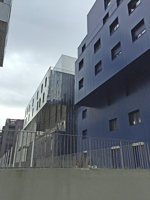
Steel-clad apartment buildings, one burnished to a high shine, the other painted a rich deep slate-blue. Image: Mark English Architects
The shapes, while irregular, remained rectangular, and the claddings complemented one another without being identical or uniform.

Stainless steel cladding creates a mirror-like reflection of the adjacent building. Image: Mark English Architects
I was comparing the mirror-like sheen on this stainless steel-clad apartment building with a similar one I just saw in Oakland, CA. However the Oakland apartment used inferior materials that weren’t holding up well – thin sheets of aluminum that were already dented and losing their sheen – and the window openings looked like they were off-the-shelf, whereas this Lyon building looks more intentional in its proportions.
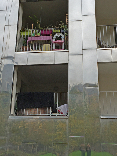
Close-up of stainless steel-clad apartment building, reflecting the greenery in the background. Image: Mark English Architects
Raised Pedestrian Passages
There were several instances of raised walkways or passages connecting buildings while allowing free pedestrian circulation at the street level below.

This pedestrian corridor is dotted with tree plantings. A raised steel-clad walkway connects the buildings above. Image: Mark English Architects
- View of the stainless-steel walkway from the other side. Notice the textured wall on the building to the right. Image: Mark English Architects
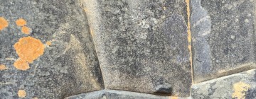
- Close-up of sculptured, textured wall on apartment building. Image: Mark English Architects
- Long-range view of courtyard with trees and raised walkway, showing second walkway behind. Image: Mark English Architects
Meanwhile, Back in San Francisco…
Towards the end of our conversation about the wonders of Lyon’s La Confluence, Mark English pondered why San Francisco’s redevelopment efforts so often aim for a solidly middle-of-the-road mediocrity that offends no one. Is it the design guidelines, the decision-making process, local NIMBYism, or something else? What are we so afraid of?
For example, in San Francisco’s UCSF Mission Bay Campus, would anyone have approved the Orange Cube? Stay tuned for a future article exploring these questions.
Additional Links
Wikipedia entry for Coop Himmelb(l)au
Critique of Musée des Confluences Lyon


