
Hiram Banks on Seeing the Light
by Rebecca Firestone with Mark English AIA | Interviews
Light is something we all take for granted, like water or air – meaning we mostly notice it when we don’t like it, when there’s not enough of it, or when there’s way too much. Premier lighting designer Hiram Banks has worked everywhere from Presidio mansions to the South Pole.
Light is something we all take for granted, like water or air – meaning we mostly notice it when we don’t like it, when there’s not enough of it, or when there’s way too much. Premier lighting designer Hiram Banks discusses his approach to architectural lighting.
You have a background in architecture and engineering, which is unusual for a lighting designer isn’t it? How has that informed your work?
My first education was in engineering systems, and after graduation I went to work for Nissan designing their assembly-line manufacturing processes and systems. It was all about hand movements and per-unit costs. It was boring. So I went back to architecture school, but then I missed the technical side.
Engineering is all about solving problems given known formulas and science, while architecture starts with theory – the “why”.
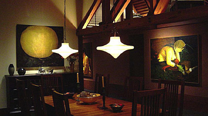
Tiburon residence designed by Steven Miller, Butler Armsden Architects, with lighting design by Hiram Banks
20 years ago, lighting was a new profession. I enjoyed it, because lighting combines architecture with the technical. It’s about the science of physics and math. You have to really know the science behind each type of lighting source in order to deploy it properly. What makes it work? What gives the light its color? What is each type of light really capable of doing?
What is the creative process that you use to approach a new lighting project? What are the elements or qualities that you seek to embody in lighting? What decisions have to be made first?
Actually, it’s the politics of the architect and the end user. Everyone has to work well together. I review the project program for opportunities to better integrate lighting into the design, and to strengthen the overall design.
I enjoy charrette sessions with the designing architects early on in the design process. We’ll brainstorm, throw ideas around, and sometimes I’ll ask them why they’ve done something a particular way in order to better understand what is informing the architecture. I have to gain their trust first before they’ll listen to my ideas.
With long-time clients like designer Gary Hutton, I already know what they don’t like, so when I come to the table with a bunch of ideas, I’ve already chosen ones that I think will work for that particular designer or project.
In any project, the proportion of time spent on design is always far less than the details. The largest portion of time is in the day-to-day project management required including field problems, submittals and clarifications as the project progresses.
How do you go about making your designs more energy-efficient?
Once the direction of the lighting design is apparent – once the concept is in place – then we can look at different ways of achieving that same result using various types of light sources. The deciding factors in that are color rendering, energy code compliance, lamp life, heat build-up, preference and cost.
So, say that we’re doing lighting accents on a bookcase with strip lights. After choosing where we want the light, next step is to determine the source – for example, halogen or fluorescent. Then we consider the color, the lifespan of the lamp and fitting, the energy use, and sustainability (disposal). Finally we do a payback analysis.
In some cases you can switch out a 50-watt MR16 for a 37-watt 1R, which gives you 20% more light with a 13-watt savings. Or change a typical incandescent “A-lamp” to a halogen one which provides for greater energy efficiency at a lower wattage with increased lamp life. These are examples of energy efficiency that can easily be done without any additional fixture expense.
I stick with tested and proven technologies, even for sustainability. For example, LEDs are very hot right now, but there are still serious problems with the quality of their color “White”, color consistency between lamps,and the amount of heat they generate.
My impression of energy-efficient lighting is that it’s harder to see with – not as sharp.
You have to use the right light for the space. Fluorescents are an example. A lot of people don’t like them, but if they’re well deployed you can’t even tell that they’re fluorescent, as long as the light is indirect. If you put it hidden behind glass so it’s indirect and use a bright white tri-phosphor, you can dim it to 1% and use it for cove lighting.
[NOTE: Tri-phosphor fluorescent lamps emission light frequencies that are more evenly distributed over the spectrum of visible light for better color rendering. The older fluorescents had discontinuous spectrums, and the lack of variety in frequencies resulted in the poor color rendering that we associate with those corpse-like skin tones]
In addition to specifying tri-phosphor, high CRI (color rendering index) fluorescent lamps, it is vital that you examine the given reflected surfaces, as the light you actually see is not just the color of the chosen fluorescent lamps but is a combination of the light emitted by the lamp itself, and the color of the reflected surfaces. Once again you need to apply the layers of lighting which will provide the warmth and visual interest that we desire.
You also have to know the physical characteristics of the design materials. When I shine lights through glass, for example, I only use Starfire crystal, rather than ordinary glass which has a greenish tint.
What are the top things that, in your opinion, lighting designs should address but often don’t?
Many lighting designs are not balanced. Instead of layers of light that balances ambient washes with focused light for visual interest, the default is to just put in a bunch of downlighting and then wonder why everything looks so dramatic. A lot of architects really like small apertures, such as an MR-16 through a recessed pinhole, and that’s all they will use. MR16 downlights alone are not the appropriate solution for lighting a space!
Lighting should enhance the overall design, not call attention to itself. With good design, you might like it but you won’t know exactly why, because good design is subtle.
Lighting should strengthen the architecture. A wash of light over a hand-plastered wall can draw attention to that area. Or, you might highlight a piece of artwork in a pool of light. A corridor can end with a point of visual interest accented with lighting.
Sometimes lighting designs aren’t maintained properly. One of my pet peeves in restaurants is a lack of coordination when replacing lamps. There are subtle color differences even within white light, and it looks poor when half the white lamps are warmer than the other half.
I haven’t seen any disasters as such, only inappropriate use of lighting technology. I see grocery stores and retail clothing stores still using T12 fluorescent lighting… why?
[NOTE: T12s were originally produced in response to demand for a more energy-efficient fluorescent lamp during the “energy crisis” of the 1970s. T12s had problems including reduced lamp life, poor color rendering, and low light output. We were discussing whether fluorescents are really inferior or not, and talked about spectrum spread and continuity, color temperature, as well as whether full-spectrum lights really live up to the name. I think they don’t.]
How can ordinary folks take advantage of new lighting technologies? Are there consumer products available that are analogous to what’s specified by designers?
First of all, the so-called full-spectrum lights that you can buy at places like Home Depot aren’t actually the same as natural daylight. In fact there’s no such thing as only one type of “natural daylight”. What time of day are we talking about? Natural light is constantly changing throughout the day – in intensity, angle, and color temperature.
[NOTE: Generally speaking, “daylight” is not the same thing as “sunlight”… daylight often means an indirect northern exposure on a clear day, which gives it a bluish cast. Cloudy-day light is whitish, but on the cool side. Sunlight looks white to the eye but according to astronomers, our sun is actually a yellow star.]
Which designers do you admire the most?
Gary Hutton brings a fresh new approach to each project, and designs the furnishings around the project. So every project is really unique. I like Aidlin Darling‘s use of materials and detailing. And of course the 20th century greats like Neutra, Mies, Craig Ellwood.
Do you prefer to collaborate with architects or interior designers?
When architects do interiors, they tend to focus on monolithic forms and materials: stone, wood, slate. It’s their training, really. I was trained that way in architecture school as well, to focus on forms rather than colors and texture. Sometimes interior designers are more homey.
What’s the most unusual lighting project you ever did?
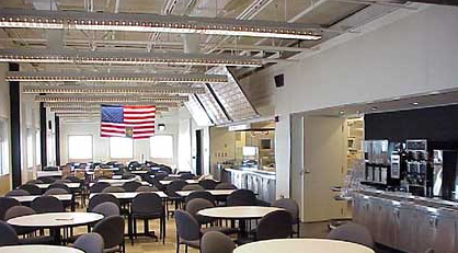
The South Pole Station for the National Science Foundation. Visiting scientists stay there for 2 years at a time. The winters of course are extremely cold, and it’s dark all winter long. It’s impossible to get in or out over the winter, and even the rest of the time travel to and from the station is limited. The station rests on ice rather than solid ground. They have to pack everything in and out with them, including waste. Energy-wise, it had to be super-efficient, because all their energy is produced onsite.
For lighting, they needed a really good white light that was energy-efficient and long-lasting, to reduce disposable waste. Because of the long, dark winters, having a high quality white light was essential.

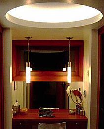
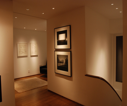





LED Lighting Design and Title 24 Compliance | Green Compliance Plus - Mark English Architects
17. Jun, 2014
[…] lighting still has a long way to go,” says Hiram Banks, a San Francisco lighting designer recently profiled on our sister blog, The Architect’s Take. Product unknowns include optimal operating […]