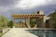
Greg Warner on the Importance of Place
by Rebecca Firestone with Mark English AIA | Interviews
“The importance of place means respect for what is actually there – including its history. If clients come to us requesting a specific regional or historical style, we respond by asking them what they like about the style they have selected and try to elicit the underlying qualities that attracted them to it in the first place. Then, ideally, we can embody those qualities in a design that’s actually the best fit for the project and its context.
The early design stages are a sort of courtship between architect and client. We’re really interviewing each other to see if there’s a mutual alignment. Just as we listen to their desires, we also educate them on what our values are, and they ideally buy into that early on in order for the project to be mutually successful.
We design homes with the client’s full life cycle in mind, and beyond. The home has to be versatile enough to accommodate generational life changes without requiring a renovation every 10 years. Sometimes this freaks out the clients a little bit! They’re not used to thinking this far ahead. We’re creating their home as an heirloom and a legacy to future generations.”
[Cover photo by Cesar Rubio]
[This is the first of a two-part series featuring Greg Warner and Brooks Walker, founding principals of Walker Warner Architects in San Francisco. Greg Warner’s interview came first.]
Pretend you’re teaching a new group of students about site response. What’s important?
Many architects say that they’re sensitive to site conditions, the environment, and sustainability. But it’s easy to fall into what I call “bling” – for example, getting seduced by the idea of “green building technologies” without considering what’s actually fundamentally appropriate to the site in question. As an architect, you can let your guard down too easily, and get taken off the path by trends. The importance of place means thoroughly understanding what is actually there.
How do you respect a place?
You have to understand the nature of the place, including its history. Using your given senses too – listening, seeing, and understanding in order to harmonize.
How did your early life affect your design sense?
Most of our work is not urban. It’s rural. I grew up outdoors on a ranch, in Hawai’i, so I’m most comfortable in that familiar context. Most of my interests involve the outdoors. I love fly fishing, hiking, cycling, and triathlons. My experience growing up in a rural area has led me to design in a very specific way that has in turn influenced my occasional urban work as well. Even in urban settings, I seek ways to relate buildings to the outdoors, and I really appreciate the importance of using natural influences to enhance quality of life.
On the East Coast where I grew up, the outdoors can be your enemy, especially in the wintertime.
The question becomes, how do WE adapt to this context to respect that climate? If you’re hiking in a rainy area, you prepare for it. Similarly, when designing a home, climate should inform the architectural solution in order to be compatible.
So your approach [to discomfort] is not to deny it. You still face it – but properly equipped.
When we design a home, we have to provide a solution that takes the client’s desires into account, because that’s one of the parameters which, along with the site, informs the design. Some clients come to us with preconceived ideas, which we feel are not a good fit for the site. For example, a client may have his vision set on having an East Coast style home, but in California. That’s not an appropriate match for the climate and history here. If we can’t talk them into accepting an alternate approach, we often won’t take the project.
How do you talk someone out of building in a wrong style?
We ask the client what they like about the buildings that they have selected, and try to elicit the underlying qualities that attracted them to each one in the first place. Then we can embody those qualities in a design that’s actually a better fit for the place. Ideally we remove “style” from the dialogue.
Often, we push back BEFORE we’re hired, by educating the client on our philosophy and our approach. We’ve been around long enough to know the importance of being selective. Filtering our clients is tough in this economy, but you’ve got to love what you do; that’s the primary step to success in a project.
It comes back to respect. We respect our clients enough to be open and candid with them, because good design is a collaboration between architect and client. Respect is one of our core values as a business.
Can you give me an example of how you talked someone out of building something that would have been site-inappropriate?
Our Kamuela Residence project in Hawai’i is a good example. The clients were a young family who wanted to build a home that was understated and respectful of the surrounding community. The clients were sophisticated and understood the social issues that can arise when building a luxury home in the midst of an agrarian community. Originally, they had notions of what I’d describe as traditional bungalow buildings: pitched roofs, lots of predictable detailing, similar to many of the existing homes on the island.

The client for Walker Warner Architects' Kamuela Residence originally expected the architects to design a home that referenced the older plantation homes in the region.
But this was also an area rich with a lot of practical, agrarian structures already optimized for the unique climate in that area: low slanted roofs to align with the prevailing winds, long narrow buildings oriented for optimum ventilation. Very fitting.
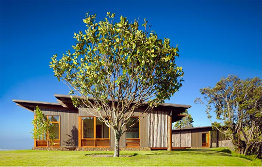
Walker Warner Architects, Kamuela Residence. After the clients saw how well-suited the local agrarian buildings were to the Hawai'ian climate, they were open to emulating the best of those features for a home that was tailored to both unique site conditions and their own needs. Photo: Matthew Millman
Initially, we drove around looking at various local buildings while I described what worked about each one. The conversation happened quickly, as did their understanding, and then there was trust; the clients understood the reasoning and logic behind how the local buildings were sited, and saw the implications for weather, views, and rain. Once it became obvious to them, they got excited.
Once the mind is opened and confident, that’s when trust begins. That’s when collaboration begins. The early stages are a sort of courtship between architect and client. We’re really interviewing each other to see if there’s a mutual alignment. Just as we listen to their desires, we also educate them on what our values are, and they ideally buy into that early on.
So that means every project you do could be in a different style, depending on what fits the site.
We don’t work in a specific style the way some architects do. It’s an approach, a point of view. To me, a style is sort of like working with a kit of parts, though. So this means we may be less practiced in using a specific kit, but I feel that we’re more versatile overall.
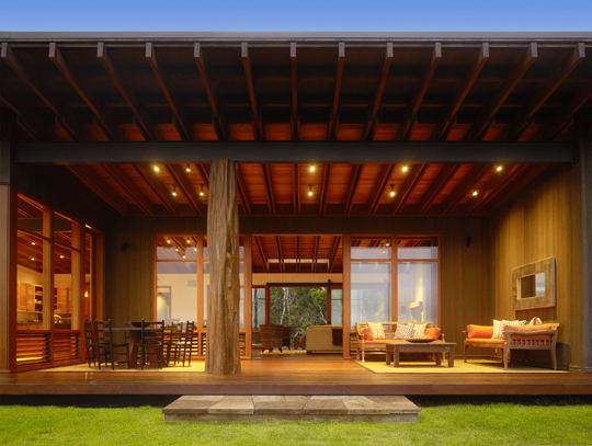
Walker Warner Architects, Kamuela Residence. The extensive porch, called a lanai in Hawai'i, is a common feature of Hawai'ian architecture. Photo: Matthew Millman
A vision our clients had initially considered was of plantation homes from the 20s or 30s, common in the region. These were built as sugar plantation housing throughout Hawai’i – a semi-Victorian look. In early Hawai’i, however, the local structures featured “single-wall” framing made with simple planks instead of studs. The buildings didn’t need insulation. The gaps between the boards allowed air to flow freely through the walls. The buildings were oriented based on the direction of the prevailing wind to further encourage good ventilation. Sheet rock is a poor choice in Hawai’i because of the humidity – it deteriorates rapidly and is too susceptible to mold and mildew.
We actually borrowed this single-wall look and have used it in other projects elsewhere. We used single-wall framing to create a permeable screen in a residence located in Woodside, CA. The living room is a glass box, but it’s screened from the western sun by this planked wall that visually intersects with the rafters.
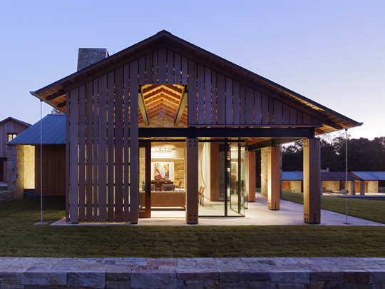
Walker Warner Architects, Woodside Residence. The textures and materials in this screen wall in this home in Woodside, CA are reminiscent of the single-wall framing typical of both Hawai'i and of barns in Northern California. This type of framing screens the sun but admits the breeze. Photo: Matthew Millman
Was it appropriate to use a Hawai’i feature in a California home?
There’s enough commonality between the climates of Hawai’i and California that in this case, it was. One common feature of buildings in both places is a generous porch, or lanai in Hawai’ian terminology. A mild and livable climate means that traditional buildings don’t always need excessive heat or air conditioning to be livable. People can live comfortably in the “in-between” zone between the indoors and the outdoors.
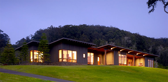
Walker Warner Architects, Kamuela Residence. It's hard to believe that this luxury contemporary home was originally based on local shacks! Photo: Matthew Millman
Our palette is often “weathered”, warmer, and not harsh or clinical. We prefer using enduring materials like wood or stone because we want our buildings to last.
Going back to the Kamuela project in Hawai’i, why were agrarian buildings a better example than plantation homes, since these plantation homes are also part of the “local context” – does this mean that the plantation homes are somehow LESS adapted to Hawai’i than the single-wall framed barns?
These homes (in the up-country ranch region) were somewhat unique as compared to true sugar plantation houses. Single-wall framing was common in Hawaii, primarily because of the simple means for construction (no studs needed). The exterior walls were simply made with vertical boards with a tongue and groove connection between each. For homes, there weren’t actually gaps (too many bugs!) between boards but the walls were literally 3/4″ thick. Barns and other structures of utility hade similar type of wall system; however, boards were not tongue and grooved together. This is similar to what you see in California hay barns (as referenced in the Woodside home).
How else was this project driven by site? Isn’t it on a border between two microclimate zones?
Yes. It’s on a hillside with great views toward a drier climate below, and a rainy climate directly behind. Trade winds tend to come over the hills and drop moisture on the way down toward the ocean. As a result, behind the house is a rainforest and watershed. The roof of this house is pitched to shed its rainwater back into the gulch located at the base of the watershed, while the front lifts toward commanding long-distance views.
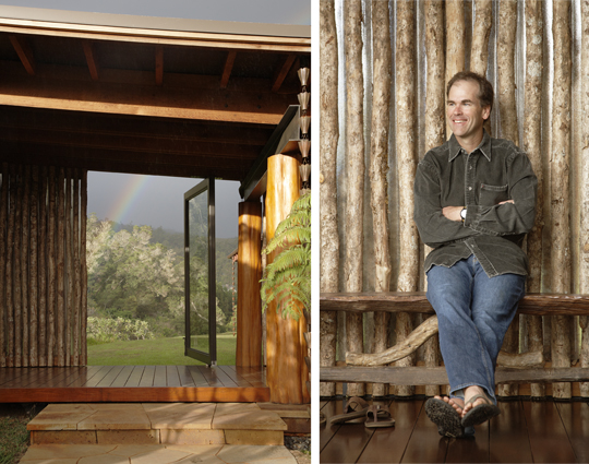
A view of the rain forest behind the Kamuela residence by Walker Warner Architects. The moisture and feeling of shelteredness on this side is balanced by sweeping views of the ocean and mountains on the other. Right photo shows Greg Warner by the natural Ohia log windscreen. Photos: Matthew Millman
Both California and Hawai’i seem to have microclimates. San Francisco is famous for them. Can you talk more about how you design for microclimates?
Another project designed in direct response to climate and to site was Sonoma Ranch. This was also a new home located on a legacy cattle ranch property in today’s California wine country. One of the area’s challenges is the wind: in the summers, it’s often difficult to simply sit outdoors and read a newspaper with the wind gusting at 30 mph or more. Our solution was to use the building as a windbreak forming a courtyard, oriented for protection from the prevailing winds.
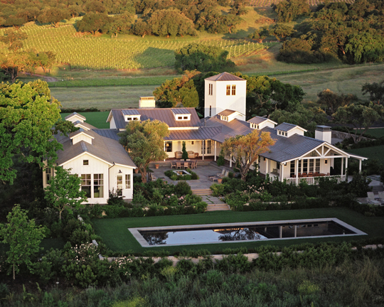
Walker Warner Architects, Sonoma Ranch. This home was designed in response to a vernacular style matching the surrounding Sonoma County agrarian buildings, and oriented to shelter the outdoor courtyard from the forceful prevailing winds. Photo: Mark Defeo
It’s designed in response to the Sonoma poultry barns that are so frequent in that area. These buildings are often whitewashed, with tin roofs. Taken in that context, our design was very fitting and respectful of the area’s history. Initially, though, the Sonoma Design Commission didn’t see it that way.
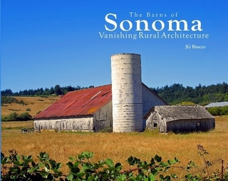
Typical barns in Sonoma are often whitewashed without offending the design board, but it can take some persuading to get a white-colored house approved. Credit: JG Bracco, Barns of Sonoma County (barnsosfsonoma.com)
Sonoma design guidelines call for buildings to disappear into the landscape: requiring earth tones that blend. We had to present to the county planners to explain how our design referenced the already existing vernacular.
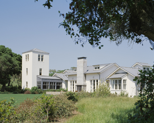
The farmhouse references for Walker Warner Architect's Sonoma Ranch are clear in this photo by Matthew Millman. Even the tower is similar to the silo in the barn photo shown previously. Photo: Matthew Millman
On the one hand there are Modernists who seek to create very clean, pure designs that are honestly about the present, stripped of ornament and unencumbered by the baggage of ages past. On the other hand, we have some high-end resort communities that REQUIRE a replicated Tuscan or Mediterranean style – that same literal historical interpretation that you resisted in the Hawai’i home. And then there’s Sonoma Ranch, which very consciously and intentionally echoes the forms of local buildings – but these are also from the past. Why’s it OK to reference history in Sonoma but not in Hawai’i?
Forced style of any sort can be problematic for obvious reasons. Those restrictions you mention are often typical of resort community design guidelines. If they’re poorly conceived, the results can be unfortunate. However, their intended purpose is to create a cohesive-looking community, which, in a way, is the same thing we strive for by making our designs appropriate for their surroundings.
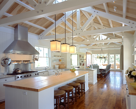
Despite the building's low profile, the interiors of Walker Warner Architect's Sonoma Ranch convey a sense of expansiveness and air. Photo: Steven Brooke
It may turn out that what a client specifically likes about a Tuscan home are the thick walls, the stone, the tile roofs. We try to dissect and re-interpret these qualities for the region and place that we’re actually designing for. You can edit the materials and the detailing and still satisfy both client and community.
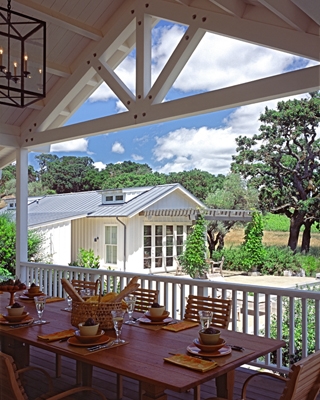
Sonoma Ranch by Walker Warner Architects. Generous porches add another layer of transition towards the outdoors. Photo: Steven Brooke
Guidelines can raise the quality of design in a resort so it doesn’t turn into a free-for-all. A building can have a Tuscan palette, and still be very contemporary. For example, in the Woodside project, we wanted a contemporary feeling that was evocative of a California barn. It’s a very modern building, but it’s rustic and warm, too.
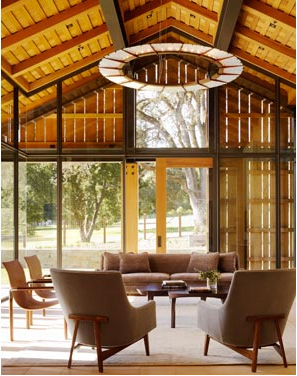
Walker Warner Architects, Woodside Residence. Once you get past the weathered-barn exterior, the living area is virtually walled in glass, but still shaded from the sun and screened for privacy. Photo: Matthew Millman
Some Modernists can have a difficult time with self-imposed palette restrictions – if they work primarily in exposed concrete and steel, they might find it difficult to satisfy community design guidelines that refer back to more traditional styles and materials. It’s risky for a Modern architect to push back against these design regulations, but it can be rewarding as well.
What’s the difference between a palette and a vocabulary?
Palette is just material. Vocabulary is inclusive of material, but also of methods and forms… more of a language.
Are you a Modernist?
I’m not a Modernist with a capital M, but I think I am forward-looking. I’m impressed with certain things about modernism, but it often seems lacking in what I like the most – warmth. There are restraints on how far I can go with a “Modern” vocabulary. On the other hand, Scarpa was a modernist, and yet his work is warm, textured, stunning and inviting – all the same adjectives you could use to describe the traditional buildings found in his Italian region.
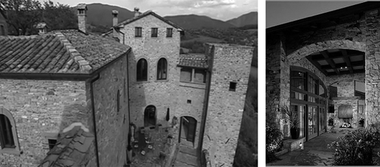
A true Tuscan building has smaller, more modest openings. Tuscan-style in California incorporates modern glass walls and expansive arches, which creates a feeling of greater openness and grandeur.
How do you draw out your clients to elicit the architectural qualities that they truly seek in their home, perhaps without knowing?
By referencing: both our work and that of other architects. Our library is extremely important as a communication tool. There is an ongoing dialogue throughout the project. We show projects to our clients that seem to us to have some of the qualities they seek – they give us feedback – and then we respond to that with informed suggestions.
What sorts of questions do you ask your clients?
We actually have a structured questionnaire for new clients. We ask questions to help them identify what the essence of their home should be. How do they plan to use it? What does a “home” really mean to them? We get them to talk about places or architecture that they have found inspiring. We ask them why they chose a property in the Bay Area as opposed to someplace else, and of course we ask them what they like. We also ask them, “What DON’T you like, and why?” We have to extract the essence of what they want and what they don’t want.
Some clients come to us with their own books, clippings, and references, but they haven’t articulated what they’re responding to in each selection. So, we ask them to write down what they like about each image or project. It’s engaging, on both a practical and an aspirational level.
Questions become more and more pointed as the project progresses. Early on, it’s more general, more gestural, and more about the senses than about daily practices. As the designs become more developed, that’s when we start asking them more detailed questions, such as how they prefer to arrange their toiletries.
You teach your clients how to respect the site and region where they want to build. What about livability?
Livability is one of our guiding principles, and yes, it can restrict innovation. We choose not to sacrifice livability – some architects do. Philip Johnson’s Glass House is a good example of a very modern home, but it does impose a certain lifestyle where you expose yourself to the outside. It’s very bold, and the Glass House is an extraordinary design. But it’s not for everyone.
Our Woodside project mixes both traditional and modern materials and elements by combining a caretaker’s unit that is actually the guest suite above a fully functioning barn. The barn has a stone facade that references rural buildings you might actually find in California, while the guest room above is a glass box that presides over the structure.
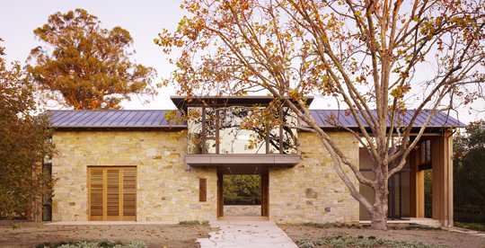
Walker Warner Architects, Woodside Residence. The guest suite glass box is an intervention that breaks up an otherwise monolithic, almost medieval-looking structure. Photo: Matthew Millman
Do you ever have to teach your clients how to live in their home, if a site-appropriate design requires changes to THEIR daily living habits? For example, in a home that relies on natural ventilation rather than air conditioning systems, you might have to get the client in the habit of opening a window instead of automatically switching on the A/C.
Do we have to teach our clients new ways of living? No. But sometimes, especially with young clients who are just starting families, we can draw on our own experience to remind them of needs they’ll soon discover for themselves.
Tell me about your materials. Are there materials you’ll never use?
As an example, we don’t use sheetrock in Hawai’i because of the humidity there, but it makes total sense to use it in some other climates. It’s more about appropriateness than an absolute list of choices. You learn about what works and what doesn’t in a particular place by studying the buildings in that area that have endured for a longer period of time.
We are more cautious than some in our exploration of new materials. If it’s too risky, or too trendy, we are more careful. It has to endure both physically and aesthetically.
We’ve looked at how you design for Hawai’i. Have you ever designed homes for colder climates? What do you do differently?
The same approach applies, namely, reviewing local buildings first and taking cues from them. One home we designed in Idaho is an example of a site-specific design for a high desert, mountain climate with hot, dry, sunny summers and cold winters.
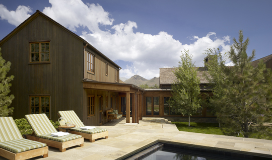
As with the Kamuela Residence, Walker Warner Architects began designing this residence in Idaho with clear attention to climate and local agrarian responses. Photo: Cesar Rubio
This home also references local agrarian structures.
So what constitutes good design?
To us, a good design should be livable, adaptable, appealing, and well-crafted with well-chosen materials.
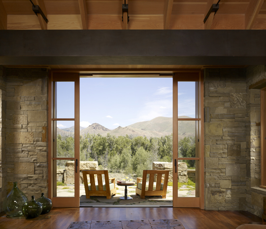
Walker Warner Architects, Idaho Residence. The interior of the living room is simple, with the same natural materials as the exterior, and welcomes in the outdoors. Photo: Cesar Rubio
Who’s your favorite architect? How did you decide to become an architect?
Vladimir Ossipoff. He practiced in Hawai’i where I was raised. I went to school as a day student at the Hawai’i Preparatory Academy, designed by Ossipoff. We all had to attend weekly Sunday services at the Davies Memorial Chapel, which he designed. I sat in that building each Sunday, twiddling my thumbs pretty much, staring at the same four walls. Without my even realizing it, that building imprinted on me. As I look back, that building is likely why I became interested in architecture.
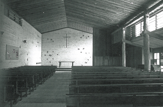
Vladimir Ossipoff designed the Davies Memorial chapel and most of the buildings on the boarding-school campus where Greg Warner spent much of his boyhood.
This revelation was actually a watershed for me, and we can follow the trail from there. An interest in fine art drew me to the University of Oregon, which has an architectural program that is steeped in the influences of context. By emphasizing sensitivity to site, I came to realize how naturally my own childhood buildings had come to shape my own point of view, and my appreciation of rural settings.
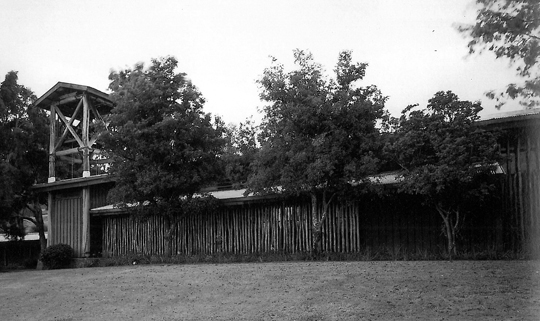
Davies Memorial Chapel, designed by Vladimir Ossipoff, located on the campus of the Hawai'i Preparatory Academy. Note the screen of natural Ohia logs, an element that Greg Warner has honored in subsequent designs from Walker Warner Architects.
Once you realize what your preferred design context is, you tend to seek out those contexts in future projects. This shapes your practice. If I had been born and raised in a city, I’d likely be an urban designer. But that’s not who I am.
What about Bay Area architects, past and present?
Many Bay Area Regionalists were also sensitive to site. Bernard Maybeck, William Wurster, Bill Turnbull. They were all forward-looking, yet they really understood the fabric in which they were working. My influences were primarily regionalists of the Bay Area and the Pacific Northwest.

Each of these rural wildnerness sites would require a different sort of architectural solution - or perhaps no solution, if it's on national parkland. Clockwise from top left: Sonoma, California desert, rural Italy, and Iceland
What do you think about the new generation of architects coming out of school today?
I’m an artist. I draw. [Drawing is a right-brain activity, whereas execution using computer-based tools is a left-brain activity.] Students today communicate more via computer than by hand. To me, the focus on the use of the computer has disabled creativity in that sense. Computers can be great tools, both for design and efficiency, but they don’t teach you how to think about a problem.
The process of design takes time. In today’s world, expectations are often focused on speed. Sometimes that means sacrificing the qualities that come from a fuller exploration.
Some designers work with a kit of parts that they’re familiar with. The advantages of this are it’s consistent, and it’s fast. You might compare this to cooking and recipes. There’s cooking from scratch, or there’s Betty Crocker.
Or, you can create your own custom mixes just to save time, but it’s still from scratch. Maybe that’s more a methodology than a recipe, though.
As a student especially, you owe it to yourself to explore as much as you can rather than go straight into formulaic approaches. You have to spend a certain amount of time in a discipline before it really becomes second nature. How can we expose students to the broadest possible range of possibilities in architecture?
Malcolm Gladwell’s book Outliers talks about something he calls the 10,000 hour threshold. It’s about how passion and a commitment to execution can become a differentiator by attracting better mentorship, which in turn raises your game even higher. I think there’s something to this.
[Note: My guess is that after 10,000 hours of practice, you will have honed your instincts and intuition to the point of a reflex that allows you to act both correctly and quickly, even under great pressure.]
Having said that, I do have some favorite details that I tend to use over and over again. One example is the steel beam resting on a wood column: simple, expressive, both durable materials used honestly.
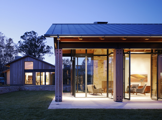
Walker Warner Architects Woodside Residence. Modern structural systems together with natural stone and wood finishes create a California hybrid architecture that responds to climate and contemporary needs. Photo: Matthew Millman
How do you convey to the clients a sense of longevity in your designs?
We’re designing homes with the client’s full life cycle in mind, and beyond. Their young children will eventually grow up into older children, and then go off to college. In the meantime, the home might accommodate in-laws or even their grown children’s return. The home has to be versatile enough to accommodate these life changes without requiring a renovation every 10 years. Sometimes this freaks out the clients a little bit! They’re not used to thinking this far ahead. But we’re creating their home as an heirloom and a legacy to future generations.


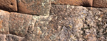


JG Bracco
23. May, 2010
I notice the cover of my photo book in your article, Greg Warner the Importance of Place. All the images have credit but that one.
Please add credit:
JG Bracco, Barns of Sonoma County (barnsosfsonoma.com)
Thanks
-jim
Mark English, AIA
26. May, 2010
Hi Jim, thanks for the catch. This interaction is the beauty of the media form. Enjoy, and thank you.
-Mark