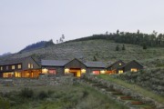
Brooks Walker: Respectful Designs That Last
by Rebecca Firestone with Mark English AIA | Interviews
I like to say that great clients create great buildings. The collaboration between architect and client is a dynamic tension, a matrix for ideas to coalesce. Constraints can be liberating because they give you a direction. It’s an art form, like classical music or haiku. You can’t just do whatever you want.
Our goal is to create a building that is so well designed, out of such durable materials, that no one would want to knock it down later on. We have to be careful about where and how much the architect’s ego should come in. After all, we’re not the end users. We want our buildings to outlast us.
A good motto might be, “Design something like you care.”
[Cover photo by Cesar Rubio]
[This is the second part of a two-part interview with the principals of Walker Warner Architects.]
Let’s talk about your early influences that led you to become an architect.
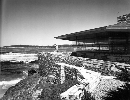
Growing up in San Francisco, I was exposed to architecture at an early age, although no one pointed it out as such. At age 3, I visited my great-grandmother’s house in Carmel. She owned a very unique Frank Lloyd Wright house, which to me was a magical world. Della Walker – that was her name – was widowed after WWII, and had a real artist’s sensibility. She bought land in Carmel on a rocky outcrop right by the water. It was the coolest little house.
It was a small house, originally only 1300 square feet or so. It was very site-specific, perched like a bird on the rocks. Even at age 3, I was wowed. It wasn’t like the other houses I was used to.
The living room was a hexagonal glass pavilion anchored around a wedge-shaped stone fireplace. It took 5 years to design and build, and my great-grandmother fought with the architect about the kitchen. I still have the correspondence about it.

The wedge-shaped fireplace in this home designed by Frank Lloyd Wright anchors the rest of the room.
She wanted an exit to take out the trash, and Wright insisted that it would destroy the integrity of the grid. Wright was willing to sacrifice practicality for an architectural idea. She had to fight to get a door. The kitchen is cramped and tiny, but for site context, the house is brilliant – a perfect fit for the tide pools all around. Going to that place was a transformative experience for me.
I’m fascinated by that hexagonal grid.
Wright’s work here is comparable to a Bach fugue. There’s theme, and variation, and repetition of it in various places, within that disciplined geometry.
What about other family members?
The rest of my family also inspired me. Della’s son, Brooks Walker, was my grandfather. He decided to become an inventor. He was the best grandfather a person could have. He was sort of a mad scientist. He was a machinist, too; he had a full wood and metal shop. He invented an anti-pollution device for cars long before they were popular. His influence on me was the fascination of building and making things.

Brooks Walker of Walker Warner Architects comes from a family of architects, artists, and inventors. Photo: Bruce Damonte
My uncle is still a practicing architect in San Francisco. Through him, I was exposed to the profession of architecture. In the 6th grade, I remember being in the middle of a geometry exercise in school, and I decided to become an architect. I told my dad, and he responded, “There’s a lot of starving architects out there.” I was crushed.
It’s a variant of the “You’ll never make a living at it” that I got from my folks about being an artist.
Maybe he was just spouting off. He was a businessman, and saw everything from that perspective. Still, it was discouraging. But I didn’t give it up completely. In high school, I was thinking about college and was into the outdoors – fly fishing and hiking among other things. I went to a boarding school with a great wood shop and worked on the weekends to build a kayak.
My mom took me to an occupational psychologist for career counseling. I took a bunch of tests and they suggested landscape architecture. It seemed to have all the things I loved the most: building, construction, design, landscape, the outdoors. The University of Oregon had a good landscape architecture program.
How did you like the architecture program at the University of Oregon?
The first year, all the architectural students were together. We all did the same design exercises. The second year wasn’t as good – it seemed vaguer and less structured, more about feelings and less about principles.
Architecture school had a philosophical divide between the architects and the landscapers in how you treat land. It’s a bit like the Democrats vs. the Republicans. The architects seemed to pay only lip service to context and site. The site was just a place for them to plunk down their architecture. It was about ego. The landscape designers actually mocked the architecture students as being insensitive to site.
Can you give some specific examples of buildings that you feel are successful, or unsuccessful, regarding site response?
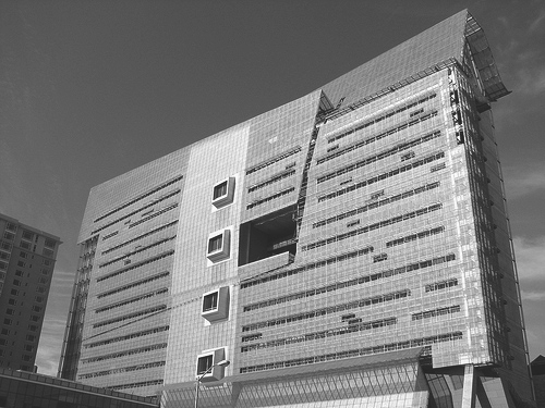
Well, one example that I consider to be unsuccessful is actually the Federal Building here in San Francisco. It was designed by Morphosis in LA, and LA is a land of freeways. Buildings there are plunked down and connected via freeways, with no pedestrian experience. LA is all about fabulously sculptural architecture that you have to drive to.
I think that urban buildings should enrich the pedestrian fabric. They shouldn’t be black holes. That building was a missed opportunity.
What about the plaza at the Federal Building? Don’t people visit it?
The plaza there doesn’t enrich the street experience.
[Conversation turns back to early influences]
Frank Lloyd Wright was very good at siting his buildings. He was very good at siting his buildings. Taliesin and Fallingwater are two examples of that, especially Fallingwater. It simultaneously blends with nature, and sits in opposition to it. There’s a tension between them. The stone versus the concrete cantilevered planes.
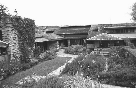
Frank Lloyd Wright's designs could be very sensitive to site and context. Shown here is his own studio, Taliesin.
Another influence that I was exposed to on a daily basis was Arthur Brown, Jr. He was a Beaux-Arts architect who designed San Francisco’s City Hall. When I was 10 years old, our family moved into a private home that he designed, and I grew up in it.

Frank Lloyd Wright's design for Fallingwater is probably his best-known work. A natural stream runs right through the building.
The Beaux-Arts movement trained people in things like scale, proportion, and symmetry – things that aren’t necessarily taught today. I never appreciated it that much growing up – too formal – but subconsciously I osmosed it. The house was so harmoniously laid out, like classical music. It was stodgy in a neoclassical way, but well-executed.
Quality can be hard to define. You don’t always know what it is, but you know it when you see it. As architects, our role is to educate our clients, to draw upon our clients’ experiences for what they’ve seen and liked in the past. They don’t always know why they like something and it’s our job to help discover that.
So that’s what constitutes good design?
Here are two quotes for you. One is by T.S. Eliot from the last of his “Four Quartets”:
We shall not cease from exploration
And the end of all our exploring
Will be to arrive where we started
And know the place for the first time.
The other is from John Fowles’ The Magus: “Design is a process to understand the essence of the client’s idea.”
How about a building that’s a good site response?
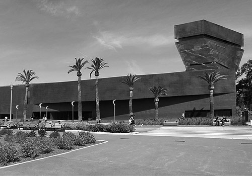
The California Academy of Sciences is a good example – in contrast to the De Young, which sits across from it in Golden Gate Park. The De Young is confusing. The massing is disappointing – to me, at least – and the interior is disorienting. I prefer an organized space with a central point from which to branch out. What’s interesting about the De Young is the copper skin and the detailing on it, the progressive perforations.
The Dominus Winery in Napa was done by the same architects as the De Young – Herzog and de Meuron. The rock wall there is conceptually brilliant. But, they were Swiss architects who didn’t think of rattlesnakes. They don’t have rattlesnakes in Switzerland, but they do in Sonoma. So that winery has a bit of a problem with attracting mice, which in turn attracts the snakes.
By contrast, Cal Academy has a central organizing concept so you don’t get lost. It’s built to a high environmental standard, and enhances its site with a light presence. It’s uplifting, rather than being a brooding monolith.
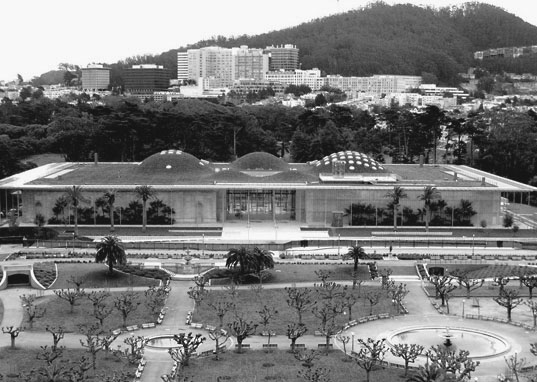
The California Academy of Sciences designed by Renzo Piano is possibly the most famous green design in the world, at least at the moment.
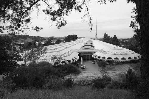
Another example of a well-sited building is Frank Lloyd Wrights’ Marin County Civic Center. It sits in the saddle between 2 hills, and by being in opposition to them it actually heightens those landforms.
A lot of modern museums are really disorienting to me. They’re like airports, but without the helpful signage.
Well, what is the purpose of a museum? At one time, a museum was a receptacle for its contents. But now, it’s about making a statement. The art is secondary. Buildings should be practical. Otherwise, it’s just really expensive sculpture, and it’s wasteful. It’s irresponsible to make buildings that are purely sculptural. It’s about the architect’s ego – a desire to create monumentality.
[ we had a short detour into the importance of the curator in a museum – not just to present the contents, but to educate people by telling a compelling story. From that perspective, certain design choices might be more justified. ]
Consider the motto: “do no harm”. It’s the architect’s version of the Hippocratic Oath that doctors take – don’t kill your patient. Don’t mess it up. It’s not a foregone conclusion that a building will automatically enhance the landscape.
Do you ever work in a modern style yourself, perhaps for a particular project where that would be a good fit?
We don’t usually get to work in a modern style, but one urban project we did was a remodel of a William Wurster house in San Francisco.
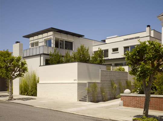
Walker Warner Architects renovated this San Francisco home originally designed by William Wurster. Photo: Matthew Millman
There was a fairly extensive historical review process that took 18 months to complete – eventually we got the project approved, and we really sought to be true to the spirit of Wurster’s original design.
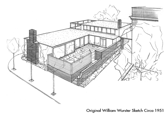
Original project sketch by William Wurster of a San Francisco home that was later renovated and expanded by Walker Warner Architects.
As a kid, I had also been exposed to Wurster’s work. We were friends with the Gregory family who owned the Gregory Farmhouse, which was also designed by Wurster. We would get together for Thanksgiving potlucks, sometimes upwards of 30 families. It’s a compound, with several buildings actually. It was built during the Depression with simple construction and a modest budget. But to me, this type of building is emblematic of the California countryside.
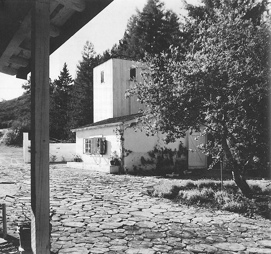
Brooks Walker spent some of his childhood at the Gregory Farmhouse designed by William Wurster in the early 1930s.
This is quintessential John Steinbeck country. Agrarian buildings, rolling hills, oaks, white barns, and a white water tower. It was buildings like this that started the trend of “ranch style homes” as a response to the boxy homes of places like Levittown.
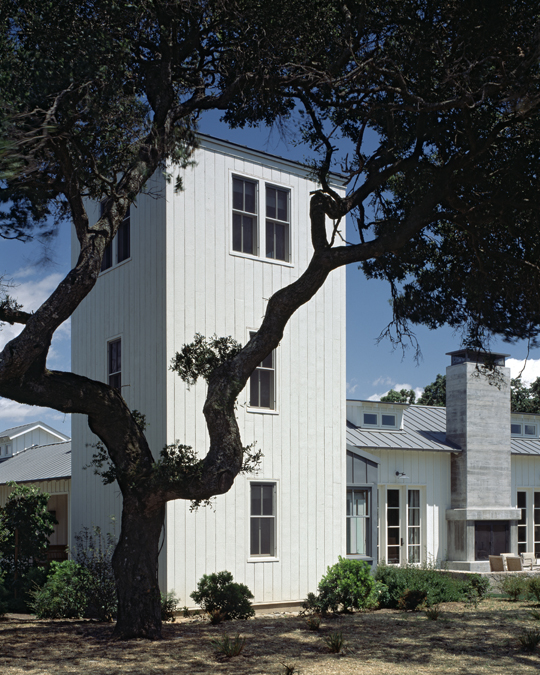
Walker Warner Architects, Sonoma Ranch. The two-storey tower structure in this new-construction home is a direct tribute to William Wurster's design for the Gregory Farmhouse. Photo: Steven Brooke
What about places you’ve been?
In terms of travel, one trip that made an impression was driving cross-country to take my sister to college in Maine. The deal was, I would escort her but we would stop along the way to visit buildings that I wanted to see. We saw the bank by Louis Sullivan in Iowa, and work by Frank Lloyd Wright in Chicago.

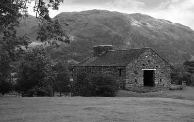
Rugged Scottish landscapes made a powerful impact on Brooks Walker during his European travels. Shown here is Eilean Donan Castle.
In Europe, the land made a powerful impact. Especially Scotland – it’s a very strong landscape compared with California. By contrast, here in America there’s a mercantile mindset. Driving up to Tahoe, for example, you see endless sprawl – strip malls in an endless replication of chain-stores and tract housing.
[Note: Lower image below is from The Onion and is not a real strip mall.]

European villages harmonize better with the landscape than strip malls - but you can't find a Home Depot in Tuscany, or can you?
Compare that to the villages in Scotland. People have been living in them for thousands of years. It’s more in harmony with the landscape, not the slash-and-burn architecture that you find here. Here the developers have a short-term view. They are not creating compelling environments that people will want 100 years from now. In Europe, they still think they’re building for future generations, not bulldozing agricultural fields for another strip mall.
A good motto might be “Design something like you care.”
Hmm, so what do you think about people like Zaha Hadid and Frank Gehry?
There’s a place for that kind of architecture, a place for pushing boundaries of what architecture could mean. But the lessons to draw from that are limited. Most of those designs are computer-enabled – new materials, new visualizations. It doesn’t create a fabric for cities. One exception in my opinion is the Guggeneheim museum in Bilbao [by Frank Gehry]. It’s a good response to its site and works within the context of the industrial town that it’s in. But it’s an exception.

Brooks Walker cites the Guggenheim Museum in Bilbao as an example of how even ultra-modern architecture can still fit the site - in this case, by echoing the industrial focus of the surrounding area.
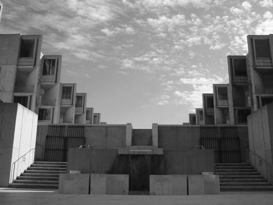
Zaha Hadid is first and foremost an artist and a sculptor. Rather than Zaha, my hero here would be Louis Kahn. His architecture shows a very deep understanding of how buildings are really put together, and their purpose. His notion of “servant spaces” for example.
Kahn’s work for the Salk Institute in San Diego is great and timeless design. It’s a laboratory where all the labs are pods, with views of the ocean. But there are also interstitial floors between the habitable spaces that have room for the building systems. Kahn knew that those systems would likely be replaced by new technologies later on, and he allowed for it in the design.

This cross section of Louis Kahn's design for the Jonas Salk Institute shows the "servant spaces" between the floors.
Kahn also drew from architectural history. I mean, why was the Parthenon great? It’s not about copying those buildings, but about the essence of scale, proportion. What is the meaning of arch, lintel, void, window, mass? Much of today’s so-called postmodern or deconstructivist work is not human-scaled. It has no sense of human proportion. But Kahn’s work will create great ruins!
It’s odd that preserving buildings often means the facade, but you can do anything you want inside it.
Floor plans aren’t sacred. It’s communal property rights that are sacred. So anytime a building’s exterior impacts the communal pedestrian experience, it’s a sensitive matter to change it. But inside… the owner has full rights to do whatever he or she wishes. Planning agencies can’t interfere with the owner’s right to modify their interior spaces. There are many examples of this in San Francisco, where a traditional facade in front conceals an utterly modern interior behind.
Now, just because you can gut the interior, does that mean that you should? My personal philosophy is to say that the inside of a building should somehow present a consistent experience with its exterior. It’s a matter of architectural honesty.
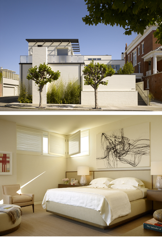
Unlike some San Francisco remodels whose starkly modern interiors bear no resemblance to their painstakingly preserved Victorian facade, Walker Warner's renovation of this William Wurster home is consistent between interior and exterior. The home seems in harmony with the greater site, even with the more traditional house next door. Photos: Matthew Millman. Interiors by Douglas Durkin Design
Well, other things have changed since the 30s. For one thing, floor plans are so open now that there’s no privacy at all. I know it’s the style, but does everyone really like that?
It’s a balance between promoting privacy vs. social interaction. In the old days, the kitchen was separate because likely there was domestic help in there. Nowadays, our clients don’t want to segment the house that way. If anyone’s in the kitchen doing the cooking, its them. They want their friends to hang out with them while they’re cooking.

The kitchen in Walker Warner Architect's renovation of this William Wurster residence includes sliding glass doors that allow the kitchen to be either open or secluded. Photo: Matthew Millman
If you’re not a modernist, what are you?
With the Wurster remodel we did in San Francisco, it was fun to do something crisp and modern for a change. But it still feels timeless. Timelessness and sustainability are qualities we seek in all our designs. Our goal is to create a building that is so well designed, out of such durable materials, that no one would want to knock it down later on. It should be so well-thought-out that it wouldn’t need to be altered much to keep up with the times. For example, although our clients for the Wurster renovation chose not to install solar panels at the time, we actually designed for photovoltaics in the future, in case they wanted to add it later.
A building shouldn’t just feel right today, it should still feel right 50 years from now.
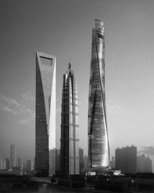
There’s a lot of architecture out there just to impress. Dubai and other emerging economies are all vying with one another to create the world’s tallest building. It’s like listening to children screaming, “Look at me! Look at me!”
We have to be careful about where and how much the architect’s ego should come in. After all, we’re not the end users. We want our buildings to outlast us. How do we design responsibly? So no, I’m not a “Modern”-ist. I’m a contextualist. I allow what is appropriate for the site to drive the design process.
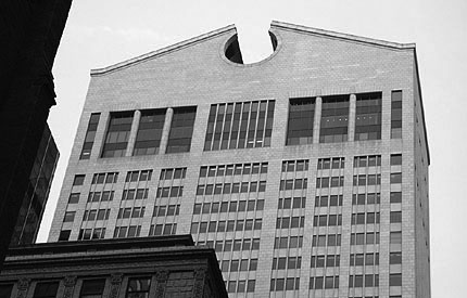
Architecture has lost its way. Post-modern architecture tries to make fun of historical references in order to “humanize” them. But there’s no understanding of what went into those historical forms.
Let’s talk about some of your projects. You’d mentioned Quintessa Winery as a good example of a site response.
It’s very gestural, driven by the client’s program which was to create a winery that used gravity crush instead of the more usual mechanical methods. It’s a method used by more high-end wineries. A winery is essentially a factory, but because of tourism, these factories look like chateaus, haciendas, and other fantasy buildings.

The Quintessa Winery, designed by Walker Warner Architects, blends into the hillside with a low profile - an antithesis to the soaring skyscraper. Photo: Mark Defeo
With Quintessa, we wanted to express its function while screening the less attractive work areas from visitors. It’s self-sufficient in energy use. On top is the visitors’ area, including sod roofs on either side which help stabilize the temperatures beneath. The white dots in the asphalt are actually chutes for the grapes, which are de-stemmed, crushed, and then funneled directly down into the fermentation barrels below. On the front, the stone wall arcs around, screening the less attractive work areas from view.

Walker Warner Architects screened the work areas at the Quintessa Winery, shown on the left, behind the sweeping curved wall shown on the right. Photos: Richard Barnes

A hand sketch of Quintessa from Brooks Walker showing a distance view of how the curved front wall integrates into the hillside behind.
When I’ve spoken with other architects, they always cite the client’s willingness to take risks as a major factor in what they can actually accomplish.
I like to say that great clients create great buildings. It’s a bit like making crystals in an 8th-grade science class. You need a string in the solution to give something on which the crystals can form. The collaboration between architect and client is a dynamic tension, a matrix for ideas to coalesce.
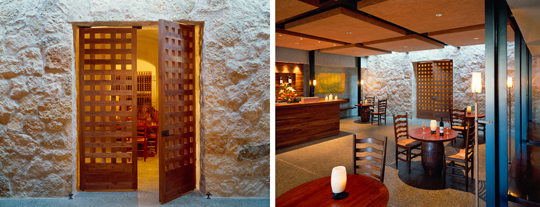
Thoughtfully finished natural materials such as stone and wood predominate in the visitor center at the Quintessa Winery, giving the rooms a timeless, elegant feeling. Photos: Richard Barnes
Constraints can be liberating because they give you a direction. It’s an art form, like classical music or haiku – there are constraints, and discipline. You can’t just do whatever you want. For us, the constraints are context and site. We spend a lot of time on the site itself.
Our ideal is to have a client who’s already lived on the site for years, and they know every breeze, every bit of hillside, every patch of sun. The site is not just the topographical contours! The map is not the territory.
Do you think a site can have an actual spiritual presence?
Christian Norberg-Shulz wrote a book called Genius Loci which means more or less spirit of place, or genius of place. The question with a building is, should it blend in, or should it sit in contrast. It’s important to note that a building can harmonize with the landscape even in contrast to it. Just because something is “contextual” doesn’t mean it always has to disappear. There is more than one way to harmonize with a landscape.

Even in nature, some creatures are almost invisible like the toad on the left, while others… who could say that this lion doesn't harmonize with his surroundings, even though he's clearly visible?
What about young architects today? Are they getting the right training?
The new kids coming out of school now have tremendous skills for 3D visualization on the computer, while we still use pencil and paper! Of course, we use hand sketches in combination with 3D visual tools. So does Frank Gehry. He just crumples up a piece of paper for the basic idea, but then he has a studio of designers to help with the detailed renderings.
Our office just implemented BIM technology. It took us a year and a half, and was very costly and time-consuming – training, designing templates, and just using the tool. BIM is very accurate in 3D visualization, but it’s easy to get sucked into detailing too early, before the overall design is really resolved. Its strengths, however, are that the next design phase is easier precisely because you’ve already worked out the detailing. It changes how we have to interact with clients, because the clients may not be ready for those details at the early design stages.
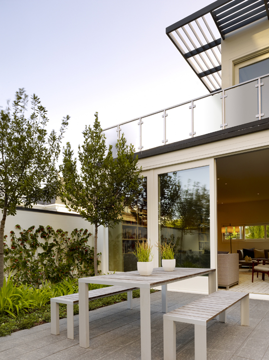
The courtyard of this William Wurster renovation by Walker Warner Architects shows how interior and exterior spaces flow into one another and present a consistent aesthetic that is true in spirit to Wurster's original design. Photo: Matthew Millman
The new generation of architects have such powerful tools at their disposal. They’re expert users in all these tools, but they’re lacking training in basics like proportion and scale. The schools used to teach that, but don’t anymore. There’s only so much you can teach in a five-year program, and the schools have to make hard decisions about how to focus their curriculum. What are the core skills that new architects need, in order to be prepared for today’s profession?
It’s like playing a style of music that’s purely improvisational rock. There’s no underpinnings, no discipline behind it, no real architectural knowledge. Picasso, for example, was classically trained. Artists from his era had skill sets so that they were departing from something, not from nothing. The newer generations can’t draw. How do they even know what is a really well-proportioned space? The schools are teaching a lot about sustainability these days, and that’s good. But sustainability can’t be at odds with livability.
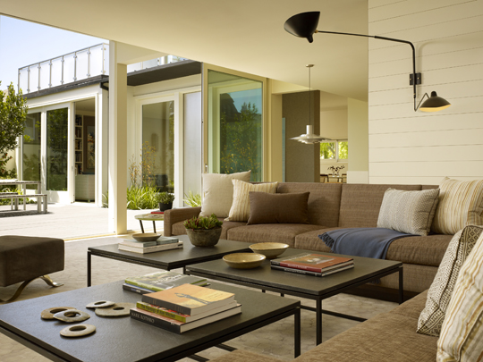
A second view of the courtyard of the Wurster renovation, from the living room. The glass wall can open completely, further blending the indoor and outdoor spaces. Photo: Matthew Millman
I’m a history buff, with an interest in modern European and U.S. history, as well as that of Japan and Asia. It’s important to consider the economic, political, and ecological forces that shape societies. History is an instructive guide.
China is now a very interesting example. It’s one of the oldest cultures around, over 5,000 years old, very advanced, and disciplined. Then, in the 1960s they had the Cultural Revolution which swept away everything from the past. Now they have another revolution of sorts happening, in architecture, knocking down older buildings in favor of showy, ultra-modern marvels. European ego-architects who express the new Chinese culture of money. They’re putting up all these showy buildings that don’t fit with the site, and are not sustainable.
To create relevant architecture, you have to draw upon wisdom from the past and create a synthesis between past and present. As the saying goes, don’t throw out the baby with the bathwater.
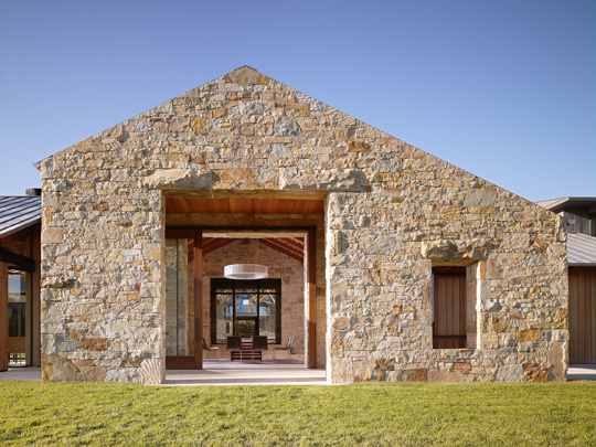
The Woodside residence by Walker Warner Architects mixes old and new. The shape references local barn structures; the stone material references very old materials and building methods; however, inside the walls, shielded from the elements, is a modern and light-filled interior. Photo: Matthew Millman
In the previous segment of this interview, with your business partner Greg Warner, Greg mentioned that Walker Warner is very selective with clients. When do you actually turn away a commission?
Well, if a client really wanted us to re-create a 300-year-old Tuscan villa, that would be fake. We would instead want to look at the essential qualities – massive walls, for example, rather than seeking surface replication. Ultimately, we have to do what’s right for the region.
When clients ask you about sustainability, what do you tell them?
Basically, we think that sustainability should be a given – not an add-on. For one thing, our buildings are designed to last, to have usefulness beyond styles and trends of the moment, and to be cherished and preserved by their owners. Beyond that, we have a system for evaluating a client’s desires for sustainability. Finding out where each client stands on the topic is important – it’s part of our process of getting to know our clients and helping to steer them in an appropriate direction.
Level 1 is our office “standard of excellence” and what I call the “pre-green” stuff. These aspects are practical, sensible considerations that should be part and parcel of every design. Response to climate, orientation, building envelope design, appropriateness of materials, natural light, ventilation, and solar access should all be considered to design an efficient yet livable home. It’s part of the basic responsibility that we as architects bear as part of our profession.
Level 2 is about using proven sustainable technologies, systems, and materials that can offer a return on investment over a period of time. We conduct energy, habitat, and building site studies to identify the best opportunities to increase the project’s efficiency and lower the impact on the environment. It’s always desirable for us to reach this level of sustainability.
Level 3 is for clients who are deeply committed to their green values. Quite often these sustainable choices do not directly benefit the project, but they do offer less impact on our environment, both locally and globally.
The overall goal is to enhance livability by promoting healthy indoor environments, comfort and efficiency, while creating architecture that will endure the test of time.






Frank Lloyd Wright: Della Walker House | tenthandstark
29. Nov, 2011
[…] Walker’s grandson Brooks Walker remembers being three and visiting his Grandma in Carmel, and no guessing what profession Brooks […]
John McVey
03. Jan, 2012
Enjoyed this interview, which I stumbled on by accident, whilst searching for information about Brooks Walker, his “fifth wheel” parallel parking device (his “Vehicle lifting and traversing device, one version of which is described in US patent 3095936 (1963).
Good questions here, and good answers (including what constitutes “good design”).
Thanks,
Barnes Walker Landscape Architects | photography - landscape photography
17. Dec, 2015
[…] Brooks Walker: Respectful Designs That Last | The … – Interview with Brooks Walker of Walker Warner Architects, a San Francisco design firm. […]
Brooks Walker Architecture | New Architecture Fan
07. Mar, 2016
[…] Brooks Walker: Respectful Designs That Last | The … – Interview with Brooks Walker of Walker Warner Architects, a San Francisco design firm. […]
SAYAG Frederic
07. Nov, 2018
Dear Mister Walker,
i’m architect in the south of France, and very interesting by the Architecture and ideas of Frank Lloyd Wright, from many years.
I came for holiday in California, Monterey, and Carmel…, in august 2019.
Do you think it will be possible to visit the Walker house ?
Best regards
SAYAG Frédéric
Architect DPLG