Olle Lundberg: Hand of a Craftsman, Part 2
by Rebecca Firestone with Mark English AIA | Interviews
“[With star clients] you have to be really “on”. There’s not much time to impress them… it’s that initial gesture that counts. You have to gain credence quickly, and bring something to the table that they didn’t expect. [When I get a new idea] it’s dreamlike at first. The idea has to be vague enough to be flexible, but clear enough to be able to return to it. I have to be disciplined about working quickly; ideas can dissipate like fog.”
This is Part 2 of our exclusive interview with Olle Lundberg of Lundberg Design. Read Part 1 here.
So do you care about the people or the building?
The building. The users are recipients of the gift. But the craft cannot exist without the craftsman. You can take something hand-crafted and replicate it by machine, but then it’s no longer craft. Craft is when someone puts their name on it. We don’t do industrial processes, we don’t do engineering. We do jewel boxes, unique one-off projects.
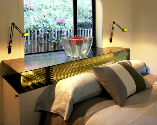
Private homes designed by Olle Lundberg typically incorporate built-in sculptural elements such as this glass window sill at Sky Ranch. Photo: Courtesy Lundberg Design
What’s your design process? Suppose you’re starting with a lot that’s 25 x 150 feet. How do you go about it?
First, I visit the site to get a gut reaction for what wants to be on the site. While I’m doing this, I’m also solving for the plan. The plan is the diagram that drives everything. The key is to get the form to align with the plan. The form is the gut-level instinct: the site, the parameters, the context, the opportunity, the hidden: what is it that no one is seeing, that we can bring out in the design?
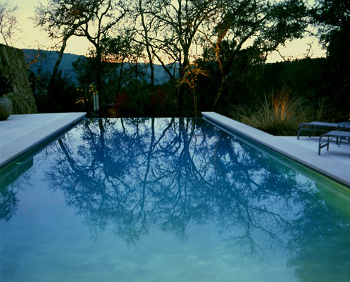
Did this pool "want" to be on this site? It would seem so. Crull Residence project by Lundberg Design. Photo: Elena Dorfman
The plan is how do you make this thing work. I’ll draw the plan with couple of sketches in 3D, put it on the computer in Revit, and start working in 3D. Revit always thinks you’re further along than you are! Then we build study models, to fix things. Physical models are good for communicating with the client, and they force us to confront and see problems.
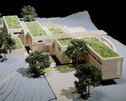
Physical models made by Lundberg Design are finely crafted down to the very last detail. Model by ZdP. Photo: Gerald Rotto
How does that first gut reaction come to you? Do you see a picture? A visual image?
No, I don’t see a picture exactly. It’s more like a 3-D sense. It’s dreamlike; I can’t pin it down exactly how I sense it. The idea has to be vague enough to be flexible, but clear enough to be able to return to it. I have to be disciplined about working quickly; don’t caress the idea and hang onto it endlessly. Ideas can dissipate like fog.
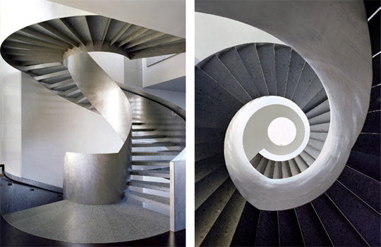
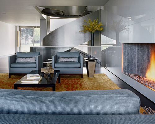
The Pacific Heights project from Lundberg Design is dominated by the idea of a central circular stair, and circles - or, more precisely, round holes - are echoed in other details as well. Photos: Art Grey
In the Hourglass Winery project, the initial idea came to me as a notion of earthwork – a cut, a violation into the hillside; a strong gesture, and the idea of a cave, what it means to express a cave and the act of digging into the hillside. Cutting into the hill also allowed us to preserve more of the cultivated land for vineyards. Good vineyard land is the most expensive agricultural land in the world!
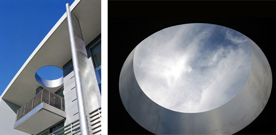
Lundberg Design's Pacific Heights project includes a circular roof opening to welcome in the sky. Left photo: Art Grey. Right photo: Ryan Hughes
There was an episode of Mad Men where one advertising guy came up with a great idea while drunk, and you just KNEW he was going to forget about it by the morning. It was agonizing to watch. The movie All That Jazz had a lot to say about the creative process and the angst that goes with it.
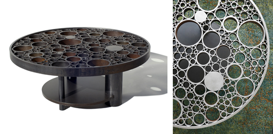
Olle Lundberg created the "Omm Table" as a custom piece for the Pacific Heights project, and again the hole is celebrated, on a series of smaller scales to the overall parti. Left photo: Ryan Hughes. Right photo: Art Grey.
Does form follow function, or does function follow form?
They go hand in hand, but if I had to choose, I’d say that function follows form. The form being the initial gut reaction of what wants to be on the site. It’s not pure form though, because in a sense the idea is already grounded in the program.
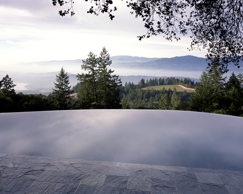
The Benioff Pool project from Lundberg Design blurs the boundaries of water, earth, and sky. Photo: Cesar Rubio
To be effective, architecture has to have a plan that works really well. Form can totally dominate in some projects, and yes, some sites seem to demand a formal solution, i.e., a “form”. But you have to make the plan work. In the example of the 25 x 150-foot lot, the form may be less important because you don’t have as much flexibility on the outside. Then, the challenge is to make something interesting out of the function.
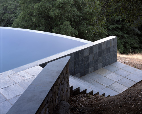
Olle Lundberg created something visually interesting out of the function of a pool by approaching it from a sculptural aspect. Photo: Cesar Rubio
How might this apply in specialized projects, such as your building lobbies?
I’ve done a lot of lobbies for clients who want to re-position their building. Actually, changing the front door and lobby is a way of transforming the building with minimal intervention. A good front door and lobby helps because people recognize where the entrance is. It makes them want to go in, and once inside, their reaction is strong.
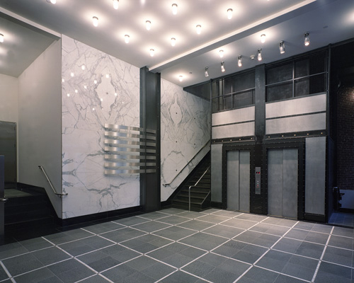
Olle Lundberg re-designed the building lobby for 445 Bush Street in San Francisco. Photo: Courtesy Lundberg Design
Tell me about your materials. Why do you like natural materials, and why are you so particular about them?
We like materials with depth and heft. I’m not a veneer guy. I prefer materials that have an elemental quality, a power about them. The power comes from the natural piece that they came from, or from the way the material was created.
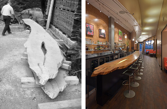
Olle Lundberg chose to preserve the elemental quality of this 30-foot timber slab that became the counter at Heaven's Dog. Left photo: Nick Polansky. Right photo: Ryan Hughes
Our palette is nature-oriented. Even steel, I consider a natural material, because it comes out of the earth. And, if it rusts, the connection with the earth is visually that much clearer.
At the dawn of humanity, blacksmiths were revered as almost magical, because they knew how to extract iron from ore and forge it into blades and tools.
Our office has a fascination with materials. We’re always looking for unusual stuff in unusual places, or ways to use ordinary material in new ways. One example is from our lobby for 1333 Broadway. We found tiles of Indian slate really cheap – around $1 per tile – but we did something different with it.
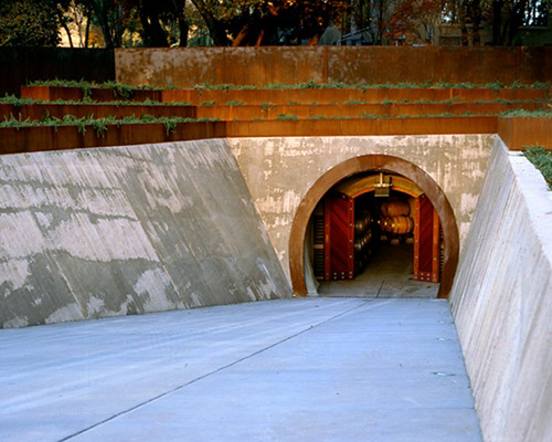
Steel is a "natural" material for Olle Lundberg. For the Rudd Winery project, he chose a type of steel that rusts to a rich russet earth tone. Photo: Courtesy Lundberg Design
It turns out the back side of this slate is scored, by hand, to make it easier to stick to the mortar when setting. And the hand-made nature of the scoring gives it a little bit of irregularity, that hand-finished touch, that is more interesting than doing the same thing by machine. So, we set the tile with the back side up to show this texture.
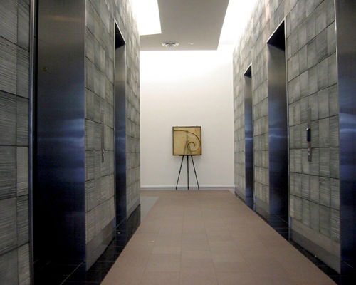
Most visitors to this lobby at 1333 Broadway in San Francisco wouldn't guess that the slate tiles were intentionally installed reverse side up to show their hand-scored texturing, which was an accidental piece of luck for designer Olle Lundberg. Photo: David Battenfield
In order to really find these material treasures, you have to visit the source, visit the stone quarries, the sawmills, and look for the weird stuff. Look for the pieces they’re throwing away.
So do you have to go all over the country to find the right quarries and such?
Usually for a project we’ll start locally, because it’s more sustainable, and it’s better to support the local economies. So we start with whatever is around and go from there.
Here’s a story for you. Apple was building a retail store in Hawaii and they wanted a wall that was veneered with pieces of volcanic lava. It was so smooth that it looked like pre-cast! But at the quarry where they were cutting out the lava pieces, they had a big throw-away that had too much texture for them.
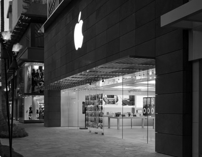
It's hard to tell in grayscale that the perfectly smooth facade of this Apple Store at the Royal Hawaiian Center in Waikiki is made out of volcanic lava. However, Olle Lundberg was more interested in the flawed pieces that weren't used.
Manufacturing makes stuff more predictable, but then any flaws tend to make the material less valuable as a commodity. However, these flaws also make the material more visually interesting.
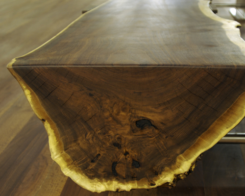
Hand-crafted benches for VMWare lobby by Olle Lundberg show the natural textures and irregularities of these sustainably harvested, hand-selected walnut trunks. Photo: Ryan Hughes
Can you deliberately induce “natural” flaws? I have to say, it’s a lot harder than an accident that didn’t require intervention. Even tossing leaves up to create a random pattern doesn’t work that well when the intention is too focused on that result.
It’s better not to, because it isn’t as honest. It’s better to use patterns based on something you found. At least that’s been my experience.
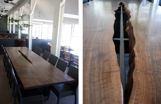
The Presidio Social Club project from Lundberg Design includes a table with a single flaw that makes the table, and the entire room, that much more interesting than a "perfect" piece would have done. Photo: Nick Polansky
You’ve been fortunate to have worked with some very high-profile clients. What’s it like working with clients who are that smart, that accomplished, people who are at the top of their game?
It’s a little intimidating. You feel like you have to be really “on”. There’s not much time to impress them. I’m a fast designer, and it’s that initial reaction – that initial gesture – that counts. I have to sell them on that and gain credence quickly. You have to surprise them, and bring something to the table that they didn’t expect. If you are too predictable, that’s not going to hold their attention for very long.
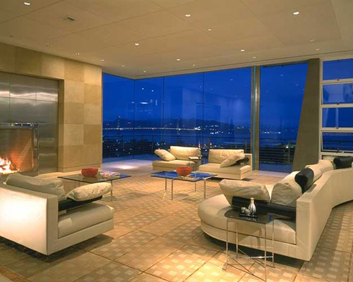
Olle Lundberg's most famous client may be Larry Ellison, founder and CEO of Oracle Corporation. Photo: Richard Barnes
In the end, though, it’s fun working with really smart people. They really challenge you. They’re smart, imaginative, exciting people to work for.
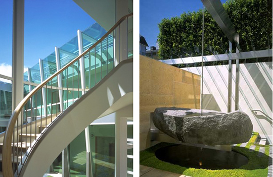
Another great thing about high-profile clients is that they're often risk-takers who are open to creative thinking. Photos show details of the Ellison residence by Olle Lundberg. Photos: Richard Barnes
It’s too bad there aren’t more clients willing to be adventurous with design. I think Modernism has an image problem. It seems as though people in this area, particularly in high-tech, are more interested in fake Tuscans and conventionally designed homes.
It’s true. People here in America are not that educated in design, not that appreciative of it outside the main enclaves – New York, L.A., Chicago. They’re defaulting to what they already know. But I think we should be designing for the era that we’re in, not some period from the past.
Here’s what I think of as a typical situation. We’ve got these young guys, in their early 30s, who’ve already made millions in the technology industry by thinking out of the box, by taking changes, by inventing something really cool. But then, they want a Georgian mansion with a brick facade. They don’t want to take risks in their home design the way they do in business. One could ask: why wouldn’t you want to live the rest of your life with that same sense of adventure? Instead, they seem to want a dream, a dream of what life used to be like.
Maybe they turned back to their own childhood when it came time to start their own families.
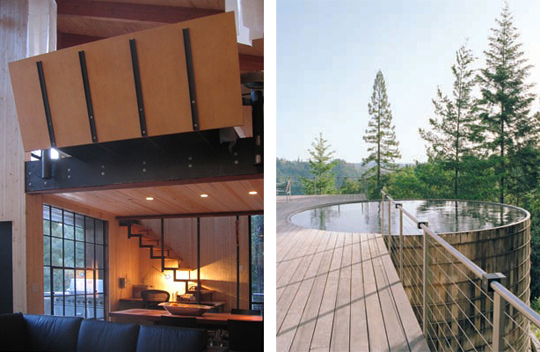
Olle Lundberg calls his own cabin "The most over-published one-room building in the world." (And here we are, publishing it again.) Its lack of adherence to "traditional form" embodies Lundberg's own sense of adventure. Photo: Courtesy Lundberg Design
Modernism in America was kind of the badge of the new corporation, a symbol of it if you will. Corporate sponsorship is one reason why Modernism is so prevalent. It’s very hard to do Modern work in San Fancisco. San Francisco as a city is very visually conservative, and is totally mired in the past. They’re in love with Victorians, and there’s no history of Modernism as there is in other places like New York. And it’s very difficult to win neighborhood approval for contemporary designs in neighborhoods like Seacliff or Presidio Heights.

The Grouf Residence by Lundberg Design might have encountered neighborhood opposition if it were built in San Francisco instead of Sonoma. Photo: Adrian Gregorutti
Also, some of the Modernism that does exist in San Francisco is not so good. They destroyed some old buildings to put up more mediocre stuff. [Perhaps it’s understandable that] the attitude in San Francisco is they don’t want things to change. Fortunately, my firm has a track record of doing beautifully-built buildings, and both the San Francisco Planning Department and the Planning Commission have been very supportive of us. Pacific Heights, not so much.
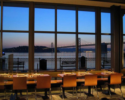
Multiple scales show in Olle Lundberg's interior for the Slanted Door, which also makes use of industrial structures such the Bay Bridge seen in the far distance. Photo: David Battenfield
But these modern corporate campuses aren’t really public spaces that people can experience every day. But then, some architects are very idealistic, and they want to create rapidly-fabricated, well-designed, non-toxic housing for disaster survivors, housing that’s not temporary throwaway trailers but real housing.
I don’t believe that you can really change the entire world through design. Architects take themselves way too seriously sometimes. But even if you can’t change the world, you can make it better.
Our firm’s work is really about small projects carefully crafted, and relatively modest buildings. Legacy buildings, that people appreciate too much to tear down later on. There’s an honor in doing that as well. Of course, maybe I’ll be the curse of the next generation of architects – they’ll have to petition the historic planning commissions for permission to alter them!
How come your projects always photograph so well? They almost seem to photograph themselves!
The secret is that Ryan from my office does all the photography now! The only thing is, I have to keep buying him new lenses to keep him happy.
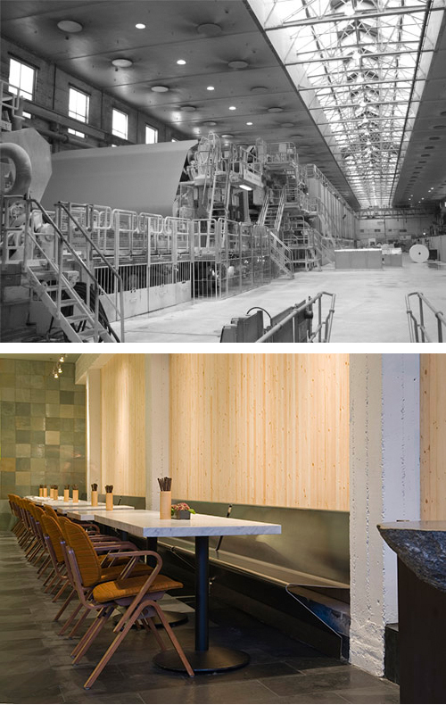
Perhaps the reason why Olle Lundberg's projects seem to lend themselves to photography is the long line of sight that reveals an overarching sense of orderliness and appropriate scale for the function being performed. Lower photo by Ryan Hughes shows the interior for Out The Door, a project from Lundberg Design.
Do you think architects should like their clients?
For houses – yes, absolutely. It’s hard to design a home for someone you don’t like. It’s not just “liking” them, either. You have to relate on a fundamental level. For me, most of my residential clients have become good friends. Our project work together was our trial by fire.
If you could design any sort of building, what would you really like to do?
I’ve done one winery from the ground up – that was the Hourglass project – and I’d love to do more. My graduate thesis was a winery. Wineries have such a strong and literal link to the landscape, and to the product of that landscape. The process of wine-making is half science, half magic or art. You’re taking product out of the earth and then taking it back into the earth again.
It would be fun to do more civic work. We’re doing bus shelters – that’s a start. Civic work is a very tough process. Everything gets watered down in committees. Much of our work is for private clients and it isn’t seen by that many people. Restaurants are seen by more people, but they’re mainly interiors projects, and sometimes they have a short life span. The Wine Elements project we did only lasted 8 months.
It might be fun to do a high-rise. I’ve worked with developers, and some of them are very good clients. Our lobbies are an example of a developer project – it’s like plastic surgery or sex appeal for an old, tired building that needs a quick face lift.
What about churches?
That’s true, I haven’t done any churches yet. [Shows us a 30 foot log remaindered from a recent lobby project] This log is so elemental, it just needs to be upright, as a centerpiece in a church. What better altar could you have than a magnificent natural piece of wood like this?
How the heck did you install that three-story steel spiral staircase in the Pacific Heights house and make it look like it’s all one piece?
That stair was built as one piece by NorCal in Oakland. With a fifteen-foot diameter, it was pushing the limits of what we could transport on a low-bay trailer, especially over hilly areas in San Francisco. We couldn’t take it over the Bay Bridge; we had to find a roundabout route, and crane it into the house through a hole in the roof at 2am.
And the San Francisco Planning Department didn’t even question it!
Structurally, it was important to make this three-story stair strong enough. One firm wanted $60,000 just to engineer it. We did a one-story prototype instead, for $3,000. This is where having a shop is indispensable. You have to incorporate the process in the design, try things out as you go, solve problems in new ways. Materials and design concepts alone won’t get you there if you’re trying to do what no one has done before.
[Note: Apparently there’s some awesome video footage of the stair being lowered through the roof by a crane, at 2am. We’ll link to it as soon as it becomes available.]

