Modern Pied-a-Terre
by Rebecca Firestone with Mark English AIA | Work/News
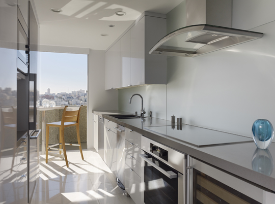
A project from Mark English Architects was recently picked up on both The Contemporist and Houzz.com. Over a year and a half, Mark English and associates Greg Corbett and Sloan Kelly, transformed this upper storey apartment from a humdrum 1960s shoebox into an oval-shaped theatrical experience – sexy and elegant. Interior designer Gary Hutton chose the furnishings that perfectly complemented the architecture.
(Photo by Matthew Millman)
We usually don’t use this blog to brag about our own work, but this time we had to. We’re very pleased and flattered to have our Fontana Building remodel featured on two major design blogs: The Contemporist and Houzz.com.

This interior remodel from Mark English Architects transformed the original early 60s decor into a sleek and sexy pied a terre. Photo by Matthew Millman.
Getting recognition for good design is a challenge that all design firms face. It used to be all about “getting published”, back when when getting featured in high-design magazines like Architectural Record was the pinnacle of architectural fame. Firms hired publicists to pitch and place stories, invested in professional photography and staging, and relied on insider connections to get the ear of a senior editor.
Now there are a greater number of places to present work. Magazines, books, and academia all retain a big role in promoting vanguard design ideas and emerging technologies. But now, online media has become the new go-to sourcebook for the general public consisting of architecture fans, potential design clients, and various professionals.
Yes, getting published is still important, and that still starts with having great photos. Typically, the architect has limited influence over the client’s interior design choices. But if the photos are cluttered, or the furniture is mediocre, the designs just don’t look as appealing. And there’s not much an architect can do about it.
That’s why this project was so exciting for us. We were doubly lucky that the interiors got the finishing touches from Gary Hutton Design that made the place picture perfect. And, photographer Matthew Millman‘s sensitivity and dedication to detail brought out every last bit of texture that, in person, make the place the perfect pied-a-terre.

The original layout had a wall that blocked the line of sight out to the San Francisco Bay. The revised plan maximizes the dramatic views and creates a theater from which to observe spectacles such as the Fleet Week aeronautics as well as Fourth of July fireworks. Parti sketch: Mark English Architects