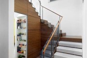
Zack/deVito Architecture: Designers and Master Builders, Part 2
by Rebecca Firestone with Mark English AIA | Interviews
“Even though a painting is ‘done’ it’s never really done. I’m always walking around my house and wanting to pull a painting off the wall and work on it some more. Or I look at something in the house and wonder, ‘Why did I do that? What have I learned from that?’ One needs to be continually asking that question.” – Lise de Vito
This is the second of a two-part interview series with the principals of Zack/de Vito Architecture. The first part, which you can read here, featured Jim Zack. Here, Rebecca Firestone (RF) of The Architect’s Take chats with Lise de Vito (LD) about her art and design approach.
RF: How did your fine-art background lead you to become an architect?
LD: My dad was both an industrial designer and a graphic designer. My mom was a fine artist, but she had also studied apparel design. From a young age I was exposed to a visual world wherein decisions were made on a visual and a cerebral basis. I would go to my dad’s office after school and there would be a full collection of markers and tools, letrasets, etc., that we could play with… my sisters and I had a heyday!
LD: Our parents took us to museums and would ask us questions: “Do you like this?” or otherwise try to get us to talk about what we saw. As a kid, I didn’t always like being forced into engaging.
In high school, I didn’t know what I wanted to do, and ended up pursuing a strong liberal arts curriculum. Architecture was the culmination of everything I’d studied: fine art, color, a graphical way of presenting an aesthetic.
RF: What do you get out of painting as opposed to architecture?
LD: There are similarities between the design/build process and the process of painting. Both start in a way with a blank canvas. With a building, certain parameters are laid on [spatial, programmatic, economic, regulatory]. With painting, all those parameters are self-imposed. But in both, there’s a process of layering, of making decisions based on earlier decisions, resulting in an outcome.
LD: It’s interesting that my painting and my architecture are so different. My paintings are rough, loose, layered, and abstract. But the architecture I do is crisp, graphic, and clean – but still a juxtaposition of materials that make up the whole. There’s still a roughness to each individual material. It’s the composition that defines it and cleans it up.
The construction process is quite messy. It doesn’t seem as if a project in the middle will ever get done. That’s interesting to me, too; from the chaos, to the recognition of the intent.
LD: Architecture is a crazy profession. The process is so lengthy. It is insane in terms of the time that it takes to design and build something. Painting is an outlet that offers a certain immediacy, to satisfy artistic yearning.
RF: But paintings can take a long time to finish, too.
LD: That’s true! And even though a painting is “done” it’s never really done. I’m always walking around my house and wanting to pull a painting off the wall and work on it some more. Or I look at something in the house and wonder “Why did I do that? What have I learned from that?” One needs to be continually asking that question.
RF: How do you and Jim work together on projects?
LD: Since I’m in the office part-time, the speculative projects work out well for me. I do the developer stuff [the houses Lise and Jim have built for themselves and then sold]. We’ve done three of these so far and are currently living in #3. The first was a remodel, and the second two are new construction.

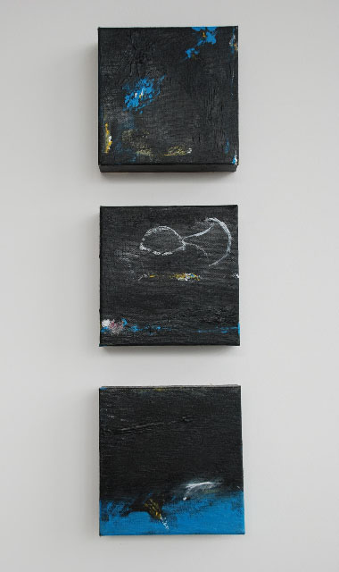
"Been There Done That" artwork and detail, by Lise de Vito (2005); acrylic, wax, masking tape, paper, No. 2 pencil on canvas
LD: It’s a very different relationship to not have a client. It’s nice, but I also miss the interaction with a client. Now I have to make every single decision myself. The husband-wife partnership is a good foil, because I have someone to bounce ideas off of. Otherwise it feels like I’m designing in a vacuum.
RF: What’s it like, living in your own work?
LD: I’m very lucky to have such an incredible learning experience. When you become the client, you realize how hard it is to be a client. Especially a client who’s never worked with an architect or designed anything before. There are so many things most clients have never even thought about: what they like, or need, or want – and how they want to manage their own project.
Some clients that come to us are just overwhelmed. Working on our own homes has given me a lot more empathy for the role of the client.
LD: The process of drawing a plan in scale and being able to see it spatially is a skill that architects develop, but it becomes really honed when you live in your own projects. You get a heightened understanding of what that skill means, where things should go, and how to accommodate the human body.
RF: How do you consider the human body in design? Can you enumerate the factors?
LD: Well, a home is not supposed to feel uncomfortable. Many people have this view of modern architecture as uncomfortable, mean, cruel, and sharp. Bloggers have seen our work and asked questions like, “How could they raise children in there? Where are the chatchkes?”
RF: Well I wonder that too sometimes. I mean, people go crazy child-proofing their homes. How safe are these minimalist contemporary homes with all those hard edges?
LD: Kids adjust… just let the child learn about their own bodies by maneuvering through the world. They can learn their way around even a modern home just fine. Once they get used to the home, they can find their way around even in the dark because they know the space. My kids have never had trouble in any of the homes we have designed and lived in.

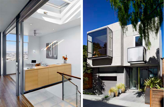
A versatile space can accommodate work and play, as seen in these two projects from Zack/deVito Architecture.
RF: Do you have any human-sizing guidelines?
LD: Designing with kids in mind is different from just designing for adults. They’re more tactile. In places like a kitchen, for example, children need different features than adults in order to be comfortable.
LD: Scale is different for children, obviously. Cabinets that are low enough to see over and through to the space beyond, windows at their height – kids appreciate when they’ve been thought of. They learn to use the home in a playful way. They learn to negotiate through their world on every level starting with the home.
LD: Some aspects of design you can play around with, and some you can’t. You can vary window heights and ceiling heights, but not the height for handrails or countertops.
I remember in school the first time I was exposed to Christopher Alexander’s A Pattern Language It was profound to me, as someone always thinking in that context and scale, even in school, to be exposed to that seminal work.
RF: Getting used to a new type of space is hard, too. Even if it’s better, it’s not what we’re used to. It’s like driving an old VW Beetle for years and then going to the latest in high-tech gadgetry.
LD: My first car had a sun roof, and I learned how much I need light. My designs now have as much light as possible, even using the trickiest ways to get light in. A windowless room with even a sliver of light is so much better than one with nothing. Tadao Ando’s churches are great examples of how little light you need to heighten emotion. It’s part of our human instinct.
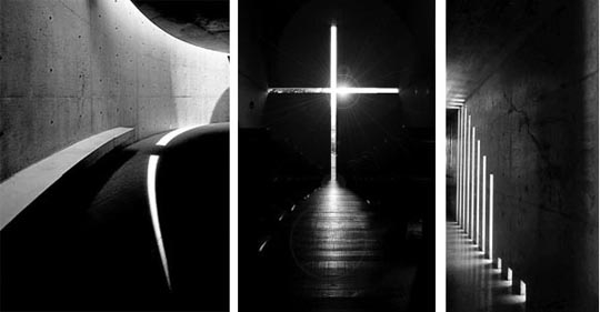
Architect Tadao Ando's minimalist designs act to draw in natural light. Shown here are the Koshino House and in the center, the Church of Light.
RF: Do you ever get a design that didn’t turn out the way you thought it would?
LD: More with little things – details and materials, not having a simple enough palette. I’m happy with the big picture. There were things I had wanted to change, but that Jim felt strongly about. So we still put our fingers on each others’ stuff [design].
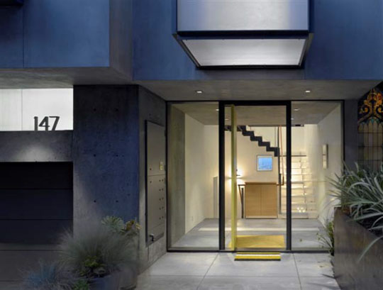
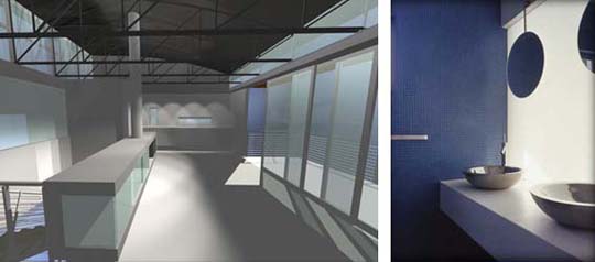
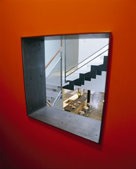
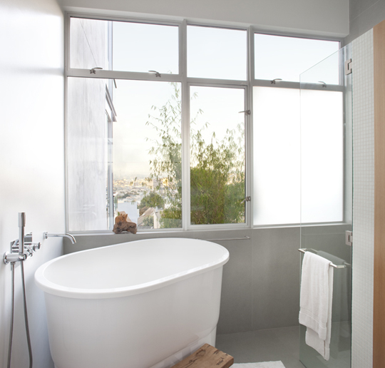
Zack/de Vito Architecture's use of materials to transfer light and create layered spaces in the Laidley Street project - the blue square is the view out through the rear side of the house of the Bay Bridge, viewed through the top of the 13-foot-high master bathroom.
RF: Do you have formal critiques?
LD: Not any more, now it’s daily banter. We are open to each other, and we highly respect each other, but we just don’t have much time to sit down and go over things in detail.

Lines of sight penetrate throughout Zack/de Vito Architecture's Laidley Street house. Photo: Bruce Demonte
RF: How did you and Jim meet, anyway? Was it at an office?
LD: Actually, no. Jim was organizing a show called “Overtime”, the first of three such shows, representing the work done by students and young architects in their off time. Jim showed some of his furniture, and we met at the opening.
It’s interesting to look at the work and then look at the person who produced it.

The kitchen of Zack/de Vito Architecture's Laidley Street house is bright and serene. Photo: Bruce Demonte
RF: Were there any surprises at that show? Someone whose off-hours work was totally different from their day job?
LD: One guy showed robotics, back before robotics was so cool. They were incredibly detailed and aesthetically spooky. It was a contrast because he was such a buttoned-down sort of person.

A cozy window seat in the corner of the kitchen at Zack/de Vito Architecture's Laidley Street house. Photo: Bruce Demonte
RF: What’s your feeling about green design?
LD: Jim and I have talked a lot about the current “green” movement. Over the years people have struggled to define what is green, and how to build a green home. The crunchy granola, wood-everywhere look is no longer mandatory. All that wood comes from forests, right? Shouldn’t we be using LESS wood?
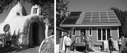
A green home doesn't have to look a certain way; it can be organic in shape or it can blend in to any ordinary neighborhood. Right photo shows one of the first Net Zero Energy homes to be commissioned.
LD: Aesthetically you don’t have to scream out how green you are. The aesthetics don’t have to be pre-determined by your ecological sensitivity level. We know someone who’s very active in the green movement, very public about it, and then I went to his home and I was shocked! A house that did not have many green features other than maybe a composter. It just proves to me that we are all growing into this.
We all try to be 100% green, or the public expectation is that anyone pushing it has to be 100% green themselves. But we should not be chiding one another. We’re all learning how to be green, and some people don’t know much. I’ve had clients who said, “I’m green – I turn the water off when I brush my teeth.” Maybe it’s a generational thing, too.
We’ve got PVs on our current home. It was a substantial investment at the time, but we felt that we needed to do it and as architects we have to be an example. And it does feel good. I’m proud when I get my electricity bill and it’s zero except for the hookup charge. Making and implementing those green decisions really did feel good!
RF: What constitutes good design? If you were teaching a class, what would you ask your students to look for?
LD: It’s in the scale. How do you feel in a space and why? The primary thing in judging design is how the space makes you feel. Do you feel big or small? Even the floor you’re standing on is going to feel a certain way, or make you feel some way.
Techniques like juxtaposing levels from one room to another, or dark and light areas in the home, creates a response when you transition from one space to the next. It’s not manipulative, but it is.
We led an after-school field trip for my kids’ class, second to fourth grade. We took them to City Hall, the Federal Building, and a few small restaurant spaces. As we walked through each place, we asked them questions about what they saw.
RF: What did they notice? Was it different from what an adult might notice?
At City Hall, they noticed the marble, and also the light. They liked the cool materials in the Federal building, because it was different from anything they had at home. Both places gave them a sense of scale: “I feel so small.”
LD: In my own designs, I emphasize views and vistas, both of other parts of the house and of the outside. Each view is constantly referring to something else, but it’s also telling you where you are. If you’re designing a passage into a room, even without a door, you need to create a threshold somehow. A cabinet, or other symbolic indication that tells your brain and body that you’re entering another space.
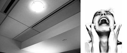
RF: Some spaces just make me angry.
LD: Me, too! Elevator lobbies especially. There’s something about the typical quality of light, all that fluorescent. Hospitals make me very upset – and it’s not because I’ve had bad experiences in them. Hospital design has really changed over the generations, so maybe it’s just the decisions they’ve been forced to make.
RF: How do you see design and architecture evolving in the future?
LD: We as human beings need to understand where we fit in the world, and how we are moved by our built environment and how we impact it by our decisions. Light and air are basic needs, and they are qualities we try to capture as architects. The human body was not meant to be locked up in a building, working in a cubicle.
LD: A good space should have a sense of unity. It does something to you, moves you. There should be a reaction. The worst reaction an architect can get is “Oh, big deal” or “Next!”








Studio Negri » Natural Light and Sustainable Architecture
30. Jun, 2013
[…] effect that perceptually changes material into immaterial, dark into light, light into space. Lise de Vito says that Tadao Ando’s churches are: great examples of how little light you need to heighten […]