Steven Miller: The Next Big Thing
by Rebecca Firestone with Mark English AIA | Interviews
“There’s an assumption of durability for architecture. Interior design is more temporal, focusing on subliminal cues in the built environment. It’s not about following a formula. Rigor isn’t clear unless it’s opposing chaos. Anything can be beautiful – in the right hands.”
When Mark English asked me to interview Steven Miller, I recalled meeting him over 10 years ago, at a Modern by Design showcase for Metropolitan Home. Steven had done the kitchen for that project, which involved invitations to 14 design studios to create the interiors as they pleased. His personality – delightful, intelligent, humorous, and poised – remains unchanged.
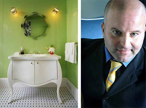
Interior designer Steven Miller has created a successful and highly collaborative business model, partnering with other designers, clients, and artisans. Photos courtesy Steven Miller
What has changed is the breadth of his focus. We spoke about temporality, authenticity, design as a science, and his newest project, NWBLK – “the next big thing”, a collaborative showcase of products and events. How can the latest fad, “the new black” as it were, be true to itself, and remain authentic?
NWBLK’s Beginnings
“NWBLK started in 2011, at the tail end of the recession, which saw an aggregation by larger companies, with the little companies falling by the wayside. What was left? A disheartening distillation of design survivors. I wanted to provide an environment for smaller batch-made craft pieces.”
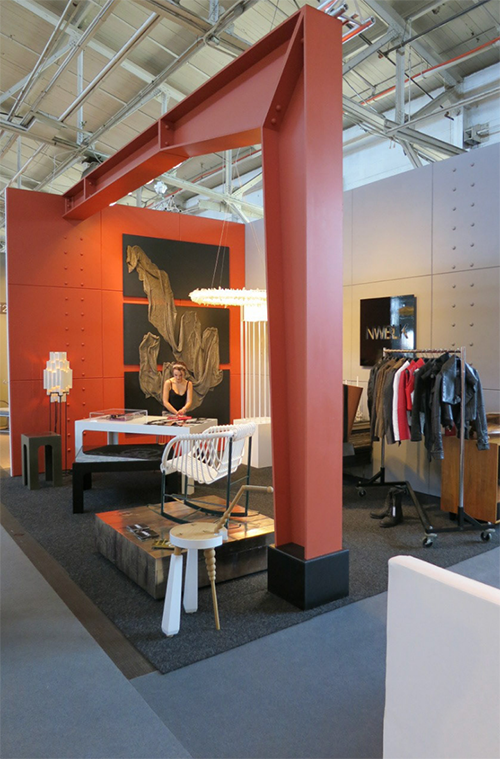
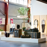
Steven Miller describes NWBLK as “experiential marketing”, showcasing a carefully curated collection of hand-crafted pieces. Photo credit: Steven Miller
- A dramatic industrial setting created the perfect backdrop for NWBLK’s pieces. Photo credit: Steven Miller
- A “disruptor’s debate” event sponsored by NWBLK included Richard Branson, among others. Photo credit: Steven Miller
- NWBLK events have showcased all sorts of elements that blur the boundaries between furnishings and art. Photo credit: Steven Miller
NWBLK Today
The NWBLK gallery was located initially in a garage, and then at a larger space at 18th and Bryant in San Francisco’s Mission district. Currently, products represented by NWBLK can be seen and purchased through the Martin Showroom in St Helena, and through a hospitality partnership where guests and visitors are able to see these products in a living environment.
The new showroom is a disarmingly modest-looking cottage behind a larger home on a private piece of property with a serene and well-established residential feel. As is common in that area, many homes have small vineyards, as well as gardens and other features of country living. There’s a community garden right next door with educational examples of low-water and sustainable agriculture in action.
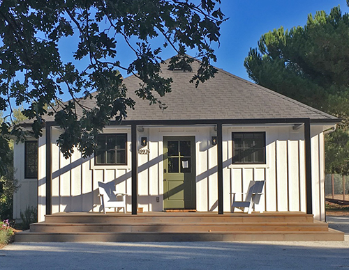
Built new to match the surrounding buildings, this guest cottage in Sonoma will be opened as new showroom/hotel in another few months. Photo: Mark English Architects
- The property containing the NWBLK guest house is integrated with its natural surroundings. Photo: Mark English Architects
- Along the private drive are many small vistas like this one. Photo: Mark English Architects
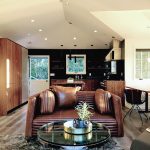
- This sofa from Verellen is buttery soft, and so alluring that it instantly demands to be worshipped.
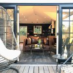
- View from the deck at the NWBLK guest cottage. There are active vineyards just behind. Image courtesy of Steven Miller
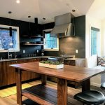
- Every feature at the NWBLK guest cottage is the result of a partnership: Counters and surfaces from Porcelanosa, cabinetry and island from Henrybuilt, appliances from Thermidor. Chairs area from NWBLK’s collection manufactured by Overgaard & Dyrman in Denmark
The partner for this hybrid showroom-hospitality venture is a former design client who lives right up front in a larger house close to the road. The NWBLK is currently working on a series of similar guest houses in partnership with this same client. All the built-ins and furnishings will come from the same partners as well, in a collaborative and mutually beneficial business arrangement.
As we walked through the cottage, he described how each detail, including the built-ins, were from other partners: custom walnut cabinetry and free-standing kitchen island from Henrybuilt Cabinetry, Porcelanosa finishes, and furnishings from some of the NWBLK exclusive designers. Others were from designers not credited on NWBLK. “They’re not all exclusives. But I can sell their work through NWBLK as part of this showroom. Visitors can see the items online and click a Buy Now button to place an order.”
Experiencing these pieces in person, as a guest, is the perfect way to fall in love with them. I was drawn to the Verellen ribbed leather sofa like a cat to a forbidden toy. The quality and craftsmanship radiated out into the room. All the items, even the mattress, are made with all-natural materials, too. The place smelled fresh and natural, even though it was still technically still under construction.
“NWBLK is an evolving business, a disruptor of certain aspects of the design world in which we’re involved,” Steven explained. “It’s an alternative to the customary notion of a retail design showroom. It started out as a guerrilla gallery, which was very successful, before moving to a larger space in San Francisco’s Mission district. The new location allowed us to produce extraordinary events and connect with a whole new clientele. Throughout, we’ve continued to introduce curated collections of pieces to new markets in new ways. This hospitality partnership assimilates all we’ve learned in the past about experiential marketing and hospitality, and rolling all that into a brand-new concept.”
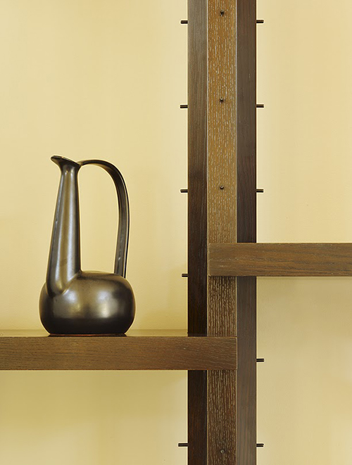
Steven Miller has several lines of furniture that he’s designed, such as this Stand and Deliver shelving system.
- This interior from Steven Miller shows a custom-built shelving system’s features to accommodate slanted ceilings.
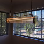
- The NWBLK guest cottage includes lighting from Urban Electric Company and shades from The Shade Store. Photo: Mark English Architects
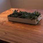
- The kitchen table at the NWBLK guest cottage is handcrafted from elm. Photo: Mark English Architects
- Even Steven Miller can’t stay off that Verellen sofa. Photo: Mark English Architects
So how can you sell items from your competitors? I wondered. You’re actually referring people there from NWBLK. “My design studio is separate from NWBLK for that reason. I can sell my furniture to other designers who are providing design services for their own clients. Or, I can be designing an interior and specify their furniture, if that’s what would make the design more perfect. Part of this showroom is I can offer furniture from other makers directly, even where I don’t have an exclusive.”
Why Yountville?
We met at Steven’s house in Yountville, CA, up in Napa. Why Yountville? I wondered. Turns out Yountville is quite the up-and-coming place, still heavily centered around wine, but with an emerging design sensibility. “We moved there for the weather, the lifestyle, gardening, and wine.” (And if you’re looking for $250 pure white linen shirts, this is the place.)
“I just joined the Yountville Zoning and Design Review Board two months ago. It’s exciting to have some real input.” Steven mentioned the influence of the devastating fires in Santa Rosa and Sonoma over the past few years. “People need quick results”. He’d had to evacuate his house, too. A sense of temporality struck us both: even in such peaceful, sunny surroundings, it all could be gone almost in an instant.
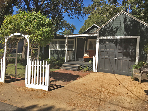
Yountville is rapidly transforming from a rural town to a well-heeled getaway in the heart of California’s wine country. Original homes such as this re-done cottage co-exist side by side with new construction. Photo: Mark English Architects
- I’d never seen distressed wood applied as an exterior design element. Photo: Mark English Architects
- This downtown Yountville building was under renovation, preserving original stonework. Photo: Mark English Architects
- Right across the street, this stone façade was likely engineered to reflect the original. Photo: Mark English Architects
- The North Block Hotel in Yountville was done by Erin Martin, a design colleague of Steven Miller. Photo: Mark English Architects
- “Erin Martin has elevated found objects,” observed Steven Miller, speaking of the North Block Hotel. Photo: Mark English Architects
- Even the ivy looks curated in Yountville’s downtown plaza. Photo: Mark English Architects
What did Steven think about Yountville’s design sensibility? I’d spent an hour wandering around after allowing extra time for traffic that wasn’t there. “It’s in its childhood here. Not infancy, though. It reflects changing ideals, and more sophisticated people.” And, Yountville was the birthplace of the renowned French Laundry, a restaurant so exclusive that it has a 2-month wait list.
The image of a glorified country store came to mind, with old farming equipment repurposed as sculptural objects. Is that art, or kitsch? I wondered. “There are plenty of collectors up here. By that, I mean broadly including collectors of furniture, art, design, and architecture. The antiques represent a wine country of yesteryear, which employed vernacular as décor.”
Originality
We kept circling back to a few fundamental questions, such as what constitutes good interior design. Take the whole distressed-wood bar craze, for example. Or when every trendy new restaurant was suddenly wallpapered with antique player-piano rolls and featured retro Edison lamps with the exposed filaments. But it was so cool the first time!
“Duplicating bold moves… it’s not as fresh the 20th time.”
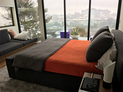
Steven Miller’s interiors don’t look trendy, but they don’t look dated, either. This one is both understated and inviting. Photo: Steven Miller
“There’s an assumption of durability in architecture,” Steven explained. “Interior design is more temporal, less static. It’s a reflection of changing tastes. You can try to be TOO far-reaching, and get hung up on fancy materials and ‘timeless design’. It just ends up being static.”
We were sitting out in a patio enjoying a handmade salad from Southside, an artisanal coffee shop and eatery. “Good interior design makes use of subliminal cues in the built environment. Even architects and designers, who should know better, don’t always consider the actual qualities of the materials. They think glass is transparent… but it’s reflective as well, creating a different sort of visual experience.”
The bright sunlight on the stone patio created intense reflections on the glass walls of Southside, creating a multi-layered effect. But you couldn’t exactly see inside. I thought that digital renders were good enough to capture most of that by now. “Renders aren’t perfect,” Steven responded.
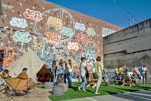
This graffiti mural, part of a NWBLK event in San Francisco, respected the work of the original taggers, in fact incorporated multiples of their work – which effectively stopped it from being defaced. Photo: Steven Miller
Aging Process
What are your preferred materials? Steven responded: “Leather, concrete, and stone, because they age well. Not cotton!” We talked about pristine interiors that start to look shabby the instant that a speck of dust intrudes, or a white building when it gets weather-stained. “We build things to look new, and when an object doesn’t look new anymore, it loses its appeal.”
“The city of Rome is lovely, with its old stone walls showing wear and tear.” Indeed, Roman stone-work shows a variety of stone-working techniques that go well beyond the faux-stone looks of today. Other materials don’t age as well. “Glass gets scratched, discolored, and sealed glass constructions can get fogged from moisture intrusion.”

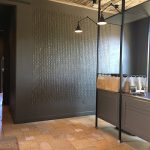
Steven Miller prefers durable materials for interiors. In this photo of his NWBLK showroom, the steel beams and concrete surfaces exude a sense of permanence but can also endure re-finishing and re-surfacing. Photo credit: Conroy + Tanzer
Steven, like his colleague and former employer Gary Hutton, has extensive experience in designing interiors for serious art collectors. “Sunlight degrades materials and artwork,” he explained, which seems obvious and yet, most homes don’t allow for an idealized, museum-grade environment. Sometimes, design trends do more harm than good, particularly the “California Modern” emphasis on large expanses of glass.
“A lot of the new buildings in San Francisco are all built for maximum exposure. They’re south-facing with floor-to-ceiling window walls, and no light control. Classic Roman buildings have deep-set windows to reduce direct glare, which is more environmentally responsive.”
Clients
How do you approach a new project? “I start with programmatic requirements,” Steven responded. “What the clients do in there, what they THINK they want… and, their assumptions about what they think they want.”
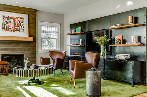
This private home interior by Steven Miller uses a lot of durable materials: leather, wood, metal, stone. But the design doesn’t call attention to itself. The focus is on the people, even though no people appear in the photo. Photo: Christopher Stark
What makes for a good client? “A lot of designers get hired for status: to make the client look rich, or so they can say that they hired a top designer. Some clients just don’t understand the mechanics of what we do.” For Steven, project acceptance criteria include a good personality fit. “Do we mesh? Or are they hiring me for the wrong reasons? Thus, authenticity extends beyond the design, to cover the entire process. “A red flag is, during an interview meeting, a client who talks nonstop about everything they want to do, and who’s not listening to me.”
A good design client may in some ways be different from clients for other types of professional services. “They don’t know what they want, but they’re excited about the opportunity to engage in figuring it out. They’re open to solving problems in new ways, and are self-aware enough to know how to trust.”
Did you ever have a client with very… unusual needs? I asked. Or special interests? “Sometimes interpersonal relationships can be complicated. I had one client who came out to me during a project. And he had a family! We saw a shift in programmatic requirements. It became clear that he needed his own master bedroom, and a private bathroom that wasn’t shared with two children.”
For special interests, Steven mentioned two projects: a surfer cottage, and one for a professional chef. “The chef wanted a dining room table that was fuckable, meaning he could make love with his wife on it.” Yes, built-in kitchen islands can be great for that as well. “The surfer needed a house that was tolerant of sand and salt water, and wet gear. Our hypothesis for that house was ‘We can make this beautiful’ and we set out to prove that.”
Disasters
Tell me about some project disasters, I said. Things that went south, maybe not anyone’s fault. How did you handle that? This question is not one they teach in design school… “
Sometimes, projects haven’t gone smoothly. If it gets past a certain point, it just cyclones. On one project for a couple, the wife’s indecision was a constant problem. She was fearful, and her husband was always apologizing for it. There was no definition of success. That project felt like it was doomed to fail. Eventually, I gracefully acknowledged that I couldn’t fulfill their needs.”
“When it gets to that point, you have to own the confrontation.”
Another project that Steven did jointly, as a junior designer, was even more instructive. “This project was beset by cost overruns. There was a meeting with the client, the contractor, and the designer. The client was a very high-powered lawyer, very strong-willed. She was used to winning cases in the courtroom. The meeting was to ask how did these cost overruns happen?
“The contractor had a binder full of Change Orders. The client slammed that binder shut and declared ‘There have been no Change Orders.’ It was as if she were upending the subject and declaring a new, alternative reality. I was just watching from the sidelines and I didn’t really know why the client did this. But it was a very shocking moment.”
Good Design
What constitutes good design? We came back again to this question. If you were teaching design students, how do you teach them to recognize it, in their own work or others’?
“Good design and successful design are not always the same thing. A successful design is one that fits the bill, one that the client likes.” I suggested that good designs were those that the designers were eager to include in their own portfolios.
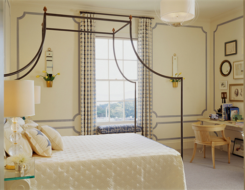
Steven Miller’s project “Cocteau’s Dream” recreates the intellectual ferment of early and mid 20th century Paris. Photo: Matthew Millman
“A good design has to be aesthetically pleasing. It should take care of programmatic concerns, including comfort and ergonomics. It should be clear about its intention.” I compared bad design to amateur dance choreographies that were too frantic or busy, so that the viewer didn’t know where to look.
One issue in judging design came up: the tyranny of the photo. Every competition, and every design magazine, relies exclusively on the sense of vision. However, designs for living should engage all the senses in a holistic and experiential way.
“I really like the SF MoMA building by Snøhetta. The acoustics are perfect. I can talk to my friends and hear them, but it doesn’t bounce all over the room. And there’s a lot of reflected light, which is important for viewing art.”
Steven learned a lot about good design from Gary Hutton. “Gary’s solutions always carry the ultimate level of aestheticism, answering the question in a very elegant way. It’s also about knowing when to back off. Gary taught me to achieve a proper edit. If there’s texture in an art piece, repeat that texture someplace else. It’s subliminally important… Some designers throw everything they have at it. There’s no restraint. It’s too much stuff, layer upon layer. It’s distracting, inauthentic, hard to remember.”
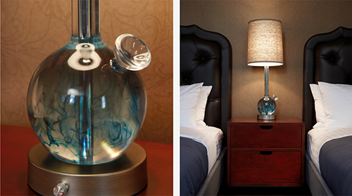
Lamp detail from Steven Miller’s design work for the Hotel Durant. Yeah… it does look like a bong. Photo: Steven Miller
Authenticity
One of the least measurable aspects of design could be described as “authenticity”. What makes art, or design, or anything “authentic”? Establishing authenticity in other art forms, especially those with strong insider cultures, can be challenging. How can we clearly identify cheap knock-offs or cultural appropriations?
“I don’t like to be pigeonholed for a ‘style’. I’m interested in so many things. I like to jump around.” We discussed one of Steven’s showcase design projects, titled Cocteau’s Dream. “I wanted to tap into the collaborative multidisciplinary environment of early and mid-20th century Parisian culture,” Steven replied. “That was a time when artists, thinkers, jazz musicians, composers, philosophers were all friendly with one another. I wanted to capture a milieu that was rife with creativity and inspiration.”
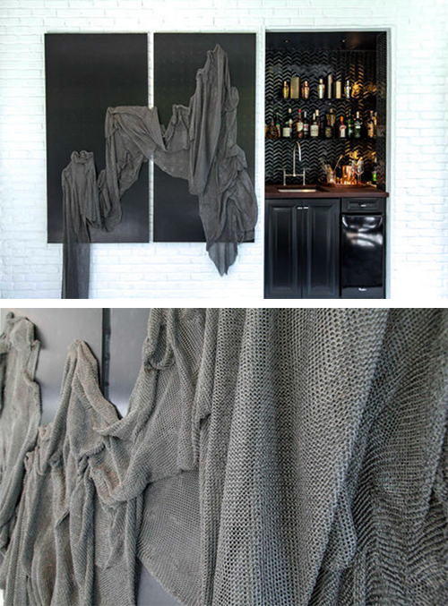
Steven Miller’s interiors incorporate fine art, texture, and the clients’ own personal tastes. Photo: Steven Miller
“Good design is not about using a formula. It’s about suspending one’s fear in pursuit of good design. You have to go with your gut. Don’t just do something predictable.”
I ventured an opinion that the more successful multidisciplinary efforts were well-grounded in training of some sort. Jazz might appear to be free-form, but maybe only a master can get away with it. We considered the place of rigor in enhancing creativity: developing skills necessary for performance.
“You have to know when to walk away from your training. It’s like tension in a musical note, which is discordant for a reason.”
Design as a Science
Steven Miller was a philosophy major before switching to art, so when he used the phrase “design as a science” we explored what that meant, and what the word “science” itself implies. Does declaring something as scientific actually make it so?
Why is design a science? “It’s a process of asking,” Steven said. Of inquiry. “We’re asking how well the final design answered the question that the original design proposition was asking.”
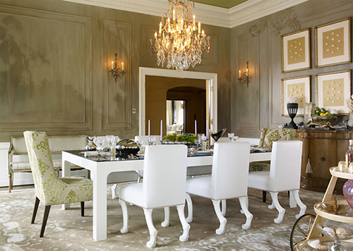
Steven Miller’s design for a private residence includes a subliminal mural on the far wall. Photo: Matthew Millman
“Design consists of both intrinsically formed ideas and academic ideas, in pursuit of answers to questions that prove a hypothesis. For example, that surfer’s cottage. That house had to accept salt air, wind and sand, and wet surfboards. The hypothesis for that project was ‘We can make this beautiful’.”
Really? Even a dumpster fire? Well… yes, at least in theory. That would be an interesting design challenge, I suggested. Steven recalled a scene from the movie American Beauty, where a plastic bag swirls in the wind. Yes, even litter can be beautiful. “I choke up even now thinking about that scene,” he said. Strangely enough, so did I.
“In the right hands… even the most hideous can be beautiful.”
Rigor and Chaos
Speaking again about “Cocteau’s Dream”, Steven said “That project used Western ideals about proportion. These ideals are supposedly rooted in mathematics, and nature, and science.” Academically formed ideas, in other words.
You mean the Golden Mean and Phi? I asked to clarify, and said that my own amateur experiments with the Golden Mean had been unsuccessful. A strict application of that proportion to, say, page layouts, only produced static and boring results. They needed to be a little “off” in some indefinable way in order to be interesting. Randomness was needed somehow, but you can’t intentionally employ randomness because as soon as you add intention… it’s not random anymore. It’s predictable, conscious.
“Rigor isn’t clear unless it’s opposing chaos.”
NWBLK
“The New Black is the next big thing, a temporal way of looking at things.” We were talking about NWBLK, Steven Miller’s newest enterprise. “It’s about curating a collection of handmade objects, and presenting them for sale in an interesting way. I wanted to create a business that taught people why original and handcrafted was so important.”
(Note that NWBLK is distinct from another site also called NEWBLK which is also a very design-oriented, artful site.)
Immediately we got on the topic of knock-offs, the bane of many a designer’s world. “I was speaking at a Japanese wood furniture symposium in Asahikawa a few years back. There was a collection of furniture on display from a collector who’d explored authenticity in a very unusual way. There would be one original piece, and then 10 knock-offs in succession. Knock-offs of knock-offs. It was like a game of telephone.”
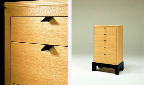
Steven Miller’s furniture designs for Conde House were for a Japanese furniture manufacturer. Photo: Conde House
Why events? Well, events are part of the “experiential marketing” concept at NWBLK. “Those events are all promoting product innovation and interaction design. Some of the concepts are thought-based, and others are about technology. NWBLK has seen product launches for two electric vehicles and the first Uber app.”
“People find us. We have a reputation, and people connect our reputation with the next best thing, with seeking out what that is. I drive one of Audi’s hybrid electric vehicles, and that car was launched at NWBLK.”
The connection between science (theory) and engineering (applied theory to solving problems) comes together in innovation as well. “Design is addressing problems that need to be solved. Mitigating greenhouse gases, or creating a living environment for a family of 5.”
Design Challenges
So, can you think up some interesting design challenges? I asked. Something that you could use to tie together a group show, or elicit a unified theme with a lot of creativity around solving a well-designed problem? “
Have two designers each do a room in the style of the other,” Steven suggested. We both sat back and wondered how… extreme… that could get. Steven mentioned Jimmy Fallon’s musical challenge, where a musician has to Improvise on the spot a well-known song and an artist’s style, for example “Somewhere Over the Rainbow” in the style of Michael Jackson.

Steven Miller carefully chose this black cabinet finish for its gleaming matte surface. Photo: James Baigrie
Steven recalled a workshop he gave at Apple, for one of their product design teams, to stretch them out of their comfort zone. “We laid out two squares on the floor, each 15’ square, with some design materials in each. Two teams, one hour. One team had access to a technician and a collection of power tools. The other had nothing. They had to pick something to make, and then present their work.”
It reminded me of the old TV show called Scrapheap Challenge, a sort of Iron Chef for makers and machinists.
This exercise yielded a surprising result, too. “The tools team was MORE challenged by having tools. They felt that they HAD to use them. The other team had a pregnant woman as one of the members, and they made her a swing bassinet.”
Links and References
- Steven Miller Design Studio
- NWBLK
- Henrybuilt cabinetry
- Verellen sofa
- Gary Hutton Design
- The bag scene from the movie American Beauty
- Scrapheap Challenge, Wiki
- NWBLK overview page
- NWBLK “who we are”

