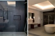
Sand and Steel: Sand Studios’ Work Shows a Lightness of Hand
by Rebecca Firestone with Mark English AIA | Interviews
“Steel is feminine. Thin, strong, and lithe, it has a certain lightness. It’s the connective tissue for disparate elements; it can be used to integrate or mediate between heavier and thicker materials to make things float and stand off from one another. We fine-tune our designs using classical proportions, and le Corbusier’s Modulor system. In Miami, our style was so completely different from what was already there. Of course there was already a lot of contemporary design, but we were recognized as having a unique sensibility. My work was softer, more textured, more detailed. Unexpected materials, and a lighter hand.”
(Photos: Ken Hayden Photography)
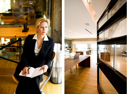
Larissa Sand in the office of Sand Studios; a door she designed, shown at the office entry. Photos: Kenneth Probst Photography
As we chatted around her kitchen table upstairs from Sand Studios, Larissa Sand was curious about why we wanted to interview her. Mark English explained how he was inspired to start The Architect’s Take after seeing how smoothly the interior designers collaborated on a recent Metropolitan Home showcase at 2201 Baker Street, and how different their process was. Architects, he explained, are more competitive almost by training, and they don’t engage in discussion and communication as readily.
We told her that we wanted to know what informs her design process, how she thought, what she was passionate about in design – in short, what makes her tick. How did she come up with some of these minimalist, yet sensuous designs? Trying to follow Sand’s mind through the conversation was like trying to catch a darting hummingbird. A very elegant, refined thought process that was both feminine and yet willing to take bold risks: artistic, technical, and financial.
Three voices are represented in the conversation below: Larissa Sand (LS), Mark English (ME), and Rebecca Firestone (RF).
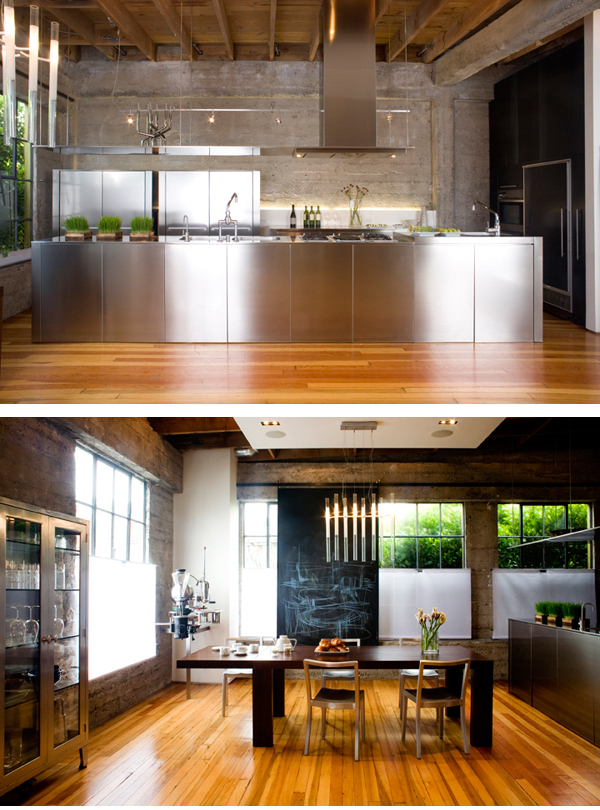
Top shows kitchen in Larissa Sand's own family residence in the Sand Studios building. Bottom shows the dining area. Rough ceilings are tamed with a soffit; chandelier and rolling blackboard designed and fabricated by Sand Studios. Window treatments are carried throughout the building, including the office downstairs. Photos: Kenneth Probst Photography
ME: How do you like working in San Francisco design community?
LS: Among design communities, San Francisco is very gregarious. People are very supportive and friendly. When I first moved to San Francisco, it was very social. There was the IOOA [interim office of architecture], and a whole art and sculpture community. It was a mutually inspiring climate, and a very eclectic time – a rich fabric of artists who were genuine, friendly, and not at all pretentious.
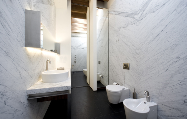
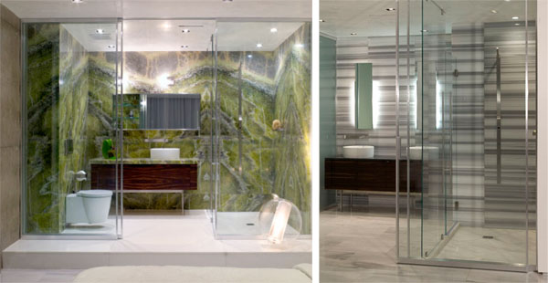
Marble-patterned bathroom in the Sand residence, designed by Sand Studios. Photo: Kenneth Probst Photography
LS: My favorites were David Ireland, Chico McMurtry, John Randolph, Bruce Tomb – I loved their work. I also remember Matt Heckert and Bill Werner of the Survival Research Laboratories.
ME: In the 1980s it was Mark Mack.
LS: He was my first teacher [at school], along with Richard Fernau. Ann Fougeron was the TA. She’d smoke cigs with us students out on the balcony.
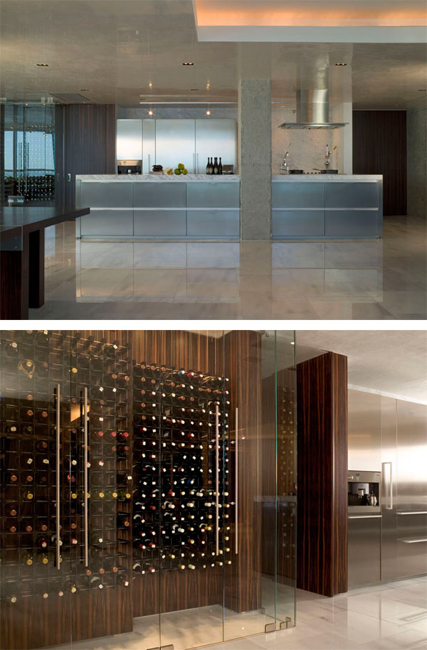
Kitchen and wine room from the Marvisi residence, a private condominium project in Miami, by Sand Studios. Photos: Ken Hayden Photography
RF: How did you decide to become an architect? Were your parents designers, too?
LS: I had a somewhat alternative childhood. My parents were scientists; my mother was a doctor. My upbringing was academic, old-European. It incorporated art appreciation as a basic necessity, as a part of middle-class European culture. You’re not human unless you have paintings in your home, you listen to music, read poetry… that’s what does the most for humanity.
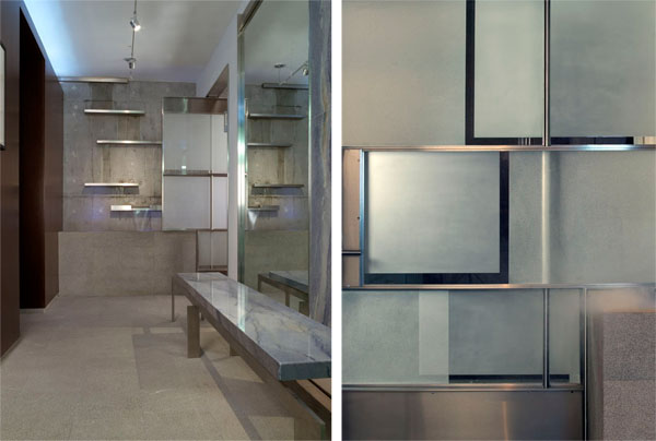
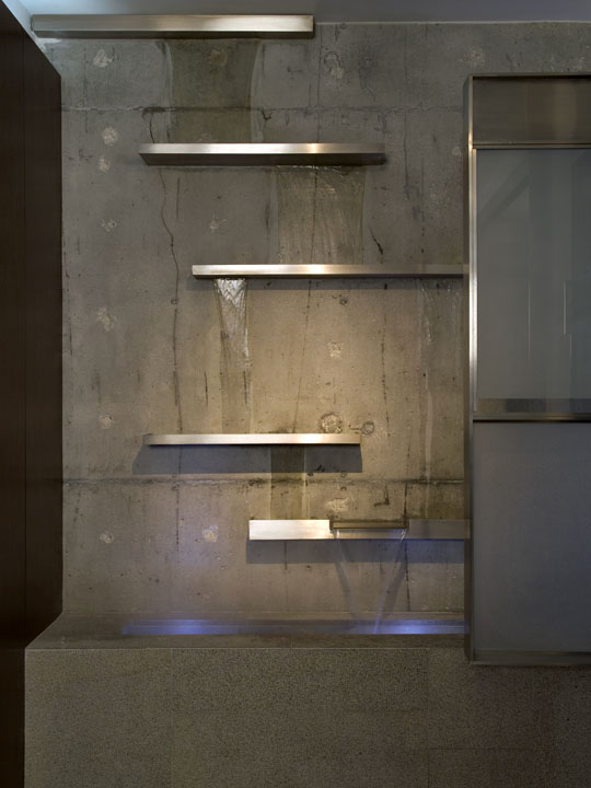
The Guttman residence, a penthouse suite by Sand Studios, includes an indoor fountain with brushed steel, concrete, and marble. Detail on right shows the custom-made entry door. Sand's doors all have thrust bearings that allow them to pivot easily and silently. Photo: Ken Hayden Photography
LS: My family survived World War II. Their parents were very educated, but with zero income. There was the expectation that I would have to get straight A’s “for the Ukraine” – for all the people back there.
LS: As a child, I drew a lot, including architecture. I drew up an entire hotel complex when I was six years old. It was a six-year-old’s conception, but it had all the major elements – parking, a lobby, guest rooms. As a child, I loved Modern art and Modern furniture, even from age 13.
I always wanted to study the arts, but in my first year at college, I liked the sciences and so I started taking pre-med. And then I went to Europe for the summer spending time with… architecture! And one day a journalist was talking to me, asking me what I wanted to study. I was looking at a particular building I admired, and it just came to me. It’s almost as if it came pouring into me. I wanted to study architecture!
Architecture has aspects of both art and science. I really enjoy the engineering and technical side of architecture. A lot of science involved an exclusion of the arts, though.
ME: How did you land some of these great projects?
LS: In Miami, I did one project and it led to a lot of work. Our style was so completely different from what was already there. Of course there was already a lot of contemporary design, from both local and New York designers. But we were recognized as having a unique sensibility. We had a different approach. Our use of unexpected materials was appreciated, for example juxtaposing rough concrete within a steel kitchen. My work was softer, more textured, more detailed. Unexpected materials, and a lighter hand.
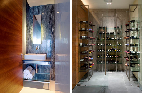
The Marvisi residence by Sand Studios shows a carefully chosen combination of materials and textures. Photo: Ken Hayden Photography
LS: Our clients run from very high-end to very humble.
ME: How do you work with “humble” clients?
LS: They’re likely schoolteachers or Berkeley professors with champagne tastes and beer budgets, and they go for smaller projects, like kitchen remodels. A client like that can’t spend $10K on a front door! But even with a modest budget, you can still do good design, with nice lines and simple materials, and a touch of uniqueness.
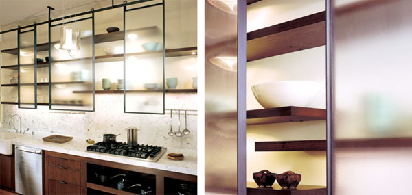
Elegance, industrial fabrication, and a laboratory-like precision characterize custom-made kitchen cabinetry from Sand Studios. Photos: Cesar Rubio Photography
LS: Design is about good space planning, and how to work with what’s existing. It’s about understanding space, and understanding light in a space. That’s what Frank Lloyd Wright and Mies [van der Rohe] talked about.
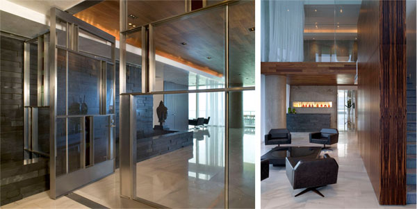
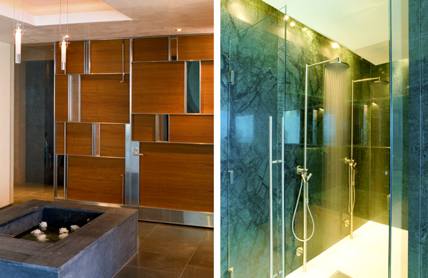
Sand Studios' limited palette has a sensual richness enhanced by a disciplined design aesthetic. Left shows the black slate and custom door at the entry lobby in the Marvisi residence; right shows a view from the interior atrium, with the slate portions visible towards the far end. Photo: Ken Hayden Photography
Design’s design, whether it’s rare ebony wood or painted MDF [medium density fiberboard]. It’s about the detailing, the refinement, and the composition. A kitchen island is a sculptural object.
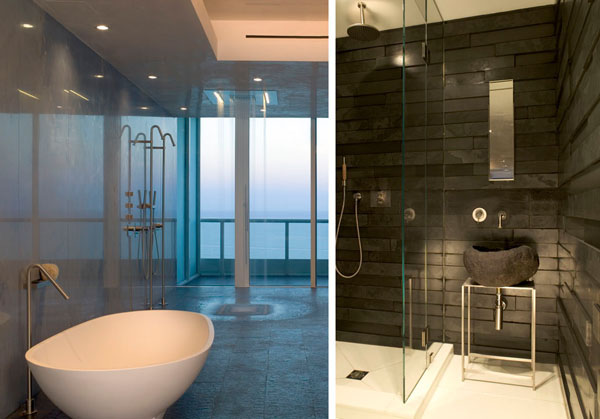
Marvisi residence bathrooms, by Sand Studios. Materials are selected for contrasting luster, color, and texture. Black slate finish on right echoes the entry lobby of the same project, shown previously. Photos: Ken Hayden Photography
ME: There’s a very interesting mix of exposed and finished elements in your offices and apartment. What was your experience with renovating this building?
LS: This building was a wreck, and the first floor was cramped and dark. That’s one reason we opened that window from the office down into the shop.

Office level of Sand Studios building. Concrete from the original structure is left exposed, offset and complemented by a smoothly articulated and finished ceiling. Photo: Kenneth Probst Photography
LS: A wall can clean up the space and break the notion of “the box” as Frank Lloyd Wright has said.
With doors, most people assume that they only come in one size, or height. When we made our own doors, we were free to experiment. Whether it’s eight feet tall or twelve feet is arbitrary. With our own space, the question was: How do you assemble old and new? Scarpa does old castles with a lightness of hand. We’re not doing that – but there’s a similarity.
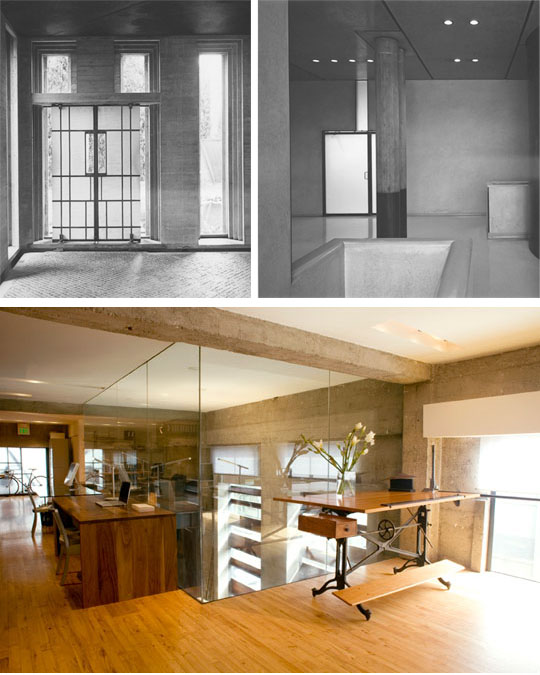
Top: Scarpa's work emphasizes the sculptural lines of the entire structure. Below: Sand Studios' renovation of their own building exposed the concrete shell and original flooring, then contrasted the original materials with smooth expanses of glass, a sculpted white ceiling, custom-made doors, a few well-chosen industrial artifacts, and a very simple but beautifully translucent window shading. The glass box seen towards the rear is a view downstairs into the shop area. Bottom photo: Kenneth Probst Photograph
ME: Why do you like working with steel?
LS: Steel is inexpensive and very strong for its size. It’s a great material for connecting diverse materials, giving lightness to a space, and making transitions with delicacy.
In 1993 I took over the shop from Jeff Sand [husband] when he started his snowboard business. Today, he designs all kinds of sports products and eye products, while I’ve continued with architecture and interior design.
I work with all aspects of metalwork, including fine hand work: TiG welding, machining, milling. We don’t do production parts, but we also work with many other fabricators who have diverse expertise: CNC machines, technical glass work, water jet cutting, and more.
In 1991 when I got out of grad school, I had lots of experience in the machine shop because our very early projects required it. My comfort in construction is especially on the finish level. I spent lots of time in the shop with cabinet makers, stone masons, and other tradespeople, going through things with them and learning how their components are used. I spent a lot of time in communication with the trades.
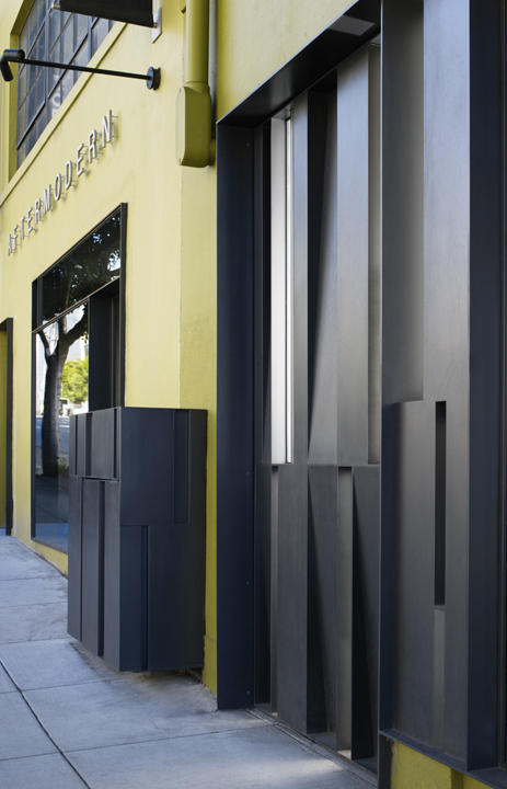
Entry door to Sand Studios building. Sand Studios' work conceals fasteners and welds in order to imbue the final product with a refined and sculptural quality. Photo: Cesar Rubio Photography
LS: Steel work is one aspect of the craft at which we’re proficient at the finest level. To create a door without a single visible weld and a smooth appearance. I spent time perfecting the craft and developing it for the purpose of architecture and lighting.
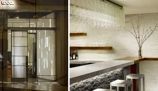
Entry facade and interior bar of The Local, designed and fabricated by Sand Studios. Photos: Cesar Rubio Photography
LS: To understand our doors, you have to understand that we approach architecture more like sculpture. The door is sculptural, but so is the rest of the building. We approach architecture as a sculptural medium: light, void, intersection, movement… its what the thing IS, in a compositional and artistic sense.
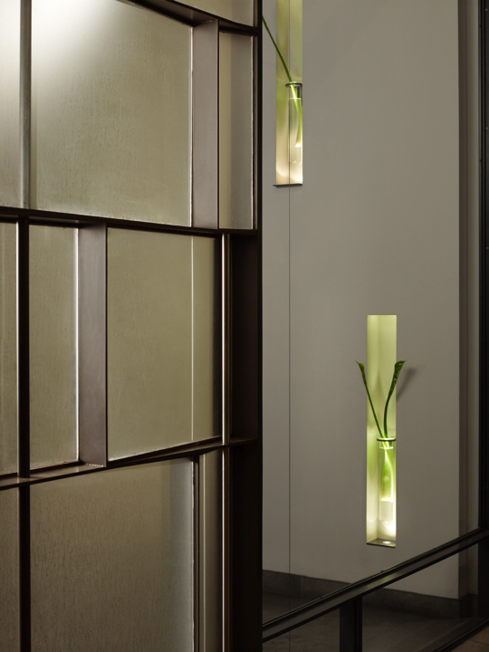
Closeup shot of glass and steel door assembly at The Local shows subtle plane articulations. Photos: Cesar Rubio Photography
LS: We had talked about refining the medium, but there’s another part to working with steel.
Steel is feminine. It’s thin, and lithe. If you work with wood, or concrete, or marble, it has to be a certain thickness. But steel allows us to make things more graceful. Think of a suspension bridge. Or a stone countertop with pencil-thin legs. [shows us her couch with thin, reflective steel legs that make it appear to levitate]
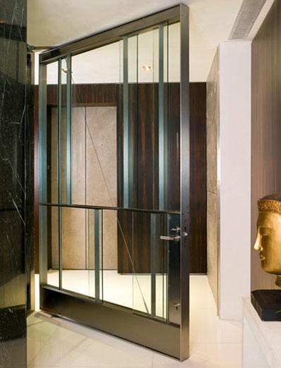
The feminine qualities of steel include its strength, which allows for thinner, more graceful structures. The mystery of this door's assembly enhances the illusion of lightness. Private condominium residence by Sand Studios. Photo: Ken Hayden Photography
LS: Steel is the connective tissue for disparate elements; it can be used to integrate or mediate between heavier and thicker materials. It has a certain lightness. Of course, you can put wood directly next to concrete and it’s fine. But by using a little steel, things stand off from one another, they float.
We aim to truly understand the structural properties of steel. There’s an economy of structure, like a tree. Everything helps to carry the load. We design with a sense of structural purpose, where no element is superfluous.
ME: That’s certainly true of the doors that you’ve done. Your work is very integrated, with discrete parts blended together into a unified whole. I can’t look at it and identify parts like L-brackets, I-beams, or angle-irons.
LS: There was a time when that was not the case. In the early 90s, I loved the industrial look. We all did, really. I appreciate the structural honesty. Jeff and I did the stairs in the Clock Tower in an industrial style.
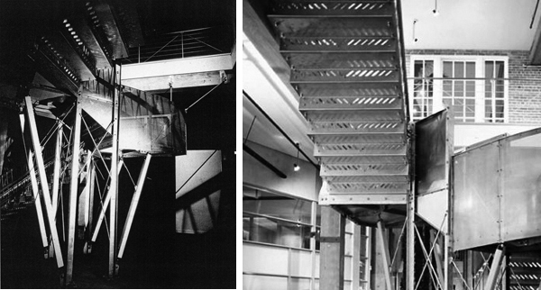
Jeff and Larissa Sand did the Clock Tower stairs for this San Francisco loft building conversion in 1993. Left Photo: JD Peterson Photography. Right Photo: Metropolis Magazine, July 1993
Surface magazine once called our work “functional exhibitionism”. We had so many nuts and bolts – we had buckets full of bolts! Eventually I wanted to work in a more subtle way. Now, I can’t stand to look at another nut!
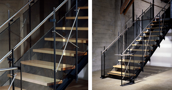
Stairs by Larissa Sand for Todd Takersley Photography. In this project, the attachment hardware is still exposed, but is lighter and more elegant. Photo: Todd Takersley
ME: Tell us about your shop. How do you integrate your design and fabrication functions under one roof?
LS: There’s a level of sculptural refinement in the shop. If we designed things and sent them out, we wouldn’t have the ability to refine [during fabrication]. For example, working on a table we might say, “These stops are too heavy. Let’s go from 3/4 of an inch to 1/2 an inch.” If we have enough time, we can send back the material and order the right one.

Flame retains a primal directness in both modern and ancient forms. Lighting and fire fixtures designed by Sand Studios. Photos: Cesar Rubio Photography.
LS: We do ridiculous shop details with obsessive precision. Our shop guys often have backgrounds in art or architecture, and they’re very particular. Because we have this level of control, we can try different things every time.
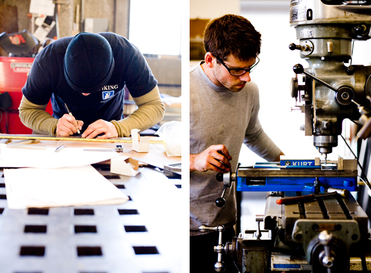
Andy and Kevin, hard at work in Sand Studios' shop where the famous doors are made. Photo: Kenneth Probst Photography
LS: We develop on a material level, not just a concept level. Developing on a material level is more sculptural. Doing our own office gave us freedom to experiment and try new things. The shop allows you to experiment, to include added technical refinement. A lot of our clients are architects and interior designers who bring us in to do aspects or portions of their projects – front doors, facades, gates, chandeliers. The problem with sculptural refinement is that your profitability falls out!
RF: Your online bio mentions the use of classical proportioning systems. Could you tell us more about this?
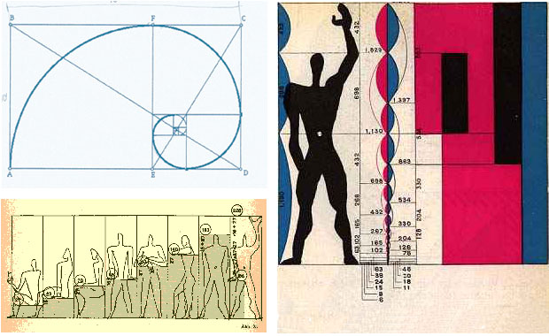
LS: We use classical proportions, and le Corbusier’s Modulor system.
LS: We use the Golden Mean, the Fibonacci series, all of that. I’m a big believer in Palladio!

Andrea Palladio's Church Redentore shows his balanced sense of proportion. Palladio's work is considered the gold standard of Renaissance architecture
RF: But to really build human-sized stuff, don’t you need to know how big your “ideal” human really is? Would a house or furniture that is “right-sized” for someone who’s 6’5″ work for someone who’s only 5 feet tall?
LS: We’ve actually found that designing around a six-foot person works pretty well for a range of body sizes. It doesn’t have to be so literally exact. Taller or shorter people are already used to accommodating themselves to the spaces they have to use.
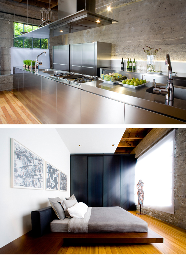
Sand residence, designed by Sand Studios. In the kitchen, a juxtaposition of smooth and rough, opaque and reflectivity. In the master bedroom, a closet on the far wall is hung floor to ceiling with custom-made sliding steel panels. Photo: Kenneth Probst Photography
RF: How would the Golden Mean apply to those niches in The Local, or the slate openings in the Guttman residence bath, or one of your doors?
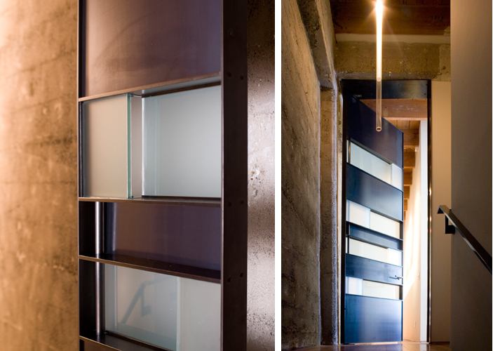
A door can double as a wall, a sculpture, and a visual destination. This door from Sand Studios is part of the Sand residence. Light in photo on the right is also a Sand design. Photo: Kenneth Probst Photograph
LS: It’s really in the spacing of the different elements, vertically and horizontally, and the relationship of the elements to one another.
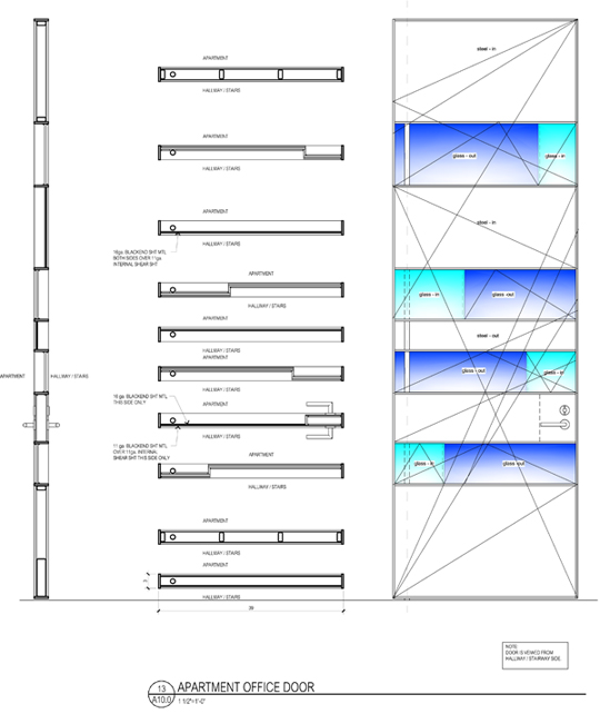
Golden Section diagonals applied to the design of the door for the Sand residence pictured immediately above.
LS: In music, in musical scales, certain intervals just FEEL right. And some scales, like Middle Eastern, have different pitches from what we are used to. But if the proportions are there, it sounds much better. I design from the gut initially, but then afterwards we fine-tune using these proportional systems. I insist that everyone in my shop do the same. [referring to a large blackboard in her home which displayed a note to her daughter] You can think of it as “Mom’s Rules in the Shop” – tuning is mandatory!
RF: Do you ever use curves, odd angles, or irregular shapes in your designs?
LS: Lately I’ve preferred things to be very linear and clean. One reason is cost, but another is to make the sculptural items bold. It’s a minimalist take. I’m not against curves, but the projects shown here are the ones I liked the best. I like simplicity and working with straight materials. My raw materials are already in a linear form: steel bars, wooden sticks and lumber. That’s just how it comes. Maybe if I used different materials I would use curves.
RF: What future directions are you pursuing? Any final words of wisdom?
To continue to further develop the sculptural nature of architectural elements and lighting. Design is really a meditative state, where mind and hands are one.




javier rodriguez
05. Dec, 2015
thanks!…nice/useful blog.