Min/Day Architecture Creates Rapid Custom-Fabricated Interiors
by Mark English, AIA | Interviews
A few weeks back, I was standing in line at the opening party for Metropolitan Home’s Modern by Design showcase at Baker Street, wondering what the latest from San Francisco’s top interior design luminaries would be. This project, a high-profile rehab of a 7,700 SF home, involved invitations to 14 design studios and giving them the freedom to create the interiors as they pleased – on their own dime.
Imagine my surprise at the top to discover Min/Day Architecture’s playful and colorful three-room “Jack and Jill” attic suite with handily elegant Murphy bed tucked away behind a custom-perforated sliding panel, a jewel-like green-tiled bathroom, and an adjoining room featuring large pink dots, with a modular table that looked like something Andy Goldsworthy might do if he ever tried working with stacked birch plywood as a fabrication medium.
A few weeks back, I was standing in line at the opening party for Metropolitan Home’s Modern by Design showcase at Baker Street, wondering what the latest from San Francisco’s top interior design luminaries would be. This project, a high-profile rehab of a 7,700 SF home, involved invitations to 14 design studios and giving them the freedom to create the interiors as they pleased – on their own dime.
Imagine my surprise at the top to discover Min/Day Architecture‘s playful and colorful three-room “Jack and Jill” attic suite with handily elegant Murphy bed tucked away behind a custom-perforated sliding panel, a jewel-like green-tiled bathroom, and an adjoining room featuring large pink dots, with a modular table that looked like something Andy Goldsworthy might do if he ever tried working with stacked birch plywood as a fabrication medium.
The overall theme looked like a mathematical distribution of dot patterns repeated in various ways – how did they do that? I wondered, my eyes watering a little as I squinted at the madly dancing dots. What algorithm did they use? The components were too regular to be hand painted, but too lyrical to have been generated by a mindless machine. Oftentimes, industrial-design vectors and geometries are easy to spot – but these dots defied easy definition, and seemed to indicate an intellectual and creative process that was very different from the sensibilities in the rest of the house.
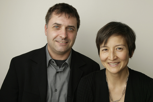
I was so curious I went and asked them. EB Min and Jeffrey Day have a practice with offices in San Francisco and Omaha, and they’re both well-versed in advanced fabrication design techniques. How did they make their clean-edged, precisely fabricated components so… organic? And how did they ever dream up this idea in the first place?
“The Murphy bed came first,” began EB. “The rooms seemed more playful than the other areas of the house – small, low ceilings, slanted rafters. The front room had great light and views, and would make a great home office. The Jill room was a problem at first… should it be for daydreaming, play, studio, or lounging?It was like a hideaway.”
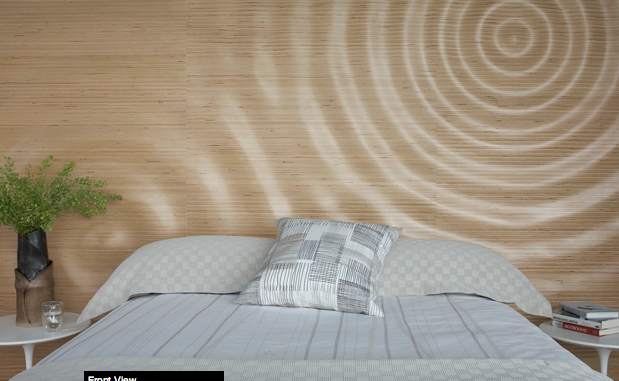
Then Min/Day hit upon the idea of “interior landscape” – something they’d done extensively in past projects. A lakeside home in Iowa, for example, featured a “Raindrop Wall” – a waveform interference pattern on the stacked-plywood head board that echoed the lake surface 10 feet away. Min/Day designed custom furniture in Rhino, and also designed all the landscaping.
Another project was the L Residence in Omaha – custom-cut fixed wood panels serving as guardrails or as grilles covering diffuse recessed lighting. “We wanted to reflect the exterior in the theme,” said EB, “and devised this close-up view of the prairie grasses to reflect the outside surroundings.”
For the Baker Street project, Min/Day wanted to continue exploring the fabrication methods that they had employed in previous projects, and to stay in keeping with the concept of celebrating the local natural environment. “We’re interested in the relationship between quantitative process and results … something that’s digitally fabricated, but with an organic result.”
And nothing says “San Francisco” more than fog. Fog… clouds… daydreaming… and thus the Cloud Wall, the Stones Table, and the Fog Wall were born. Software tools included Rhino, Grasshopper, Illustrator, and Vectoraster.
Cloud Wall
The Cloud Wall was created from a photo using Vectoraster, a graphics utility that generates scalable vector-based halftone dot screens with customizable grids.
Jeff explained, “We started with an image of actual clouds. After creating the dot pattern in Vectoraster, we took it into Illustrator to mask to the shape of the wall and ceiling planes and to scale it precisely. Since we were working with a vector-based file this was easy, unlike using Photoshop’s half-tone filter. The wall coverings were printed by Giant Impressions, a large-format graphics print vendor in San Jose.”
Did you pick discrete dot sizes? I asked, betting with myself under the table. Yes, they had, probably a posterize filter in Photoshop. Keeping the sizes simple actually reinforced the optical illusion, especially from very close up.
Stones Table
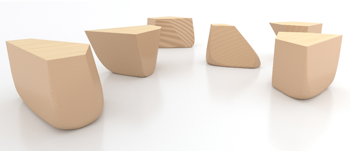
In addition to honoring the clouds, Min/Day were inspired by Japanese gardens like Ryoanji, which features clusters of large stones arranged so that some are always hidden from the viewer. “We thought of making ‘stone poufs’ and then had the idea of assembling them all into one table.”
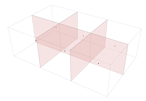
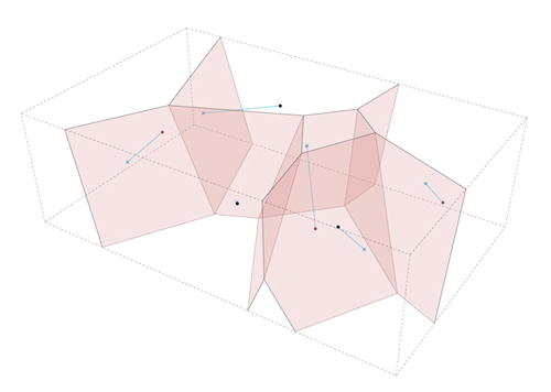
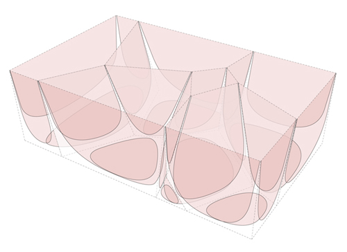
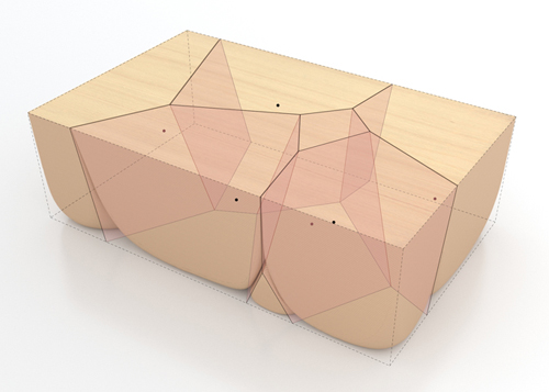
They created the table shape as a Golden Rectangle with standard proportions.The first challenge was dividing the volume into six random but pleasing shapes that would be stable enough to stand alone. Instead of just manually slicing up the volume, Min/Day decided that it would be more elegant and natural to let mathematical law determine the shapes using a geometric concept called a Voronoi diagram.
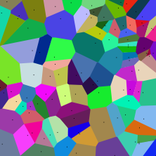
A Voronoi diagram is essentially a type of surface tiling, created by defining a discrete set of points or “sites” on a surface plane, and then defining “cells” which consist of all the area around each point that is closer to that point than to any other point. The boundaries between the cells are where it is equidistant between two sites, and the corner nodes are points equidistant to three (or more) sites. The table of course is three-dimensional, not two – making the problem-solving exercise that much more complex.
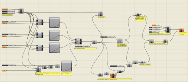
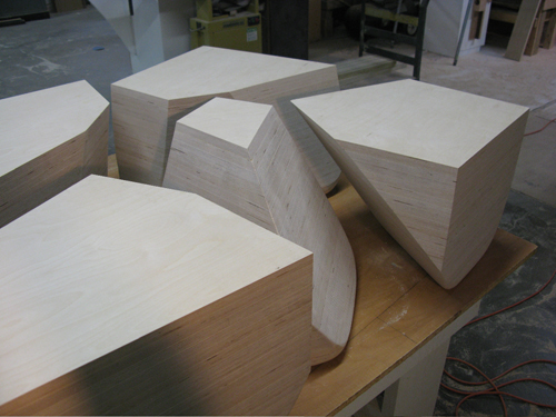
To allow Rhino to employ an algorithm to create the slices, they used Grasshopper, a free visual scripting language that works as a Rhino plug-in, and played around with the location of the points until they got a result they liked. The pieces had to each be unique, and they also had to be free-standing when disassembled. “We deliberately included one shape that’s almost useless… it’s mostly center volume,” said EB. “We also built cardboard models to see if they were really stable, and we also included a piece that looked little bit tippy, but was secretly counterbalanced inside.”
Initial versions were “too angular” and looked like “shards”. We added rounding to the bottom using an ‘erosion filter’. That was a lot of work.”
How did you simulate the eroded effect on the bottom? That’s where they went to Grasshopper once more. “We needed to take each vertical vector and taper it from sharp to round. It’s very difficult to round them by hand in Rhino. We were going to have the rounding done manually during fabrication, and if we’d had access to a five-axis milling machine, this would have been a lot easier. The person we outsourced the CNC routing to only had a three-axis machine, and he ended up doing it “his” way without asking us.”
Why did you even bother going through this painful exercise? Was the end result that much better because of it? I asked. “It speeded up the iterations. We could play with any factor and immediately re-generate the whole thing,” EB explained. Grasshopper has multiple levels of undo and even a projective history function. So, we could make a change to any step within the process without having to re-do it all from scratch every time.”
“Grasshopper itself is free, and it’s only a year old,” said Jeff. “Word is that it’ll always be free, because they don’t want to have to provide tech support for it. It’s very popular in schools right now, but serious scripters would probably laugh at it. We generated the basic forms using a 3D Voronoi script that comes packaged as a component in Grasshopper. The rest of the formal permutations are embedded in additional Grasshopper components that we used in the final “definition”. Because Grasshopper is parametric, we can determine as many variables (parameters) as we want, and then adjust them for each new iteration.”
The final table was fabricated from stacked Baltic birch plywood by Andy Colley, who also fabricated the Raindrop Wall for the lakeside house project. How “green” was this table? I asked. Was it made from recycled or reused material? “We chose Baltic birch for the look,” replied EB. “It’s not reclaimed or reused, but it could be made from other materials as long as they were cuttable.”
Was casting an option? I wondered. “If it were a cast piece, it might not need rounded bottoms,” EB mused aloud, with Jeff on speaker phone. “And casting it from recycled plastic would make it greener for sure.”
Fog Wall
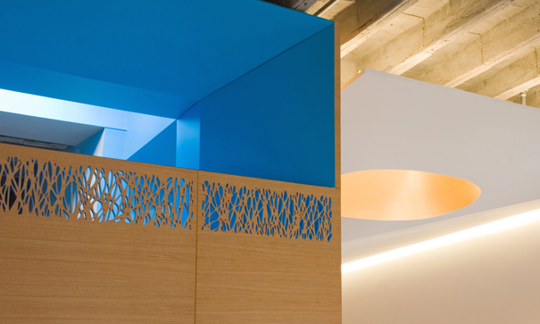
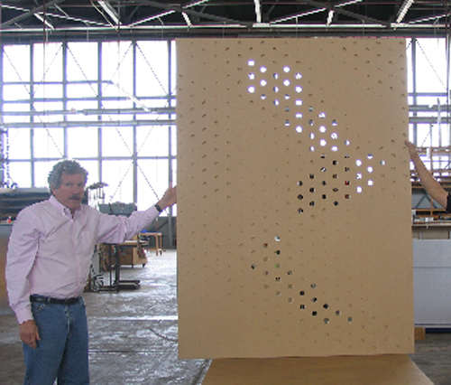
The perforated panel that slides to reveal a Murphy bed carried the cloud concept in a new direction. “Fog masks and disintegrates things. Objects in fog dissolve; they’re mysterious. The Fog Wall both hides and yet partially reveals.”
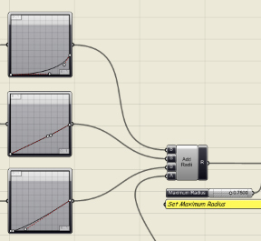
This time, they didn’t start with a photograph, though. “We randomly drew four curves in Rhino. The curves would determine the dot size through proximity. The definition of each curve included its influence – how far out its effects go, as related to a set of center points.”
Scripting all the transformations in Grasshopper allowed for a very iterative design approach. “Most architects think about form. This method emphasizes logic, and the forms are the result of that logic.” They could experiment with just about anything in the model, from the hole sizes to the axis of extrusion.
Fabrication turned out to be a much bigger challenge than anticipated, because they had to represent not only different size dots, but each size was associated with a defined amount of penetration through the screen. “We had an early mockup done of the perforations, and there were too many different hole sizes. The fabricator recommended optimizing the pattern to 5 discrete diameters and 4 depths in order to save on machine time and fabrication costs, so we came up with five different hole sizes. This allowed the fabricator to generate a grid of holes and drill each size to a different depth. All he needed was five different drill bits.”
Natural Geometries
There’s something very elegant and abstract about Min/Day’s designs, and yet despite their formal qualities, they are very much based on what I would call natural law. They’re not sterile ideals of intellectual perfection – they look like natural forces such as gravity and wind have been at work. In fact, Min/Day’s use of computational geometry parallels the discovery of the original laws and formulae within nature, and is a use of digital technology to highlight nature rather than leapfrog it.
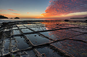
The five-dollar word for “tiling” is “tessellation”. Tessellations frequently appeared in the art of M. C. Escher, and they also appear in natural sites such as this Tasmanian beach.
Fabrication
We talked about the ins and outs of relying on tightly controlled custom fabrication. Fabrication can be easier, but information management can be a challenge. Having more control over the logic enables Min/Day to work very closely with their fabricators and to control timelines far better than with outsourced custom furniture, which has a typical lead time of 12 to 16 weeks.
You Get What You Pay For
Although Min/Day donated their labor and material costs, they do get to keep the items afterwards. “The Fog Wall assembly was designed for portability”. Metropolitan Home funded the permanent finishes and fixtures. The whole project was done in four and a half months.
So, how much did it all cost you, if that’s not too nosey a question? “I’m afraid to know” EB laughed ruefully. They haven’t had the time to calculate their hours and all the material costs. “The Fog Wall was made by Delphi Productions in Alameda. They can build almost anything. Mueller Nicholls made the cabinets and casework, and A Cappella did the installation. The Stones Table was made by Andy Colley of Colley Furniture Studio, who works out of Omaha, Nebraska. We’ve worked with him for 3 years. He’s very adventurous and he really enjoys a challenge. The Cloud Wall was by Giant Impressions in San Jose. They did a terrific job installing it – you can’t even tell that there are seams.”
It turned out that much of their project was built on barter. They persuaded vendors to donate or discount materials and installation in return for the exposure. “But for us, this was a great project,” said EB. “We had the opportunity to experiment and explore, and it gave us a chance to stretch our wings and get recognition for it.”






jillmimo (Jill Moran)
08. Mar, 2010
Read this interview w/ another female local luminary of the design community, Min Day: http://tinyurl.com/msa7rn
Vittorio Menna
04. Jun, 2010
Hi,
first of all congrats for your works, very interesting. I use grasshopper too, and i m kind of curious to know how you created 3D voronoi volumes in your Stones Table.
Thanks in advance,
best regards
arch. Vittorio Menna
blog wunderlust : 2nd August 2010 | Architecture Design & Trends
08. Jun, 2011
[…] coffee | Small Houses, Big Plans: Modern Model Home Design Ideas | Min/Day Architecture creates prefabricated interiors Share Architecture e² – the village architect blog wunderlust : 9 August […]
Il nuovo master INARCH in Tecnologie Emergenti. Una conversazione con Fernando Rial e Dario Donato. | PaesaggiSensibili
30. May, 2013
[…] http://www.digitalcrafting.dk/?cat=16http://www.arch.columbia.edu/labs/fablabhttp://www.rhinofablab.com/http://peterbooth.wordpress.com/https://thearchitectstake.com/interviews/minday-architecture-creates-rapid-custom-fabricated-interior… […]
Women In Architecture: Interview Series | The Architects' Take
12. Apr, 2016
[…] features on The Architect’s Take: Min|Day was our inaugural feature. We did a follow-up profile of her business partner Jeffrey Day as […]
Min|Day Architecture: Interview with Jeffrey Day | The Architects' Take
17. Feb, 2017
[…] back in the mists of time (2009) when we started this blog, our very first article was about Min|Day Architecture. We were so interested in the thinking behind a couple of their […]