
Gary Hutton: San Francisco Master of Interior Design
by Rebecca Firestone with Mark English AIA | Interviews
Fashions come and go, but then they come back around again. Wayne Thiebaud once said, “There’s nothing uglier than a 20-year-old car, but there’s nothing groovier than a 50-year-old car.” It’s our own thought process that has changed, not the object itself…
When something is completely made by hand, like a custom home, there’s a Zen to that. Your body recognizes it almost on a cellular level. It’s really about knowing how to make things. That’s what you learn at a good art school. My furniture is made by people who do the finest work in this country. People in the know, people who work with metal, they see my tables and they say, “Oh… my… God…”
– Gary Hutton
(Photo: Steve Hodge)
Gary Hutton‘s office in Potrero Hill is a nice place to visit: warm and welcoming, with a very finely honed and understated elegance. At first, I was highly distracted by the vintage 70s disco platform shoes that were apparently part of the decor, to the point where I forgot all my clever opening remarks. But then we went into a conference room – with a beautiful table made with cast concrete legs and a thick plate glass top – and the words flew for hours. We had a follow-up session with Gary, myself (Rebecca) and Mark English.
His personality is both warm and forceful. Deeply empathetic, quick to laugh – but underneath, a core of steely determination to never, ever compromise on quality. I was looking for the secret of his success – read on if you want to know, too.
Childhood Proclivities
I grew up on an apple farm in Watsonville, California. Even as a small child, I had a real interest in interiors and was decorating my room all the time. My parents were very indulgent – they just closed the door and let me have at it. At age 5 or 6, I saved my allowance and did a Polynesian theme – fishsnets, glass floats, plastic orchids.
Later at age 14, my sister got married and moved out, and I got her room, which was much bigger than my old one. My dad and I put up a wall of wood paneling. It was the Pecan color – I remember that I was very specific about it at the lumberyard. I painted the ceiling bright yellow-gold, and the other walls were off-white. I found an old metal and wood trunk in a barn and painted it olive green. It’s still there… still olive green! (In the 90s that would have changed if anyone had been paying attention, but I was long gone by then.) For window coverings, I had roller shades that looked like burlap, with gold trim to match the ceiling.
Childhood Hobbies
As a kid, I wasn’t a collector per se. I built model cars. A love of automobiles was one of the few things my dad and I shared. Here are some trophies I won for model cars, and a few more for cheerleading. In 1968 we won first place in the San Jose Cheerleading Competition. Cheerleading wasn’t as athletic as it is now. My main job was to hold the girls up. That takes balance more than strength.
Before I got to high school, the model cars were my main diversion. It took so many different skills to make one back then. Even the spray painting was a two-step process. First a metallic silver color, and then a clear color coat on top. I would go to fabric stores with my mom to buy corduroy, and then cut individual wales to make the piping for the car seats. I’d cut thread to make the spark plug wires in the engine. I would cut the front off of one car and join it to the back of another, creating custom hybrid cars.
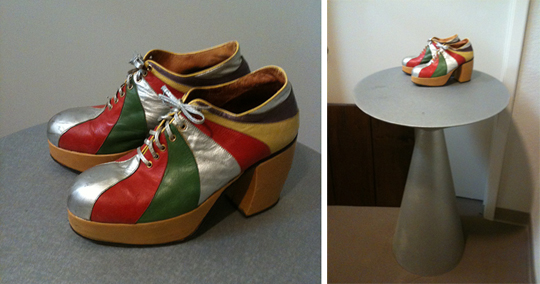
These vintage 1970s disco shoes are on display at Gary Hutton's office, on a table he designed called the Ciao table - here shown in one of several available patina finishes. Photo: Mark English
Growing Up in Watsonville
Back then, Watsonville was a small, agrarian town of 12,000 people. Our 30-acre apple ranch was 6 or 7 miles out of town, too far to walk anywhere. I spent a lot of time by myself, exploring, finding artifacts and machine parts. There were trees to climb, and places for forts. My sister was 5 years older than I was, and was not interested in hanging out with me. We never fought – we were just in different worlds, culturally as well as age-wise. 1966-67 were transition years. My sister was into poodle skirts and Elvis, while I went to high school with hippies and the Rolling Stones.
My dad was a railroad engineer. He drove trains, had a cap, the whole works. He mostly stayed local, doing runs to San Francisco and back, or loading and organizing the cars for cross-country trips in the railyard. I remember he would deliver boxcars of sugar to the local Wrigley’s plant, and go back to pick up the loads of chewing gum. My mom was a homemaker. She didn’t really have any hobbies as such. Both my parents were active church members in a Baptist denomination. Making bandages for missionaries, that sort of thing.
Education
I was on the college prep track at Watsonville H.S. which didn’t leave much room in the way of electives. Since my parents insisted on music, the electives I was able to take were choir and band. I didn’t take a single art class in high school – it wasn’t until I got to junior college at Cabrillo that I had my first art class. I was torn between art and interior design. But the head of the Art Department at Cabrillo College was “not down with decorators”… And in those days, people thought that going to San Jose State was like flushing yourself down the toilet. So the way he presented the choice to me was, “You could go with fine art at a 4-year institution like UC-Davis and study with all these great people, or you can go to San Jose State… and be a decorator.”
There’s a world of difference between a designer and a decorator, though. A designer is a decorator who can draw. Anyone can call themselves a “decorator” – but there are also ways of going deeper into the design.

A "decorator" without formal training in fine art and craftsmanship could never have designed a table with the level of sculptural refinement shown in this Gueridon table from Gary Hutton. Photo: David Wilson
In retrospect, being an art major at Davis was the best thing I could have done. That was a golden time for the art department at UC-Davis. The department was still small – 125 art majors total – and every class was amazing, with instructors who are now icons. I had Wayne Thiebaud for drawing, William T. Wiley, printmaking with Roland Peterson, sculpture with Manuel Neary. Classes were small, only 10 students per class usually. So we always had a lot of personal attention.
Rebecca: Sometimes great artists aren’t always great teachers, though.
Thiebaud was the greatest teacher I ever had. He conveyed such love and curiosity. One class he taught was on theory and criticism, and that was at 9 in the morning. At noon, we’d get out and we’d jump in the car and go straight to the SF-MoMA to look at what he’d just been telling us about.
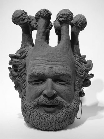
Robert Arneson, on the other hand, was totally incapable of communicating in a formalized classroom setting. His class was a total bust. BUT – if you were willing to hang out in the sculpture studio – if you were willing to play in the mud with Bob, on your own time – it indicated to him that you really wanted to understand, and he’d share everything he had with you, side by side. He had an incredible generosity of spirit.
Rebecca: Do you have any examples of your early artwork?
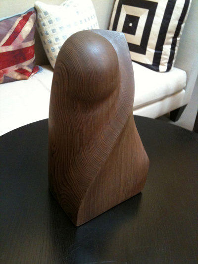
Interior designer Gary Hutton created this sculpture as a fine-art studies undergraduate at UC-Davis. Photo: Mark English
I made this from a single redwood board, which I laminated and then began working on. Starting out ahead of time with a “plan” wasn’t producing very good results, though. The professor told me to let the material tell me what it wanted to be. I was so frustrated I ended up taking the skill saw and just HACKING at it! The cut I made – it became a defining line in the finished piece.
Furniture Craftsmanship
[Hutton showed us a few examples of his furniture pieces that he had in his office.]
Shown here are the Facet 3 and Facet 4 tables from Gary Hutton Design, which I saw in person. Even the closest of inspections will fail to turn up any evidence of visible welds or other means of assembly. The metalwork and finish on these tables is as smooth as polished stone. Photo: David Wilson
Rebecca: This bronze table rings like a bell! What a beautiful tone it has. You can’t hear this sound in a photograph, though. And it’s so smooth.
No… and you can’t see how it’s put together, either. Look underneath. There are no visible welds.
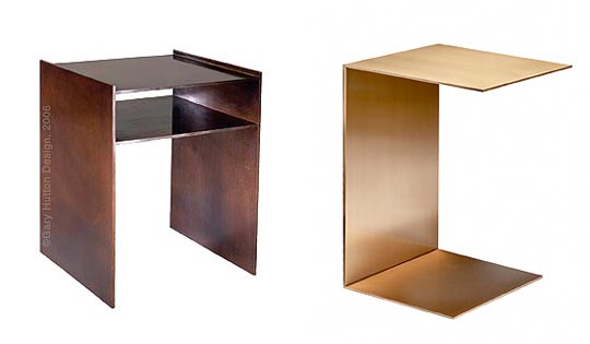
Gary Hutton designed the A3 Table and the A7 Table as well. These are museum-quality pieces, except you're allowed to touch them. Photo: David Wilson
[Rebecca: This, in my opinion, is Gary Hutton’s Secret #1 – intensive studio art training, a close attention to craftsmanship and detail, has given him both the hand and the eye of a sculptor. It is as a sculptor that we can best appreciate his furniture and his interiors.]
Interiors as Showcases for Fine Art Collections
Rebecca: Who are some of your favorite fine artists?
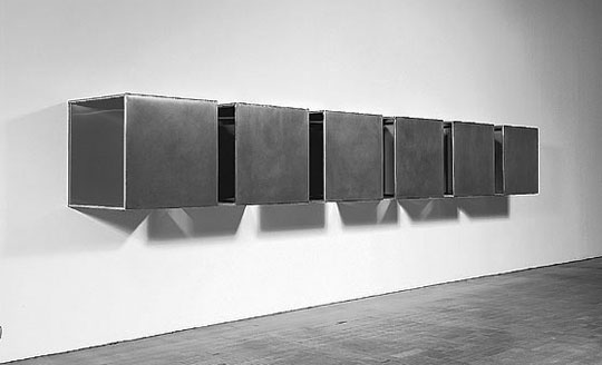
Oh, there are so many! Donald Judd and Frank Stella are just two.
Rebecca: How does art selection fit into your practice as an interior designer today? Do you pick the art for your clients?
I work with serious art collectors, so no – they’ve already got their collections, or they work with art consultants. I create the background for their collections. Many of my clients rotate their collections, or they’ll move pieces from one home to another. The interiors have to be able to showcase anything they might want to hang there.
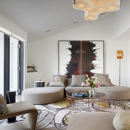
This Venice loft is one of Gary Hutton's interiors. The room is designed to showcase artwork, but is not so closely married to any one piece that it would be ruined if that piece were exchanged for a different one. Photo: Matthew Millman
Gary’s Favorite Interior Designers
Rebecca: Who are some of your favorite interior designers, past and present?
After graduating from Davis, I spent a year trying to find a job as a sculptor. Imagine that! [laughter] I did actually get one commission. Then I went back to school, to CCA, which was called CCAC back then, and studied design. At that time, San Francisco was a major interior design town. Now it’s not – now it’s a food town. Back then, though, it was a hotbed of design. There was one socialite, Harry DeWilt, whose famous quote was, “San Francisco is a quaint fishing village run by interior decorators.”
Let’s see, who was there? Michael Taylor, who created the so-called “California Look”. Diana Vreeland called him “The James Dean of decorators,” because he challenged and rebelled against the design trends of his day. Tony Hale. Billy Gaylord. Eleanor Forbes. Eleanor Ford. John Saladino and Joe Durso from New York – I loved their work. So many of them have come and gone, and yet here I am, all these years later, still standing!
[Rebecca: I was curious about Michael Taylor and how exactly he might have influenced Gary Hutton, which is how I came upon the two above-referenced sites. Taylor said, ““When you take things out, you must increase the size of what’s left.” He rebelled against the clutter and pretentiousness of Postmodern designs that relied on fake columns and other such gimmicks. Taylor also believed that white was the best color for capturing light.]
Rebecca: What’s the secret of your success in this recession, when so many design studios are closing their doors?
I’ve always remained small, and haven’t gotten big to absorb huge projects the way some studios did. The most people I’ve ever had on staff is 5. This keeps us nimble. And, up until this recession, having the furniture line helped carry us through other slow periods. This time, furniture sales have dropped off to almost nothing. But, most of our projects last a long time, 18 months to 3 years. These long projects didn’t get stopped, which was fortunate. The projects are long because often we work from the ground up with the designing architects, so we’re there from Day 1 all the way through construction.
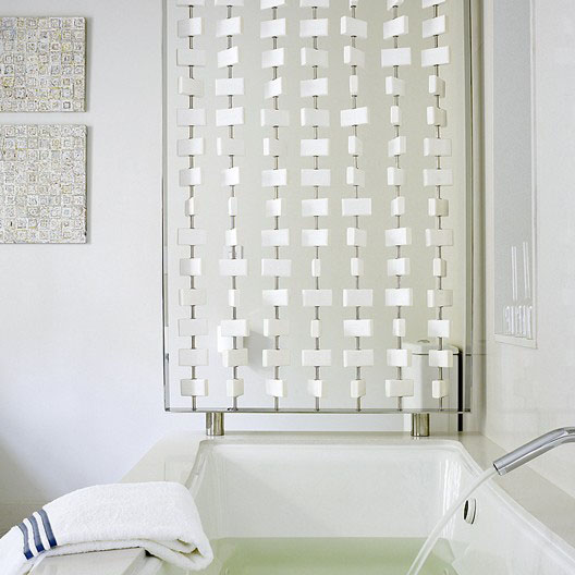
Gary Hutton's training as a sculptor possibly inspired him to invent this screen made with Ivory soap bars for the Metropolitan Home Designer Showcase on Baker Street in San Francisco. Of course, the metal frame itself was very finely crafted - something I wouldn't have thought about if he hadn't told me. Photo: Matthew Millman
Interior Designers Who’ve Worked With Gary Hutton
I’ve had a few people come through my studio who are now out on their own. Steven Miller, Joel Robare are just two. It’s great to see people grow. I see it as a process of mentoring those around me. After 30 years, hopefully there’s more than just air space inside there!
I first met Steven at CCAC. Jerry van Slambrook was there. He was a contract designer, one of Gensler’s first 12 employees, and also worked at Perkins & Will before turning to teaching. Jerry asked me to critique his class. Steven Miller presented, and I thought, “This kid has got STYLE.” Two years later, he came to me as an intern, and after that I hired him. He was great fun. At a certain point, he needed to go and do his own thing. He had trouble coming to grips with that. And I didn’t have enough experience with employees to understand what was going on. But we’re still friends!
Mark: In my experience with employees, when it’s time for them to leave, a certain amount of friction would occur. Sometimes the mentor gets plowed under. The energy to launch came partly from a rejection of the mentor.
Well, this is a small town – as you know. Stuff gets around. You learn to keep your mouth shut.
Mark: I do some mentoring at the AIA partly out of a feeling that there’s really no escape from the community. The design community is my family, so I might as well make it better. There might be some family spats but that’s all they are. We still have to get along somehow.
Yesterday, I was leaving the gym just as Richard Beard was coming in. The Museum of Craft and Design was having a show, architectural models, and a lot of people I knew were in it. I was thinking, “Oh, I really should go…” because I knew I’d get pressure if I didn’t. Sometimes that pressure is part of being in the community, too.

This San Francisco apartment renovation was a collaboration between architect Mark English and interior designer Gary Hutton. Photo: Matthew Millman
Museum of Craft and Design
I was on the museum board for a bit at the San Francisco Museum of Craft and Design. They’re unusual in that they don’t have a collection. They do shows, these pop-up shows. They just had another wonderful show, three artists and three installations. And last winter, they had a terrific jewelry show. There was some strange conceptual jewelry, and a beautiful installation – a series of cast latex rubber hands on posts. There were pins stuck through the fingers to keep the rings on. It was creepy, but wonderful at the same time. There was a serpentine necklace of black silicon, so thin that it conformed to the body and looked like a tattoo. Another piece was a series of luxury brand corporate logos like Nike, Pepsi, Chanel, all collaged together to make a giant crucifix.
They did another show in the Castro recently, a sound installation. The artists blew huge glass vessels that were motorized, with a stylus, played like a finger on a wine glass. There were 15-20 vessels on each wall, making random sounds – glorious!
Ted Cohen designs most of their exhibits. He’s in his 80s now, and does museum exhibits all over the country. He doesn’t have a cell phone, doesn’t do email, and he doesn’t drive. He takes public transportation everywhere. He’s still totally his own person. I want to be like that when I’m his age!
Good Design and the Test of Time
Rebecca: What constitutes “good design”?
Suitability. Is it the right thing for those people, in that space?
Here’s one example. Tony Duquette redid a Venetian palazzo for one of his clients in a way that was totally off-the-wall crazy, but it worked because it was right for her. She was so stylish, so self-assured, and so in love with the most avant-garde fashion imaginable. And Tony made it work. Who else would think of taking a 12th century Venetian palazzo and covering the molding with leopard velvet? Or taking the grand plasterwork and covering it with coral? There’s a chandelier in there that’s made of coral. It’s beautiful in its wackiness… glorious.
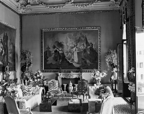
Gary Hutton made special mention of Tony Duquette's leopard room in the 12th-century Palazzo Brandolini in Venice.
Another amazing interior was the Union Bank Headquarters in San Francisco, right on Sansome and California Streets. Skidmore, Owings & Merrill redid the interior the late 70s or early 80s, with Charles Pfister as the lead I.D. on the project. This was at a time when the Japanese had more money than anyone else and they wanted to show it; this project was supposedly the single largest order of Knoll furniture ever placed. It’s not there anymore, unfortunately.
It was a beautiful commercial interior: spare, elegant, colorful, in that early 80’s corporate lush sort of way. The lobby is 2 stories tall, with the tellers sitting inside a marble donut in the middle. The access was actually from below, from downstairs, so the donut was completely unbroken all the way around. There was a cylindrical light fixture overhead that hung most of the way down in that soaring lobby. A mezzanine ran all the way around, and there were conference rooms in each of the four corners. These were cylinders as well, with smaller cylinders inside covered in ombre silk going from red to orange. Everything else was pale – the carpet, the marble, and the pale oak furniture.
Rebecca: Do any of these really bold interiors stand the test of time?
Well, fashions come and go, but then they come back around again. Wayne Thiebaud once said, “There’s nothing uglier than a 20-year-old car, but there’s nothing groovier than a 50-year-old car.” It’s our own thought process that has changed, not the object itself.
Rebecca: Some of that has to do with the condition of the object. A vintage Chevy with fins that’s all banged up and dilapidated isn’t as exciting as one that’s in pristine condition.
That’s true enough. There are fashions in art, too. There was a painter in the late 1800s, Bierstadt, who made these giant paintings of places like Yosemite. He was one of the most successful artists of his day. But by the 1950s, nobody wanted them. You could pick them up for next to nothing. Now, they’re in great demand again. In today’s contemporary art market, Warhol, Koons, and Picasso are very fashionable. Especially late-period Picasso. Abstract expressionists and color field painters are not as fashionable as they were 10 years ago, though. It’s all in the eye of the beholder, really.
Wayne Thiebaud once said about his own work, “I’m a painter, not an artist. Only time will tell if it’s art.” In interior design and in architecture, too, the idea is to do the best job you can, and to work in your craft to the highest level possible, but then you just have to wait and see.
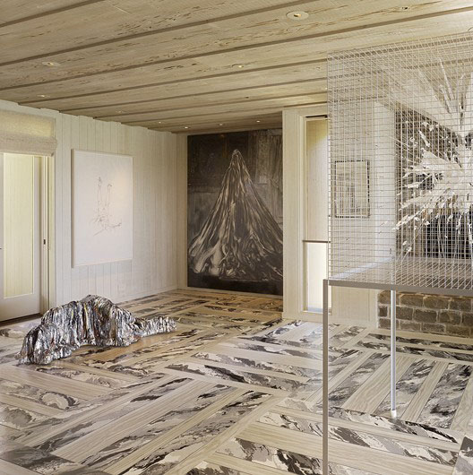
Gary Hutton designed this foyer to complement the various pieces of art and sculpture, including a specially commissioned floor from artist Robert Miele, created using painted vinyl inlay. Photo: Matthew Millman
Back to fashion. You have to look at the big picture. The Barcelona Pavilion in the 1920s by Mies van der Rohe is another example. At the time, people hated it. Now it’s one of the icons of Modernism. It was partly his genius, but also partly being in the right place at the right time, and getting a commission that wasn’t hampered by a lot of functional requirements. A pavilion isn’t a school, or a hospital, or a train station. This gave a lot more freedom of expression.
Rebecca: Yes, and now some of these early Modernist works are the focus of historic preservation efforts! People put incredible amounts of time and effort into restoring them exactly as they were made at the time. But that brings us back to the importance of craft…
[to be continued, in Part 2]
Photographer note: Matthew Millman is based in San Francisco, CA






Luxury God » Blog Archive » Gary Hutton Design: San Francisco Interiors | The Architects' Take
26. Feb, 2011
[…] the original here: Gary Hutton Design: San Francisco Interiors | The Architects' Take Tags: all-collaged, artists-blew, […]
URL
28. Jul, 2023
… [Trackback]
[…] Informations on that Topic: thearchitectstake.com/interviews/gary-hutton-san-francisco-master-interior-design/ […]