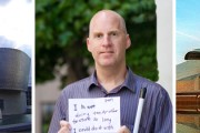
Chris Downey on Tactile Architecture
by Rebecca Firestone with Mark English AIA | Interviews
“The idea of simplicity for the sake of mental clarity can actually be created even within a complex space by having an orthogonal way of moving through that space. Even a Frank Gehry design can have an orthogonal footprint within it. I’d love to visit his museum in Bilbao. It could be a fascinating building to hear or to sense… virtual reality is all about being “somewhere else,” but architecture is about being where you are – that’s what I’m really interested in doing.”
– Chris Downey, Architect
After hearing and digesting Chris Downey’s lecture on architecture for the blind, Mark English and I paid him a follow-up visit at the downtown design offices of Tom Eliot Fisch, where we asked a few questions that he hadn’t quite gotten to in his earlier talk. Questions are marked either as Mark English (ME) or Rebecca Firestone (RF).
ME: What originally inspired you to become an architect?
Early in my life, my parents commissioned a Modern home from an architect in Tennessee – the only Modern home in the area. It was my first exposure to Modernism and it fundamentally influenced my own design ideas. Particularly the home’s close relation to the surrounding landscape and hillside on which it was built.
For a kid, it was pretty darn cool. You could walk right onto the roof and onto the back of the hill. The house wrapped around trees, too. It suggested that you could do a lot with design besides repeating a style or an image. Later we moved to Raleigh, North Carolina, and saw a different environment. Raleigh actually has a good collection of Modern architecture.
I was constantly exposed to the design profession, surrounded by it. I took a summer job at a landscape architect, and ended up working with topographical drawings, understanding the profession from a landscape perspective. I renovated a house with my stepfather and brother, and the dean of the North Carolina School of Design lived right across the street from us.
All of this impressed upon me the relationship of built form to landscape, and of architecture as a process of problem solving, construction, and also creativity.
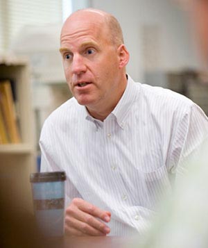
Chris Downey is an animated speaker, full of quips and lighthearted comments, but when it comes to his design work for the visually impaired, he's seriously dedicated to making the built environment friendlier and easier to use.
ME: Why did your parents hire an architect?
I have no clue, never asked them. My father was a doctor, and my mother is a professional musician – singer, organist, guitarist. Music was my introduction to the arts, through my mother – that and the commitment and passion that you need to succeed in any art.
ME: What did your friends and their parents think about your Modern home?
Who knows? Kids don’t get hung up on things like “This doesn’t look right.” Either a place is engaging or it’s not. It’s what you can do with it that matters. Forget the references, the question is, for any design, are you thrilled by it? Does it thrill the child in you?
ME: Who were your influences in school? When I was at Cal Poly I was really interested in Mark Mack’s work. What I liked about Stan Saitowitz and Mark Mack was that both started with drawings that showed the inherent relationship between building and landscape.
I was interested in Mark Mack, too. I never studied with him, but I went to his studio critiques and I was fascinated by his work. I was less into his use of color. What I liked was his form and how he worked with space. I studied with Stanley Saitowitz, Lars Lerup, Yung Ho Cheng, Marc Treib, and Gary Black.
RF: There are certain design hazards like open stairwells or rail-less stairs that are dangerous to visually impaired people, but which are often part of the Minimalist or Modernist vocabulary. Which of our beloved Modern design notions might have to fall by the wayside in the name of safety and accessibility? Isn’t minimalism about REDUCING sensory input?
A lot of these aren’t allowed by code anymore. There are period Mid-Century Modern buildings that won’t do any updates because they’d be forced to abandon the original design. Of course, when I still had my sight, I didn’t understand the real challenges with open stair risers. When I tried using one afterwards, it was a problem and I appreciated closed risers!

Open-riser stairs look cool but can be harrowing for people with serious visual impairments. Left: this open-riser stair has no rail and no guiding wall to follow. Center: this one at least has a minimal handrail, although it's too open for safety. Right: this stair has a nice handrail with a glass wall on both sides, although a blind person could still bump heads with it when approaching from the side.
We get too caught up in a desired look, but is there really only one way to do a cool stair? No! Minimalist thinking could go beyond this tendency to stop at the first idea. There are so many ways to do the same thing. This might challenge the way we think, but architecture is at its best when it is forced to engage with the outside world.
Even a rich material palette can be appropriate in Minimalism, because if you’re doing less, then what you DO end up doing is more powerful.
ME: Constraints can add to the enjoyment of a design problem.
Absolutely. When faced with new constraints, you can either resist them or they can force you out of your comfort zone. It’s like taking on a riddle to which you don’t have the answer, and knowing that this means you’re onto something good. That challenge can push you a little, or a lot. Constraints give you an anchor.
There’s the story about Frank Lloyd Wright, where a client came to him with the “perfect site” – no rocks, no flaws, nice and even. Wright sent him off and told him to look for another site! The perfect site was too boring.

Sometimes the perfect site isn't enough of a design challenge for an "intense" architect. There's nothing to fix or work with.
RF: How do you feel about asymmetric spaces, clever angles, other non-rectilinear forms? How important is that rectangle to you now? Is it better to have a grid, or are vague zoomorphics OK, maybe even preferred? And what makes for a claustrophobic or airy space for someone who can’t see?
I’m wary of drawing sweeping conclusions, being only 3 years blind. There’s no such thing as a prototype blind person, we’re all different. I’m careful to incorporate information from other blind people in my designs.
College campuses do tend towards the indirect, meandering plan. This can be challenging to navigate, and even sighted people get lost. There’s one path at UC-Berkeley that I used to walk almost in my sleep, so finding it again after losing my sight wasn’t that problematic. But it’s hard for a designer to anticipate conditions where some users can’t easily see their destinations.
When designing interior space, a more regularized, orthogonal environment is easier, especially for the newly blind who need to create a mental map. The regularity helps the mind to sort out the space. One of my student problems involved designing a space that was simple but looked complex, and one that was complex but looked simple. However, if you enter a space and you can’t build a mental image of it, that space is inherently complex.
Complexity just for the sake of complexity isn’t always desirable, but it depends on matching the design intent to the space’s intended use. It might be fun to explore a museum, but I don’t want to “explore” an office building when I’m looking for a particular conference room.
The idea of simplicity for the sake of mental clarity can actually be created even within a complex space by having an orthogonal way of moving through that space. Even a Frank Gehry design can have an orthogonal footprint within it. I’d love to visit his museum in Bilbao. It could be a fascinating building to hear, and to sense.
ME: When you create mental maps, do you actually build a model in your mind?
Yes. With the Polytrauma Rehabilitation Center, I have a better idea of what it’s like to be in the space after working with the tactile drawings. I can mentally walk the drawing using my fingers, focusing on circulation and how people move through the building. While doing this, I ask what is unique and recognizable about each space?
I create a catalog of physical experiences. When actually in a building, I move relative to reference points such as the main stair or elevator, using landmarks that can include sounds, materials, even doors. In one museum that had a lot of open spaces divided by a few primary walls that were very thick, I could feel the transitions through changes in acoustics and air pressure.
RF: Can you design specifically for the acoustical experience?
In architecture, we all work with acoustics to some extent, either for sound insulation or for tuning a concert hall. But beyond this engineering perfection, we can also create unique experiences, sculpting sound as people move through the space. We can consider an acoustic strategy that includes a hierarchy. For example, a main corridor could have one sort of acoustical quality, while secondary corridors could have a distinctly different sound to them.
Universal design principles include designing for a wider sensory palette. Here’s one example, a winery I worked on a few years ago for Francis Ford Coppola. You’d think that a movie director would be focused on the visual, but at one point he described the feeling he wanted in terms of a moment in time, a scene, including the breeze, the smell of the grill, people chattering both close and far off, the filtered light on your face through the loggia and vines overhead, the touch of the chair and the feeling of the table under your arm. Somehow in a movie you have to make all the senses come to life, to give the audience that sense of immediacy, the experience of being there. Not just what it looks like.
RF: What about kinetic memory sequencing as an alternative to the mental map? For example, walking through an area and just knowing that when I see a certain landmark, I have to turn right, but I don’t necessarily have the full area all mapped out at once. More like a memorized poem where in order to find a passage you have to recite the whole thing to remember the part you want.
There are so many ways to make sense of the world around us. NPR did a special about “ants that count”, a study in the Sahara that challenged the notion that ants can only find their way around by scent trails. Well, what about places like the Sahara, with sand and wind that blows away these trails? The ants did just fine without scent. So they came up with a theory that the ants were counting their footsteps, and it turned out that when the ants’ legs were artificially lengthened or shortened, they did miss their marks – but only on the first day. By the second day, they had re-adjusted.
I don’t count steps except at this one stair at the SmithGroup’s office at Battery and Sacramento, here in San Francisco. It’s an old building, used to be a bank, and it has very wide stairs with no handrails, far too many columns, a bunch of potted plants in the way, and a series of doors only one of which actually opens from the outside. I had to figure out that I needed to go 13 paces from the corner in order to find the door.
RF: When you shared that story about hitting tree branches and other head-level hazards, I though of a helmet with whiskers like a cat’s, or infrared sensors. It would probably look silly, but maybe there are other devices out there.
Yes, there are things like lasers on canes. A director at the Polytrauma Center who’s blind actually gets to work on a Segway, and wears a vest with laser sensors. Also, people who have been blind from birth are sometimes highly skilled at echo-location. The portion of the brain normally given over for visual processing can be repurposed for other forms of navigation, to the point where if you’re born blind and then get your sight back, you can’t actually see that well even though there’s nothing mechanically wrong with your eye.
There’s one example of a man who lost his sight at age 3 and then had it partially restored at age 40. He would see things like groceries and not know what they were until he picked them up. Then he’d know instantly. Apparently people who’ve had their sight restored don’t see optical illusions, either. They see what’s actually there.
RF: What about landscapes and non-visual landmarks? What works for you?
Well, when I’m walking down Battery Street, I can hear all sorts of distinctive sounds. The wind through certain plants, even hanging plants like ivy. I can orient by sounds in front of me, that I can walk towards (not behind). Sometimes street musicians mask sounds that I need to hear, like traffic sounds at intersections. Some intersections like California and Battery are really hard to hear. And it can be hard to walk at rush hour when cars are stopped.
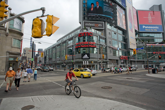
Blind people use the sounds of other people walking, moving traffic, and other cues to navigate across busy intersections.
Sometimes I follow people. I remember one woman with hard-sole shoes and a rolling bag. I followed her all the way to Market Street, then spoke to her to say, “I’m not really following you… but I am.” We had a nice chat and a few days later I heard her again and she said to me, “Wanna hop in behind me?”
On the street sometimes I’ll hear a group of people talking, but when I approach close they all stop talking! I want to tell them to keep talking because it helps me navigate.
RF: Sometimes I speculate about our civilization’s dependence on artificial light. Nowadays, artificial light technology is so powerful that there’s little difference between day and night, possibly leading to over-stimulation. But up until about 200 years ago, the only sources of artificial light were candles, and streets were not as brightly lit, either. In rural areas, I’m guessing there was a lot less light at night, meaning that people might have been far more used to using their other senses for navigation, or perhaps kinetic memory, than they are today. What do you think about this?
Well, they might have gotten their outdoor stuff done by the time the sun went down! Maybe people had better sleep patterns, too. Actually, when I first lost my sight, I was sleepy all the time, sometimes when I really didn’t want to sleep. Then I couldn’t sleep at night for more than 2 hours. I had no circadian rhythms. Melatonin helps with that.
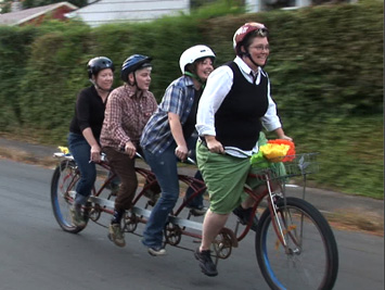
I also keep to a rigorous and consistent schedule. I row on a crew team 3 days a week, which meets at 5:30 am. On the off days, I don’t get up too much later than that to maintain the consistency. I also ride on a tandem bike with another person in front. One day I shut my eyes because they were stinging from sweat, and I asked my partner, “Is it OK for me to shut my eyes while riding?” and we both had a good laugh.
ME: Have you traveled to new places since losing your sight? What’s that been like?
I’ve traveled a fair amount. For example, Portland, San Diego, New York City, and of course every new building is a process of hypothesis and exploration. Exploring keeps your skills alive. A sense of adventure, of uncharted territory. And help is never that far away, even in New York where you’d think people would be brusque.
RF: Under your slide on building handshake, you mentioned Alvar Aalto and Tsien & William but we didn’t have time to explain that.
The “handshake” concept is a response to the old way of designing schools for the blind which over-did things with textured walls and floors everywhere. It led to a cacophony of texture. No one’s going to go around touching every wall. But, there are specific places within a building that you do touch: the front door; a handrail; a half-wall over a mezzanine that you lean against; a countertop; plumbing fixtures. We usually think about how these things look, but we should be also thinking about how they fit to the body.

A "building handshake" describes how a building fits itself to the human body. This example of an "ergonomic kitchen" is from Javabali.com - ergonomic features include a non-fatiguing counter height, and minimal back-and-forth trips.
Here’s a good example of a building handshake. I visited the American Folk Art Museum in New York City with Mr. Pereira (the blind architect from Portugal). “Let’s go have a touch tour,” he said. It was a very rich building to explore through touch, very rich in texture. Architecture students sometimes draw buildings in order to learn about them. The act of drawing makes you focus on all the little details and realize how the building is put together. We were doing the same thing through touch.
The ironic thing is that Mr. Pereira was in town to give a lecture at the MoMA on “Art Beyond Sight”, and as it turns out the modern idea of a museum where you can’t touch the art is post-Renaissance. Prior to that, people could pick things up, learn about them by feel. It’s how children learn about the world, too. Anyhow, here we were in the Folk Art Museum, and a guard came up to us and told us, “You can’t touch the building.” We started asking him, “So can we touch the painted sheetrock?” No. “How about the concrete?” Well… OK. Maybe he was worried about fingerprints?
RF: Well, museum guards are probably not encouraged to make exceptions.
Back to material palettes for a moment. Earlier you had asked about Minimalism. My advice to Minimalist designers would be: Don’t go just for the visual. A lot of Modernism’s image problem is a public perception that it’s cold, disheartening, impersonal. That can be offset by making the building generous to the touch.
Even the benches in the Folk Art Museum were Minimalist and yet, they were sculpted for butts, so that when you sat on them, they welcomed the body. That’s what a handshake is all about – generosity.
Alvar Aalto thought a lot about touch. His furniture was a critique of Mies’ cold steel approach. Aalto’s furniture was more about touch than look. His houses include a variety of crafted door handles that fit well into the hand, and when he placed columns in space, they were always round columns rather than squared-off steel beams. He often wrapped them in the midsection, where your body comes in contact when passing by.
RF: It’s interesting that you talked about museums so much, because I have similar problems even though my vision is OK. So what do you think of the De Young other than the Skydome? Navigable or confusing?
I haven’t been inside it much since losing my sight, but I have explored the exterior. The copper skin with its changes in perforation had a huge variety of texture and even differences in temperature.
RF: Any concluding remarks?
In the grand scheme of things, it’s important to work with all the senses during the design process. Architecture should be sensory-rich. Unlike virtual reality, which is all about being “somewhere else,” architecture is about being where you are. Philosophically, that’s what I’m really interested in doing.


Current Sources and Annotations: October 12, 2012 | Dave Giancarli – Thesis
11. Oct, 2012
[…] https://thearchitectstake.com/interviews/chris-downey-tactile-architecture/ […]
Bizuayehu
01. Jun, 2014
Hello Chris, this is Bizuayehu from Ethiopia. I an a fifth year Urban planning student and am working my undergraduate project on blind people and the physical city. I relay need the help of professionals like you. it is very difficult to find such a professional in my country.