Karin Payson on Architectural Practice – Part 2
by Rebecca Firestone with Mark English AIA | Interviews
“40% of my graduate class were women, but only 9% of licensed architects are women. You know where I think they are? Buried! A few years ago, Robert Venturi got the Pritzker Prize. He had a practice with his wife for over 30 years, co-wrote his books with her, but she wasn’t originally listed. So now, when he got the Pritzker Prize, she was ignored! It was a huge scandal, in my opinion.
“I don’t play therapist with my clients. I play teacher. I educate my clients about the possibilities. Sometimes clients don’t get it until they actually see the walls come down.
“I’m not interested in floor plans that are full of dead ends and pointy angles. In museums, I like simple floor plans. It makes for a more peaceful experience. I always know where I am.”
This is Part 2 of our interview with Karin Payson. Here’s Part 1 if you haven’t read it.
Frank Lloyd Wright: Do We Dare?
RF: I’m afraid to even mention this, but I visited a Wright house once and hated it. Tiny dark corridors, no shelving… I felt trapped in there. What do you think of his work?
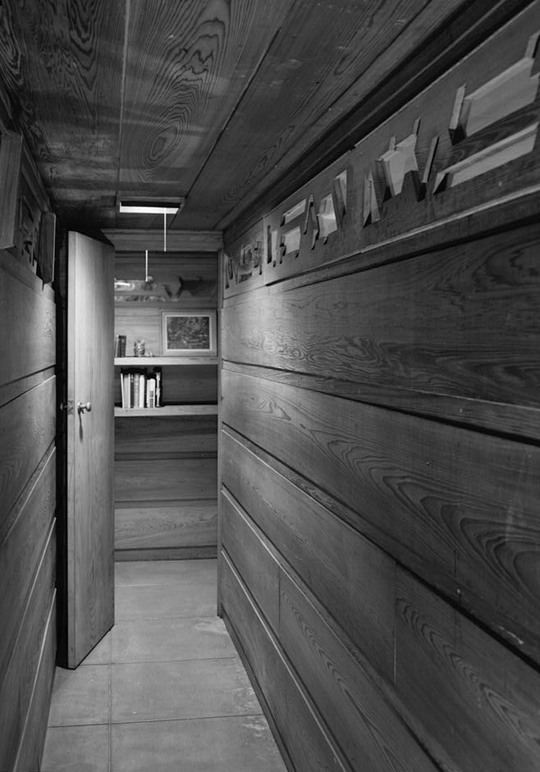
Frank Lloyd Wright intentionally kept walls close in this design, as shown in the Pope-Leighey house in Virginia.
KP: For my earlier projects, I studied Wright rigorously. I was still working from the “tartan” grid. Part of the power of that grid is that you can create a building that looks symmetrical at first glance, but isn’t.
KP: Later I realized that Wright was actually very Victorian, very dark in sensibility. I visited Falling Water a few years back, finally, and I was astonished at how oppressive it was. So dark. Yes, the exteriors are amazing. But inside… it’s almost as if he’s treating you as if you’re in a tube and he wants to squeeze you out into the landscape. So controlling!
RF: When I think Victorian, I think of over-carved armoires and corsets.
KP: It’s a mental corset, really. Wright thought he was thinking outside of the box but he was still locked into a sense of what I’d call “interiority”. [interiors as dark, confined spaces that are mainly intended to keep the outdoors out]
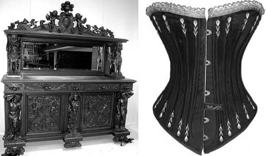
The heavy, dark furniture and corsets that we associate with the Victorian era seem to speak of a mental and physical confinement that contrasts with today's informal, contemporary lifestyles. Typical Modern architecture emphasizes a spacious, and airy feel - a freedom to move and to act unfettered by the past.
KP: Contrast Wright’s sensibility with that of Aalto’s Villa Mairea house. It’s at a far northern latitude [below the Arctic Circle but not far off], and I saw it on an overcast day. There was still such a relaxed quality to the interior, of Aalto’s work, built at the same era as Wright’s Falling Water.
ME: I’d like to get back to the Frank Lloyd Wright issue. I’ve never understood it, always thought he was antiquated, a 19th century architect working in the 20th century. And his manipulations are obvious. His need to control everything down to the doorknobs is oppressive.
KP: But consider this. He’s very important to our clients and in the popular imagination, because he designed homes, unlike Frank Gehry who got away from residential design as soon as he could! Wright really *is* the great American architect. And yes, he had a gift for self-promotion, cape and all.
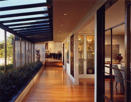
Interior view from Karin Payson's Carmel project. Multiple visual destinations highlight the owners' extensive art collection. Photo: Matthew Millman
RF: OK, if you’re brave enough to trash a few icons here… what do you think of Zaha Hadid? I’ve struggled with her but maybe I’m ignorant. Never visited any of her built works.
KP: Anyone who can get themselves out there, I admire. I’ve been practicing for 25+ years and it’s hard to get anything built, and to get good clients. Do I like her work? No. Do I agree with it? No. But I still admire her. I looked at video of one of her recent projects, a car manufacturer, and it’s an example of her work applied appropriately.
Michael Graves [of the New York Five] was popular in the 1980s. But regardless whether you like them or not, they serve as our culture’s muses. They draw attention to our field.
Richard Neutra
Mark English joined us for a subsequent conversation.
ME: Last October I was in LA and saw a Neutra exhibit. That man can draw!
KP: Why was LA so attractive to those German ex-pats? Maybe because it’s so wide open and free, especially in the 40s. Unlike the planned hierarchies, it was wide open socially and professionally.
ME: Dwell magazine reminds me of some of these Neutra designs, but they were of course earlier.
KP: I refer to Neutra a lot. He was incredibly prolific, too. I sometimes comb his books looking for floor plans. For me, the floor plan is the generator of all ideas. Neutra’s plans were very simple, very clean, not overly academic.
RF: What do you mean by academic?
KP: Not outwardly formal. Not trying to shove everything into a conceptual “parti” or a diagram. That’s what I got from visiting all those Aalto projects in Finland. I saw that Aalto was also rigorous about organizing space, but not in the way that I had originally thought about the parti.
Neutra also had that gift, to create a strong organizing concept, simply expressed.
ME: So did Stirling in the old days, or Predock. I loved Predock when he was more abstract. Now he’s more literal – it’s a pyramid, now it’s a bridge, now it’s a mountain, now it’s a pyramid again.
KP: His Rio Grande Center near Albuquerque was cool. It’s a very humble project.
ME: Predock focused on you as a visitor moving through the space. It was about the visitor’s experience.
KP: Circulation is the heart of the plan.
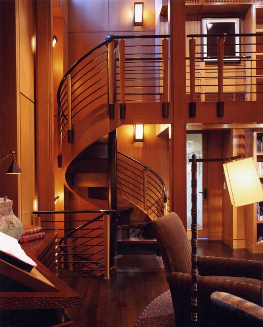
Stair detail from Karin Payson's Carmel project, showing the circulation through rooms and levels. Photo: Matthew Millman
ME: Some designs are done without starting from a floor plan. You just start with the stair. Start with the circulation.
KP: The first time I took the licensing exam, I forgot about the second egress.
ME: Yes, that’s the freshman mistake, isn’t it? Forgetting about the stair.
Mentors
RF: So you have mentors or consultants for specific areas such as marketing. Do you have mentors that you still use to be a better designer?
KP: Not as such, but one important mentor was Susana Torre at Columbia. She was my professor and is now a friend. She co-founded the “heresies collective”. She came from Argentina along with other designers fleeing the coup in the late 60s.
KP: She still keeps me on my toes but is also incredibly supportive. When I face real professional crises, she’s someone I can talk to. She’s had her own crises and has always risen above them. At Columbia University, she was denied tenure when no woman in the architecture department had ever been granted tenure. She sued them and won a settlement. Later at Parsons she ran her own department until being lured away by Cranbrook for a 5-year contract as the dean of architecture. Cranbrook broke that contract a year and a half later, after she’d already given up other positions! But she got up and dusted herself off, and went on with her life.
Modernism and Good Design
RF: What constitutes good design?
KP: Quality of idea and the depth to which the design expresses that idea… the number of ways that a simple idea or message can be reiterated, the clarity of expression. Design is not the same as a style. I believe in style, but not necessarily of the fashionable sort. But I’m happy that Modernism is back!
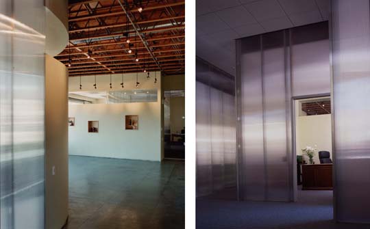
Commercial interior by Karin Payson for Plath and Company shows spareness and simplicity. The brushed translucent panels diffuse the light for a softer minimalism. Photos: Cesar Rubio
RF: Modernism has an image problem… a lot of people like myself haven’t grown up with good examples of modern design. We grew up with bad design, cheap institutional knock-offs. Americans aren’t educated to appreciate design the same way they’re educated in math and science.
KP: Charles & Ray Eames offered midcentury modern designed for the masses. Their furniture is very expensive now, but originally it was intended to make good design available for the post-war American middle class.
RF: Perhaps the Cold War-era drive for Americans win the space race, the arms race, and at the Olympics took away from the study of art, music, and culture? I think that today’s Americans are well-educated in technical fields but design appreciation is not as central to our culture.

This simple wire chair designed by Charles and Ray Eames was originally designed for middle-class consumers.
KP: Another factor may be that Modernism is too abstract – it lacks enough of a tactile experience.
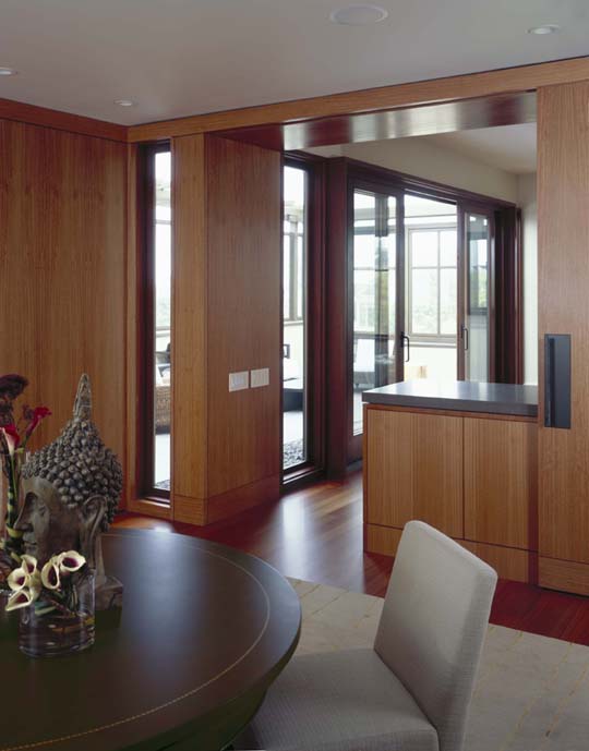
Dining room detail from Karin Payson's Starfish House project. "Tactile" here means that the surfaces here appear as if they would be pleasant to the touch, not harsh or cold or uncomfortable. Photo: Stephen Barker
Floor Plans and Orientation
RF: What do you think of these modern museums? Some of these spaces just make me angry, confused, and lost.
KP: The Jewish Museum in Berlin by Daniel Liebeskind is cool and photogenic, but the floor plan is so confusing that they painted huge red arrows on the floor and have full-time staff just to direct people where to go.
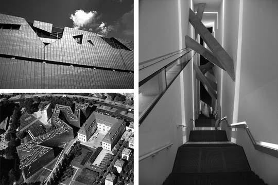
Daniel Liebskind's Jewish Museum in Berlin is intentionally designed with broken lines to symbolize broken hopes, scars, and racial trauma.
[For an alternative take, try this blogger’s manifesto.]
RF: What about the Contemporary Jewish Museum here in San Francisco? I like it. I don’t normally like those crazy angles but I like that space, and I don’t find it disorienting. The music room sounds really good. And he worked in the Jewish mysticism in a genuine way – not superficial or shallow.
KP: He had more limitations to work with, and in this case that was good. [The Contemporary Jewish Museum is] a nice building.

This oddly shaped media room in Daniel Liebskind's Contemporary Jewish Museum in San Francisco actually sounds terrific for musical exhibits.
RF: Visiting some of these museums is like being lost in an airport, but without the helpful signage.
KP: Signage alone is not enough. You also need a simple and easy to follow floor plan. Visitors should enter and feel that they have now arrived. From there, a simple path to get to where you need to go. They should always know where they are.

This classical floor plan of the U.S. Capitol building is balanced, mostly symmetrical, and easy to orient within.
RF: What works for this?
KP: I always try to minimize the number of corridors and maximize the views to the outside. Outside views are one way to orient. Natural light also helps with orientation. In my own modest home, the original first floor skylights became a two-story light well that serves both the first floor and the new sauna.
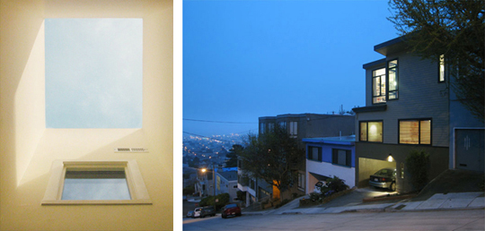
Karin Payson created a two-story light well when adding a second story onto her San Francisco home. Photos: Stephen Barker
KP: I’m not interested in floor plans that are full of dead ends and pointy angles. In museums, I like simple floor plans. It makes for a more peaceful experience. I always know where I am – orientation is for people as well as buildings.
KP: Being in a building should be an uplifting experience. Even at its most banal, for example at the doctor’s office, the building should at least be comfortable and functional, and if possible it should have good natural light.
RF: Some buildings are deliberately designed to baffle and confuse the patrons. Casinos and shopping malls, for example. It may depend on the purpose of the building. Forts are designed to be hard to penetrate, and the Viet Cong tunnels were also structured to slow down pursuers. Of course casinos and malls are designed to trap people so they can’t find their way out – in their wanderings, they might see something and make an impulse buy.
KP: Buildings are there to serve, even if the client’s first thought is to impress visitors rather than aid them. As a designer, part of my function is to give people what they asked for, but perhaps in a form they never considered. In that spirit, by making the building a peaceful experience, I am serving the client even when this means going beyond their first directives. A building should enhance their sense of security and peace.
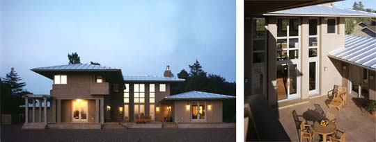
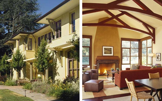
Front and courtyard views of this residence by Karin Payson uses height and lines of sight to create a calming and peaceful setting. Photos: Tim Street-Porter
Current and Past Projects
RF: Some people get so used to having some annoying wall in their way to the point where it makes a dent in their mind. In Feng Shui they call this “cutting the chi” because you’re so used to it that you forget it’s there, but it still impacts you every day. Your body, driven by memory, still flinches from it. Then, an architect comes in and says, “You know… you could just take that thing out!” et voila.
KP: Sometimes this “going beyond” becomes apparent to the client only when they actually see the wall go down! Our Star Fish project on Broadway started out as a facade refresh for a humdrum 1970s design; the original front wall was broken up [show]. But the client still wanted a traditional home.
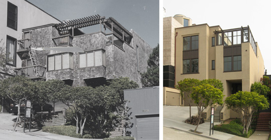
Before, left: Karin Payson's client had wanted a traditional home. After, right: When the client saw the walls come down during the demolition, she changed her mind and went Modern! Right photo: Stephen Barker
KP: Then, she saw the wall come down during the demolition, and a door opened in her mind. For the first time she could really grasp the possibilities. It became a Modern project, a much better project in fact!
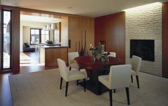
Same project as above. Karin Payson creates an atmosphere of Modern serenity and warmth in this San Francisco remodel. Photo: Stephen Barker
RF: So what are you working on now?
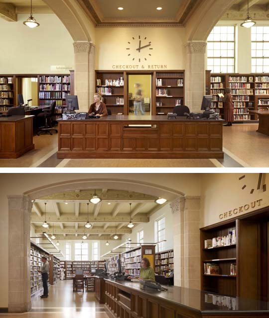
KP: I’m having a blast doing interior architecture. One of our projects is a public library in San Francisco’s Bayview district. The lead architect is THA. In this project, we’ve had many lively discussions about color and pattern and texture.
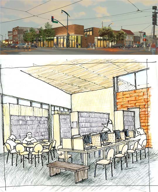
Rendering and sketch for the Bayview Public Library project, a joint effort between Karin Payson and THA. Top: Rendering courtesy of THA. Below: Hand sketch by Karin Payson
KP: The lead architect did a bold move in the interior with two big blocks clad in Heath tile, one green, one burnt orange. But aside from this big gesture, he wanted everything else to be white, with grey floors. I worked hard with him to develop an interior that we are both excited about.
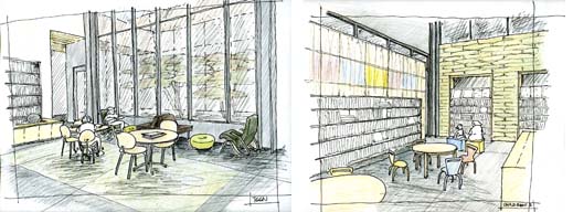
Interior sketches of the teen area (left) and childrens' area (right) for the Bayview Public Library project. Hand sketches by Karin Payson.
RF: One of your projects was described as a compromise between two totally different sensibilities: ultra-minimalist and traditionalist. How did you manage to balance this in the project and not get caught up inside their marital conflicts?
KP: That was the house which I call “Garden House With Music”. The husband had studied architecure in the 1970s, at Princeton, and he wanted something very contemporary. The wife wanted a traditional home. The Garden House With Music was my response to these differing needs. I like to call it “the Maybeck house that wasn’t”.

Architect Karin Payson drew inspiration from Maybeck to create this entry for this private residence in Atherton. "When you see this deeply recessed entry, you know that you have really arrived." Photo: Matthew Millman
KP: The detailing is more muscular, more streamlined. It’s modernist detailing in a traditional architecture.

Exterior and sitting-room views of the "Garden House With Music" residence in Atherton designed by Karin Payson. Photo: Matthew Millman
On Conducting a Project
RF: One thing they really don’t teach you in school is how to run a project.
KP: Running a project means you have to grab and hold the owner’s attention and respect. People really trust me because I’m so direct, but it doesn’t help me sell. I’ve been told I have a lack of instinct for schmoozing. Working with demanding clients is a delicate balancing act, no doubt about it. One of my first mentors, Paul Wiseman, told me something I never forgot. On our first project together, he said to me, “Don’t ever forget, sweetie – we come in the back door.”
RF: Do you ever have to play therapist with your clients? Especially married couples.
KP: I don’t play therapist, actually – I play teacher. I educate my clients about the possibilities. It’s a delicate and perennial problem, and it’s a part of just about every project. Managing the expectations of the clients sometimes means learning more than I wanted to know about THEIR relationship.
RF: In a project where the interiors could be done either by you or by someone else, how do you negotiate who does what, without fighting over who gets a bigger share of the pie?
KP: It’s a dance, no doubt about it. Trust and teamwork are important all around. A general rule of thumb is, whoever brings the client has the clout. But that’s also why I’d rather work with the big boys, people who are already secure. People like Paul Wiseman or Barbara Scavullo really know how to run a project. I like working with interior designers, because I get great projects with the budget to have everything nicely finished.
RF: What about contractors?
KP: The contractor is very meaningful. You don’t want to end up with the owner pulling the builder aside and overriding directives without telling the architect. I have mixed feelings about design-build architects who offer their services as contractors to other architects. You don’t want two architects suddenly pushing the design in different directions.

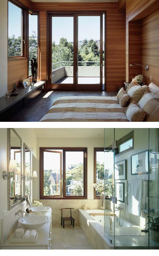
Terrace view from kitchen of Karin Payson's Starfish House project. Contrasting window framing recalls Aalto's Villa Mairea. Photo: Stephen Barker
RF: What’s your litmus test for a contractor?
KP: First, do they return my phone calls? Second, do the send me a copy of the proposal?
RF: How often do you get to really see your designs all the way through construction?
KP: A lot of architects don’t do construction administration. But that’s how you really finish your design. Otherwise the builder will change things, move things around. With the house that I did with Wiseman, say you’re turning a corner with a window, even a few inches off can devastate the final effect.

Master bedroom of Karin Payson's Starfish House project. The use of matte surfaces and a sparing color palette creates a warm and home-like feeling without sacrificing simplicity and openness. Photo: Stephen Barker
KP: It comes down to design intent versus contractor’s realities. Contractor’s realities can be a cop out, an excuse to just say no. The contractor wants to do what’s easiest for them, especially in public projects that are low budget to begin with. Design intent must come first. That means the architect has to be on the spot to enforce design integrity, and if the contractor doesn’t want to build it, the architect has to ask, “OK, so how do you think we should do it?”
KP: I was working on a project for an Oakland developer [shows loft-style town houses]. The owner wanted someone that he could control. When the contractor complained to him saying “She’s not sending me any details”, I had to teach him to read my drawings right in front of the client!
KP: I said to the client, “You have three options. You can fire me. You can fire the contractor. Or, you can pay me to teach him to read my drawings.” The chose Option 3, and to his credit, the contractor rose to the occasion.
These Young People Today
ME: So what do you think of young architects coming out of school? In my experience, dedicated people are extremely hard to find. It seems that schools are producing people who are not excited about anything. Is it just our profession? This generation has grown up with so many distractions. It’s a generation that is very easily bored.
KP: A few months ago I was mouthing off at the AIA-SF Small Business Committee about misspelled and badly written resumes, partly as a response to this superficiality. I sometimes want to ask these kids, “So, if you make a mistake in a building, what do you think is going to happen? Why don’t you start right now by paying attention!”
ME: Is it due to the use of the computer, do you think? The computer eliminates that sense of connection.
KP: Yes, I suppose it is a separating tool.
ME: It makes things too easy. Anyone can use a computer to draw a box and make it look like something without really trying. But with physical model-making, accidents can occur that are really fruitful mistakes, fortuitous errors. That doesn’t happen with the computer the way it does when designing using a manual method like a model.
KP: Computers aren’t very spontaneous. I’m the only one in my office that uses study models, but that’s how I like to work. Intermittent floor plans, sketching, and massing.
Here’s an example. Here’s a Hudson River property that my husband and I own. We plan to build in 2012. We did something new for the design process on this one: I worked with a young man who had no architectural training, but who had a background as a sculptor. He created these two study models: one at 1/40th scale for the site, and one at 1/8 scale for the building area.
Working with this model, we could change things at will more quickly than on a computer. If we didn’t like the way a roof is going – just rip it out and turn it around. Clients can immediately grasp the concept with a model, too.
I’ve had clients ask me not to spend time doing these models. I responded once by saying, “OK… you don’t want me to waste time on models. But would you tell your lawyer not to use a law library?” They immediately get the point.
RF: Are models that expensive to do?
KP: Not necessarily.
ME: It’s like a long night before a big project is due at school, it’s kind of fun. And then there’s the drama of ripping the model up right in front of the client.
KP: The computer is definitely a distancing factor. The best trained people know how to use both manual and computer methods. My brother, who’s also an architect, says, “If people can’t draw, they can’t draw any better on the computer.” I look for people who can draw. Or a musician… someone who’s had ANY artistic training.
RF: Someone who’s wrestled with the medium.
KP: Yes. I’m a believer in the value of a good liberal arts education. Maybe it’s an East Coast mentality, but I believe these two things: where you went to school matters, and so does completing your education and actually graduating.
ME: Very few people are interested in licensing these days, too. What’s up with that? Things sure have changed since we got our license.
KP: I blame NCARB for that. What people have to go through now is terrible! [describes new test taking procedure] There’s no sense of collective effort.
KP: When I took my exams, I gave up studying the mech portion. I had gotten to the electrical portion and I just couldn’t get the difference between amps and ohms. Then when it was time to take the exam, a colleague said to me, “Oh just read it…” and I did, and turned out I did know most of the answers after all, just from working experience. The mech was a 3-hour exam and I finished in an hour and a half, and got a 75 which is enough to pass. I would never have been able to do that under the new system.
ME: I took everything in one week. By the time we got to the design portion, at the end of the week, I was totally fried. It was a communal, almost a tribal event. But that’s all gone now.
KP: I think it devalues the profession, really. Maybe the licensing process is why the new generation seems simultaneously unenthusiastic and entitled. If you can work 15 years and get the same salary as a licensed architect… why bother getting a license at all? In California, you can do a lot even without a license.
KP: That’s totally different from other professions such as medicine or law. You can’t even work in either of those fields without a license. But you can call yourself an architect and get away with it, for the most part, because even if you’re caught there’s no enforcement.
On Working With the AIA
ME: Tell us about your public service on the AIA board. How was it?
KP: I wasn’t even a member of the AIA when I was invited to be on the board. But I loved it, because I got out of my little hole. As a small practitioner you can get really isolated. At the AIA, I had access to other architects and access to architects who were principals in bigger firms. An example of how that was helpful was as a reality check for bad employees. I could talk to other firm heads and ask them, “So, you’ve got an employee with these skills, this performance. What would this person be worth to you, and how much would you pay them?”
KP: I’m not sure I accomplished much on the board. I was more of a counter-balance. If I think something’s ridiculous, I say so. The Monterey Design Conference [put on by the AIA-CC] was an example. Last year’s conference was a bust. They lost a lot of money. I suggested that we cancel it for this year, and combine it with other events, but the board is pretty big – 60 people. They didn’t want to change. It’s this institutional inertia at the AIA. It’s getting better, but slowly.
ME: You and Michael Bernard have the small-firm advocacy.
KP: The AIA as a whole doesn’t do enough for small businesses, even though the vast majority of all architects are working at firms with fewer than 5 people! Our chapter in San Francisco does a lot more than most.
ME: The San Francisco House Tours, for example.
KP: But on many design projects the architect is still invisible.
ME: The AIA Awards aren’t pitched for us, either. There’s no awards category for small residential detail projects or residential interiors. That’s all lumped together with large commercial projects which is totally inappropriate. I had a master bath to submit last fall, and I had to compete against airport interiors.
ME: Architects who do small residential interiors never win AIA awards with them. Mid-level firms are completely cut out. Min/Day Architecture, for example, does a lot of interior work, they’re quite the rising star. There is no easy path to recognition for firms like theirs within the AIA awards process.
On Getting Media Acknowledgment
ME: Getting published isn’t any easier. How have you fared with this?
KP: The furniture has to be really fancy to get anyone’s attention.
ME: The newly-defunct Metropolitan Home magazine said this to us, too, when we submitted some of our work for consideration. They didn’t like the furniture. And, I felt cautious about getting them to mention us at all for the Baker Street project. I had to be very, very persistent.
Business Development
RF: The outlook for small firms is pretty grim. How are you keeping your hand in the game? How do you find clients and how do you get recognition?
KP: Referrals from other clients are rare. I get more referrals from owners’ reps, interior designers, and contractors. Then I have plenty of testimonials from past clients. Sometimes people find me from house tours, but not as often.
KP: I did have one Napa project in the late 90s that resulted in follow-on work. The client gutted a 60s ranch house with a decent plan, well-built, but the orientation was all wrong – small mean windows on the south side where all the light is – so we worked to remedy this. That client called us a year later to commission a guest house on the same property for his son and daughter in law. Then, a few years after that, the son and daughter in law commissioned us to remodel their home on the Peninsula.
Women in Architecture
RF: It must be even harder for woman-owned firms to stay in business than ever before.
KP: 40% of my graduate class were women, but only 9% of licensed architects are women. There are very few women running their own firms, and even fewer doing it alone without architect husbands. Toby Levy‘s been an architect in San Francisco for 30 years on her own, but she’s one of the few.
KP: Where are the other women? You know where I think they are? Buried! A few years ago, Robert Venturi got the Pritzker Prize. He had a practice with his wife for over 30 years, and they wrote two books together. She co-wrote those books, but wasn’t originally listed. So now when he got the Pritzker Prize, she was ignored! It was a huge scandal, in my opinion.
KP: He should have turned it down. But after 40 years of working together and publishing together, you’re not going to split up over that. It was a different generation.
Photo Credit Links
The following professional architectural photographers have consented to share their images for this article and the preceding one:
- Stephen Barker
- Matthew Millman
- Cesar Rubio
- Tim Street-Porter



ip camera
15. Dec, 2010
Thanks for the informative article, it was a good read and I hope its ok that I share this with some facebook friends. Thanks.
computer running slow
02. Feb, 2011
Brilliant blog about Karin Payson: Architectural Practice Part 2 | The Architects' Take. I read it twice.
Glory Eland
27. Jun, 2011
Hello, cheers for the great post. Honestly, just around 7 months ago I started using the internet and became an internet user and came online for the first time, and I have found that a great deal of crap out there. I love that you have put out wonderful content that is clear and well-written. Best of luck and thanks for the very good hints.