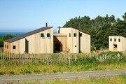
Malcolm Davis’ Earthy, Approachable Modernism
by Rebecca Firestone with Mark English AIA | Interviews
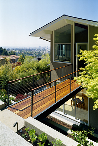
“I’ve thought about housing for a long time.” Architect Malcolm Davis reminisced about his early childhood, when one of his favorite activities was drawing floor plans. “I guess you’d say I’m a believer in the power of environmental determinism,” Davis went on. “It’s the idea that we are formed by the spaces we inhabit. A house should feel comfortable and restorative.”
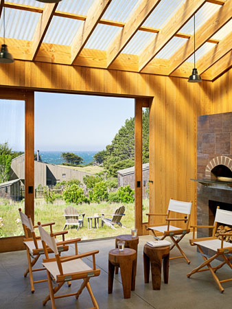
(Above photo: Joe Fletcher)
“I’ve thought about housing for a long time.” Architect Malcolm Davis reminisced about his early childhood, when one of his favorite activities was drawing floor plans. He grew up in a cultured household – his father, a classical pianist, had two grand pianos and a harpsichord, while his mother had original Heath dishware and rocked him in an Eames rocking chair.
“Both my parents had an eye for spare, modern design,” Davis said. “My mother was a would-be lexographer. She shared with us her interest in words and in subtle shades of meaning – an awareness that is reflected in my own work.” In a later conversation, he explained, “It was very hard to find the right house for a family like ours with such unusual programmatic needs. My early floor plans often were an attempt to define this ‘perfect house’ – with private bedrooms for each of the kids and an extra-large living room for the pianos.”
“I guess you’d say I’m a believer in the power of environmental determinism,” Davis went on. “It’s the idea that we are formed by the spaces we inhabit. The world is not a sane, rational place, and I don’t think a home needs to reflect this. Instead, a house should feel comfortable and restorative.”
What does that mean exactly?
“Even if you aren’t happy with your life, you’ll still like the house. It means that you’re not going to get sick of it in a few years. Superficial materials can be exchanged, but the layout should work for a long time. Good design should be timeless.”
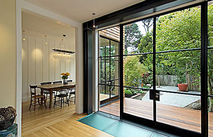
Exposed steel reinforces the look as well as the structure of this Presidio remodel by Malcolm Davis (Photo: Treve Johnson)
What’s the place of comfort in high-end design?
Some contemporary designs just don’t look like they’re made for humans with actual bodies, and I wondered whether Davis had any thoughts on that. He responded, “Sometimes a building looks great in a photograph, but it’s not comfortable. My work is quieter than that. People may not specifically know why it works. It’s by seeking cohesiveness and working to figure everything out, that the work gains a sense of order and calm.”
On borrowed light, and borrowing ideas
“I like to draw from things that have worked in the past, even if they’re not my ideas. I didn’t invent transom windows or borrowed light, but they’re brilliant ideas.” Borrowed light is a major design theme for Davis, and a great thing about it is that it’s low-tech. It’s basically a means of getting daylight deep into a building to illuminate interior spaces that might otherwise need artificial lighting all the time.
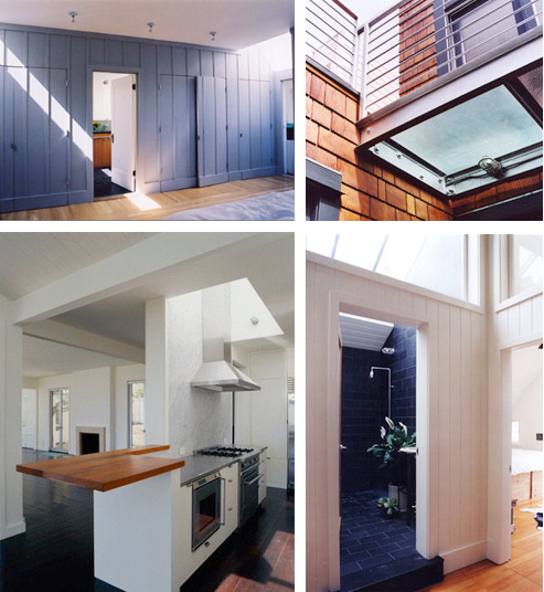
Davis brightens interior spaces by borrowing light from other rooms or even via a translucent floor (Photos: Michael Venera, Malcolm Davis, and Massimiliano Bonati)
“I revisited Sir John Soane’s house after going there with my parents years ago in the 1970s, and I was struck once again at how the light quality was evocative of San Francisco. In San Francisco, where you have a lot of houses that are hemmed in on either side by other buildings, you have to harvest every bit of light that you can.” Sir John Soane’s Museum, as it is officially named, makes very ingenious use of borrowed daylight among its many other features.
Davis went on about light. “The Maison de Verre has a richness of light quality throughout the day. It’s not static.”
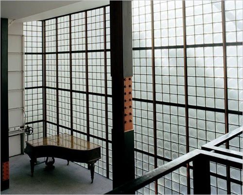
The Maison de Verre (house of glass), completed in 1932, is an example of early industrial-Modern design.
“The Church of Light in Japan is another example. It’s a concrete box with a cross cut into the wall. The light is AMAZING. The beauty is not always in what we build… it’s what we allow to happen in our buildings.”
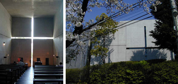
The Church of Light by Tadao Ando, located in Osaka, Japan, has dramatic light changes throughout the day.
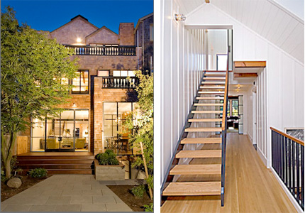
Davis’ Presidio remodel project makes extensive use of borrowed light. “The owners loved the location. The house was already a place for neighborhood kids to congregate. The problem was it was too dark inside, and with a 3-story house that’s surrounded by houses on either side, that’s not so easy to remedy.” He showed where the old stairs had been awkwardly placed and how they tended to deposit the unfortunate user right in front of a blank wall or closed door. “The solution was to bring light into the core and to rework the circulation through the center of the home.”
What about context in design?
Context is another big theme. A building should somehow relate to its context, either in harmony or in contrast. “Whatever you put up, it should have something to say, and it should be something that you want to hear for awhile,” Davis added. Perhaps the same criteria could apply to neighborhoods as to individual homes – ideally, the inhabitants of an area should feel supported by their built environment. One of Davis’ projects was to rescue and remodel a tiny but charming Victorian cottage in San Francisco’s Castro neighborhood, before some other developer demolished it to build something bigger and most likely blander.
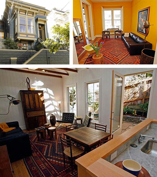
Malcolm Davis and Thomas Brian Lackey remodeled this 2-unit, 1,400 square foot Victorian to save it from the wrecking ball (Photo: Kim Komenich, SF Chronicle).
Your office building is a great neighborhood gathering spot. Was it another historic rescue?
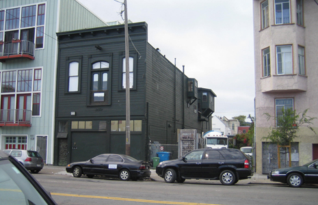
Davis told me the story of his current building, a 6,500 square foot wood frame building that used to be a carriage house. His offices are in the former hayloft. The property had been purchased by a developer who’d wanted to knock it down and build condos, but apparently the zoning wouldn’t allow it. Thus it passed into the hands of Malcolm Davis and his partner Thomas Brian Lackey, who runs the Stable Cafe on the ground floor (I’ve personally tested the food there and it’s excellent). It’s in a slightly seedy yet historical area of San Francisco’s extensive Mission district.
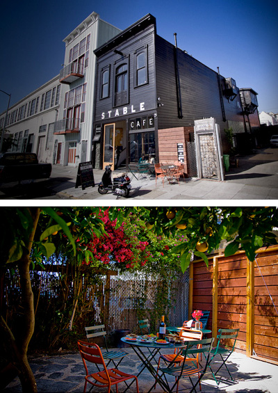
Malcolm Davis' office building houses 12 businesses including a neighborhood cafe. (Photos: Jeannie Choe)
“When we bought it, there was a lot of empty dilapidated space here, except for the bicycle messenger service,” said Davis. “Now we have 12 businesses operating in here employing 45 people.” Tenants include a graphic designer, a bike messenger service, the cafe, a commercial kitchen used by six different businesses, and two wholesale distributors of organic meat (which is not stored in the building). Davis joked about using a carriage house to build a “stable” community – a local gathering spot in a neighborhood that had formerly lacked such amenities.
How do you recognize good design?
“It’s the resolution around the edges, and includes both context and execution. But we should distinguish ‘fabric’ buildings from ‘monument’ buildings. For a monument, the criteria are different. What is it saying? Is the building cohesive in itself? Is there a clear intent driving why it is the way it is?”
Can you give me some examples of bad design and describe why you don’t like it?
“There are lots of missed opportunities out there. An example might be planning a new public space as a collection of different buildings with insufficient attention paid to the exterior spaces between them. Each building looks like it was designed by a different architect, with their own agendas, and none of whom were actually there. It’s like a dinner party where there’s no coherent conversation because everyone’s shouting at once”

A building view is more satisfying when the entire building is visible and framed along a major axis.
“Axial buildings need a place from which they can be viewed on an axis. San Francisco’s City Hall is a good example of an axial building with a clear view.”
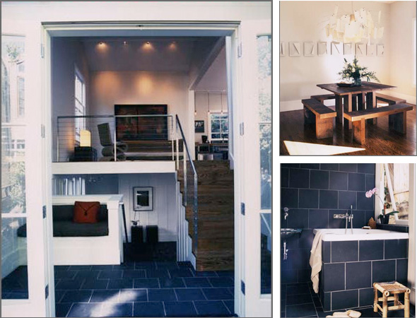
Malcolm Davis designed this tiny home to replace a San Francisco earthquake cottage that had burned down.
On clever architecture that’s annoying and disorienting: “Some people strive for disorder in their buildings. Well-handled, this can be an interesting thing, in the right context. For example, museums should be challenging and thought-provoking.” The problem is the knock-offs, which Davis referred to as “the trickle-down effect”.
“It’s when some detail from a great building gets taken off and spread everywhere.” And if people only grow up knowing the knock-offs, is it any wonder they don’t appreciate the originals?
Mark English remembers seeing one of your houses on a tour a few years back.
I asked Malcolm about his house on 21st street. “The house was north facing, and on a downslope. Getting light in there was a major goal. I put in a glass floor in the South porch to let light down into the basement.”
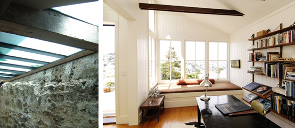
In Davis' 21st Street project, a glass floor in the porch breathes new light and life into a dark basement while the upper floors are opened to light and views.
How do you blend the old with the new in your remodels?
Davis’ obsession with found objects pervades the office. “I’m fascinated with castoffs and the operation of natural processes,” he said, showing me some weathered pieces of wood and metal, and a large insulator. “This insulator used to be cutting-edge technology, and now look at it.” He showed me a tiny, antique TV that reminded me of my first camera, a Brownie.
“I’m fascinated by anachronisms and the obsolete. Everyday objects can eventually become fine-art pieces or collector’s items.”
For remodels, he likes to incorporate elements from the old house as reused or found objects – especially with wood. It adds an overall cohesiveness. One remodel project, a charming house in San Francisco’s Noe Valley, had already suffered some haphazard alteration. Davis actually replicated the old-style windows on the new addition all the way down to the rope and pulley system.
Your work is very eclectic, but it doesn’t suffer from the usual faults of fusion artistry. Why not?
Most attempts at eclecticism end up as a wash – a superficial mishmash of borrowed content, poorly executed, even more poorly understood. It really works best when the artists have mastered the original art forms and can justify their decisions in terms of making their design stronger as a result.
So how do you keep an eclectic design from falling apart? “Designing is a matter of tying together disparate ideas to make it into a cohesive whole. When a design has been sufficiently refined and worked out, it feels inevitable. A writer friend of mine observed once that with a good story, the ending is surprising – but also inevitable. It just ‘feels’ right.”
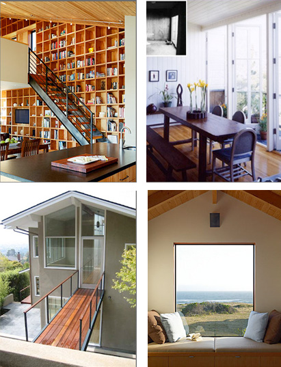
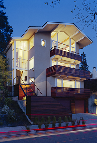
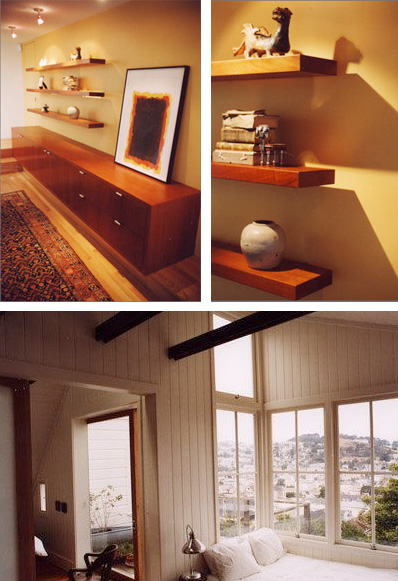
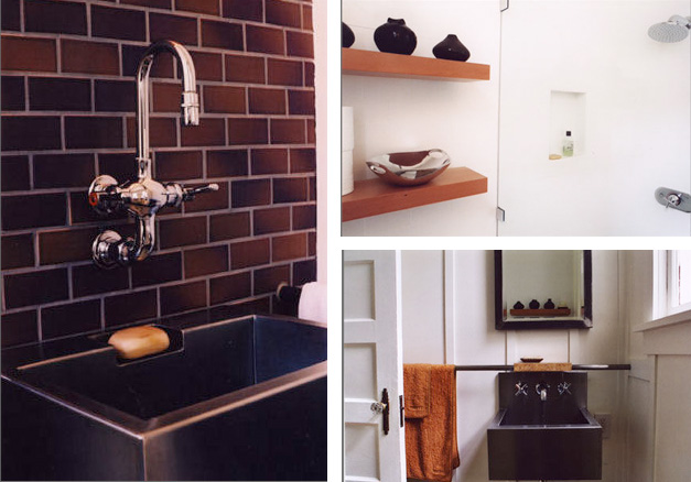
Davis's eclectic style seeks a design cohesiveness that is unique to each project (Photos: Joe Fletcher, Michael Venera)
Quinn Morgan, a designer at Malcolm Davis’ studio, added, “No one understands how hard it is to make it look simple.”
On space, urbanity, and inflated expectations
We returned to context as a factor in design, particularly urban contexts. “Cities are more sustainable than everyone living in huge country homes. European cities worked. Cities were more like high-density suburbs, even LA. Now, everyone needs a car, and at least three parking spaces for it: at home, at work, and when you go out.”
“It was A/C that influenced urban design with things like inoperable windows. This is just hubris. In the 50s glassy houses were popular because ‘energy’s cheap’. People believed that they’d all have nuclear power plants in their own backyard and electricity would be entirely free!” Really? I thought, thinking of California’s 2001 power crisis.
How much space do people really need? “Well, an average home after World War II was 800 square feet and had 4 people living in it. Now an average home is 2,500 square feet.” (I’d been hoping there was some magic number, known only to architects, for the ideal amount of per-person space to assume when designing a living space.)
Why do people suddenly need all this space?
Is it because they feel so crowded in an urban environment that they’re making fortresses and personal playgrounds for themselves?If we all lived in little commune-like villages, maybe we’d only need a tiny cottage because the grounds would theoretically be part of our home as well, similar to an Israeli kibbutz. Do people just have too many possessions? Or do they think they need more space because mass-designed living spaces are so poorly designed to begin with? Davis cited cheap energy, air conditioning, and unrealistic expectations as the enablers for building inefficient homes in inadvisable climates.
“Adding climate control… does that mean we’re giving up the outdoors now? Perhaps our notion of oversized interior spaces comes from the sets of sitcoms. Shows like Seinfeld or Friends are supposed to be set in Manhattan, and yet you see these huge kitchens that can fit 8 people. There’s no way a typical Manhattan kitchen can fit that many people. Or Mary Tyler Moore – she was supposed to be living in a studio apartment, but it was enormous… and it had no bathroom. I think that the sound stage conveys a sense of space that people unconsciously take on when they watch those shows over and over – they start thinking that those stage sets are the norm in real life.”
How much contrast between building and surroundings is too much?
Back to context… whether we design our buildings to fit in or to stand out, how can we do either one successfully, for a richer and more satisfying urban experience? American cities are far less rooted in the past than cities in Europe. It’s almost as if we’re in love with our imagined European past because we can pick random features as optional accessories, (think: faux Tuscan) rather than seeking to rid ourselves of centuries of cultural baggage. Must we design everything to match what’s next to it?
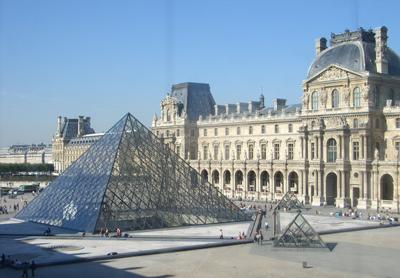
Obviously not. “Paris has very cohesive architecture, and the modern bits really stand out,” Davis observed.
What’s your personal design vocabulary?
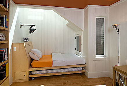
Eventually our conversation found his way to Davis’ project portfolio and began flipping through it. The shameless notion of combining unpretentious domestic comfort with high-end design is almost too radical, or detestable, for contemplation. And yet, Davis’ work abounds in small “comfort zones” or nooks, alcoves, places to sit and experience the aspects of the home.
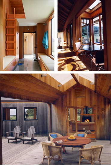
Comfort zones are islands of restfulness that feel protected, even if they're right in the middle of a larger zone
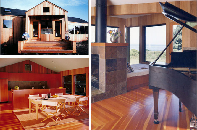
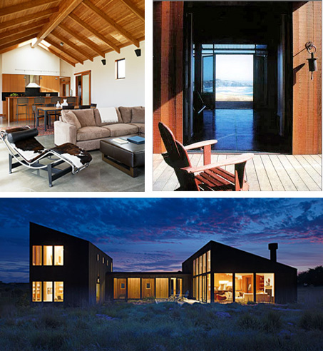
Davis seems to have developed two vocabularies: one specifically for Sea Ranch where he’s done several new homes, and one for San Francisco remodels, which present an entirely different set of constraints. His San Francisco work almost reminds me of New England in its practical, spare, and simple fashioning – but it’s not so devoid of texture as to appear sterile.
Davis’ designs are remarkably consistent – earthy, eclectic, and unpretentious. He’s very skilled at mixing required elements in a seamless way. And he’s practical, too. Rather than adding more to a design, he’s more likely to seek ways to get the maximum out of the resources that are already there. His spaces are ship-shape, with everything tucked away as efficiently as possible – not buried in deep storage where they’d have to be dug up constantly, but out of the way, so that objects and people aren’t competing for use of the same area. He used the word “harvesting” several times as a way to express the opportunism of his approach – harvesting daylight, or storage space, for example.
Louis Kahn once defined “house” as “a place in which it is good to live.” And in order to live well, a home’s design must consider patterns of real living. A kitchen isn’t just functional label of “kitchen” where hired hands prepare meals for their employers. In contemporary lifestyles, a kitchen is a social space, sometimes the main gathering point in the home. In addition to being used for food preparation, a modern kitchen can be a place where a family gathers to cook, chat, watch the news, work on school projects, or live out other parts of their lives. A home is full of places for life to happen, really, and a good home is one with enough space for the lives of each of its occupants.



折りたたみ傘 丈夫
20. Aug, 2013
パイロット 万年筆