Conversations with Gary Hutton, Part 2
by Rebecca Firestone with Mark English AIA | Interviews
Continuation of last week’s conversation with Gary Hutton, one of San Francisco’s premier interior designers
(Photo: David Wilson)
Part 2 of a conversation with Gary Hutton. Interviewers include myself (Rebecca) and Mark English.
Why Handmade Is So Important
Gary Hutton: There’s all this furniture hype about “handmade”. It’s really about knowing how to make things. That’s what you learn at a good art school. My furniture is made by people who do the finest work in this country. People in the know, people who work with metal, they see my tables and they say, “Oh… my… God…” If you look, you’ll see that there are no visible welds. They’re put together by a process called plug welding. That’s really about the craft, having good craftsmanship.
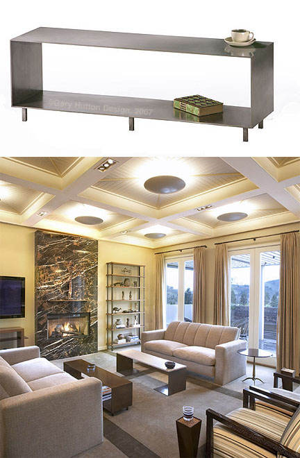
At top is Gary Hutton's A6 table design. Below, the table (along with several other Hutton furniture designs) is shown in its natural habitat: an East Bay interior also by Hutton. Photos: David Wilson
Ingenuity and Resourcefulness of Material
Rebecca: But the cool thing about your Baker Street project was that you were very ingenious with simple materials.
There’s a big difference between working with a developer and working with a custom builder, a difference in thought process. Developers want to achieve the biggest bang for the cheapest buck. They want the “wow” factor and to pay nothing for it.

This interior by Gary Hutton was for a Metropolitan Home designer showcase on Baker Street in San Francisco. The sculpted carpet probably wasn't cheap, but the curtains are actually made from recycled soda bottles. Photo: Matthew Millman
Rebecca: I remember these felt curtains made from recycled soda bottles. So simple and yet so elegant. And that wall with the push pins.
That was a seismic map of North America made with 1100 pearls. Don’t ask me how I came to have a collection of 1100 Swarovski pearls!
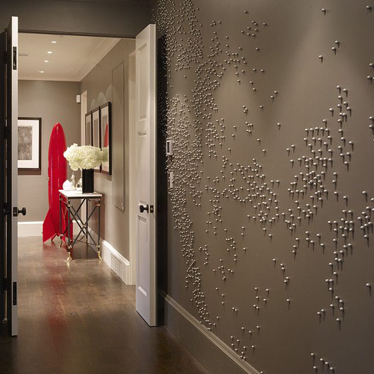
From the same Metropolitan Home showcase, Gary Hutton's seismic map installation. Photo: Matthew Millman
Knock-Offs
Rebecca: So tell me about knock-offs. The Ciao table, or the Puddle table. Does it bother you?
It bothers me tremendously, but there’s nothing I can do about it. These designs can be copyrighted, but the Supreme Court ruled in the early 80s that if 10% of the design has changed, then it’s not the same thing. Of course the proportions aren’t exactly the same, either. The shape isn’t right. Look… here’s a design publication that just came out containing photos of 2 knockoffs from my designs. The original tables were cast bronze and the knockoffs are in wood or painted wood. I’ve been making that Ciao table since 1986. These are designers. They should know better! Seeing that absolutely ruined my weekend.
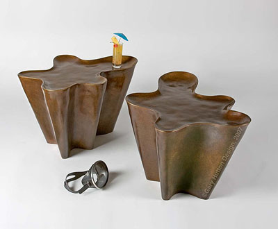
If you see it up close, Gary Hutton's "Pool Table" is a finely crafted cast bronze piece. In a catalog, however, a cheap knockoff doesn't look that different - and there's nothing a designer can do about it. Photo: David Wilson
Rebecca: But does it actually hurt your business?
The people who can afford to pay for meticulous craftsmanship are not going to buy a knockoff at Crate & Barrel. Nothing comes fully formed. Some Modernist schools like the Bauhaus really emphasized the art and craft. Consider the Breuer tubular steel chair. They were not the first to make it. But they saw the possibilities for mass production, to make fine art available to the masses. But then this Breuer chair has its cheaper knock-offs, too. There are 27 bends in the original Breuer chair. The cheaper copy has maybe half that number. It’s not as comfortable.

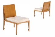
Gary Hutton's Havana chair design almost looks like it's on pointe - the legs recall stylized arrowheads. Photo: David Wilson
Ergonomic Furniture Design
Rebecca: Do you consider ergonomics and comfort in your furniture designs?
Oh yes, I think about it a lot. With seating, there’s not a lot of flexibility. The seat pitch front to back has to be around an inch and a half – otherwise you’ll feel like you’re pitching forward. Regarding seat depth, there is a sweet spot that will work even for a very short or a very tall person. But, furniture designers have tended to design to their own body’s scale. Michael Taylor was 6’4″ – and his furniture is BIG. Billy Baldwin was tiny, and his furniture is all very delicate.
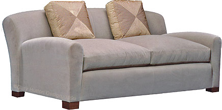
Gary Hutton showed me a version of the Thayer Sofa, which is specifically designed with a deep pitch so that a person can lie down lengthwise and have enough room to read the paper.
I have to think about how people will want to use each piece. Not everyone will sit formally in a chair, for example. Some people prefer to lounge, or to read – a sofa should support people in how they want to live, not the other way around.
Creating New Furniture Designs
The economic downturn has stalled the development of more furniture pieces, but that’s my creative outlet. Interiors are work, a by-produt of client needs and desires. But my furniture is closer to pure expression. Typically, it takes 1-3 years to create a new furniture design. The Sturgis chair is one example that took 3-4 years of prototyping. We made 4 or 5 of them, and we had to keep going until it “sat” right, and we could find the right gauge of metal. And we have to pay someone to make each one, one at a time. A lot of it is finding the right person to make it. You need a really skilled fabricator.
Mark: That’s similar to what architect Anne Fougeron says about some of her stair designs. The engineers look at her designs and say they can’t calc it out. So her closest relationship is with her fabricator, who’s not afraid to give it a try.
Rebecca: Maybe it’s better to let the engineers figure it out afterwards. Get it to work first, and then the engineer can figure out why. So, how do you get the first inklings of a new furniture design? Is it a visual image? Kinesthetic? A concept?
The Sturgis chair started with the idea of handlebars, like the handlebars on a motorcycle. Then came the single-piece cantilevered seat – figuring out how to attach it at only two places and make it springy. Getting the curve of the attachment piece right was hard, because if it wasn’t coiled enough, it would break or bend.
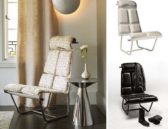
The same chair design can change like a chameleon to suit different settings and tastes. Here we see three versions of Gary Hutton's "Sturgis" chair. Left photo: Matthew Millman. Right photos: David Wilson
Fabrication, or How We Do It
People today are totally disengaged from actually making things. Even designers have no idea how things are made, how they go together. Here’s a video that explains how we make our pieces. (NOTE: The video is no longer available but this slideshow covers the furniture making process). It covers lost-wax bronze casting, our welded pieces, and the upholstery. It’s very exacting. When something is completely made by hand, like a custom home, there’s a Zen to that. Your body recognizes it almost on a cellular level.
Rebecca: Isn’t that a conflict with the philosophy of mass-produced art or furnishings, the “design for the masses” approach whose original intent was to make good design accessible and affordable to a greater number of people?
Mark: As Michelle Kaufmann once said, true prefab is without intent. If you change it – it’s no longer prefab, it’s some strange hybrid.
We recently had the privilege of working on a Quincy Jones house in Belvedere that had been brutally remodeled. All the finishes had been destroyed, bastardized. My client bought it anyway. We were walking through it and went into a secondary bedroom that hadn’t been altered and she asked me, “Why do I like this room better?” Well, it was because the original handcrafted intent had been left alone in that one room. Her instincts were correct.
Interior Design Thought Process
Rebecca: What’s your typical approach when starting a new project? How do you go about strategizing or thinking about it?
I listen, and I talk to the clients, try to find out where they’re coming from. What they say is not necessarily what they mean. I have to watch closely for visual clues of personal style. What is their clothing, their surroundings, their car? I observe them interacting with things in space, and how they move through that space. As a designer, I have to figure out my clients. What are they really after? They may not want to tell you. I also ask them to bring pictures of stuff they don’t like. Sometimes, you can get more information that way.
There’s a story about Billy Gaylord, who was a San Francisco interior decorator. He was doing a presentation for a couple’s bedroom. She kept saying she wanted contemporary, but it turned out that this was only because that’s what she thought he wanted. It just wasn’t working. Then he said, “I want the bedroom to feel like the inside of my wife’s lingerie drawer. I want to feel like I’m being invited in every evening, like I’m entering my wife’s personal lair.”
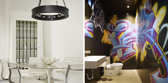
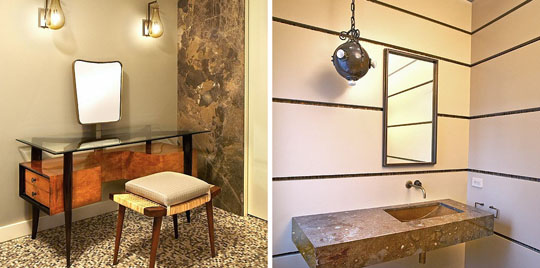
Gary Hutton made this Venice loft very sleek and modern - but he put a little "street" into the bathroom for contrast. Photos: Matthew Millman
The North Point Project
On the apartment renovation that I did recently with Mark English Architects, Mark had already given us a beautiful design. But the furnishings were still lacking. I had to take what was already there and make it stronger, complete it. There was already that round sofa, which I echoed on the other side of the room. The oval ceiling is echoed on the floor. With the master bed, the client told me that he wanted it to feel like a really, really fancy hotel suite.
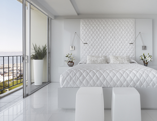
Gary Hutton designed this curiously alluring master bed as a built-in for an apartment renovation done together architect with Mark English. Photo: Matthew Millman
Colorful vs. Monochrome Interiors
Rebecca: What’s your take on use of color? Most of your work features a very restrained palette – why is that? And yet some of your past articles talk about “bling”. So… in your heart, are you minimal or bling?
I like to say that my furniture is the low child of Judith Lieber and Donald Judd. I like cleanliness of line and spareness. I’ve worked for so many art collectors. They don’t leave a piece in the same place forever. They like to rotate what they have up. So I use a lot of neutrals because any art can rotate in or out of that space. There’s one client, I’ve done 6 or 7 projects for over the years. There have been five pieces of art over one particular sofa in as many years, including a piece by Jeff Koons and a video installation. There’s a Frank Stella hanging there now, my favorite so far.
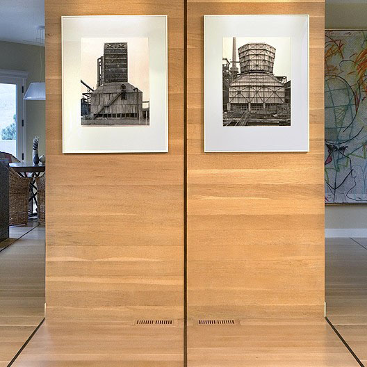
Gary Hutton's interior designs are often intended to showcase major art collections. Photo: David Wilson
I’ve done rooms for people that were colorful, too. One such room had red furniture, an Oriental patterned carpet, and an ottoman in red, yellow, and purple. It was a warm and intimate spot.
Creating Dynamic Social Spaces
Rebecca: A lot of interior re-work isn’t about colors or fabrics, it’s about flow, furniture placement, reducing clutter, social organization – space planning. Is this at all a part of what you do with interior design?
Furniture groupings and placement are important in defining social interactions. Sometimes I’ll come up with a couple of different schemes for people to choose from. What are people going to want to do in different areas of a room? One area might have a sofa to take advantage of a certain view, for example. Or a south facing window might have a reading nook.
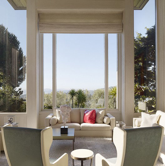
In his interiors, Gary Hutton pays attention to furniture placement as a way to shape and define social interactions. Photo: Cesar Rubio
Here’s one example of that. Clients from Hillsborough, a couple who were well traveled, and well prepared to work with me. They brought photos of things they liked, but they also told me this story about a horrible dinner party one of them had attended where he ended up trapped with the same four people all evening, because the dining table was too big. So, we knew that we needed to organize the furniture in their rooms to allow for movement.
The room strategy, if you will, was to have seating groups to allow for conversation where one person could easily turn from one group to another. It was a very large room, too, with 14′ ceilings. But it wouldn’t’ always be full of people. To avoid having it feel empty when there were only a few people at home, we put the smallest group of furniture by the fireplace, so there would be a cozy, intimate spot even within this cavernous room.
[Rebecca: This is Gary Hutton’s Secret #2 – the ability of a psychologist or therapist to observe closely, read the client’s unconscious desires, respect their inner feelings and needs, and win their deepest trust.]
Rebecca: In most of these rooms so far it sounds like the main focus is artwork.
Rooms should have a focus. But it doesn’t always have to be artwork. One client I have is a total TV person. He’s never more than 10 feet away from a TV. He and his wife have two TVs in the bedroom, one for each of them to watch their favorite programs, and a TV in the bathroom ceiling right over the tub.
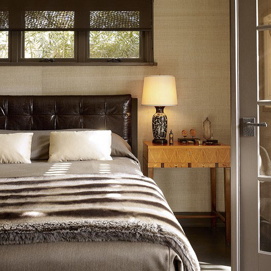
"Every room should have a focus," says interior designer Gary Hutton. Shown here is one of Hutton's interiors, a Los Angeles residence. Photo: Matthew Millman
The Future of Print Media
The focus of a room consists of the things people carry around with them from place to place, things that are important to them. Their books, their art, their TV. It becomes part of their collective consciousness. But you can’t get a room published if it’s got a TV in it. These shelter magazines don’t want to see TVs. Or toilets. All their top editors are women, and they don’t want to see TVs or toilets. Architectural Digest has rarely published a bathroom – and never have they shown a toilet or a TV. That could change now under their new leadership.
Rebecca: But there’s also this kind of worship of the bathroom.
Trade magazines are the ones who will publish kitchens and bathrooms.

Interior designer Gary Hutton took the idea of "bathroom worship" in a whole new direction, in this remodel of an apartment at the Four Seasons. Photo: Matthew Millman
Rebecca: Print magazines are in trouble. They’re still relying on an antiquated business model which consists of selling a lot of advertising. Their ad space is expensive and who knows if it’ll lead to project work?
Electronic reading devices are becoming popular, but most magazines haven’t caught on. They don’t offer online subscriptions, only a per-issue charge that’s a lot more expensive.
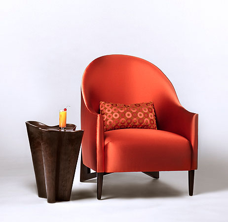
Gary Hutton's not afraid of color. Shown here his Thomas chair covered in red satin, which completely changes its personality. Photo: David Wilson
Rebecca: Magazines today seem like artifacts or relics.
There was one magazine that was really great, called Flair, published in the 1950s. Fleur Cowles was the editor. It had fantastic work by writers, photographers, and designers. It was only around for a year. It was privately funded and didn’t need to turn a huge profit. By contrast, Architectural Digest is – or was – a money-making venture. In the past 8 years, though, it seems to have become the People Magazine of decorating, a celebrity phenomenon. The sort of thing that drives impulse buys at airports.
Makeovers as Holistic Transformations
Interior design and architecture complement one another. The interiors complete the architecture. A good analogy might be a guy who’s really handsome, great physique, but he’s still naked. He needs the right clothes. Then, once he’s outfitted, you realize that in order for him to truly look his best, he needs a few finishing touches, maybe getting his teeth capped and a different haircut.
But to really be transformative, you have to intuit to the heart of the client’s real character, get to what really makes them tick deep down inside. I was watching this TV show on TLC called “What Not To Wear”. They take someone who’s a wreck and then these two stylists show up. The deal is, they give you $5,000 but you have to bring everything you already own to New York City, and they get to throw it out if they want to.
Watching that show is like watching a reptile. It’s so fascinating that you can’t stop looking. I remember a young woman from Dallas in her early 30s, who was married to a 23-year-old guy. When they walked down the street together – she was often mistaken for his mother. She dressed in this dumpy way and didn’t care for herself. Well, it turned out that she’d invested her life savings in a neighborhood bar in Dallas. It was something she really, really believed in – and eventually the business failed. When that happened, she caved in on herself. She was punishing herself for this failure, and she believed deep down that she didn’t deserve to look her best.
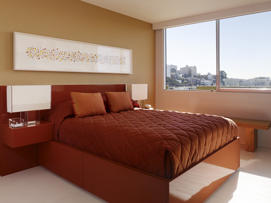
Gary Hutton provided the interior design for this guest suite in an apartment renovation done together with architect Mark English. Photo: Matthew Millman
On that show, they try to find that nugget in the client’s personality and consciousness that makes them who they are. The woman from Dallas had a Betty Page physique and sensibility – that 1940’s pin-up look. She loved that vintage vibe. So they sent her out to vintage stores, not to re-create the look but to take the spirit of that.
A second person on the show was a 30-year-old woman who’d just finished her Ph.D. in social psychology, but she still looked like a college student. She thought style was pointless, superficial. She refused to accept the premise that people make judgments based on what you look like. As a child, she had been very interested in clothes, but it all fell away in college. She turned her back on it. She’d go into her mother’s closet and wear her mother’s dresses because they were there, and while they fit, they didn’t look as good on her as they did on her mom.
And some people on that show have refused to buy into it at all. They resist! But the TV stylist hosts understand the psychology of people and how some people ignore their appearance to their own detriment. The stylists have to figure out: who are they, really? And then, they have to offer the clients the comfort that allows them to move forward with life so they can get to the next stage of development. It’s things like this that I, as a custom designer, also need to capture.
Managing Clients
Rebecca: What about your biggest pet peeves?
Indecision, and lack of candor.
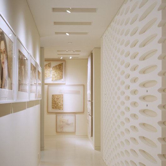
Gary Hutton created the interiors for this private residence specifically to showcase the owners' art collection. The white sculpted wall is an art piece created by Rudolph Stingle out of styrofoam. Photo: Matthew Millman
Rebecca: How do you work around it?
With indecision, sometimes I have to tell them, “If you don’t decide by next week it’s going to put the project back six months and cost another $30,000.” That usually motivates them.
Rebecca: Sometimes as an artist you have to take charge. People respect you more.
There are times in a project when you have to take charge. Lack of candor is a little harder to deal with, but sometimes clients are really doing their best. I have one client who has her own eccentricities, but she understands that, and she owns it. She’ll call me and say “You just have to listen to me for a while. But I want to make sure you bill me for it.” And then she talks for a while, and I listen, and then she’s through.
Rebecca: Redoing someone’s interior living space is a very intimate exercise. There really has to be trust on a lot of levels. I’ve heard other architects say that design is a little like being a therapist.
Yes, it can be. I took a lot of psychology classes at school and I loved them.
Rebecca: Do you apply that knowledge in your practice now when dealing with clients?
Yes. Sometimes I have clients who are unhappy about something to do with their project. I tell them: “Don’t worry. We’ll resolve it one way or another. I can’t tell you how long, but we’ll do it, because we have always come through for you before.” And that’s our core commitment.
[This is Gary Hutton’s Secret #3 – Knowing when to be direct, and still being able to pull it off with poise and dignity.]
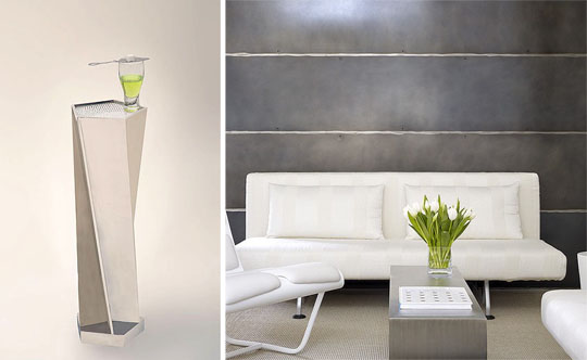
Two images from Gary Hutton Design. Left: the Green Fairy graces a silvery Facet 5 table. Right: a view of a Venice, CA loft remodeled by Hutton. Left photo: David Wilson. Right photo: Matthew Millman
Photographer Note: Matthew Millman is based in San Francisco, CA.

