
Chris Downey on Architecture for the Blind
by Rebecca Firestone with Mark English AIA | Interviews
“When I lost my vision, the first thing I had to learn was non-visual coping skills. Rehabilitation teaches you about things like how to travel on mass transit, but there was no training on how to be a blind architect. But why not? After all, Beethoven wrote some of his best music after going deaf. We’re not shut out of architecture.”
– Chris Downey, Architect
Last month, I had the pleasure of hearing a very unusual talk at the AIA San Francisco. Chris Downey lost his eyesight following a surgical operation two and a half years ago, and has continued to practice architecture. He spoke to an audience of architects about some of the special methods he uses to share ideas with design teams on projects, and also about how to design buildings and environments specifically for people with limited vision. “The ADA is more about mobility,” he said. “For the visually impaired, it’s more about safety.”
“I’ve only been blind for two and a half years,” he joked. “As far as knowing how to get around easily without vision, I’m still a kid.” Downey also noted that his driver’s license was still valid until a few weeks ago. “When I lost my vision, the first thing I had to learn was non-visual coping skills. They teach you about things like how to travel on mass transit. But there was no training on how to be a blind architect.”
Downey didn’t let that slow him down, though. Eventually, he found an architect named Carlos Mourão Pereira in Lisbon, Portugal, who had also lost his sight, and who still practices and teaches architecture. “I didn’t want to become a code consultant, or a spec writer. This guy told me ‘stick to your guns’. After all, Beethoven wrote some of his best music after going deaf. We’re not shut out of architecture.”
Design is Not Just a Visual Process
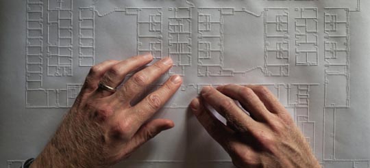
“We’re used to thinking of design as being a visual process. But really, design is an intellectual process, and the visual dimension is a tool to aid in that. It’s one way of getting information, but it’s not the only way.” Downey found several methods that he could use to to create new designs and to communicate with other members of the design team, including physical models, drawing kits with raised lines, and special 3D printers that print drawings in a raised form, like Braille.
“The rest of the team creates a PDF file, and I can print that file on the embossing printer without special software. Revit even lets you load in a Braille font to get labels on drawings, without requiring that the rest of the team know Braille.” To convert computer screen information into audio form, Downey uses a product from Freedom Scientific called Jaws.
This bias towards the visual occurs in other fields besides architecture. “Professions such as math, science, and engineering are also commonly thought to be out of reach for people without vision,” said Downey. The stereotype of a “trade school” that saw blind people as only fit for simple trades such as basket-weaving comes to mind, but a brief perusal of the Perkins School for the Blind History Museum site reveals that with the right encouragement, blind people have been able to participate in a variety of activities – including team sports and professional careers.
Downey’s Recent Work
Downey discussed some of his recent design projects, which are mainly focused on serving people who are visually impaired. He learned a lot from working with the SmithGroup and The Design Partnership on the VA Polytrauma and Blind Rehabilitation Center in Palo Alto. “What makes for a beautiful building, a delightful building, if you can’t see it?” he asked. “How can we express Vitruvius’ notion of ‘delight in architecture’?”

Architect Chris Downey worked with SmithGroup and the Design Partnership on the design of the VA Polytrauma Center in Palo Alto, California, after losing his own eyesight. Image courtesy of SmithGroup.
He’s consulted on the renovation of the Associated Blind Housing in NY, a 220-unit development, and is also exploring some potential work for Guide Dogs for the Blind in San Rafael. New projects include an eye clinic for Duke University (together with HOK) in Durham, NC, and projects for other service providers for the visually impaired. Facilities for visually impaired people include such things as rehabilitation centers, yoga centers, storefronts, summer camps, and self-defense. “What is an appropriate visitor experience for someone who isn’t completely blind, but who still has impaired vision?” he asked. Considering that up to 20% of us may lose some vision as we get older, the implications are that we all might need additional cues at some time or another in order to maintain our navigation skills.
Beyond that, Downey’s interest is not limited solely to work for the visually impaired. “Many places benefit from a multisensory experience: playgrounds for example, are physically dynamic and socially interactive.” By paying greater attention to all the senses, environments can be more enjoyable and stimulating without becoming more stressful.

If Chris Downey ever wanted to quit being a blind architect, he could be a comedian. This photo by Tony Diefell shows Downey with a sign saying "I have been doing architecture for so long I could do it with my eyes closed - REALLY."
How Many Blind People Are Out There, Anyway?
At first, designs for the so-called “blind population” might seem to serve only a small number of people, until one considers the fact that total blindness is only the most extreme form of visual impairment. People who are legally blind, for example, cannot drive a car but they can often see well enough to perform other tasks. They, too, have had to adapt and learn alternative coping skills to compensate. “Sometimes it’s easier having no sight at all,” noted Downey. “Glare and variable light levels can be a real problem. With some vision conditions, it can take 20 minutes to adjust from dark to bright light.”
The American Optometric Association defines blindness in specific functional terms: anyone with vision worse than 20/200 in their “better” eye, that cannot be improved with corrective lenses, is considered legally blind. In addition, people with a central visual field of less than 20 degrees diameter (a 10-degree radius) are also considered legally blind. The leading causes of blindness in the U.S. are accidents, diabetes, glaucoma, and macular degeneration. Although vision loss can happen at any age, vision impairment is disproportionately found in older people; according to the Braille Institute, 70% of severely visually impaired persons are age 65 or older.
[Then there are people whose eyesight is fine, but who still trip over things in the dark with embarrassing frequency.]
Blind People Use the Same Buildings as the Rest of Us
Not only is the problem widespread, but consider also that dedicated centers and schools aren’t the only areas that are used by people with visual impairments. Other areas that are especially problematic for visually impaired people include transit centers, public buildings, cafes, and even supposedly “pedestrian-friendly” sidewalks.
People who are legally blind can’t drive, and thus are more dependent on alternative methods of travel. These typically include mass transit, other people, or their own feet. Orientation mobility was the term used to assess how to do things like find the turnstile, find the right platform and the right train, board the train, recognize the stop, get off the train, find the desired exit from the station, and so forth. In poorly designed transit centers, even people with perfect vision can have trouble figuring it all out, especially if they’re not familiar with the area.
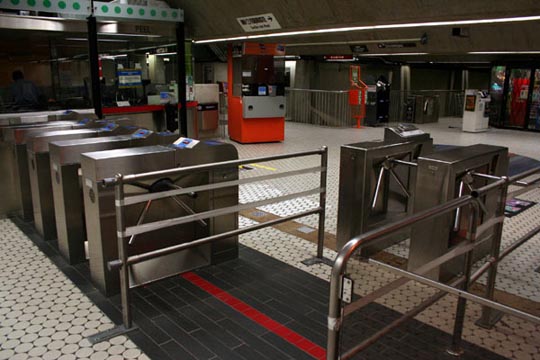
Transit stations are an area where it's especially important to make features like turnstiles easy to find for vision-impaired individuals who depend on public transportation to get around.
Museums are another area, surprisingly. “But why not? We still belong to society. A blind person might still go to the museum as part of a family outing, with friends, or on their own, and get something out of it while participating in the cultural institution.” Museums today are almost “heroically visual” but that wasn’t always the case. “You can’t touch, feel, or pick up art the way one could in the Renaissance. When museums started forbidding this, there was a huge reaction to it. But doing so helps to understand things physically.”
In 2006, the Department of Justice had a lawsuit regarding the accessibility of the International Spy Museum. “Just being able to walk around doesn’t equal accessibility. Accessibility of content is as important as physical accessibility. What is the visitor experience if you can’t see?” In fact, accessibility is a lot more than wheelchairs, because people can have different disabilities.
Designing Sensory-Rich Environments
Once Downey started to lay it all out, a lot of it seemed like common sense, like the fact that people with poor vision use other senses to compensate. To be more user-friendly, buildings and environments should speak to senses other than vision, to make places more recognizable for a wider spectrum of abilities. Integrated holistic architecture was the term Downey used to describe this approach.
“Typically, 80% of of our sensory experience is visual, because it’s so much quicker. The remaining 20% is non-visual. But 100% of the ‘design’ tends to be all about the visual,” said Downey. When one considers the nature of most design awards and publications, it’s hard to argue with that. “It’s hard to draw acoustics, or smell, or touch, and it’s hard to photograph these things.”

Scented plants such as rose, mint, or angel's trumpets can help create a sensory-rich experience for people who can't see.
And so we forget about other sensory dimensions until the building is built. By that point, it’s a bit late in the day to correct for fundamental design flaws such as poor acoustics. We typically just grit our teeth and pretend that we like it.
Beautiful Buildings that Sound Good
During the talk, someone asked what a beautiful building might be for someone who couldn’t see it. Downey replied, “It’s about appropriateness. A cathedral will have a different sound than a bedroom. Inside the SmithGroup offices in San Francisco, there was a hard walkway and I could tell by their footsteps not only who was coming but what mood they were in. In spaces, I prefer more ‘live’ sound, although a dead space featuring acoustical stillness is probably better for activities requiring focus and concentration.”
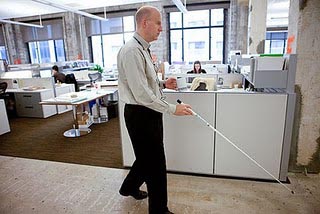
Chris Downey walking along the corridor at the SmithGroup. The walkway's hard surface differentiates it from the carpeted seating areas beyond. Photo: Robert Durrell
One space that was memorable to Downey was the James Turell Skydome at the De Young Museum. It has an interesting acoustic and feel… simple and elegant, with benches that conform to the body. You can hear your own movement. I don’t think they were trying for that, it just turned out that way.”
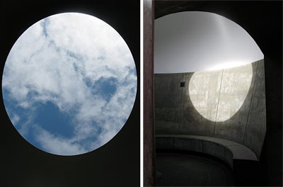
The Sky Dome by James Turrell, at the De Young Museum in San Francisco, is a fascinating acoustical experience regardless of whether you can see or not.
On airports: “Chicago’s O’Hare Airport is great for the blind. On the concourse, it’s easy to follow the people in front of you as they walk along the terrazzo floor. The seating areas have carpet which you can’t hear, but as spaces they’re differentiated, which is good. There’s a hierarchy of finishes, a variety of spaces, that tells you where you are.”
Does the Americans with Disabilities Act Help the Blind?
Well, not as much as it could, according to Downey. “ADA doesn’t address the visual much. It’s more about mobility. But there are spaces that are fine for people in wheelchairs that are hazardous to blind people.”
First he showed us a bunch of “head-bangers” that made everyone wince and clutch their foreheads. In the first photo, Downey showed himself with cane smacking into a low stair right at head level, which had plenty of clearance for the cane beneath. “Building protrusions are worse than branches,” Downey noted. “At least with branches, there are these things called ‘leaves’ that brush against your face and give you a little warning.”
Walls that tilt inwards may be a Modernist dream at places like the Contemporary Jewish Museum, but they’re equally bad for blind people for the same reason. The top of such a wall can smack into someone’s head well before the sweep of the cane could detect the bottom of the wall. This condition might also be referred to as “bad feng shui” because sharp angles and visual obstacles “cut the chi” and in this case they can cut your head, too.
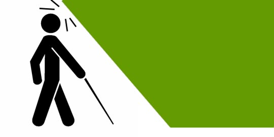
Walls that tilt inward can be hazardous to blind people, because their head will connect with the wall before their cane can detect it.
“A good stair example will be surrounded by a rail that a cane would find,” said Downey, showing us a photo of stairs done right. “Don’t rely on movable objects like potted plants to denote perimeters, though, because they will inevitably be moved. The features must be fixed and on the ground, where a cane sweep can detect it.”
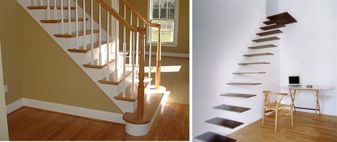
The type of stair shown on the left, while less "design-ey", would allow a blind person with a cane to detect it from the side. The one on the right would not reveal itself to a cane sweep at floor level, creating a hazardous condition.
Seismic braces are a good example of replacing one hazard with another. A diagonal brace located in an awkward part of a room can be an obstacle even for sighted people. Downey showed several examples from local eateries (we won’t name them here because sometimes you really don’t have a choice of whether or not to use a brace, and sometimes there’s no leeway on placement, either). There was another brace at the Chicago Navy Pier Convention Center which seemed almost intentionally designed as a booby trap.
Stairs can be nerve-wracking, even if they’ve got plenty of handrails. Downey showed a few photos of what he termed “wedding-cake stairs” at an office building in San Francisco’s Financial District, and at a local middle school. These are stairs with a scalloped or zigzag footprint that can make it hard for a blind person to detect when they have reached the top of the landing.
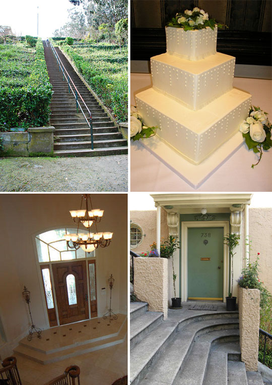
Tiered stairways that bend or curve around can be hard for blind people to navigate, because they can mistake a corner for a landing. Clockwise from top left, first is a typical straight stair with a railing in the middle. Top right shows an actual wedding cake with a corner "stair". Lower left shows an irregular tiered platform in a home by the front entry. Lower right shows a reverse wedding-cake stair.
A lot of these conditions were well-intentioned ideas with unintended consequences, like the seismic braces. One surprising example of this was an attractive brick-paved street without curbs that was shared by vehicles and pedestrians, on either side of a painted line. This is challenging for blind people, who rely on being able to feel the curb and the level change from sidewalk to street to know which is which. A painted line doesn’t help them.
Accessibility Features that Work
So, what sort of features actually work for visually impaired people? Downey listed several areas of concern and discussed the trial-and-error method of discovering solutions.
Disability vs. Handicap
Downey showed an excerpt from the Boy Scout Merit Badge Handbook that offered an important philosophical distinction. A disability is a condition that limits a person’s ability to do certain things. A handicap is an environmental condition that creates a restriction or disadvantage for that person. “People with disabilities aren’t handicapped UNLESS their environment places barriers in their way.”
He mentioned the term “helicopter architecture” to describe over-use of accessibility features. “Like helicopter parents who hover constantly over their kids, helicopter architecture over-does it. Find what works to enable people to find their own way, independently.”
Way Finding
With wheelchair-bound people, the problem isn’t knowing where to go, it’s getting there. For the visually impaired, however, finding their way is a major concern. What about tactile maps? someone asked during the talk. “They tried that in MUNI for a while but it wasn’t a success. First you have to FIND the map, and who wants to touch all those walls?” Good point… a person could go through a lot of latex gloves that way.
Visually impaired people can use a combination of sensory and relational methods for orientation, including traffic noise, the sound of other people’s footfalls, and even asking for directions. “But how do you give non-visual directions? They usually end up just leading the person. There’s a dignity of going on your own, of not having to rely on assistance.” Hmm… is that why men are so reluctant to ask for directions?
Sometimes there’s a rhythm to time, space, and the body. Downey described walking an unfamiliar route when working on a project out of state. “In New York City, I took a 16-block walk back from an office to my hotel, zigzagging every other street, and I just knew how far I had gone. At the middle of the final block, I turned to the right to discover that I had overshot the door to the inn by about 2 feet as I hit the left side of the potted plant with my cane rather than the right side, which would have put me in direct line for the entry. It’s kinetic, it’s about time and space.”
By the same token, finding one’s way within a building without sight can be somewhat of an art form. “I can listen for the ping of the elevator to find it, but in a big lobby you can’t always make a beeline straight through. There might be seating areas in between. Listen also for the flow of people. It’s constant problem solving.”
Patterns and Predictability
Because people with visual impairments can’t always spot hazards from a distance, or detect when objects have been moved, consistent patterns and predictable environments are especially important for safety reasons. In fact, these features are helpful for sighted people in low-light conditions as well, especially if you’re bleary-eyed in the morning and looking for your toothbrush.
In fact, some of the worst design offenses occur in the bathroom, as Downey discovered. “Bathrooms aren’t very predictable. There’s no consistent logic to where things are placed. After washing my hands, it’s often hard to find the towel, and after feeling all the walls, I have to wash my hands again!”
Even the humble urinal has contributed to the problem. “The ADA mandates low urinals, but I’m 6’4″ and a low urinal is exactly what I DON’T need.” Sometimes the minimalist design approach really doesn’t help. The urinals come out all cool and designey – and smaller, smaller, smaller. And that’s something you don’t want to find by feel. “When I discover that the urinals are small and low, I simply have to head out in search of the toilet stall.”
The Brian Higgins Test
Chris Downey shared this term, named after the director of Computer Access Technology for the VA Palo Alto Western Blind Rehabilitation Center. It’s a basic litmus test for gadget usability: “Can you still use it with your eyes closed, or behind your back?” It’s a good test for any sort of hardship field conditions, so why not everywhere? Now, apply this test to buildings, and ask whether people can:
- Move through the space
- Know where they are
- Find the front door to enter or exit
The use of markers should include non-visual landmarks as well as visual ones.
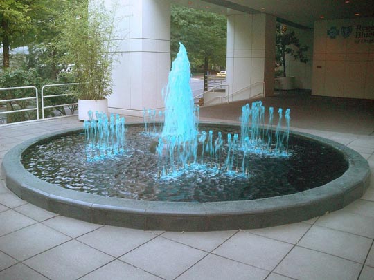
Fountains make good non-visual landmarks because you can hear them and feel the spray. This one would be hard for someone to fall into, because it has a generous raised rim.
Building Handshake
A building’s “handshake” consists of designated points of interaction where visitors touch or grip things, like railings or door handles. Downey didn’t go into this in depth due to time constraints, but we’ve all experienced doors or other features that looked really cool but were awkward or even impossible to use. Something more ergonomic that fits the hand and body easily can make this “handshake” a more pleasant experience.
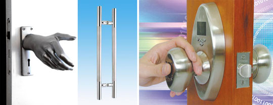
A building's "handshake" is literally that. Left shows the "hand-le", a design by Naomi Thellier de Poncheville. Middle shows a typical door handle one might find in a public building or office. Right shows the BioKnob by Tychi Systems, a biometric doorknob that reads the user's thumbprint.
Materials and Surfaces
Acoustics are an important component of sight-free navigation. Although people aren’t quite as skilled as bats, changes in acoustics are quite noticeable and can serve as a reminder of location. Materials and finishes can be employed to change acoustics, and changes in floor coverings can serve as a tactile indicator when transitioning from one area to another. Hard surfaces on floors can also help with a cane, because the tapping can create echoes that serve to define the space.
Downey mentioned the Kimbell Art Museum, a famous design by Louis Kahn. “I was looking forward to hearing all those barrel vaults, but the acoustics were so well treated that it was rather flat. The exterior vault, I could hear.” Eventually Downey noticed that the exhibits had wood floors, with bands of travertine on the structural grid. “I could tell where I was by the sound and tactile feel of the floor.”
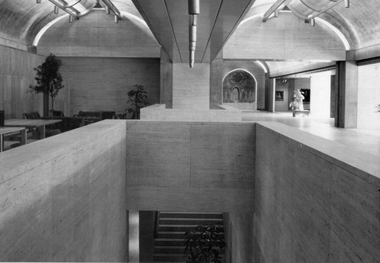
Louis Kahn's design for the Kimbell Art Museum did such a good a job on the acoustics that it's difficult to navigate using sound alone.
Tactile strips for transit boarding platforms are by now a familiar sight in most major metropolitan areas. Downey notes that in places like the Mongomery Street BART station, there’s not enough textural differentiation between the tactile strips and the brick paving on the rest of the platform.
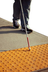
We're all used to seeing tactile boarding strips like this one at train platforms and sidewalk crossings. In addition to providing extra traction, they also allow a blind person to detect the difference in texture and thus locate the edge.
Accessible Technology
Although technology and gadgetry by itself isn’t architecture, it is part of the larger field of design. It’s part of the interface that we all have with our world. And, gadgets like touchscreens and even media walls can become environmental features if they’re built in. Downey talked about the design implications of gadgets for the visually impaired. “The iPhone had no accessbility features when it first came out. I joked that it was really an ‘eye’ phone. Apple subsequently hired a team of sight-impaired engineers to add accessibility features, and now every iPhone is accessible to the visually impaired.”
Everything from exercise bikes to microwaves can be easy or hard to use. Even larger displays won’t always help, although it’s a lot better than the other kind. What really helps people who can’t see? Audible feedback, including “click” sounds to let you know when somethings been pushed, and tactile controls, which a touchscreen doesn’t always have. “Think about setting your thermostat from 65 to 70 degrees. You need to know when it’s actually at 70, and audible feedback that says the number is essential.”
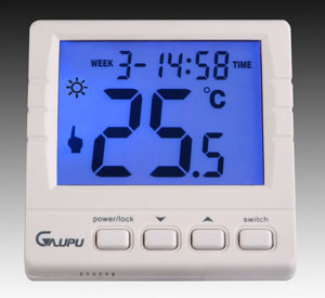
This programmable thermostat provides visual feedback, but a blind person would need audio feedback in order to know what temperature it's currently set to.
Stairs
In addition to the head-banger concern discussed under the ADA heading, Downey had a few more notes on stairs and escalators for those new to sight loss. “You need a safe place to initiate and finish a climb. This can be hard to do with other foot traffic already pressing at your back. Others with balance and mobility challenges have similar concerns. Escalators are still a challenge for me – but I’m getting better.”
Downey noted that up to one-third of our sense of balance comes from vision. People new to sight loss often have impaired balance as a result. “It was the first part of my rehabilitation training after losing my sight,” he noted. And, stairs are noticeably harder to navigate, especially going down, when you can’t see the edge of the treads.
Tune in next week for a few follow-up questions that Mark English and I had for Mr. Downey.



KELLY CONDON
13. Dec, 2010
LOVE LOVE LOVE LOVE LOVE!
I worked with Chris when I first moved to San Francisco & I wouldn’t doubt for one second that he could change the face of architecture with his eyes closed.
It’s wonderful to know he’s still projecting visions from his mind’s eye out into the physical world & very encouraging to learn that he’s on the forefront of this under-explored frontier in architecture.
Sounds like it may involve some innovative product design…
Irving Gonzales
13. Dec, 2010
What a wonderfully inspiring article. Thank you for also expanding on the topic of architecture of the senses.
Tami Rasch
31. Dec, 2010
WOW Chris, you sound amazing! My husband just lost his sight at 46 due to strokes and is NO WHERE near as positive and upbeat as your seem. That’s amazing that you have made a life around your vision loss. You are a true inspiration to all who is visually impaired.
Architecture for the Blind | Design for Ability
15. Aug, 2011
[…] Here are a few topics from the article, but you should really read the whole thing on thearchitectstake.com: here […]
Current Sources and Annotations: October 12, 2012 | Sensory Architecture
20. Oct, 2012
[…] https://thearchitectstake.com/interviews/chris-downey-architecture-blind/ […]
Jacqueline Wurzelbacher
05. Oct, 2014
I am sighted and have a friend who was blinded at birth as a preemie from too much oxygen. We do fair housing testing together for Access Living. Recently, I’ve begun training as a tour guide for Frank Lloyd Wright houses. My friend could definitely handle the walk-through but how could the standard architectural tour be focused for people who are blind?
Blind Architect Chris Downey | Best Architecture firm recommendations
19. Jan, 2016
[…] Chris Downey: Architecture for the Blind | The … – Architect Chris Downey continues to practice after losing his eyesight, and presents design advice to others. […]
School For The Blind Architecture Design | online -interior design magazines
21. Jan, 2016
[…] Chris Downey: Architecture for the Blind | The Architects … – Chris Downey on Architecture for the Blind. Monday, December 13, 2010 | Alan Huguenot, CEPE | Interviews “When I lost my vision, the first thing I had to learn was … […]
Chris Downey Architecture Blind | residential architect
22. Jan, 2016
[…] Chris Downey: Architecture for the Blind | The Architects … – Architect Chris Downey continues to practice after losing his eyesight, and presents design advice to others. […]
Architecture Blind Senses | Become Architecture Fan
18. Apr, 2016
[…] Chris Downey: Architecture for the Blind | The Architects … – Chris Downey on Architecture for the Blind. Monday, December 13, 2010 | Rebecca Firestone | Interviews “When I lost my vision, the first thing I had to learn was … […]
Blind Architecture | New Architecture Fan
03. May, 2016
[…] Chris Downey: Architecture for the Blind | The Architects … – Chris Downey on Architecture for the Blind. Monday, December 13, 2010 | Rebecca Firestone | Interviews “When I lost my vision, the first thing I had to learn was … […]
lily
11. Jul, 2016
hi there – not sure who to direct this question. my husband is visually impaired (can see from one eye but not as clearly as before) as a result of unmanaged diabetes before. working with this disability has caused huge difficulties reading/drawing architectural digital plans on the computer (CADD, Revit). Any suggestions on computer screen tools, etc. to aid with this impairment? Thank you
Rebecca Firestone
27. Aug, 2016
Chris Downey talked about some of this in one of the articles (it’s a 2-part article). He relies on teamwork, computer voice prompts, and reads printed plans in Braille (yes, there’s a font for it). It’s not a simple fix, obviously. One person’s workaround might not work for you. Good luck.
Nancy Graefff
13. Jan, 2019
I’m wondering if you may be related to my grandmother. She was virtually blind from congenital cataracts as a child in Northern Ireland her name was Florence Downey. She was an inspiration to us!