
Anne Fougeron: Architectural Edge in the 21st Century
by Rebecca Firestone with Mark English AIA | Interviews
“Architecture is a tough profession, and it’s not kind to women. It’s not kind to anyone, really. But you’ve got to claw yourself out of that hole. You have to fight the fight. You can’t stay in the back, because nobody’s going to fight that fight for you. NUMBERS MATTER.
With the Planned Parenthood clinics, I didn’t want clinics that look like a prison. There’s already so much victimization of women… why punish them further by making them come to a jail for basic care? Ninety percent of Planned Parenthood’s business is providing basic gyn care – exams, pap smears – for women who can’t afford it any other way. These women already going through enough in their lives. Some of them already have other traumas to work through. The clinics should make them feel wanted and safe.”
Anne, Architects and interior designers are natural enemies sometimes. Which side are you on? Are YOU afraid of drapery? What about color?
Absolutely not! I love drapery. I have a beautiful metallicized linen drapery from France in my own bedroom at home. Drapery can be very useful – it can add sophistication and intelligence to a design.
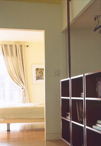
Anne Fougeron isn’t afraid of drapery, although she doesn’t overdo it, either. Shown here is Fougeron’s own home. Photo: J.J. Casas
What I don’t like is consumption for consumption’s sake. Sometimes interior design is about chachkes and owning too many things, just for the sake of having an attractive assortment. It’s OK to have a lot of stuff as long as it’s personal. It can be reassuring, bringing joy. But not if someone else who doesn’t even know you has picked it all out for you.
What’s the most extreme design challenge you ever faced?
Convincing people that design matters, and explaining to them WHY it matters – without lying to them or condescending. This applies both to private clients and to public agencies and officials. A lot of people just don’t get it with modern design. It’s like trying to explain why a great novel is worthwhile to someone who only reads the sports page or the gossip columns in the newspaper.
How do you convince someone that design matters?
A good design should last over time, be well-sited, and include amenities that matter. Quality costs more, but they’ll end up with something that’s far more suited to their needs. It helps for people to have some visual training so they can understand the importance of design in the world. Unfortunately, the slash-and-burn budget cuts in public schools have gutted most of the arts programs.
People without design education tend to romanticize the past at the expense of the present.
What people don’t realize is that bad architecture has been around forever – not everything that’s old is good!

San Francisco is famous for Victorians, but much of their ornament went to disguising the fact that their footprints weren’t actually that spacious – vertical space was an attempt to compensate for the lack of usable, horizontal floor space.
San Francisco has a lot of Victorians, but many of these buildings are not good design. They’re dark and cramped inside, with too many walls and inconvenient kitchens. It’s no wonder that owners today want to knock out walls, open them up, and bring more daylight in.
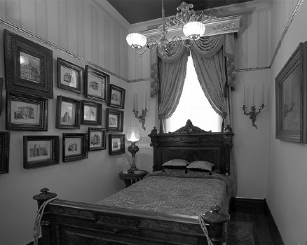
This Victorian bedroom may have gorgeous detailing and beautiful furniture, but it’s still so small that a guest can literally lie on the twin bed and touch both walls.
[Developer “loft-style” condos use the same trick to disguise their units’ cramped footprint with disproportionately high ceilings, which creates vertical, but useless space.]
Tell me more about how buildings can emotionally affect people.
Buildings like the Notre Dame in Paris or Hagia Sophia in Istanbul convey commitment to a grand idea. They inspire awe and amazement that the building could be done at all. They take people by the throat.
Small buildings can do it, too. Even a private home – a person can unlock their door, go inside, and get that “wow” feeling because it’s a special space and they think, “I’m so glad to be home.” I have an email from a client in Palo Alto who wrote to me, “I finally got to spend some time in my house over Christmas and it’s ten times better than I anticipated.”
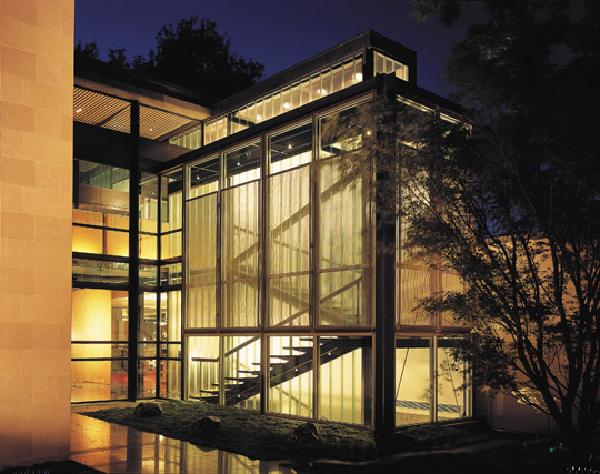
The clients for Anne Fougeron’s 440 House project loved their home enough to write her an email after spending their first Christmas holiday in it. Photo: Tim Street-Porter
Buildings can evoke all kinds of responses: exhilarated, cozy, or even uncomfortable. Sometimes we will intentionally elicit a response of discomfort as part of the design.
[Even a small amount of edginess can add dynamic tension.]
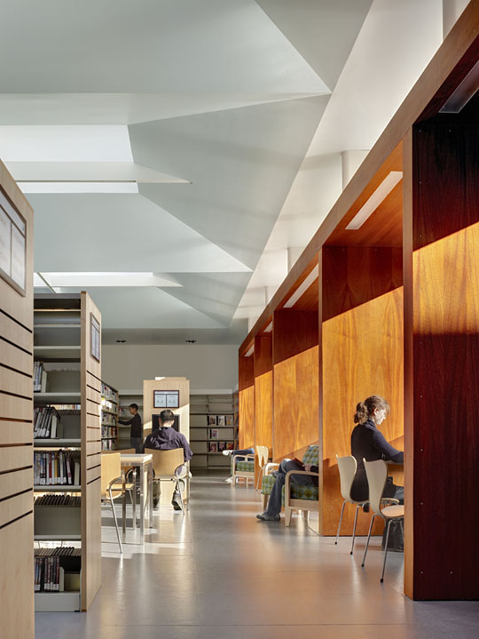
Anne Fougeron’s Ingleside Library. Sunlight is drawn into the interior, while along the walls windowed niches built from honey-toned natural wood create a warm and inviting environment. Photo: Joe Fletcher
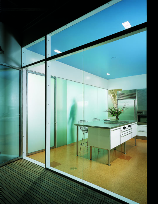
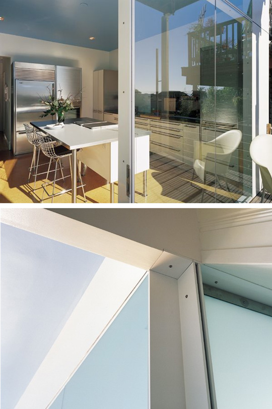
Kitchen of Anne Fougeron’s 21 House project. A semi-transparent bathroom wall behind creates interest, but also a sense of voyeurism and exhibitionism. Photo: Matthew Millman
Tell me about how you work with builders and craftspeople. Are they fabricators for your designs or do they contribute to the designs as well? How do you integrate the crafters with the builders?
There’s one craftsman, Dennis Luedeman [based in Emeryville], a steel fabricator that we’ve worked with for 20 years. I learned about welding after the first dining room table I commissioned from him, and I didn’t realize that welds could either be exposed or hidden until I saw them on the table. He also did the stairs for the Tehama Grasshopper project.
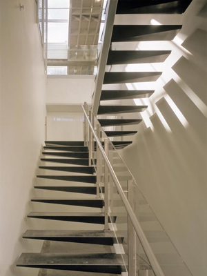
The steel fabricator who built these stairs for Anne Fougeron’s Tehama project had created a physical mockup that ended up influencing the design – the shape of the stair treads, for example. Photo: Richard Barnes
We let him take a lot of design initiatives. It looks like our work, but has his personal imprint. He has an implicit understanding of the materials that even our structural engineers cannot match. We have stair fights all the time! He has to prove himself, but he does, and he keeps pushing the envelope of what can be done with the material. We have other people like that for glass and other materials. People who have a thorough understanding of how to put buildings together. I care about how it looks, but I’m always open to new ideas suggested by the craftsmen we work with.
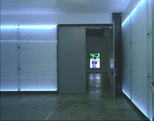
With glass fabrication, much of the cost comes from finishing the edges. In the Hosfelt Gallery project, Anne Fougeron found a glass fabricator who already offered pre-finished panels in specific sizes for a very good price. She accommodated her design to make use of this fact. … Photo: Ethan Kaplan
There’s a big difference among builders, too. Good builders don’t try to pretend that they could do it better themselves, without the architect. A lot of builders are just in it for the money, and they don’t care about the design.
This can be a problem with designing public buildings. We don’t have any control over who the builder is for those projects. The cheapest bid gets it, and the process can take so long that material specifications have changed, or prices have shifted. And the contractor who has won the bid has often cut corners to get the job done. It is a dangerous combination. All these factors take a toll on the quality of the design and affect the overall result. Public buildings really should be built to the highest standard, as they are not often replaced, and they are so important to the life of a city and a community.
If public buildings are such a pain, why bother?
It’s a big chance to influence the urban fabric… and I really believe in good public buildings. Even with all the extra paperwork, the applications, the timeframes, the lack of control over the builders – it’s worth it in the end. I can’t just do private homes.
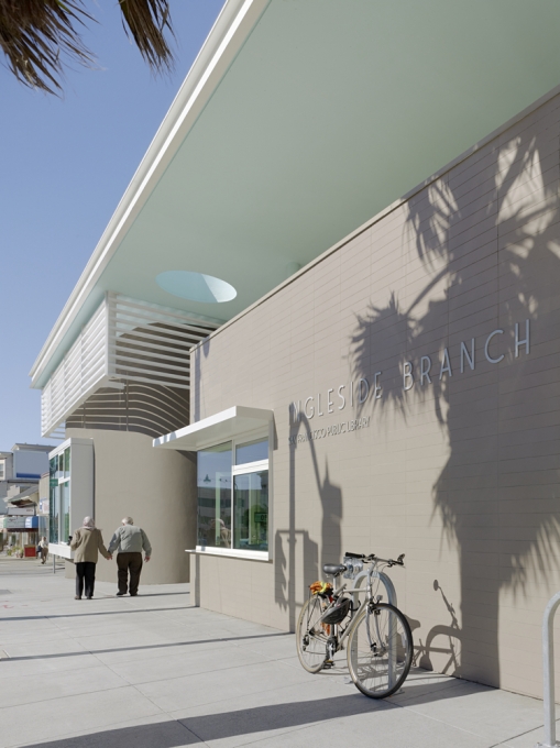
Anne Fougeron’s Ingleside Branch Library in San Francisco as seen from a pedestrian street viewpoint. Photo: Joe Fletcher
Who were the teachers and mentors that influenced you the most?
One was Dan Solomon at UC-Berkeley, whom I studied with and later worked in his studio for 4 years. He was good at site planning and housing in an urban design context. Now there’s more interest in that sort of thing. I think it’s OK to include modern buildings in an old context, to respect the urban fabric but twist it a little bit. Here’s one project we did – 1532 House – that manages to differentiate from the surrounding homes without overwhelming them.
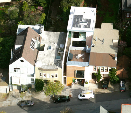
Anne Fougeron’s contemporary 1532 house in San Francisco (second from right) preserves the rhythm of the street without slavishly imitating the older facades of the surrounding homes on either side.
The front profile is the same height, so the rhythm and the massing match. But it’s in a California modern vernacular – a permeable screen and a line of sight straight through – unlike the older Mission style homes on either side with their solid opaque walls and smaller windows. I call it the “Dr Jekyll/Mr Hyde” house.
[That variety actually makes for a more interesting pedestrian experience.]
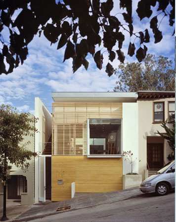
A pedestrian might appreciate the variety which punctuates without overwhelming in Anne Fougeron’s 1532 House. Photo: Richard Barnes
Back to mentors. Another one was Dolf Schnebli, who would come out for quick 3-4 week studios between his other teaching gig in Zurich. He emphasized the integration of buildings over time and history.
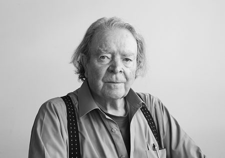
Dolf Schnebli was one of Anne Fougeron’s professors who influenced an entire generation of contemporary architects.
Dolf was a diehard Modernist in a post-modern era. The people he taught or who worked for him include Botta, and also Hertzog de Meuron. He was always super-available to us, and one of my biggest “AHA!” moments was in his class. One project assignment was a day-care center in Berkeley, and I designed a bunch of cute little buildings, which I had drawn by hand with wiggly lines to show how vernacular it all was. He said to me, “It’s fine to want to make it vernacular, but it does not need to look like it was designed by a peasant. Vernacular doesn’t mean ‘peasant’!”
He didn’t mean that I had no talent; what he meant was that it’s OK for a trained architect to draw upon the skills and history of other architects as well as the vernacular. Don’t try to pretend that other architects didn’t do anything. You don’t have to dumb it down. It’s OK for a designer to be sophisticated.
Some works on vernacular architecture imply that anything vernacular is good!
Bad architecture can be timeless, too. There’s been bad architecture throughout history! Sometimes it’s an emotional attachment, as in Ethiopia where they have these thatched huts called Tukul. Traditionally, people live in them together with all their animals and a wood-burning fireplace. It’s emotional but unsanitary – traditional shelters can have intelligent systems but they still could be better.
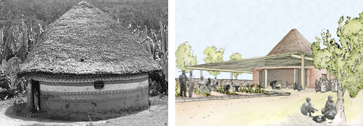
Traditional shelters such as this Ethiopian hut can have great sentimental value, but modern interpretations can improve upon living conditions while still preserving their character. On the right is Hosanna Clinic, a design by Anne Fougeron, which preserves the familiar local vernacular forms while allowing for modern sanitation and health care needs.
I teach this, too, to be constantly aware of what other people are trying to do. There’s another style of design that’s more intuitive, going with the flow, and that’s OK too. It’s a different kind of art, though.
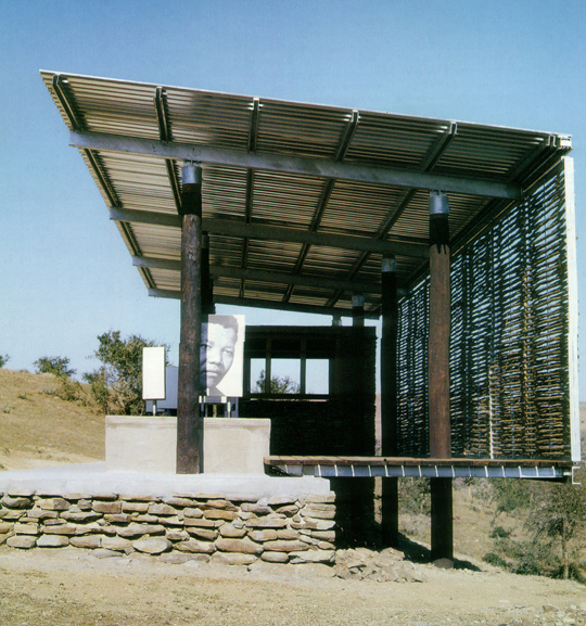
A closeup of another structure at the Hosanna Clinic shows how modern materials can provide the same shelter from the sun, but with more durable surfaces and better air circulation.
What do you think of the training that young architects are getting today?
Architecture is not about sitting at the computer, making crazy dissolving morphing skins. It’s about buildings. Buildings are made of stuff. They’re built by somebody – a lot of somebodies. It’s very labor-intensive. I always tell people, “If you want to be an architect, you’ve got to go out there and look at real buildings.”

Getting out there and looking at real buildings can be an education in itself. Artist David Macaulay’s whimsical drawing “Secrets of the Great Pyramid Revealed” implies that, unless we look for ourselves, the Great Pyramid really could have a giant razor hidden inside it – for all WE know.
You need to train your eye. It’ll ground you. This is rather Bauhaus-y, actually – the Bauhaus school had an emphasis on integrating directly with craftspeople.
How do you teach your students how to approach a design problem? What are some of the problems that work the best as teaching tools?
How I teach depends on what I’m teaching. The course itself needs a goal, and then you can teach to that goal. Personal attention to each student is important. An autocratic teaching style is not as good, because people think and learn differently. I’m rigorous, though. For example, if I teach a course in site planning, I might have the students design the same project on two different sites. They’ll learn from that how the project has to change in response to each site.
For beginning students, the problems are fairly circumscribed, because they’ll be overwhelmed. In a graduate-level studio course, though, they should already know what they’re doing and can handle more complex problems.
Critiquing is a really important teaching skill. It’s a negative art, in a way. It’s not a cheery process. You can’t just tell your students that everything they do is fabulous. But you don’t have to crush them and tell them they’re idiots, either. Even if there are 20 things wrong with their design, you don’t have to overwhelm the student. First, tell them what works, and then start in with the main issue that doesn’t work. Dolf Schnebli taught me this lesson too.
Getting critiqued is always the hardest part about being an art student. But I had one painting professor who was able to do it well. He never crushed anyone. He’d just say something like, “I don’t think the black sun quite works” but he’d say it in a way that made you feel clever for even having tried it, made you WANT to go and do it over.
Learning’s tough. If you want to be coddled, you can stay home in bed. In the real world, people aren’t super-nice. Don’t be brutal. But if you can’t take the heat, get out of the kitchen.

“If you can’t take the heat, get out of the kitchen,” says architect Anne Fougeron about getting critiqued.
Do you ever get students who seem on Day 1 to be useless lumps, but somehow they just work and work and they get really good?
Some of the best students are the ones who struggled more in the beginning, but they applied themselves. It’s like they know that they’re starting at the bottom of the barrel and they work harder. What I really dislike is students who don’t work, and who don’t even show up to their studio classes.

Two famous so-called low-achievers. Albert Einstein flunked math in high school, and is now thought to have been dyslexic. Fred Astaire’s Wikipedia entry says: “a screen test report on Astaire for RKO Pictures, now lost along with the test, is reported to have read: “Can’t sing. Can’t act. Balding. Can dance… a little.”
As a student myself, I wasn’t as facile as some. But having too much talent can be a handicap, because they don’t know how to sequence their steps. They can’t find their anchor. They rely on their initial talent and they don’t work as hard. Being the grinder can be a better path than having it all come too easily.
Do you emphasize theory or practice when teaching?
I’m less completely theoretical than some. Architecture doesn’t do well as all-theory, it tends to get bogged down in incoherent discussion. I’m interested in the theory about making. For students, I also want to make them think about issues that they’ll have to confront in the real world as professionals.
Sometimes that means problems that go beyond mere design, for example assigning problems that have social relevance. I think the more junior students are sometimes more comfortable with the fluff – they’re not ready to confront larger issues just yet. But I try to have rigorous standards regardless of the class level.
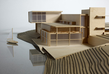
Final physical model of Anne Fougeron’s design for Maison d’Acier, which is French for “house made of steel”. This house was designed for a steel fabricator to celebrate steel’s structural capabilities, including a dramatic cantilevered room overlooking the Ohio lake where the home is sited.
Do you teach people to design in specific styles?
I try NOT to enforce a stylistic direction. You don’t want everyone’s work to look the same. Even with something like math, where there’s supposedly one right answer to a problem, there can be many ways to solve it. The students in this one course, not my course, were creating these deconstructed, Zaha Hadid-meets-Frank-Gehry-meets-Coop Himmelblau designs. It made no sense. Sometimes enforcing these deconstructionist styles like “no orthogonal grids” can be more constraining than not!
[Perhaps because it creates needless design complication?]
Can you set your own teaching goals or do you have to teach to a pre-set curriculum?
The last time I taught was a graduate studio course at UC-Berkeley, and I taught whatever I wanted. Some schools like ETH Zurich have structured programs. Having a set curriculum is not necessarily a bad idea, though. It ensures that the graduates will all have exposure to the same core set of ideas that have been received, understood, and processed. If the curriculum is too loosey-goosey, too unstructured – the graduates can’t always THINK very well.
Architecture is really about common sense, using issues to solve as a way to generate ideas. They may not always be resolved cleanly, but you can’t ignore them.
What sort of curriculum would you have in say an elementary school, or high school, if our public schools were to introduce design or architecture into their programs? A lot of it might depend on the ability of the teacher, too.
I have a European background so I tend to train the eye, more than the hand. You can train people to make things, or you can train them to be sophisticated about visual things.
Architectural training in the U.S. is all about materials and methods, and not about architectural history. Architecture is treated as a technical profession where contract law is more important than history. I think some training in both is good, though. It’s like music – you can teach people to be very sophisticated listeners, but then you teach them to play a simpler instrument to start out. It doesn’t have to be intimidating. Music is something that everyone can do at least at a basic level. Everyone can learn to hold a beat well enough to play in an ensemble.
It’s a life skill, really. You don’t have to be an expert at everything, just do it well enough to get it done.
[We got off on a tangent and the resumed our discussion about college-level coursework.]
There are too many courses in things like ADA compliance now, not enough time for design. ADA compliance is easier to teach, because it’s very quantitative. And, there’s a big lobbying effort for it. It’s not that accessibility isn’t important, because it is. It’s just that so much time is devoted now to keeping up with the latest standards, and how many people is that really serving?
The same thing is true of green building. It’s easy to say, but the truth is, it’s complicated and we have to think carefully about where those resources are being spent. Is the linoleum on the floor REALLY the biggest problem we have?
For schools, I think the faculty should have enough practical experience. They should have built works, not be all theory. Of course, having an active practice can eventually eat away at the time you have for teaching.
What do you get out of teaching?
Having to teach makes you have to deal with abstract ideas of design, which you first formulate and then have to teach. It should be about more than just technical aspects like heating systems and fire codes.
What do YOU think constitutes good design?
It’s understanding of the various conflicting forces that make a building. There’s budget – and there’s lack of budget. There’s context – and unwillingess to change. There’s the client – and then there are the neighbors. All these different needs and constraints pull the project in different directions. Good design is the synthesis of all these forces in a way that still makes it work.
Good design wows people. It’s an almost ethereal quality that is present in really good buildings. Louis Kahn is one example, particularly the Kimbell Art Museum. It’s not huge, it’s intimate. Kahn designed it with barrel vaults – but then he included diagonal movement across these barrels with the circulation. It is so simple and yet so sophisticated.
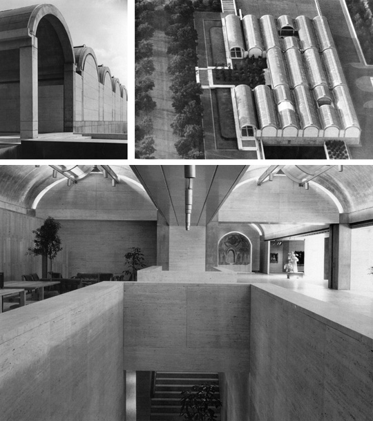
In his design for the Kimbell Art Museum, Louis Kahn managed to create diagonal lines of sight that cut across the straight lines of the barrel vaulting, similar to the multiple vanishing points seen when traversing a regularly planted orchard.
Design can be painfully slow, and most people don’t understand how something can be so flawless and yet take so long!
Even Picasso, who was very prolific, was always working his ideas through.
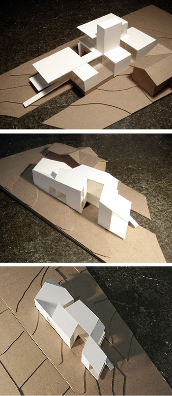
Three schemes from Anne Fougeron for the same project, a proposed home in South Carolina, showing how physical models can be both a tool for the creator and as a way to communicate ideas to clients.
What are some of your favorite buildings?
I am an architecture junkie and so I look at and love many buildings. Just to name a few, both old and new:
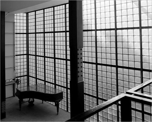
Hagia Sophia in Istanbul, for its light, scale, and virtue. The Parthenon in Rome. The Cathedral of Saint-Chappelle, all glass with spines of stone. Louis Kahn’s Kimbell Art Museum. Le Corbusier’s Ronchamp Chapel [Chapel Notre Dame du Haut]. Pierre Charreau’s Maison de Verre, where everything was made custom, and Charreau had to fit the new residence underneath an existing apartment.
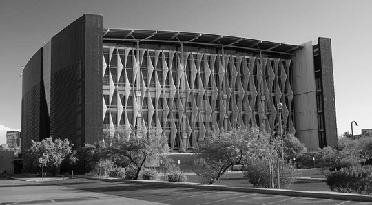
The Phoenix Library, it sings! There are so many advanced features, from the screens and window systems designed to mitigate the extreme heat and sunlight, to the columns with skylights as column capitals. You don’t need 16 signs to find things, because it’s clear where you are at all times, and you can find the bathroom!
In the SF library, you can’t find anything and don’t know where you are.
How are the acoustics in your interiors like the 440 House? All that hard surface.
We thought about that a lot, and we wanted a “live” sound. In that home, the living room has an intentionally formal feel, and the acoustics are part of that feeling too. Think about the sound of stacked heels on a hard stair, that click, click, click – it adds to the sense of formality.
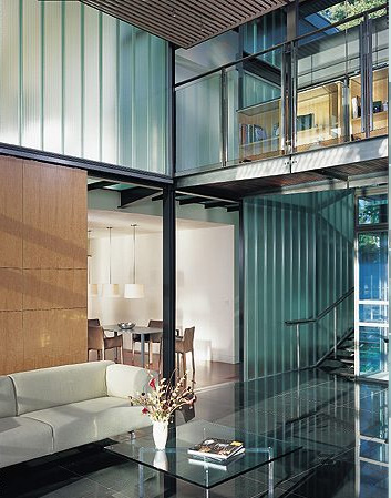
Anne Fougeron designed the living room at the 440 House as an intentionally formal space. The surfaces make the acoustics very bright – you can imagine the heels clicking. Photo: Tim Street-Porter
The kitchen by contrast has a wood floor, a lower ceiling, acoustical treatments, cushier furniture. It’s a cozy place to hang out, watch TV – its informality is an intentional contrast to the living room. All rooms in a home are not equal! There can be differences between them.

By contrast, the kitchen in Anne Fougeron’s 440 house creates a feeling of warmth, coziness, and relaxed intimacy. Photo: Tim Street-Porter
That staircase, if you’ll notice, is rather shallow. We were actually worried that it was going to be too shallow, and we built a prototype for the client out of plywood first. We said, “Go have a couple of glasses of wine and try it out for a week or so.” It turned out the clients liked it just fine, and had no problem navigating up and down.
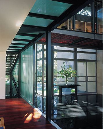
Anne Fougeron was concerned about the shallow stair at the 440 House and actually insisted that the clients try out a prototype for a week to make sure they could use it comfortably. Photo: Tim Street-Porter
Let’s look at your JFR House in Big Sur. How can a glass box set the tone for energy efficiency? And how do you keep them comfortable in the summer and winter?
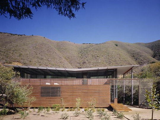
This home was set out in the redwoods, among surrounding hills that are high enough to block direct sunlight from reaching the sunroom even with an entire wall and ceiling out of glass. However, California’s energy code doesn’t allow shading from foliage or land features to be counted, so we had to work closely with the building department in order to get the permit. The home is designed for daylighting and passive solar, so that it’s actually pleasant to be there at any time of day.

Anne Fougeron’s JFR House sits in a bowl in the landscape and is completely surrounded by hills on all sides. Seen here is the front entry. Photo: Richard Barnes
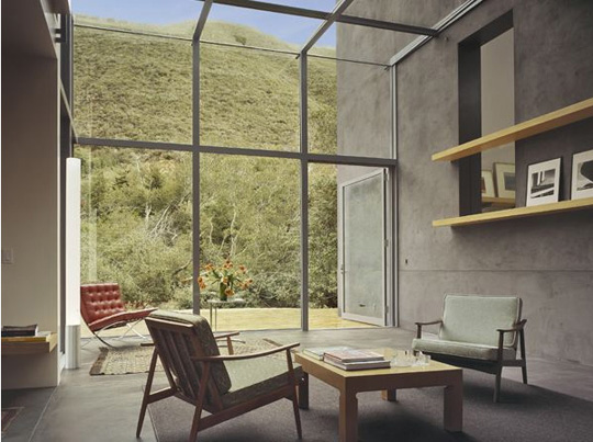
In the living room of Anne Fougeron’s JFR House, the hillside gives a protected feel, and prevents too much direct sunlight from causing excessive heat gain. There is still plenty of light, but not too much. Photo: Richard Barnes
On that note, which new building technologies are most exciting to you? Including materials and finishes.
Caulking! Really good caulking allows more flush details, because it can expand and contract. Details on how you can DO building, like gasketing, thermal breaks, and flashing are always getting better. Solar-embedded panels in glass and other glass technologies, which integrate green features much more easily into buildings.
One innovation that’s becoming more popular especially in Europe are double and triple building skins. Technology is constantly evolving, and even if we don’t use something right away, it works through the webs of our brain. HAVING to do it helps.
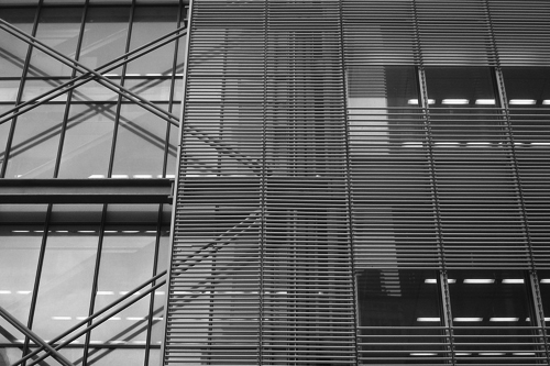
Renzo Piano’s NY Times Building has a double skin with anoperable outer layer, plus a window-by-window daylighting system that has the sun’s position vis a vis surrounding buildings from EVERY window… for all 15,000 windows.
So how do you keep up with it all?
We use consultants! Especially for our firm, because we do take risks with new designs. Waterproofing especially. Pretty much every project we use a waterproofing consultant.
Tell me about designing for health care. What are some of the constraints and how are they different from, say, a private residence or another type of public building such as a library? How can you make a hospital fun rather than drab, without spending a prohibitive amount of money?
Health care can be very prescriptive. Hospitals have a lot of regulations and not much budget. But there’s no reason that clinics couldn’t be nicer, more nurturing environments. Our work for Planned Parenthood attempts to do exactly that.
Did you have to design any extra security features into the Planned Parenthood facilities? They don’t look like a troublemaker would have much trouble just walking in.
Planned Parenthood had to do a lot of security upgrades after several high-profile incidents, including one in Boston where a man walked in and shot a doctor and at staff. I’d already done a few clinics for them so they came to me and asked if I knew anything about security. I said that I didn’t know but I would try. They hired me.
I didn’t want clinics that look like a prison. There’s already so much victimization of women… why punish them further by making them come to a jail for basic care? Ninety percent of their business is basic gyn care – exams, pap smears – for women who can’t afford it any other way. These women already going through enough in their lives. Some of them already have other traumas to work through. The clinics should make them feel wanted and safe.

Anne Fougeron designed the interior of this Planned Parenthood clinic to help the clients feel wanted and safe, using daylight and fresh springlike colors to create a serene feel. Photo: Grey Crawford
Here you see the entry lobby. The lobby is the first line of defense. Bulletproof glass and materials all around. Doors that lock on closing. An air gap by the window so they can speak with the receptionist behind. Panic buttons everywhere. If the receptionist determines that the client or situation just doesn’t feel right, the police can be there in 2 minutes. So the staff also knows that they’re safe.
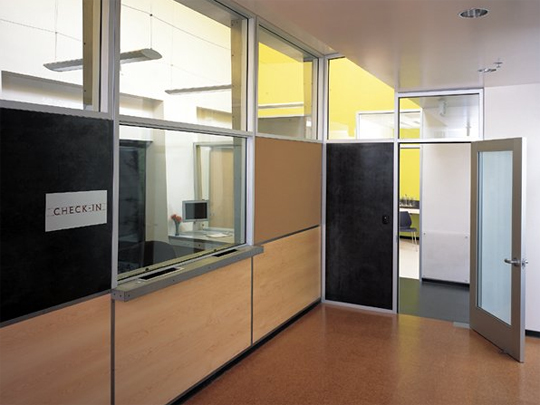
The Planned Parenthood lobby from the visitors side manages to employe state-of-the-art security without calling attention to the fact. Photo: Grey Crawford
Interiors are lively, with color and as much daylight as possible. Daylight changes throughout the day – makes it more interesting for clients who might have to stay there all day. Benches to encourage interactions. They’re built from resistant materials, because they get a lot of wear and tear and there are very minimal maintenance budgets. Surfaces have to be durable and easy to clean – resin or wood rather than fabric, for example.
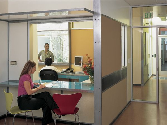
Planned Parenthood lobby designed by Anne Fougeron, as seen from the staff side. Photo: Grey Crawford
Planned Parenthood is a good client. A lot of other health care work is prescriptive and normative, done to meet regulations. Now that we’re winning design awards, there’s more interest in going beyond the prescriptive to create spaces that help morale. Improved morale is very important for health and healing.
What’s your position on sustainability in design?
Build it right, build it once, don’t build it again.
Tell me more about the city of the future. There’s such a disconnect between utopian visions of past ages and their eventual reality that I wonder whether our Cities of the Future will really be full of pristine vertical farms, or whether it’ll be more like Blade Runner. Design is one thing, but humans are another. If there are too many rats in the cage, it doesn’t matter how pretty the cage is.
That was a competition to envision SF as the city of the future. Rather than set it in far in the future, we felt that a realistic timeframe would be something like 100 years. There was a planner on the jury and I said, “In 100 years, you won’t even have approved anything!” That got a laugh.

In ancient times, farming was basically poking holes into the ground. Modern farming, even with large-scale equipment like the combine harvester on the right, is still basically doing the same thing.
Instead of envisioning a vast sweep, we saw small things happening incrementally. Our take was urban agriculture. In 100 years there will be even less arable land to support a growing population. But we’re still growing like we were thousands of years ago. Poking holes into the ground.
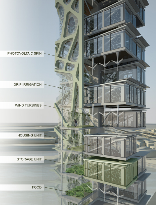
Architect Anne Fougeron’s conception for San Francisco’s recent Cities of the Future competition features vertical farming towers that are also energy self-sufficient housing units.

Another image from Anne Fougeron’s concept for Cities of the Future. These farming towers could be integrated into the existing urban fabric, while existing buildings could additionally be re-purposed or modified to further increase the amount of arable surface area.
Real soil isn’t always even arable. In Ethiopia, they can’t grow anything on their land other than those strange banana leaf plants. Minimum nutrients for maximum work. But all you really need out of the soil are the minerals. Instead of doing that, there’s hydroponics, and vertical farming makes more out of limited land area. One agricultural town could feel all of the Bay Area.

Anne Fougeron’s strategic plan for Cities of the Future includes a network of designated vertical farming sites scattered throughout the San Francisco Bay Area. Here, the sites extend up and down the bay on both the Peninsula and the East Bay shorelines.
In Japan, they’re using basements of buildings that otherwise go unused. In San Francisco eventually they’ll ban cars from downtown, and we could use those parking garages.
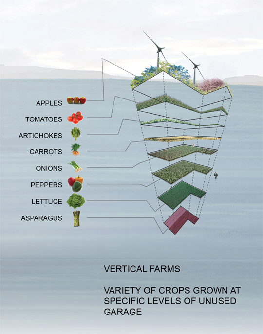
Anne Fougeron’s idea was to re-use multi-level parking garages for urban agriculture, with different crops grown on each level.
Your Tehama project reminds me of a spaceship. Not the retro, Space Agey Jetsons kind, either. It’s so light it feels like it’s in the stratosphere.
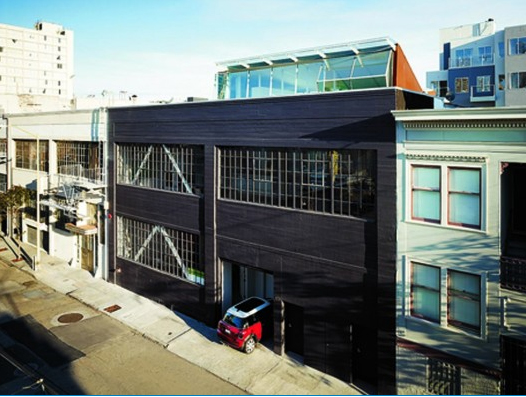
Anne Fougeron’s award-winning Tehama warehouse renovation includes a residence on the top two floors, while Fougeron’s offices are on the ground floor. The penthouse floor is visible as a “glass bubble” on the roof. Photo: Matthew Millman
This project was a renovation of an old warehouse space with a new penthouse portion at the top. The intention of the penthouse was to participate in urban life. At the time it was built, there were no immediate lines of sight from close-by buildings directly into the space, so it was feasible to envision the penthouse as a glass bubble that floated above the city but was also still part of it.
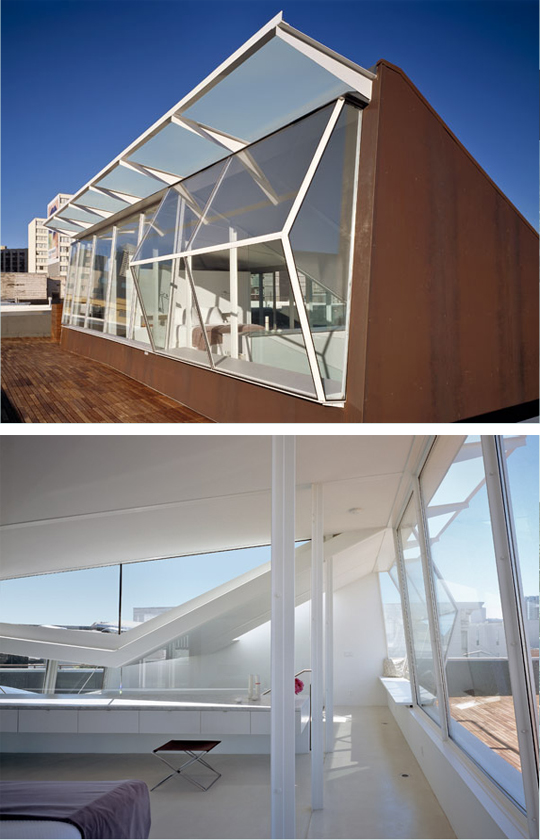
Interior and exterior shots of the penthouse level for Anne Fougeron’s Tehama warehouse renovation. Photos: Richard Barnes
We designed it to maximize the transparency between up and down. Operable windows allow for natural ventilation. Most lofts have dark airless spaces in the back – the interior rooms have to borrow light because they have none of their own. We made this more like a house, by adding light and air. An interior courtyard on the lower level brings light deep into the interior, as well as creating a stack ventilation effect – ventilation without mechanical means.
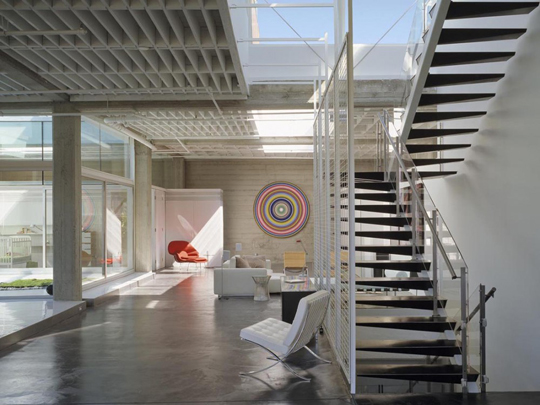
Main living area for the residential area of the Tehama loft. Above is the penthouse, and to the left is seen the interior courtyard that brings light and air deep into the heart of the building. Photo: Richard Barnes
We didn’t do detailed modeling of the sun patterns daily and seasonally, but the building was already built, and we didn’t have the option of orienting it. I knew approximately what would happen. That wall by the stairs was left that way because we knew it would catch the light and cast dynamic shadows on the wall behind.
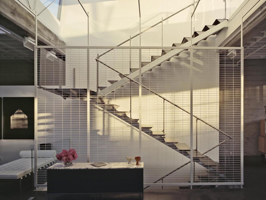
The wall behind the stairs from main living area to penthouse of the Tehama loft catch dramatic light changes throughout the day. Photo: Richard Barnes
The acoustics in there are bright. But that’s the way the client wanted it. They didn’t want a lot of stuff. They didn’t have the budget for it either.
What’s it like to be FAIA?
You mean, what did I get out of it? Well, I got to hang out with all these fantastic white males! On my own! In my gown!
[A Fellow of the American Institute of Architects is recognized as having made outstanding contributions to the profession. Fewer than 2% of registered US architects are elected. To be considered, an architect must be nominated by petition, either by other Fellows, by a greater number of AIA members, or by the local AIA chapter as was done in Anne Fougeron’s case. Of the 134 Fellows elevated nationwide in 2010, only 22 were women. Anne Fougeron is listed under the 2010 FAIA Fellows at this link.]
Seriously… I did it because I have a feminist agenda. There aren’t enough women architect/designers in the profession. We have to push the envelope. So, I applied – if I hadn’t gotten it, I would have been super ticked off. Out of the 34 California architects to become FAIA, only 4 women became FAIA for their design work, and only 6 women total were elevated to FAIA. Not a great track record. If you look at the national list, you will see how few women became FAIA for design.
So, 16% of the Fellows are women, but half the undergraduate architecture students are women! Where are they?
First of all, it’s a tough profession, and it’s not kind to women. It’s not kind to anyone, really. And it’s sexist: the developer world, the city-planning world, the engineering world are all male-oriented. Not everyone is an entrepeneur, either. It’s hard to be the sole proprietor of your own firm – hard for everyone, not just women.
In 1993-95 I closed my office and moved to France. When I came back, I restarted my office and soon after got divorced. I didn’t have deep pockets and I had a young daughter to feed and take care of; she was 6. Necessity is the mother of invention. I was able to restart my business and raise a great daughter… she’s confident, smart, accomplished.

Anne Fougeron, left, in a recent photo with her daughter whom she raised as a single parent at the same time that she was building her own design practice.
A lot of the women don’t get their license, but they do go into related professions.
You’ve got to claw yourself out of that hole. You have to fight the fight. You can’t stay in the back, because nobody’s going to fight that fight for you. NUMBERS MATTER.
See Anne’s work at: www.fougeron.com




Abrasha
04. May, 2010
So much of what you say can also be applied to the field of jewelry design. I liked the things you said about teaching, especially about critiquing.
Congratulations on becoming FAIA!
And kudos to you for giving Dennis the credit he so deserves.
Daniel Gregory
05. May, 2010
This is a marvelous, deeply insightful, and utterly compelling interview. Rebecca Firestone’s questions are especially deft and Anne Fougeron’s answers are forthright, clear, and revelatory. And really fun to read — you can hear her natural, no-nonsense, wry-sensible voice in every answer. It should be essential reading for anyone interested in the art and practice of architecture. Bravo and huge thanks.
Jennifer Koskinen
19. May, 2010
Fabulous post!!
I truly appreciate the depth and breadth of this interview and the depth of Anne’s work.
Thank you (and Anne!) for the insight and the inspiration!
Dan Dodt
22. May, 2010
Anne Fougeron adds layers of swift intelligence and urbane sophistication to the known fundamentals of building design, art and architecture.
Her sweeping energy alone can transform a design meeting into a think tank of humor, history, world view.. and solutions. She is that rare architect (and I’ve worked with a number) who is never defensive in reacting to an outside idea, is open to exploring input (including the client’s), and somehow distills all of this into sublime, light filled environments which will withstand the test of time. No one-liners or architectural cliches here.
anticristo
15. Apr, 2011
Hello There. I found your blog using msn. This is an extremely well written article. I’ll be sure to bookmark it and come back to read more of your useful information. Thanks for the post. I will certainly comeback.
Mark English, AIA
04. Jul, 2011
Please send me an email at mark@markenglisharchitects.com with your proposed use. Thanks, Mark
facebook mobile
24. Sep, 2011
Nice post about Anne Fougeron: Architectural Edge in the 21st Century | The Architects’ Take. I am very impressed with the time and effort you have put into writing this story. I will give you a link on my social media blog. All the best!
Candy Yilt
06. Apr, 2015
How do you think sites like http://www.lotplans.com effect the world of Architecture? Does it expand the online reach of the architect or dilute the value of the work?
Anne Fougeron 1955 | un día | una arquitecta
16. Sep, 2015
[…] [1] Entrevista: “women in architecture” por Antonina Ilieva, 2011. Consultado el 10/08/2015. [2] Haciendo referencia al jefe inventado por la detective Laura Holt, personaje de ficción. […]