
Jeffrey Day (MIN|DAY) on Artistry and Utility
by Rebecca Firestone with Mark English AIA | Interviews
“Art has conventionally been distinguished from architecture based on utility – architecture must do something, while art is free from functional requirements. However, art can lead us to approach architecture as something more than just rote problem-solving. Injecting an element of “uselessness” into a building allows the artistic elements to form an intellectual background against which the building’s functional aspects can be fulfilled in innovative ways.
Ironically, contemporary artists are much more engaged with the actual world through activist agendas that directly address social and environmental problems. Art helps us innovate how we deal with the world, beyond purely normative solutions.”
Jeffrey L. Day
Min|Day Architecture
Way back in the mists of time (2009) when we started this blog, our very first article was about Min|Day Architecture. We were so interested in the thinking behind a couple of their projects that we forgot to ask them how they got there: why did they choose architecture as a profession? And what do they think really constitutes “good design”? So, we revisited both EB Min and Jeffrey Day to follow up on these important questions.
They’re an unusual firm in several respects. First, they’re geographically separated. Jeffrey Day is an Associate Professor at the University of Nebraska-Lincoln. EB Min works in Min|Day’s San Francisco office, and is also an Adjunct Professor at the California College of the Arts. Second, they’re unusually technically savvy, with a design process that relies on close relationships with their fabricators. They’ve won several prestigious design awards. And they seem to combine a very advanced design sense with a humanistic approach that keeps people at the center of the designs rather than elevating formal concepts and expecting the occupants to fit themselves to an imposed environment.
Jeffrey Day spoke with us by telephone.
What was your family background? Any designers?
I’m from New England, born in Cambridge, Massachusetts. Both sides of of my family have been in Massachusetts for long time. My family moved around a bit, including 5 yrs in New Zealand, and Seattle. I finally finished high school in Maine.
No one in my family is a designer. My father was in publishing. He wrote a few novels and children’s books, then worked as an editor in publishing house, editing non-fiction and fiction. He also did development writing for non-profits. He’s retired now, and still does some writing for non-profits in Vermont. My father’s foremost hobby is building wooden boats, which is somewhat relevant to what I do now.
My mom has degrees in physics and chemistry. She worked as lab assistant for a while and and then became a full-time mom.
How did you end up doing visual studies at Harvard?
I had been interested in architecture for a long time, maybe as far back as junior high. I considered other schools like Syracuse and Cornell, each of which had 5-year architecture programs. Eventually I felt that I would get a more diverse education at Harvard. There wasn’t an architecture undergrad major at Harvard, so I took courses in studio art, history and theory, graphic design. Extracurricular activities included working with the drama club on theater and stage set design.
Some of our current projects like the Soft Cube at the Bemis Art Center in Omaha draw on that background, using a stage-set approach to create an atmosphere for various events. Bemis is a “social stage” a background for unscripted and unprogrammed activity.

The Soft Cube by Min|Day Architecture is actually a curved wall created as an acoustical installation inside of an otherwise empty room at the Bemis Art Center in Omaha, NE. The name "Soft Cube" refers to a desire to soften the "white cube" of the gallery space.
The Red Shed video lounge is another example of a social platform. It’s an environment for video art, where the seating surface also serves as the screen. Unlike video rooms in museums (dark, isolated, hermetic, hushed) this one was supposed to foster social interactions.

The Red Shed video lounge by Min|Day Architecture is intended to foster social interaction and choice - the interior surface is simultaneously a lounge, a seat, and also serves as the viewing screen.
The CalmDome is another one. This was a collaboration with group of artists in Kansas who called themselves Carnal Torpor. It was an odd-shaped, egg-like geometric thing. It was intended as a spiritual space. From the outside it looks like an object sitting in space. On the inside, it’s filled with electronics, proximity sensors, motion sensors. Visitors interact with a soundtrack and a synthesizer soundscape. The CalmDome was first shown at the Smart Museum in Chicago, and then at the Bemis Center in Omaha. It now resides in a long-term installation in Kansas City.
The core concept in all three of these projects was the use of stage sets as environments. The intention in the CalmDome was that people can’t just be spectators. It’s social. Up to eight people can fit inside at once, but they’re crammed together a bit, and thus forced to interact.

The CalmDome by Min|Day Architecture contains an array of proximity and motion sensors that respond to visitor movements.
Did you ever study proxemics?
Yes, I read Edward T. Hall’s works on proxemics. He was interested in the behavioral aspects of space, how space shapes behavior, and how cultural conditioning affects people’s responses to particular spaces, particularly their notions of privacy.
One critique of this approach is that social science looks at averages, and makes assumptions about what large groups of people will do, how they will behave. Architecture is more focused on individual experience, about people behaving in individual ways – as if they had a choice. It’s not trying to generalize about “how do PEOPLE interact in space.” It’s “How will YOU interact with THIS space?”
At Min|Day, we design based on the individual. We’re not predicting results or forcing people into a certain response. There’s a choice.

Airport lines and cattle chutes have one thing in common: they don't offer a choice.
Our Red Shed environment had a chair-bed that gradually morphed from one shape into another. Visitors could pick their own spot anywhere on this continuum. It offered a choice, and actually confronted people with the need to make a decision about how they were going to inhabit the space. It wasn’t a difficult or threatening choice, but it was a challenge.

Min|Day Architecture's installation, the Red Shed video lounge, challenges each visitor to choose their most preferred spot.
What does it mean to “inhabit” a space? How’s that different from just moving through it?
It’s a verb. It’s active. The person is an actor who is doing more than just traversing. Inhabiting makes it more conscious, but without predetermined roles.
I bet that kids love things like the Red Shed.
Kids are more experimental when interacting with new spaces. Adults are more concerned with being proper and behaving in expected ways.
Who were your mentors?
I have a different answer each time someone asks me that question. I don’t have single favorite mentor, no single point of reference. My mentors were various instructors in college, who taught me how to be creative in architecture.
What are some of your design influences?
Early 20th century avant-garde artists like Marcel Duchamp. American artists of 60s and 70s. Michael Heiter. Robert Smithson. People who worked outside of the gallery system. The art world was breaking away from the gallery, becoming more process-based. Sometimes works were in remote and inaccessible locations.
Architects who influence me included Alvaro Siza, Peter Zumthor, Rem Koolhaas’ writings, and de Meuron.
Another influence was traveling in the 3rd world: Asia, China, Tibet, India. It was important, but it’s hard for me to say why. I remember thinking of the Tibetan structures and their relationship to the land. Our Lake Okoboji house has aspect of Tibetan religious buildings in that the exterior shows the same monolithic, earthy, natural colors you’d find in the surrounding landscape, while inside is a de-materialized world of bright colors and indeterminate edges.

Min|Day Architecture designed this interior of a live/work loft in Nebraska using bright colors and custom-cut wood screens inspired by the prairie grasses outside.
Some of your writings reference vernacular architecture, which seems to be a product of local culture. What does culture have to do with architecture?
I’m interested in how various cultures inhabit space, how their architecture emerges from that backdrop of space to meet basic needs. Not so much as an imposed culture, but more about how culture and place are related. As part of my lecture materials, I have 2 slides, each showing a different valley in Tibet. These two valleys are far apart, but they look the same. Roads, town, river – it’s how one settles in space. A pattern emerges. In Western culture many of our inhabited spaces are electronic, virtual.

Two valleys in Tibet, far apart from one another, still show similar patterns of settlement. Above: Tikse in Ladakh. Below: Yumbulakhang near Tsetang. Photos provided by Jeffrey L. Day.
What are some of your favorite buildings?
I used to be interested in contemporary Spanish and Portuguese architecture. They did a better job of expressing vernacular principles without being too literal about it. The designers referenced vernacular in a deeper way than just putting a bay window in a building to make it feel like it’s in San Francisco.

Jeffrey Day feels that in general, contemporary Spanish architects do a better job of expressing vernacular forms by re-inventing them, rather than merely seeking to replicate the past. Clockwise from upper left: Magma Arts and Congress Centre by Menis Arquitectos, interior/exterior views of a residence by Fran Silvestre Arquitectos, and a contemporary Spanish style home by WDA Architects in Palo Alto, California. (These images were selected by Rebecca, not Jeffrey Day.)
In particular I would point out these Spanish architects: Ábalos & Herreros, Alberto Campo Baeza, Miralles & Pinos, Mansilla + Tuñón, RCR Aranda Pigem Vilalta Arquitectes. From Portugal: Alvaro Siza, Eduardo Souto de Moura, Aires Mateus. But, overall, I’m less interested in the formal results of architecture than in the process.

Here's a collection of Jeffrey Day's favorite Spanish and Portuguese architects, works selected here for their potential resemblance to local vernacular forms. Clockwise from upper left: Mimesis Museum by Alvaro Siza and Carlos Castanheira, a residence titled Quinto lo Lago by Eduardo Soto de Moura, Museu Paola Rego Casa das Historias, also by Eduarto Soto de Moura, and a residential complex by Aires Mateus.
How does one express a vernacular in a deeper way exactly?
Well, around the Bay Area, people are so in love with the idea of San Francisco. It’s hard for architects to break away and think. The knee-jerk reaction to San Francisco includes the standard tourist fare – the Painted Ladies that are the Victorians, with their gingerbread facades and bay windows, for example. People seek to preserve and replicate this look regardless of actual design needs [or in the absence of a wholistic design approach]. Distinctive features such as bay windows are degraded into formal elements added to a building regardless of whether it makes sense to put one there or not.
When setting forth design guidelines, local Planning Departments often try to define character in these sorts of physical terms, because it’s not as easy to write a set of rules for conceptual ideas as it is to list discrete physical elements.
If a client said “We want a Tudor” – well, that’s 14th century Germany. The styles that emerged at that time were the result of a process: a response to local conditions as well as available technologies. But someone who requests that style today doesn’t want a process, they want a product. That’s how realtors and developers tend to think. We don’t do that sort of product-oriented architectural design. We focus on how to use space, on programmatic needs, and on budget. But first, we have to draw the client out of that real-estate mindset.
[That can be hard to do when the idea of “having a Look” is so embedded not only in realtors’ minds but in developers’ and neighborhood associations’ minds as well.]

Vernacular architecture… emerges out of basic needs, using available materials and systems, as it makes sense in a particular place." - Jeffrey Day of Min|Day Architecture
So what is vernacular architecture, since we’ve mentioned that term?
I studied with Albert Szabo in college. He was educated in American Bauhaus in the 50s – he was connected to le Corbusie and Mies van der Rohe – so he was a Modernist. But he was also very interested in “indigenous” architecture, which is architecture that emerges from a particular place.

Further examples of vernacular architecture from Europe and Thailand. These homes are not monumental architecture - that's something else.
At UC Berkeley, I studied with Richard Fernau of Fernau + Hartman, and later worked with that firm. Now, at Min|Day, we are interested in the process of creating architecture – be it vernacular or contemporary – not into just repeating its forms. Nonetheless, Fernau talked about vernacular architecture as “expedient”, rather than as nostalgic. Vernacular architecture is one that emerges out of basic needs, using available materials and systems, as it makes sense in a particular place, without seeking to express a self-conscious, stylistic agenda.

Are DIY Burningman shade structures "vernacular"? They meet basic needs, using available materials, with shapes refined yearly through windstorm stress tests - but of course Burningman does have its own stylistic agenda.
Then not everything that’s old is vernacular, either. All those ancient palaces, cathedrals, and monuments were self-conscious, seeking to make a statement.
That’s right. They’re not vernacular. They’re too refined.

Large-scale public buildings and royal palaces are not considered "vernacular", even though they are also a product of place.
And some of today’s post-industrial building styles could be considered “vernacular”, particularly slums and shantytowns.
People forget that vernacular is continually evolving. A Midwestern American barn is now a pre-engineered metal building. Even Levittown is somewhat vernacular, although it was based based more on marketing than on meeting direct needs, so it arose from a different circumstance.

A pre-engineered metal barn is a form of modern vernacular, in a way: meets basic needs, using available materials, and - assuming the purchaser puts it together - an understanding of process.
I prefer to view vernacular architecture as including a clear understanding of process.

Vernacular architecture, such as these hand-built adobe houses, implies a clear understanding of the process. Left image by Dmitrii Zagorodnov
By presenting design as a process, you’re asking clients to take a risk. They don’t know how it will come out.
Clients need to take the time to allow the process to happen. If we do a large house, we need time to consider everything. But not everything we do is slow. The Soft Cube was fast, under 6 weeks. It’s more of an architectural intervention than a separate structure, though. The client treated us like artists, to – no formal desires were imposed, and the impermanence of the project meant there was less pressure.
What constitutes “good design”?
A tough question, hard but necessary. I’d say that a good design emerges as a response to first principles of program and site. It’s about allowing a project to emerge, more than formal maneuvering. The designer can provide direction as to how the project emerges from its constraints.
An interesting convergence of art and activism is currently occurring, where artists are coming back to utility and away from autonomous concepts of beauty and expression. For example, Mel Chin’s “Fundred” project is trying to address lead paint contamination that is affecting children in poor neighborhoods. Artists are making change happen, and not just talking about it.
How do you teach the concept of “good design” to your students?
Well, if the design assignment is to create a library, then the students should list the spaces that it has to have, but they’re not judged by their adherence to the program. The students should question the program, re-evaluate it, re-define the program as part of the design process. Only after questioning the problem can they take a position. My belief is that there is no such thing as one right answer to any design problem.
The Seattle Public Library is an example of good design. It emerged from questions about what a library really is in the 21st century. It’s not just a repository for books.
[Arcspace has this to say: “Koolhaas sees the new library as a custodian of the book, a showcase for new information, a place for thought, discussion and reflection – a dynamic presence.”]

Rem Koolhass designed Seattle Public Library first by re-examining the program - in the 21st century, a library should disseminate information, encourage thought and discussion, and serve as more than a repository for books.
There’s a sort of dichotomy between form and function. I just asked myself “what is art?” and immediately thought “anything that’s otherwise useless” – something that’s purely for the sake of beauty but has no practical application or value. Something frivolous, done purely for the love of the thing. As an artist myself, though, I’m not very comfortable with this notion of art as useless.
Architecture does have some expectation of utility. Art doesn’t have that requirement. But architecture really has to go beyond utility. It has to question that utility. Art and architecture inform one another in this regard. On the one hand, architecture gives the artist a structure and a process which in turn enables the execution of larger art projects. Studio artists who do large-scale works have to approach their projects in an architectural fashion – thinking about structural integrity, engineering, fabrication techniques, and budget.

Min|Day Architecture uses a structured design process to create the sculptural shapes for custom-fabricated furniture such as this table for a private house on Lake Okoboji.
On the other hand, art can influence architecture as well, by emphasizing originality and a projective engagement with the world. Art has conventionally been distinguished from architecture based on utility – architecture must do something, while art is free from functional requirements. However, art can lead us to approach architecture as something more than just rote problem-solving. Injecting an element of “uselessness” into a building allows the artistic elements to form an intellectual background against which the building’s functional aspects can be fulfilled in innovative ways.
Ironically, contemporary artists are much more engaged with the actual world through activist agendas that directly address social and environmental problems. Thus, the distinctions between architecture and art are less noticeable than in the Modernist period. Art helps us innovate how we deal with the world, beyond purely normative solutions.
There’s nothing wrong with uselessness. If you take away the “useless” aspect, it’s nothing but functional problem solving, and I’m tired of that!

The Raindrop Wall is another built-in feature designed for the Lake Okoboji House by Min|Day Architecture.
So how do you combine useful and useless to make a better building?
One example is Theaster Gates. Gates is an artist who buys old buildings and develops them to meet community needs. [His web site says: “Theaster Gates is an artist, musician, and “cultural planner” as well as Director of Arts Program Development at the University of Chicago… When Theaster is not making art for museums, he is committed to the restoration of poor black neighborhoods, converting abandoned buildings into cultural spaces…]
Omaha is a depressed area, and re-purposing old buildings – soul food restaurants, urban farming experiments – is a good way to take something “useless” and make it useful to the community once again. One initiative for us is working with the Salina Art Center in Kansas on some of their diverse spaces. They have a residency program for artists to engage communities.
Tell me more about your Qatar university tent-making class, where you “experimented with tradition”. Usually tradition is presented as an either-or: either people seek to preserve a tradition unchanged, as a museum exhibit under glass, or they want to toss it out. Even if they keep it, they might cannibalize it without regard to its former meaning. Experimenting with a tradition while still respecting its validity is a sort of dual heresy.
I was invited to teach this class by a professor at Virginia Commonwealth University – Qatar, a Swedish architect named Johan Granberg. Earlier, he had taught a one-week design/build class in Papua New Guinea on the use of bamboo. He got students to work with traditional building techniques that everyone there already knew how to do. The students were indigenous builders who were being asked to do something new, but with familiar materials that were locally abundant.

The weeklong tent-making workshop focused on getting the architecture students to think about why tents assume certain forms. Photo provided by Jeffrey Day.
This class wasn’t in New Guinea, though. It was on the Arabian Peninsula. Locally abundant materials include a lot of sand. But, the tent is a common vernacular form in that area of the world, even for people who live in palaces. I used the class to encourage the students to go beyond what they think of as “architecture”. A lot of architecture in that area is palaces, actually. The big design decision these students might face is whether to finish it in gold or marble. When I asked them to design a tent, I wanted to get them thinking about why a tent is the way it is.

The weeklong tent-making workshop focused on getting the architecture students to think about why tents assume certain forms. Photo provided by Jeffrey Day.
So did anything come out of that class?
The class was only a week. On Day 1 we all went to the market and bought canvas, poles, and rope, and then they had 3 days to create structures. Then, there were a few cultural difficulties. All of the students were women, but in that area of the world you can’t send women out alone to a fabrication shop. They were unfamiliar with the design/build concept, and were not used to making things. It was a challenge getting them to work in teams – some of them were more interested in going to the mall.

Tents of all sorts are still in use just about everywhere. Left: traditional Bedouin tents from Yemen. Right: the slightly more space-age Kelty tent from REI.
American architectural students seem to understand that one should know about how things are made.
I wanted to ask you about your geometries. Some designers use crazy geometries to express the disjunction of contemporary life – although your geometries appear very complex, they don’t feel chaotic to me. There’s an underlying visual logic that is apparent as in the Stones Table.
Those crazy geometries were part of the deconstructionist 90s, but that has pretty much disappeared now. I’m interested in connecting architecture to real issues, not just some concept of disorientation.

Min|Day Architecture used a parametric modeling aid in refining the form of the Stones Table, which was inspired by Voronoi tessellations and also by Japanese Zen rock gardens.
The geometries in our designs are not just about form for its own sake. They’re based in performance criteria, about how light and air move through the space, and it’s about making it work – not just about “expression”.

The Bemis Art Center Infoshop by Min|Day Architecture uses a recursive geometry to create a dynamic and usable space.
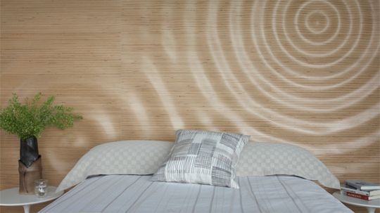
The Reflecting Wall is not about solving a particular problem, but it does meet strict criteria: a complex aperiodic pattern, a dynamic experience of surface.

The Reflecting Wall by Min|Day Architecture uses a complex tiling pattern that seems to blend in with the colors of the sky.
We had a project in China (which has since been cancelled) that used a traditional Chinese “ice-ray” pattern to set up a site plan for 23 acres. We used Grasshopper, a parametric modeling program with an optmizer to generate variations for master planning of 90 lots and homes of 10 different sizes. The evolutionary problem-solver we used with Grasshopper is called Galapagos. [more on this project at the end of this article]
The CalmDome is a truncated icosahedron, an Archimedean solid.

The CalmDome is based on an Archimedean solid (a polyhedron whose faces are regular polygons, but not all the same ones).
The Soft Cube wall is a double curved surface. The non-parallel surfaces act to reflect and scatter sound for acoustical purposes. The rough cardboard material helps to absorb sound, and the slats in the wall further aid in sound baffling.

The rough pressed cardboard slats of the Soft Cube wall aid in sound reduction at a low cost.
How did you and EB Min come to form a design firm? And how do you make it work with you in Omaha and her in San Francisco?
We’ve known each other for a long time. So there’s a familiarity there, and complementary skills. Our design process is very fluid, with a lot of back and forth, charrettes, even heated arguments. With our joint design work, we’re not so interested in quantifying results. It’s more about intuition. With color, for example, we think about it a lot, but we don’t consciously try to elicit a particular response.
Our work is Modern but it’s based on livability. It’s about how people perform their daily tasks and live their everyday lives – mundane in a way, but it can also be creative. We don’t have a toolbox of standardized responses to these needs. For each project, we have to think anew about how to construct views, how light enters the space, the relationship between spaces, and how the family lives together.

"Our work is Modern but it's based on livability," says Jeffrey Day of Min|Day Architecture. Shown here is the bathroom from a Metropolitan Designer Showcase home on Baker Street in San Francisco, where each portion of the home was re-done by a different designer.
So, if every project is new, do you have a way to test or prototype your ideas before you go to the trouble and expense of construction? What happens if the idea isn’t working?
For some things, we can test or prototype the idea ahead of time. One example is a wheelchair-accessible house that we did. We build a cardboard mockup of the kitchen and made a lot of adjustments based on our experience with the mockup. Color schemes can be tested after construction and finalized on site. It does mean a longer design process.
What sort of design course would you teach to high school or middle school students, if you had the chance?
I’d teach them how to understand and confront a problem. Give them a project, some materials, and let them go at it. I wouldn’t teach techniques like detailing; you can’t teach people all at once to understand every kind of building. Architecture school does this well: teaches how design addresses a problem. What I don’t like about it is the implication that there is only one solution.
Thom Maine says that schools should specialize. This pigeonholes people as specialists or experts of various sorts. But I think architects should be generalists – rigorous ones. They have to be intelligent enough to grasp the main principles in related disciplines, like structural engineering, so that in design meetings they can understand what the structural engineer is saying.
What skills do graduating architectural students need today?
Digital technology, problem solving, a knowledge of how buildings are put together: building systems and how they interact, including mechanical systems and building envelopes. Regarding digital tools, today’s architecture grads know more about computers than the people actually running firms. Not only BIM, but parametric modeling techniques and scripting as design tools.
Is hand drawing still useful?
Not hand drafting. But, you can’t beat hand sketches for quickly generating and communicating ideas.
OK let’s go back to the China ice-ray project. We’d touched on this when discussing your geometries. What is an ice ray pattern, anyway? Is that anything like a Voronoi tessellation?
An ice ray is a pattern used in traditional Chinese architecture, used in the organization of lattices and screens, and sometimes in paving. It’s a way of subdividing a polygon in various ways. We used it as a site planning tool for a housing development in China, to create a sense of randomness with some controls, and also to keep a sense of Chinese-ness.

The "ice ray" pattern is used in traditional Chinese designs such as lattices and paving stones. Min|Day Architecture used this as an algorithm to generate site plans for a housing development in China.
The development program called for group of houses of 10 different sizes, plus a larger, centralized club-house. We started with the 22-acre site itself, which was a trapezoidal shape, and proceeded in stages. To create the plan, we used an evolutionary modeler called Galapagos, with scripting in Grasshopper. Each stage was optimized in the modeler before going on to the next, but when the whole thing was done, we could go back and make adjustments to any stage and re-run the whole thing.

The ice ray analysis by Min|Day Architecture began with a trapezoidally shaped site, which would be divided by successive stages in the optimizer.
The first step was to divide the site in half as two mirror images. Next, we divided the two halves into 5 spaces for a total of 10 spaces each. Each area had to be 4-sided, identical in area, but different in shape. These spaces were the “neighborhoods” and would have 10 houses each.

After dividing the site in half, Min|Day Architecture divided the areas again, first into "neighborhoods" and then into individual sites for detached homes.
Then, we divided each neighborhood once more, to create areas for each house. There were 10 discrete house sizes, and 9 instances of each for a total of 90 houses. (The club-house had a neighborhood all to itself.) Each neighborhood had one house of each size.

Sample house plans from Min|Day Architecture for the China housing development project.
We added some very basic Feng Shui principles into the computation as well – things like ensuring that the windows of one house didn’t face directly into the windows of the next, and configuring the entrances according to the expectations of a typical Chinese buyer. If any of the housing units violated these common design practices, the houses wouldn’t sell. The concept was that the houses were like “scholar stones” within a traditional Chinese garden – objects of contemplation.

The resulting site plan shows roads, site drainage, and houses that are both sited and oriented according to basic Feng Shui principles.
The software we used, Galapagos, is what is known as an evolutionary problem solver, meaning that it uses a genetic algorithm to generate better and better solutions. These solutions are headed towards an ideal, but they never actually get there. Our problem was relatively simple, so each stage took only about 5 minutes to run. But, as with the other projects we discussed (the Fog Wall and the Stones Table), once the end to end runs were completed, we had the ability to change the parameters within any one stage and re-generate the solutions.
Ice-Ray Lattice – Basic Recursion – Example 8.1 | Generative Landscapes
28. Aug, 2014
[…] for design applications, here is a writeup on how Min|Day architects applied some of the principles of the Ice-Ray on a couple of […]