
Karin Payson on Architectural Practice – Part 1
by Rebecca Firestone with Mark English AIA | Interviews
“Hugh Hardy once said to me that the problem with architects is a fear of drapery! Interior design is more tactile than architectural design… I think that many architects are afraid of this tactility. They’re afraid of color.
“Before I saw Aalto’s houses in their natural setting, I was married to the grid… [but] Aalto’s floor plans, while rigorous, did not use a grid. Instead, they focused on grabbing light, on nature, and on circulation.”
(Photo: Stephen Barker)
The architectural profession is in crisis. Half the firms in San Francisco shuttered their doors this past year, or so it seems, and those that remain have pared down their staff. Even professionals who’ve been stably employed for years are showing up at job fairs with that stunned and hungry look that – well, let me put it this way. I had it, too.

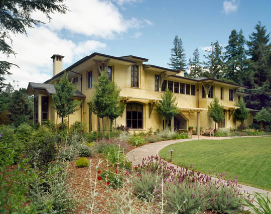
Karin Payson built one of the first green roofs in San Francisco for her Hill House project, in 2003. Photos: Stephen Barker
Not only that, but architects aren’t always known for their marketing savvy. Residential architects in particular may have a hard time finding clients, because they don’t know how to use the new marketing channels that have emerged in the past 10 years. And who can blame them? Architects are supposed to spend their time designing, not working with their agent to get on Oprah.
Karin Payson has been running own firm since 1992, one of very few woman-owned firms in San Francisco. We asked her not only about the state of design, but the state of the profession. Are young designers any good these days? How does she stay in business? What’s up with interior designers and architects? Who are her favorite designers and why?

The kitchen from Karin Payson's Oak Knoll project shows how a light touch with a sparing hand can create serenity and spaciousness. Photo: Stephen Barker
In the portions below, three voices are represented: Karin Payson (KP), Mark English (ME), and Rebecca Firestone (RF).
Interior Design vs. Architecture
Payson was a hands-on designer from the start. “My father was a textile engineer with JP Stevens and he used to bring home 100-yard samples from the textile mills in places like North Carolina. I learned to sew at age 10 and eventually worked my way through college as a seamstress.”

An architect and an interior designer prepare for another face-off at the project site.
RF: Can you talk about the tension that seems to exist between architects and interior designers? One seemed to emphasize formality, volumes and minimal color palettes, while the other emphasizes color, flamboyance, and a textured experience.
KP: Interior design is confused with decoration – which in turn is seen as fun and mostly about curtains. Interior design is more tactile than architectural design. It’s a tactile world as well as a visual one. I think that many architects are afraid of this tactility. They’re afraid of color and of the tactile qualities of interior finishes.
KP: Most architects are afraid of color. They think it’s cutesy, poo-poo, fun – not real design. What they don’t realize is that fabric for example can have both emotional and acoustical value.
KP: Tactile has to do with both light and finishes, and how they work together. How the surfaces are finished changes the light in the room, and can give it a whole new dimension. Reflected light off of white walls, or wood, or gray concrete – totally different feeling. Hugh Hardy was my employer and one of my mentors after grad school. He said that architects suffer from a fear of drapery!

Why are architects so afraid of a little color?
KP: Decorating is such a dirty word! But as one interior designer said to me, “I don’t mind being called a decorator, because so few people are any good at it.” To be able to select accessories, fabric, and furnishings on an art level is really the completion of the design, not a trival afterthought.
RF: A lot of interior work seems to be about furniture placement. Don’t you have to consider this when setting up your views and window positioning?
KP: We show furniture placement with several iterations. This project folio is actually an interiors package that we’re about to present to the client. These examples show how you might furnish the room. There are several lines of sight [shows out the window and a couple that go diagonally across the house].
Influences
RF: Who are your influences? Whom do you admire?
KP: I suppose we have to mention Frank Lloyd Wright and Bernard Maybeck. I studied their work a lot, because we ARE in California [meaning their work is designed for American climates]. I’ve also liked Alvar Aalto and the New York Five from a very young age.

Clockwise from top left, works by John Hedjuk, Charles Gwathmey (the Guggenheim), and Richard Meier.

The Salzman house by Richard Meier was a landmark project that deeply influenced architect Karin Payson's own work. Photo: Karin Payson
Other names… Louis Kahn. Charles Voysey. Edwin Lutyens… his work was rooted in its time. But it’s not entirely traditional residential architecture. It’s humorous and rigorous, with great proportions. Hans Wegner and his chairs. Brulo Lisle. Going back further… Palladio, of course! For fine artists, Mark Rothko. Paolo Uccello. David Smith. George Rickey. Martin Puryear.

"Something I love but I would never do" is how architect Karin Payson describes the work of 19th-century English architect Charles Voysey. Photo: Heinz Theuerkauf, 1976.

"His work was rooted in its time. But it's… humorous and rigorous, with great proportions," says architect Karin Payson of the work of Edwin Lutyens. Lutyens buildings from top left: Greywalls, Homewood, and Lodge Runnymede.

Photos by Karin Payson of Charles Gwathmey's studio.
Alvar Aalto: Light and Flow
RF: Tell me more about Aalto. Why’d you pick him?
[Brings out a folio of Aalto’s work ]
KP: In the summer of 2001, I went to Finland and spent 8 days traveling and looking at Aalto’s work. Observing his houses in their natural environment. That trip changed my life!

Alvar Aalto's Villa Mairea. Original color photo by Rafael Rybczynski.
I picked up a lot of ideas from Aalto, nuances like the positioning of windows in a room. In Aalto’s buildings the window positioning is extraordinary, especially given the latitude. I had never been so far north before, never north of London. The quality of light, and the angle of light, is completely different at that latitude. I was shooting film [not digital], and even on a bright sunny day, I couldn’t shoot ASA-100 film facing north because there was not enough light.

At far northern latitudes, winter light has a muted and indirect quality.
At that latitude, skylights are placed in the south or west rather than north as we would do here.
Small details can be huge. Like corner windows that wrap both sides. The light enters the room from a corner window in a completely different way than from a window smack in the middle of a wall. Here’s one of Aalto’s tricks that I borrowed for my house. In the master bedroom, which faces north and east, the ceiling is canted and washed by light from corner windows. The cant also washes the wall with more light. This creates a room with lots of privacy, but also lots of light.

Master bedroom in Karin Payson's own house, which she designed with maximum light in mind. Putting a small window at the corner and letting it wash the wall with light can be very effective for private living areas. Top photo shows view looking north, bottom photos shows view towards the east. Note the canted ceiling shown in the east facing photo. Photos: Stephen Barker
In the library, you don’t need as much privacy as you do in a bedroom.

A partial wall divides the bedroom from the library. Karin Payson used larger windows in her library, where privacy was not as much of a concern as in the bedroom areas. The partial wall lets the bedroom "borrow" light from the living room. Photo: Stephen Barker
Aalto was sort of sidelined as a regionalist at the time by proponents of the International Style who felt he wasn’t pure – he used local materials, applied decoration and finishes, and colors other than pure white.

Alvar Aalto's use of applied decoration such as wood finishes was a departure from the "purist" approach of the International Style. Shown here is an exterior detail from Aalto's Villa Mairea. Photo: Karin Payson.
KP: Here’s another feature I like about Aalto’s work. Window frames richly surrounding the windows. It helps provide a visual anchor.

The contrasting rich tone of the wood frame windows in Alvar Aalto's Villa Mairea emphasizes the importance of windows as more than just an absence of wall, instead affirming them as positive elements in the overall design. Photo: Karin Payson
KP: And look at this wall, with its change of plane and material. To be inspired by someone else’s work without making yours look like a copy… that’s the challenge.

Mostly white plaster, one wall in Aalto's Villa Mairea is cut away to reveal a brick wall as a sculptural element. (Rough concrete is "in" again now, of course.)
KP: In Aalto’s stairwell at Villa Mairea, the uneven patterning of poles is not structurally necessary. It’s there to echo the forest outside.

Left, the stairs at Alver Aalto's Villa Mairea are designed to mimic the forests outdoors. On the right, Thorncrown Chapel by E. Fay Jones is another design that mimics the forest, this one in the American Ozarks.
KP: On a project which we did in Carmel, the stairwells also mimic nature with straight lines. We originally wanted to create rails by wrapping bronze cord, but due to practical considerations we went with a series of wrapped bronze rods.

Alvar Aalto's stair detail from Villa Mairea on the left inspired Karin Payson's work for the Carmel residence shown on the right. The straight and tapered lines of the California forest outside are continued through the upsweep of the stair rails, just as Aalto's stair was also designed with the surrounding natural setting in mind. Left photo: Karin Payson. Right photo: Matthew Millman.
KP: The smooth and rich materials, natural materials used in this house defend the importance of the tactile.

Walnut tread, bronze stair pans, and wrapped bronze rods are tactile details that add to the richness of this Carmel home designed by Karin Payson. Photo: Karin Payson
KP: Before seeing Aalto, I was more married to the grid. I was obsessed with it. It’s my “post-Bauhaus” training. But Aalto’s floor plans, while rigorous, did not use this grid. Instead, they focused on grabbing light, on nature, and on circulation. It’s more about how people will experience the space.
Strict adherence to the grid isn’t enough to make a great room. [shows her Hill House project] Here I finished the entry wall with Douglas fir, very warm, and it’s washed by light from two vertical windows.

Placement of windows and selection of a warm matte wood finish adds luminosity and a tactile quality to this entry hallway in Karin Payson's Hill House project. Photo: Stephen Barker
— to be continued in Part 2 —
8 Responses to “Karin Payson on Architectural Practice – Part 1”
Leave a Reply
You must be logged in to post a comment.


Helen Monks
26. Jan, 2010
Karin
I agree with your comments about light, nature and circulation. As a town planner I’d add that the circulation is of people and air – too many buildings are stuffy; too many buildings are designed so that they require (at new or as retrofit) airconditioning, which is not sustainable building practice.
Keep declaring the importance of women in the design and construction professions. We’re good at it!
Best wishes
Helen Monks
Town planning consultant
Australia
Ryann Cottonaro
27. Jan, 2010
As a general contractor, it was interesting to gain insight on the struggles between the architect and interior designer. We have found that although, frustrating at times, this healthy tension paves the way for an amazing product for the client.
Marlowe
28. Jan, 2010
Fascinating article/interview. I agree with you that interior design isn’t just about frivolous superficial color and texture.
My wife is a textile designer and interior designer. Her textiles (hand knotted rugs mainly) are bold, bright contemporary designs but her interior design aesthetic is about simplicity. She has a great sense of space.
I’m a writer/film maker/designer. I find it impossible to write web copy or text for any document without thinking of the space/field where the words will sit. But the page is naked without the words. The same is true for a building. The architecture defines the rules of the game. The interior design tells us how we bend them.
Thanks
Marlowe
Ron Case
16. Mar, 2010
I think the article does not serve either the architect or interior designer well. There are bad architects and bad interior designers, but to lump everyone in a general manner is a little short sighted. I do not know of one architect or interior designer who does not treat natural light as very important.
We are all a victim of our influences. This shapes our aesthetics. Some of us just enjoy simpler spaces. Color is great as long as it has a lot of thought behind its use.
Mark English, AIA
16. Mar, 2010
Thanks for your comments, we’re always happy to have a dialog. Obviously, our goal is to allow the interviewee to voice his/her opinions; yours would certainly be different!
As to whether we all treat natural light as important….I’m sure you do, but many don’t. In any case, Karin seems to think not. We could stroll around San Francisco and find many examples where the careful use and reverence of natural light is lacking or subordinate to other concerns. Some of these buildings are award winners! In any case, a sincere thanks for your comments. – Mark
PS- love the FIRST CONGREGATIONAL CHURCH.
Leo Ickovic
21. Sep, 2011
At the age of twenty-two I first became acquainted with Alvar Alto by accident in walking into the Mt. Angel Library in Oregon. Ever since having that spiritual experience, I have been brought into the light of how fine design can enrich a person’s life. So wonderful to read of his influence in Karin’s art.
Francesca
04. Dec, 2012
Interesting Interview and amazing pictures selection. I absolutely agree with the statement: “Interior design is more tactile than architectural design”. I was debating on which to choose for my major and I choose to follow my guts and go with interior. Thanks for sharing!
Karin Payson: Architectural Practice Part 2 | The Architects' Take
21. Dec, 2013
[…] is Part 2 of our interview with Karin Payson. Here’s Part 1 if you haven’t read […]