
Architectural Photographer Claudio Santini: Images That Make You Dream
by Rebecca Firestone with Mark English AIA | Interviews
“When I photograph a building, I am documenting the work of someone else. The photographer’s interpretation should amplify the designer’s intent. If the architecture is very strong like a master, then the photographs will show it.
“[My work is] atmospheric, a selective interpretation of feeling and light. It explains less but it makes you dream more.
“Technique and beauty must be formally balanced. The first thing to remember is that beauty is not luxury! A $10 million dollar home or a $500K home can both be equally beautiful. Simplicity is the ideal, and sometimes simple subjects are more photogenic.”
It must have been three or four years ago that I first heard of Claudio Santini, when Mark English posted an unsolicited testimonial to the Small Business Committee of the AIA-San Francisco, praising both Claudio’s work and his professionalism. Crisp but subtle, with a gentle brush, his photos were naturally lit and at times appeared to glow from the inside. It had the same formality and rigor as the austere, head-on shots that seem to constitute “high end” architectural photography, but with a little more movement, a little more air – a little more room to breathe.

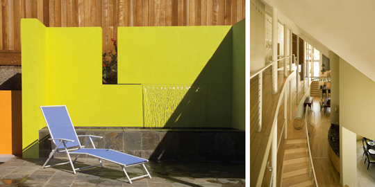
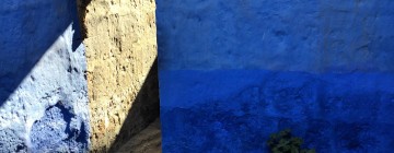
Simplicity of image shows purity of form in Claudio Santini's photography of a project by Mark English Architects.
What is your background and how did you come to architectural photography?
From 1979-1982 I went to architecture school in Rome. Taught by the best professionals, the curriculum included extensive field work and apprenticeships. At the same time, I did a photography major with a focus on architectural photography at the Institute for Architectural Design. The professors were very well-connected to the editors at magazines both at home and abroad. That’s how I made my first American connections.
In 1982 my professors brought me to the U.S. to photograph projects, and also introduced me to editors in Italy. I photographed U.S. projects and sold the photos to Italian editors of magazines like Domus, Abitare, and Casa Vogue. I enjoyed working on these projects and eventually they became a book.
What do you strive for when photographing someone else’s design project?
My purpose is to document their work and respect the philosophy of the architecture – to show what makes the architecture beautiful? The idea is to create an essential image with no “noise”… this means with interiors, keeping accessories to a minimum.

The orange throw creates a spot of color in an otherwise muted palette, creating a visual anchor. Design: LeanArch. Photo © Claudio Santini
When I photograph a building, I am documenting the work of someone else. The photographer’s interpretation should amplify the designer’s intent.

This structure is actually a 19th-century timber frame barn that was relocated from the East Coast to California. The skin is contemporary, with the original interior preserved. Design: Carver + Schicketanz. Photo © Claudio Santini, who says, "The skin is what makes this particular image so clear."
Do you have to photograph the same project differently for different publications?
Yes. For example, some magazine photos are overloaded with richness and artificial light.
I prefer a different approach, one that diminishes and reduces to bare essentials. I use 90% natural light if I can, and augment it only to help the natural light. It’s imperfect, but fascinating. When a photo has perfect light, it looks artificial.

In this photo of a project by Callas Shortridge Architects, Claudio Santini used mainly daylight with only minimal fill-in to assist the natural light in the darker zones.
For commercial purposes, the intention is to explain the itinerary inside the home, with a narrative development.
For books like the ones I’ve published, you want to dream. These photos are more abstract and not as literal. People can read whatever they want into it, like an abstract painting. Magazines on the other hand are more literal-minded.

"This photo is evocative because you don't understand what it is or even where you are. This ignites the imagination." Design: Carver + Schicketanz. Photo © Claudio Santini
Have you ever worked on a shoot where the same project was photographed by different photographers?
There is one project I’m working on together with another photographer. His photos are very technical, very perfect, very straight. Mine, on the other hand, are more atmospheric, emphasizing feeling and light. It explains less but it makes you dream more.

Photographer Claudio Santini used a tilt-shift lens to correct distortions in perspective when photographing this project, designed by Carver + Schicketanz. Photos © Claudio Santini
How do you photograph small spaces where you can’t get those splashy wide-angle lens shots?
A tilt-shift lens corrects perspective. It’s what we use also for exterior shots sometimes.

A tilt-shift lens helps when photographing small, tight spaces. Design: Steven Shortridge. Photo © Claudio Santini
In today’s digital world, everything is speeded up more. Images travel faster and are viewed by more people. That increases the rigor required of the image.
What would you say about image composition in architectural photography?
Details are very, very important. You need an assistant to move things around. Even one inch can make a difference.

These images have an abstract, rendered quality. Design: LeanArch. Photos © Claudio Santini
I try to make it as abstract as possible, almost like a rendering. It’s easier to reduce, to remove, than it is to add.

"The image is so clean that it almost looks fake." Design: LeanArch. Photos © Claudio Santini
How abstract do you go?
To the point where the image makes you dream. The dream is a kind of meeting point between description and abstraction, between the non-verbal and the explicit. It’s a tension between opposites.

The abstractions created by the downward perspective and the angled stairs almost feels like a movie or stage set, creating a sense of place that is curiously removed from the world at large. This shows a former hay barn in Siena, Italy, remodeled by architect Luigi Villano. Photo © Claudio Santini
What other photographers do you admire?
Julius Shulman is one. He brought life to images with black and white by adding people. He showed lifestyle and entertainment within architecture. Adding people puts the image at a specific point in time, not a timeless abstraction.

Julius Shulman's photo of Case Study House #22 includes people. Design by architect Pierre Koenig. Image © J. Paul Getty Trust, Julius Shulman Photography Archive
Of course, lifestyles have changed over the years. In the 1950s, everyone was in the living room. In 2009, they’re all in the kitchen.

This untitled photo by Julius Shulman pictures the State Capitol Bank in Oklahoma City. It was designed architects Bailey, Bozalis, Dickinson & Roloff; Shulman photographed the building on May 11,1963. Image © J. Paul Getty Trust, Julius Shulman Photography Archive
I am also inspired by fashion photographers. Some of them are very creative people in terms of lighting and trends. Another inspiration to me is Caravaggio’s sense of light and dark.

For a more dramatic photo, try using only a single light source such as a window or a door - and let it be natural light. Shown here is an example of vernacular architecture from the island of Pantelleria, a stone house estimate at 300 years old. Interior by Karin Eggers. Photo © Claudio Santini
Who were the “old guard”?
Aldo Ballo worked closely with Casa Vogue. Very graphic, simple, clean, pure photography design.
What about the use of color?
I want to find the perfect balance between color and form, as with fashionable clothing. Fashion photographers know how to interpret feeling and light.

A composition with an Eames chair, a concrete wall, and orange glass is simple but strong; this photo by Claudio Santini shows a home designed by Sander Architects, using all recycled materials.
For shoots I sometimes bring my own accessories, including artwork. Usually the owners and architects let me do that.

These architectural images would look quite different without paintings to anchor them. Claudio Santini introduced the paintings as accessories when photographing this project by LeanArch.
Do you have any do’s and don’ts for architectural photography?
Architects photograph like drawings, very literally, but with photographers, they each have to follow their own voice to invoke beauty. For me, it’s simplicity and formal balance among few elements.

The simplicity of this design from Sander Architecture is heightened by the focus on the shadows created by subtle inserts in the glass panels. Photo © Claudio Santini
With digital tools, it’s much more affordable to reach quality. Something that used to cost many thousands of dollars in labor costs can be a do-it-yourself project now for $3,000. I guess one “Do” would be to invest in technology and digital knowledge.
Is there still a place for the darkroom in the digital age?
Platinum and silver prints have a better black, but inkjet printers now are almost as good.
Tell us more about the way you handle lighting.
With natural light, there is a “zone system” between outside and inside. It’s all about compensation – compensating for the difference between the interior and exterior light levels. The goal is to make the balance believable, so that it doesn’t look artificial. Balance here refers to the interior and exterior light readings. If your light is well balanced, then even if you add small amounts of artificial light, the photos won’t show it.
If you add too much light inside, the final effect is fake. The goal is to create a final effect that is pleasant to look at.

Zones are a way of transitioning from interior lighting to exterior lighting. Design: Carver + Schicketanz. Photos © Claudio Santini
What about dealing with different types of light?
I’m very old-school and I prefer one light source – natural light, with a maximum of two light sources. The newer generation of photographers have eliminated lighting and just do it all on the computer using Photoshop layers. I think it looks less natural.

A serene sense of place comes from the expansive view as seen through openings. Design: Robert Anderson. Photo © Claudio Santini
Tungsten gives warmth, but not used as the main light source.

Simple forms and pure daylight enhance the drama of this skytop pool. Design: Robert Anderson, same project as shown immediately previous. Photo © Claudio Santini
When dealing with multiple light sources, they should be the same color temperature or the same color family, or it will look strange.

Consistency of light and a softer touch lend a sense of serenity and restfulness to this interior. Design: Jonathan Feldman of Feldman Architecture. Photo © Claudio Santini
Are there great buildings that don’t photograph well? Photographing Louis Kahn’s work for example… don’t you have to experience it?
If the architecture is very strong like a master, then the photographs will show it.

The strength of this architecture lies in a purity of form that complements the open, natural setting. Design: SPF Architects. Photo © Claudio Santini
What are you working on now?
I’m interested in architectural photography with a theme: connected to a social movement or social art, something that is connected to both people and cities. Themes like showing how green design can also be beautiful design, for example, or a survey of vernacular architecture in Italy.
Themes can be a way of treating subjects that are challenging to express. For example, my book Green is Beautiful is not just a technical book on environmentally friendly design.

Two examples of vernacular architecture photographed by Claudio Santini. Both examples show the Trullo style typical of Puglia, Italy. House shown on top was remodeled by architect Silvia Prevedello. Photos © Claudio Santini
I’m also interested in architecture without architects. For example, rural architecture – architecture made by regular people using common sense. The study of designs made by ordinary people is a branch of anthropology, actually.
I’m always excited about my latest project. Right now, its rural architecture and spontaneity. I’m working on a new book that is entirely photographed in Italy.

Vernacular architecture in the Trullo style, photographed by Claudio Santini. Interior and furnishings selected by the owner, Emanuele Amoroso.
Bernard Rudofsky organized shows in the 1960s [and earlier] treating this subject.
Isn’t it scary for architects to hear about “architecture without architects”?
Not for the talented ones. They’re inspired by it.
Le Corbusier’s sketchbooks included lots of little drawings of rural architecture.
A good architectural photographer should identify or feel out trends, show something wider than simply documenting architecture as one would for a magazine feature. I feel that a good architectural photographer’s work should have balance: 30% academic work and 70% social trends.

Interior of a home in the historical village center in Puglia, Italy. Photo © Claudio Santini
Let’s talk about books. How do you start them?
The first step is choosing a publisher and selling them on your idea. I have to consider:
- Who’s going to buy this book?
- What does the publisher want? The publisher wants to show the most popular trends in art and social architecture. So, the question for me is: What subjects can reflect or express these trends?
- How to go beyond niche marketing to reach a wider public audience.

Claudio Santini worked very closely with the editors and writers to produce his latest book on the aesthetics of eco-friendly design, "Green is Beautiful"
How do you keep it from pandering to the lowest common denominator of public tastes? How do you keep it from being crassly commercial?
Technique and beauty must be formally balanced. The first thing to remember is that beauty is not luxury! A $10 million dollar home or a $500K home can both be equally beautiful. Simplicity is the ideal, and sometimes simple subjects are more photogenic.

Left show a $20M home in LA designed by Ted Tokio Tanaka Architects for a celebrity golfer. Right shows the Venice residence of architect Steven Shortridge, with a considerably more modest budget and footprint. Photos © Claudio Santini
Tell us more about the production behind your latest book, Green is Beautiful.
I was totally comfortable with the process. The project was supported by architects, the publisher who liked my idea, and the editor/designer.
I thought: My story can make people dream. This is the American dream, the land of opportunities. Books like this can make people dream about what they themselves could create.
How was it collaborating with Dafna [writer for Green is Beautiful]?
I gave her the concept and she took it and ran with it. Photographers interpret, but so do writers. Her writing really completed my work, and I could not have done it without her.
What’s the most unusual project you’ve ever photographed?
I’d have to say the houses of artists. Artists have very strong personalities, and they bring their own creativity and soul to their homes. They don’t care if it’s going to be photographed for Architectural Digest.

Detail from the LA luxury home pictured immediately above, designed by Ted Tokio Tanaka Architects. Photo © Claudio Santini
What about photographing interior design vs. architecture? Architects don’t always like a lot of pillows, draperies, etc. But why do interior design and architecture have to fight?
I think it’s because the interior designers are not with the project from the start. They’re treated as an afterthought. The vision for the building should be shared by the interior designer from the beginning. Even Frank Gehry uses interior designers. There doesn’t have to be a conflict.

Photographer Claudio Santini's black and white imagery captures the same feeling of space and atmosphere as his color work. Design: Dean Nota
Image Copyright Notice
Claudio Santini has granted limited rights for The Architect’s Take to publish the copyrighted images of his work that appear within this article. For more information, please contact Claudio Santini directly.
LINKS
LeanArch
Callas Shortridge Architects – no link
Carver + Schicketanz Architects
Luigi Villano – no link
Robert Anderson – no link
Karin Eggers – no link
Sander Architects
Silvia Prevedello – no link
Ted Tokio Tanaka Architects
Claudio Santini
Mark English Architects
Green Is Beautiful
Feldman Architecture
SPF Architects
Dean Nota
3 Responses to “Architectural Photographer Claudio Santini: Images That Make You Dream”
Leave a Reply
You must be logged in to post a comment.
John Klopf
28. Dec, 2009
beautiful work – thanks for the insights into the photographer’s mind, too.
Charles Dudley
29. Dec, 2009
Loved this post. I agree that “When a photo has perfect light, it looks artificial.” I shoot interiors and exteriors with 100% available light and love the realness of the end product. I believe the entire purpose of architectural photography is to express the feeling of actually being in the space which is lost when additional light is added.
photography courses
24. May, 2010
How gorgeous are these photos. Good stuff!